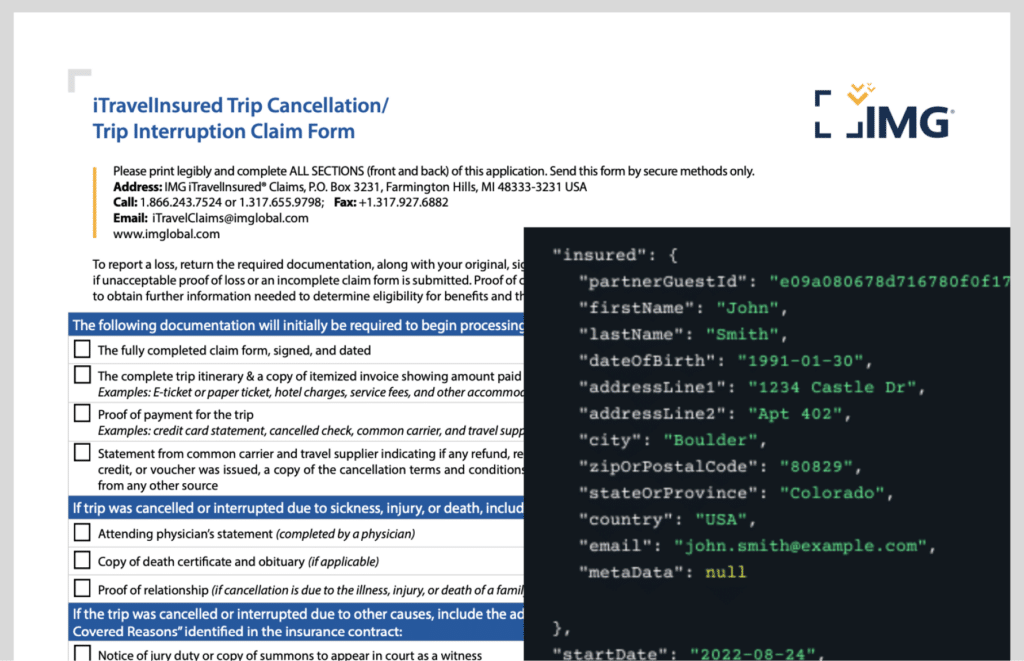

Case Study Coming
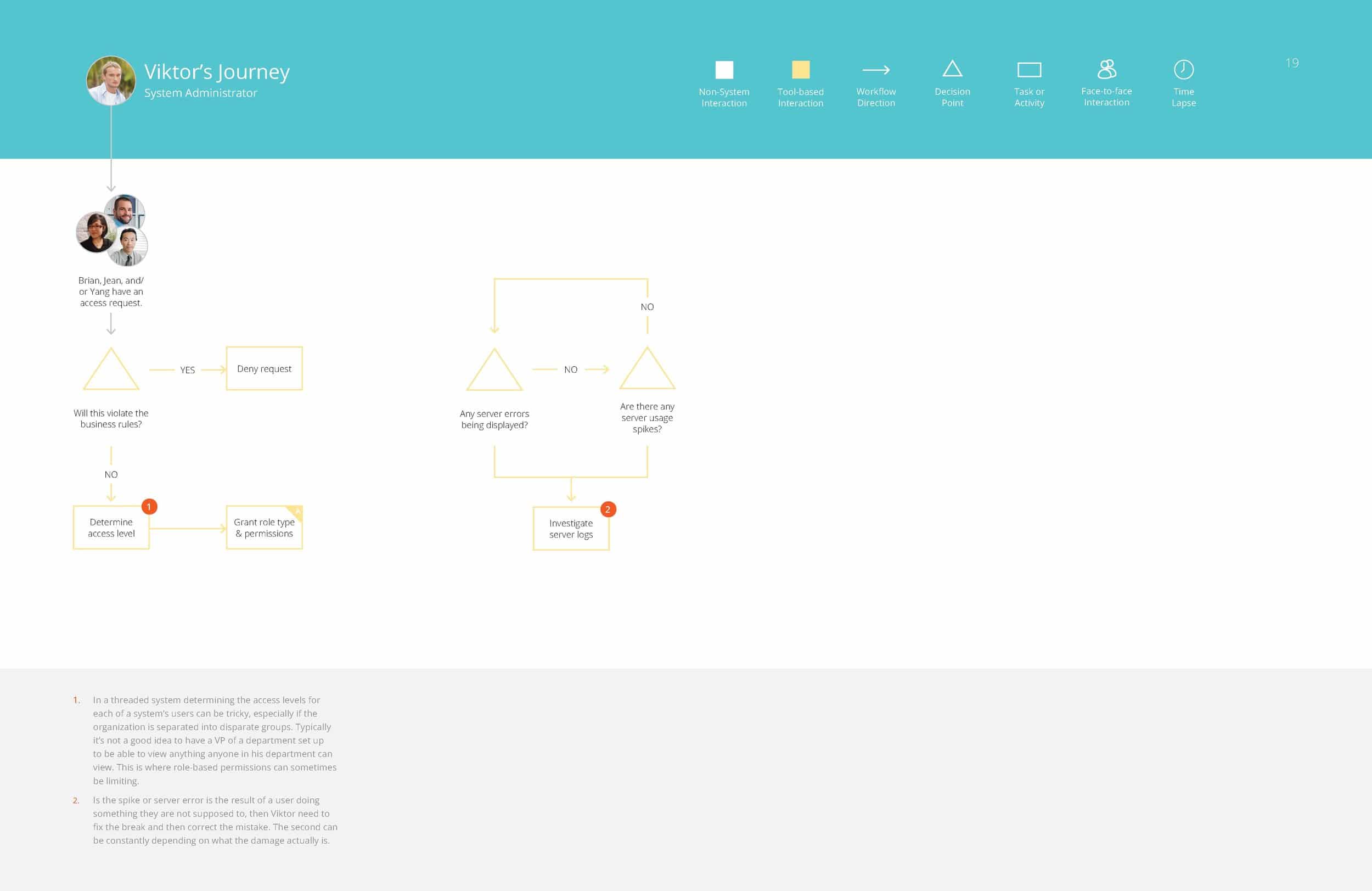
PROBLEM STATEMENT
Jacob’s Pillow is a well known dance school in the ((Birkshires)). They wanted to design their website in a way that would ….
APPROACH

Assessing the Redesign

Understanding the Stakeholders & Audiences

Competitive Analysis

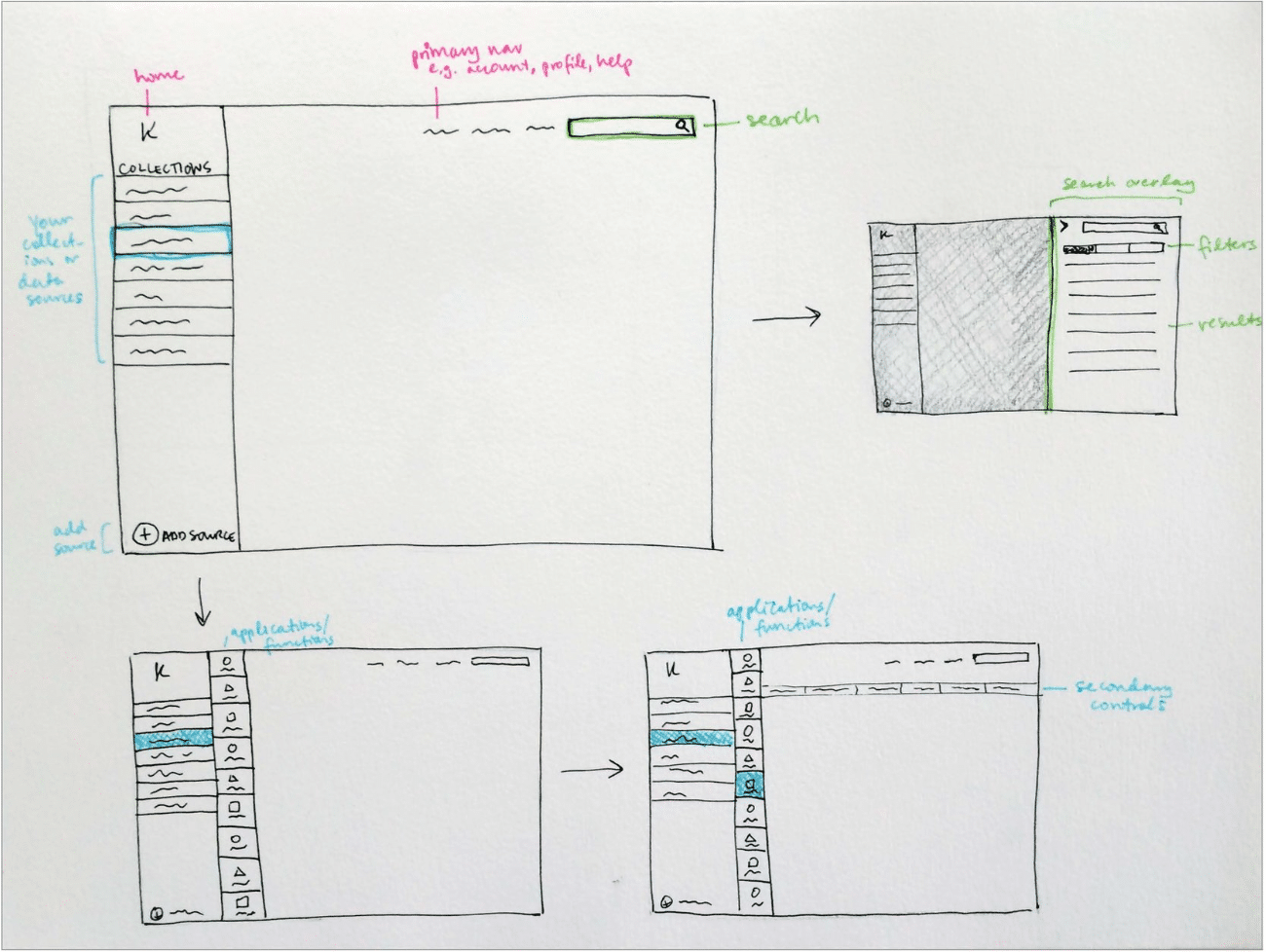
Sitemapping / Information Architecture

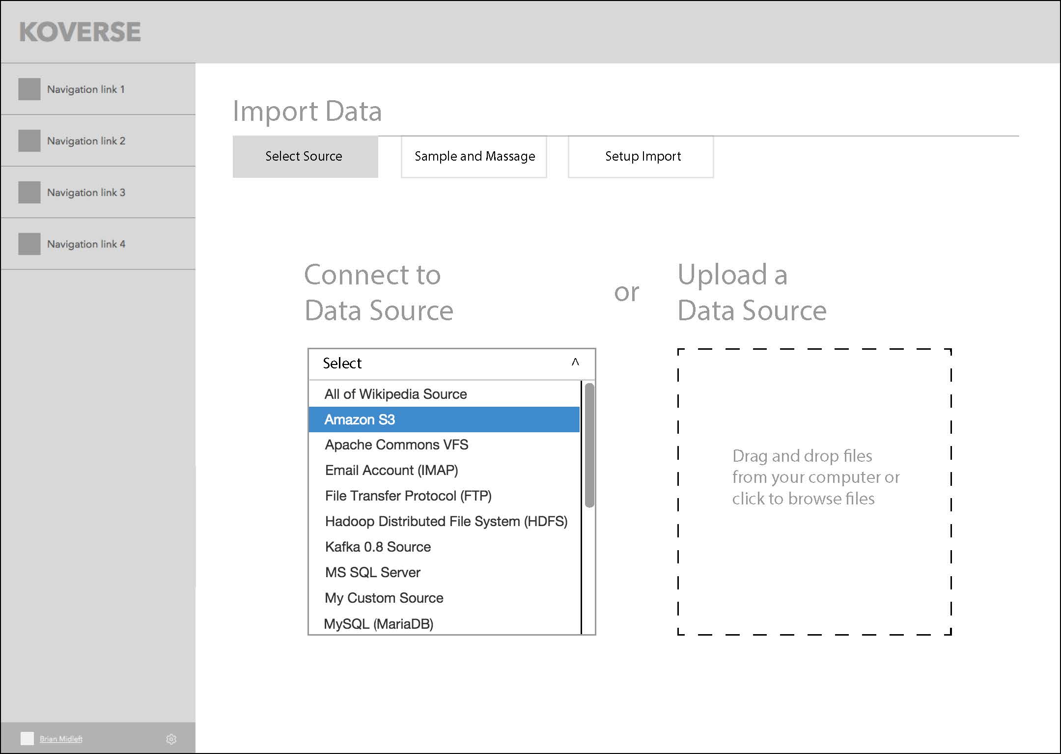
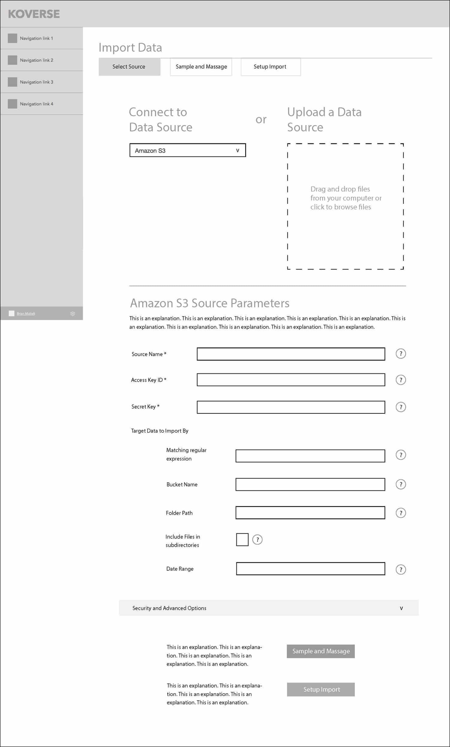
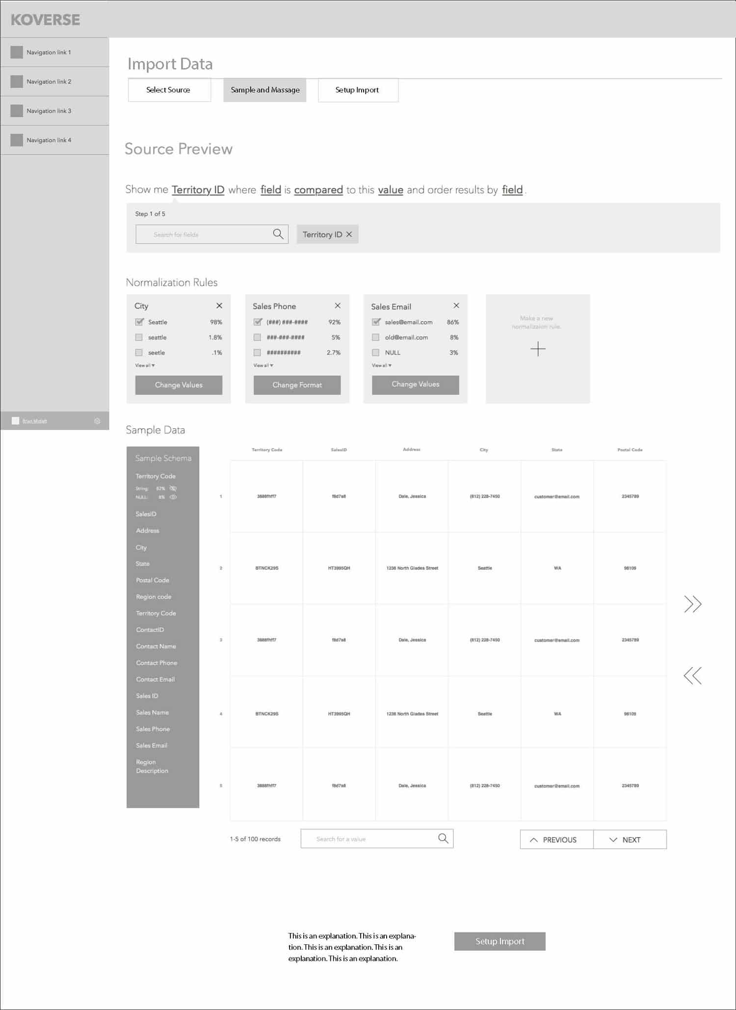
Visual Design

Development
2. Title
D – CONTENT
Using three lines….
Using three lines….
Using three lines….
4. Title
D – CONTENT
Using three lines….
Using three lines….
Using three lines….
6. Title
D – CONTENT
Using three lines….
Using three lines….
Using three lines….