
Partner iOS & Android App

PROBLEM STATEMENT
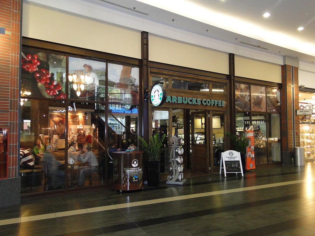
Starbucks Corporate approached the Mentor Creative Group looking to develop a mobile app that would enable their partners to engage with each other and the company on their personal device.
The Partner App is meant to provide a secure, easy to use platform for partners to schedule their work, stay up to date on Starbucks news, receive benefits information, and communicate with peers.
APPROACH

Assessing How Things Were Working
User Interviews
System Sentiment Analysis
Information Architecture
UI Concepts & Ideation
Wireframes & Prototyping
Prototype Usability Testing
Development
User Interviews
USER INTERVIEWS
Many of the requirements for the apps were pre-defined by Starbucks Corporate itself.
However to understand what parts of the current communication system were working well for people, and in what ways the apps could be designed to fit naturally into the barista’s work and communications flow, interviews proved very helpful.
The user interviews were conducted in two different Starbucks locations in Seattle, WA.
Research Materials
The User Interview Scripts and Key Takeaways
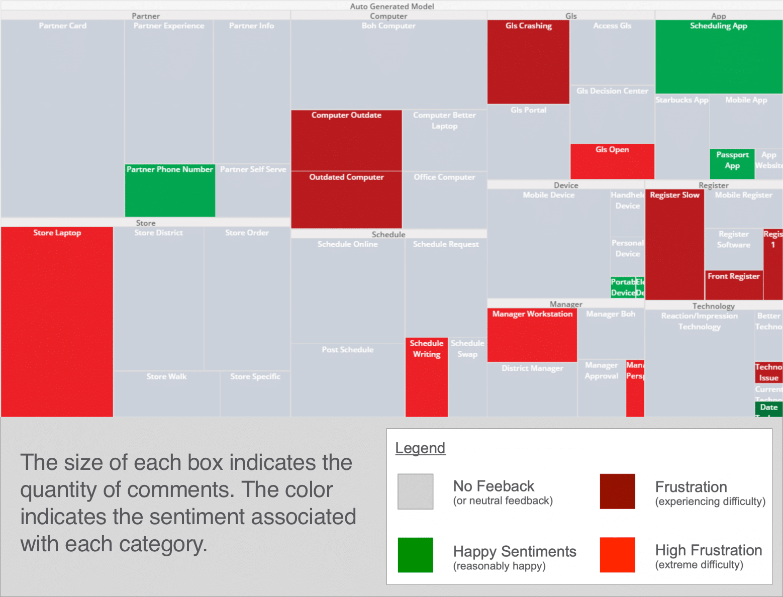
System Sentiment Analysis
Interview Response Heat Mapping
From the interviews with the Starbucks store employees, a heat map was put together to map the sentiments the partners felt about different aspects of the current communication system.
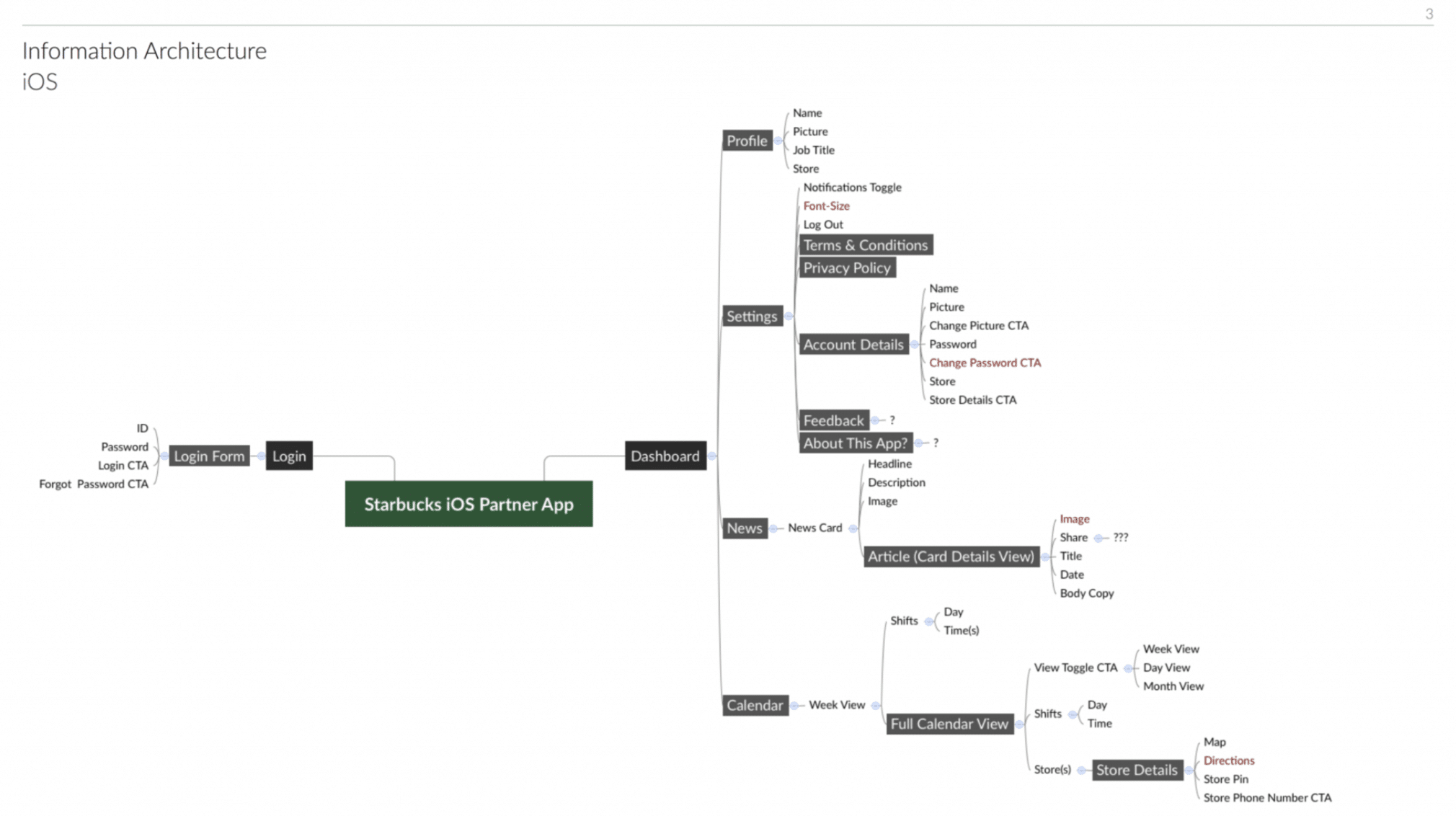
Information Architecture
DEFINING THE SCOPE OF THE APP
To capture all aspects of what information would be useful for the partners within the app and how all this information would relate to each other within the app, we began the design process by mapping out the information and the architecture of how the app would flow.
UI Concepts & Ideation
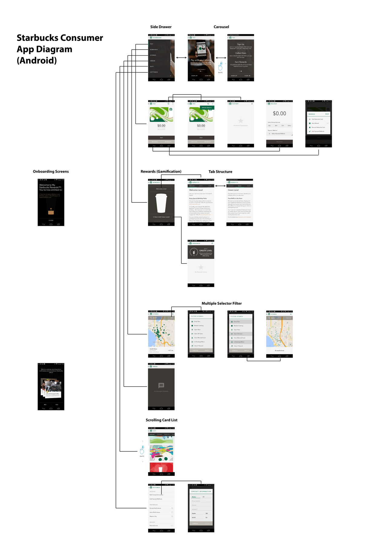
FITTING INTO SEVERAL ESTABLISHED UI PARADIGMS (STARBUCKS, IOS, ANDROID)
With the information architecture of the apps in place, we began researching and ideating how the UI for the apps could work and also fit within the larger contexts we were designing for.
There were a few established UI paradigms we were very aware we needed to fit within that were already established:
The Starbucks design paradigm – Starbucks already had a consumer app, and other internal tools, and we wanted to make sure this app for their partners fit functionally and visually together with it.
iOS and Android – Because we were designing two apps that would be the same just for iOS and Android, we needed to format things a little differently to fit with the established design patterns of both operating platforms.
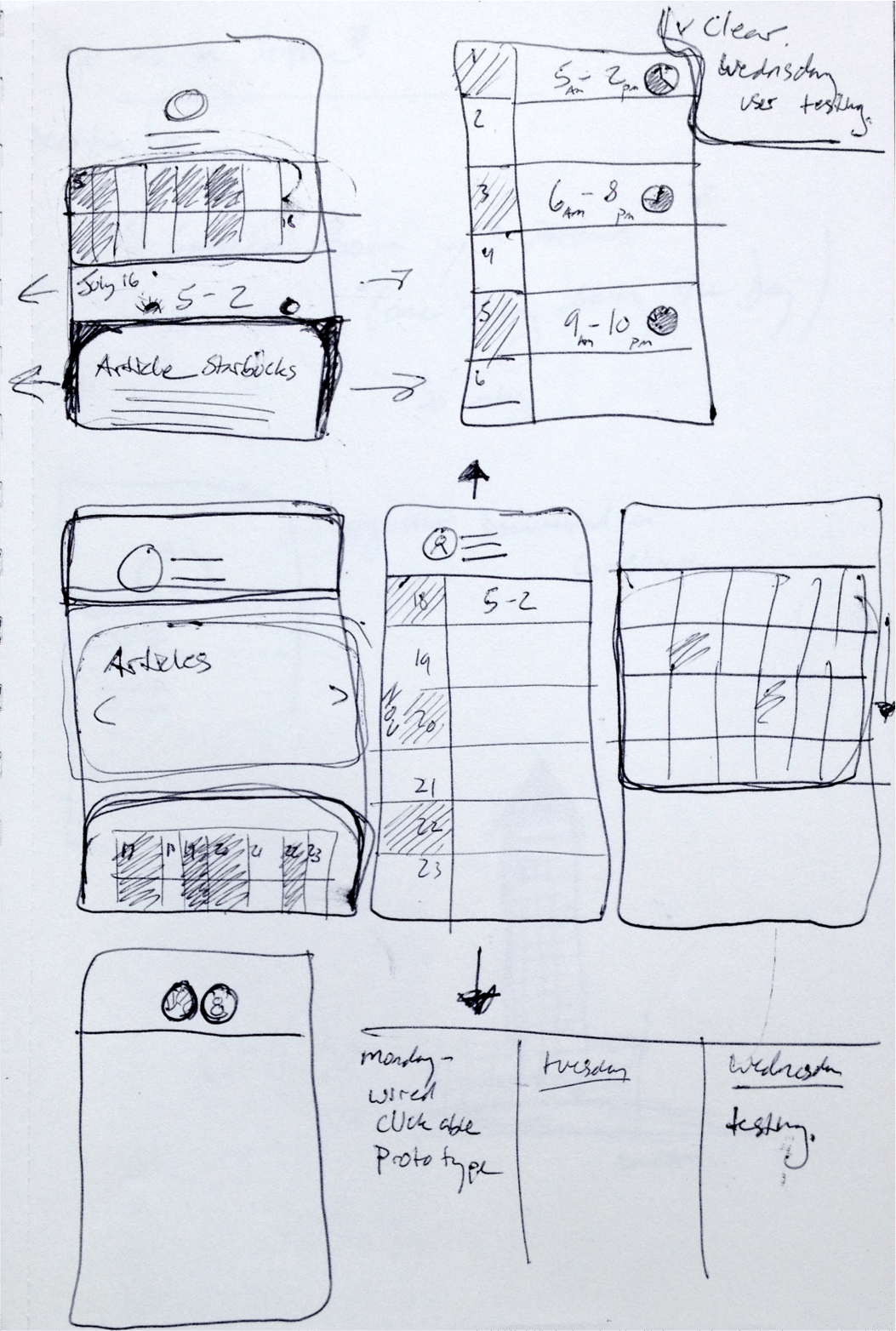
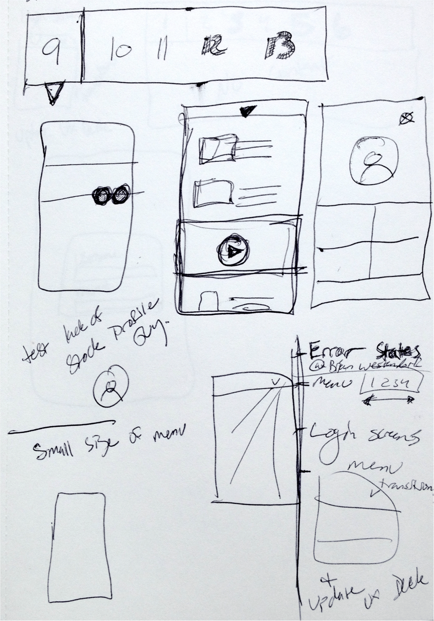
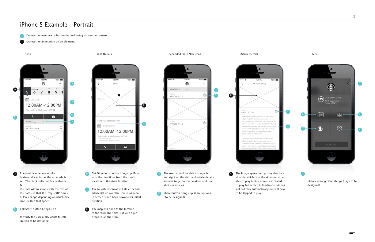
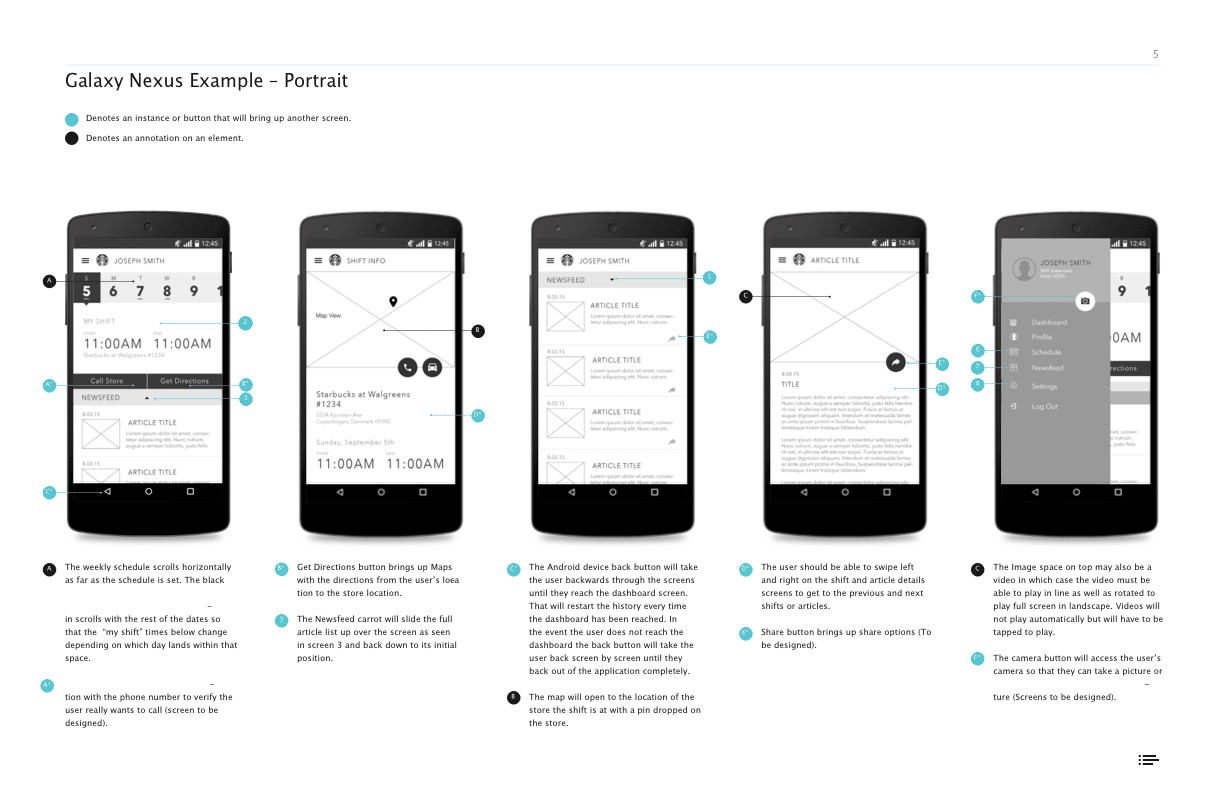
Wireframes & Prototyping
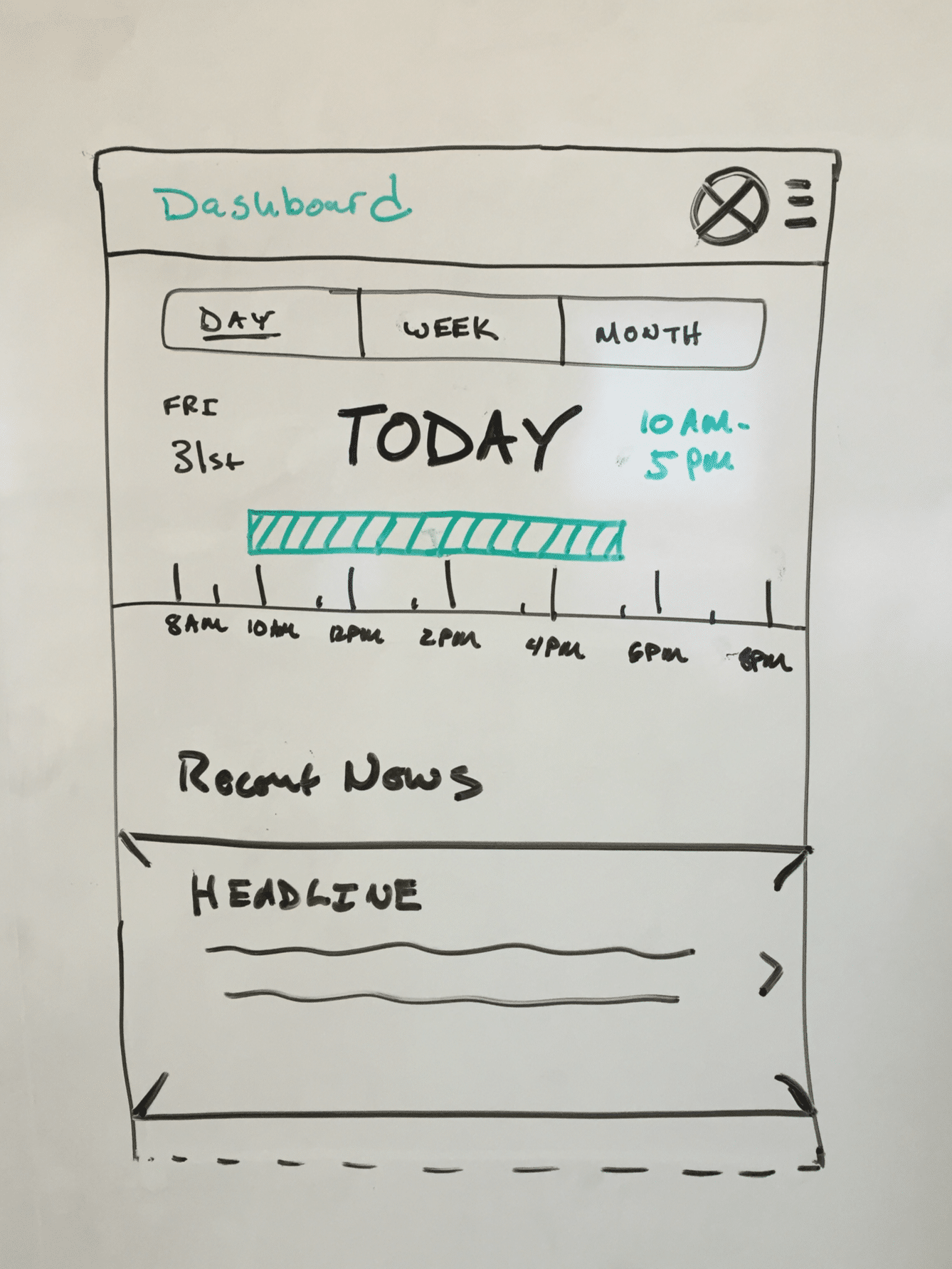
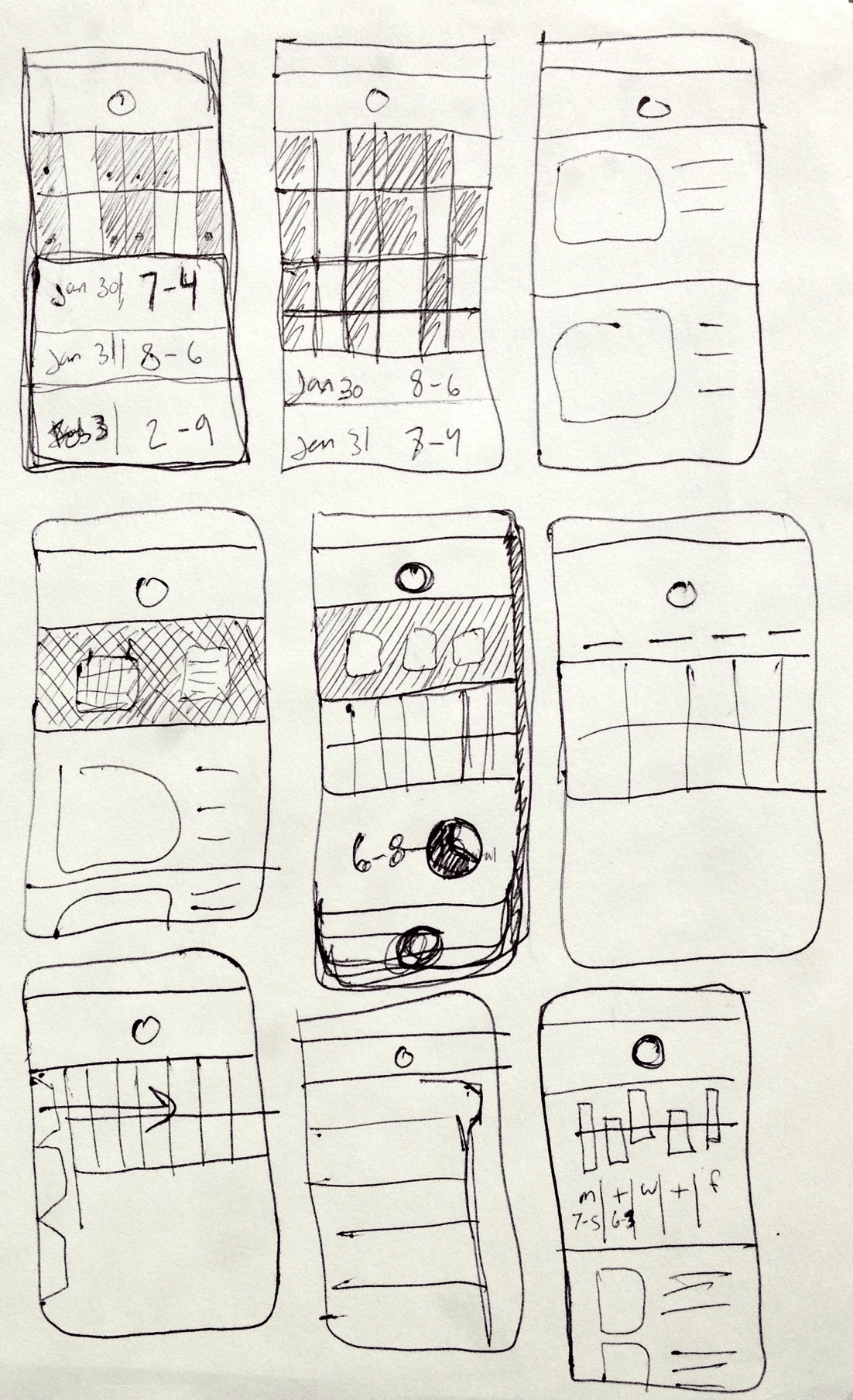
WIREFRAMING A FEW DIFFERENT CONCEPTS
We had a few different concepts for for how the screen level UI could work, and how the navigation could we worked in the apps to be intuitive for users to get from section to section.
Things like how far in advance on a calendar partners needed to be able to mark, and managers needed to plan for dictated how a calendar layout should work and function.
We we given access to a few Starbucks locations and to Starbucks Corporate Headquarters test kitchen to test a few different wireframe concepts and prototypes.
Prototype Usability Testing
TESTING AT STARBUCKS HEADQUARTERS & A SECOND LOCATION
We took advantage of easy access to the actual users who would be using the apps to show a few rounds of wireframes, get feedback, and as the design progressed, to actually test our interactive prototypes.
Early on we asked for partner feedback on wireframes specifically around their thoughts on certain UI elements, if they felt information was missing on the screens that would be useful for them etc..
As the designs progressed and we built actual prototypes for more refined designs, we shifted to asking the partners to complete certain tasks and observed how they naturally went about trying to complete those tasks.
Testing Resources
Research proposal, study kit, findings, an observation worksheet.
Development & QA
for Android & iOS Platforms
WORKING WITH THE STARBUCKS DEVELOPMENT TEAM
The apps were built in sections as parts of the designs were finalized so that the design and development phases of the project overlapped.
We worked with the internal Starbucks development teams to build the apps.
To do this, we produced detailed annotation documents outlining functionality, and visual elements. We would then meet with them regularly to review the development progress and provide QA as things were being developed.
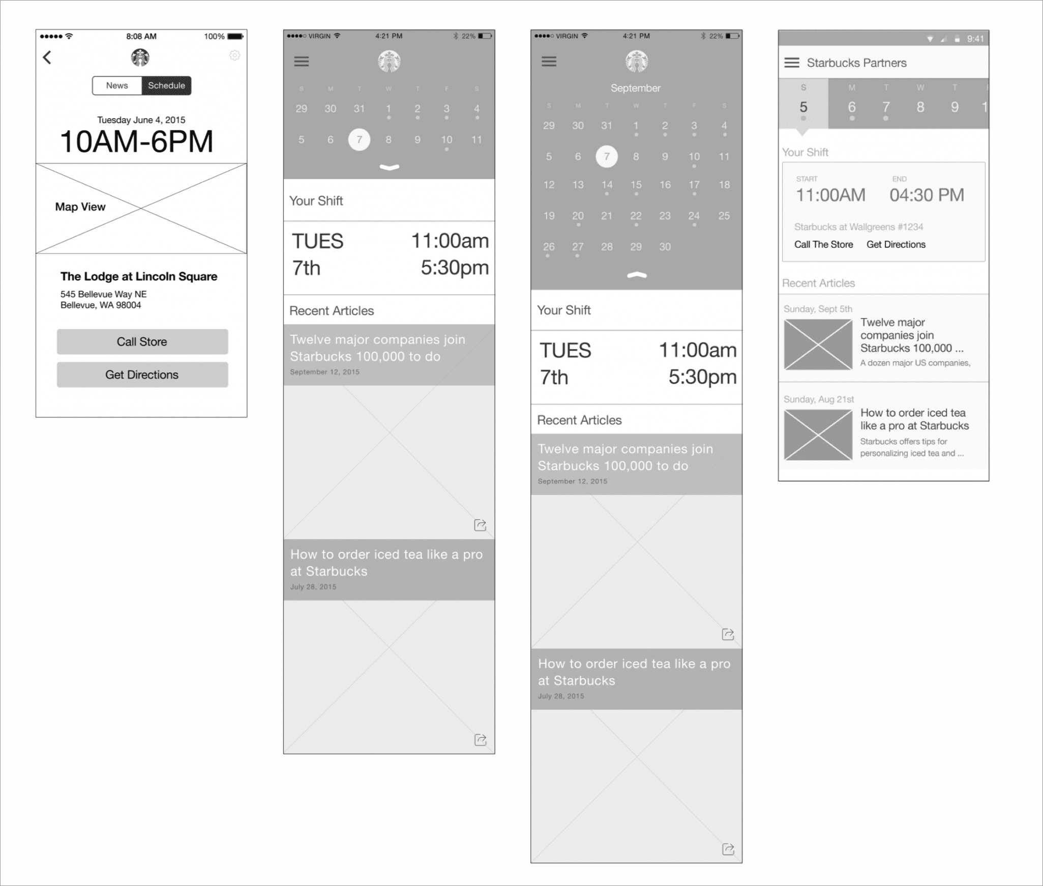
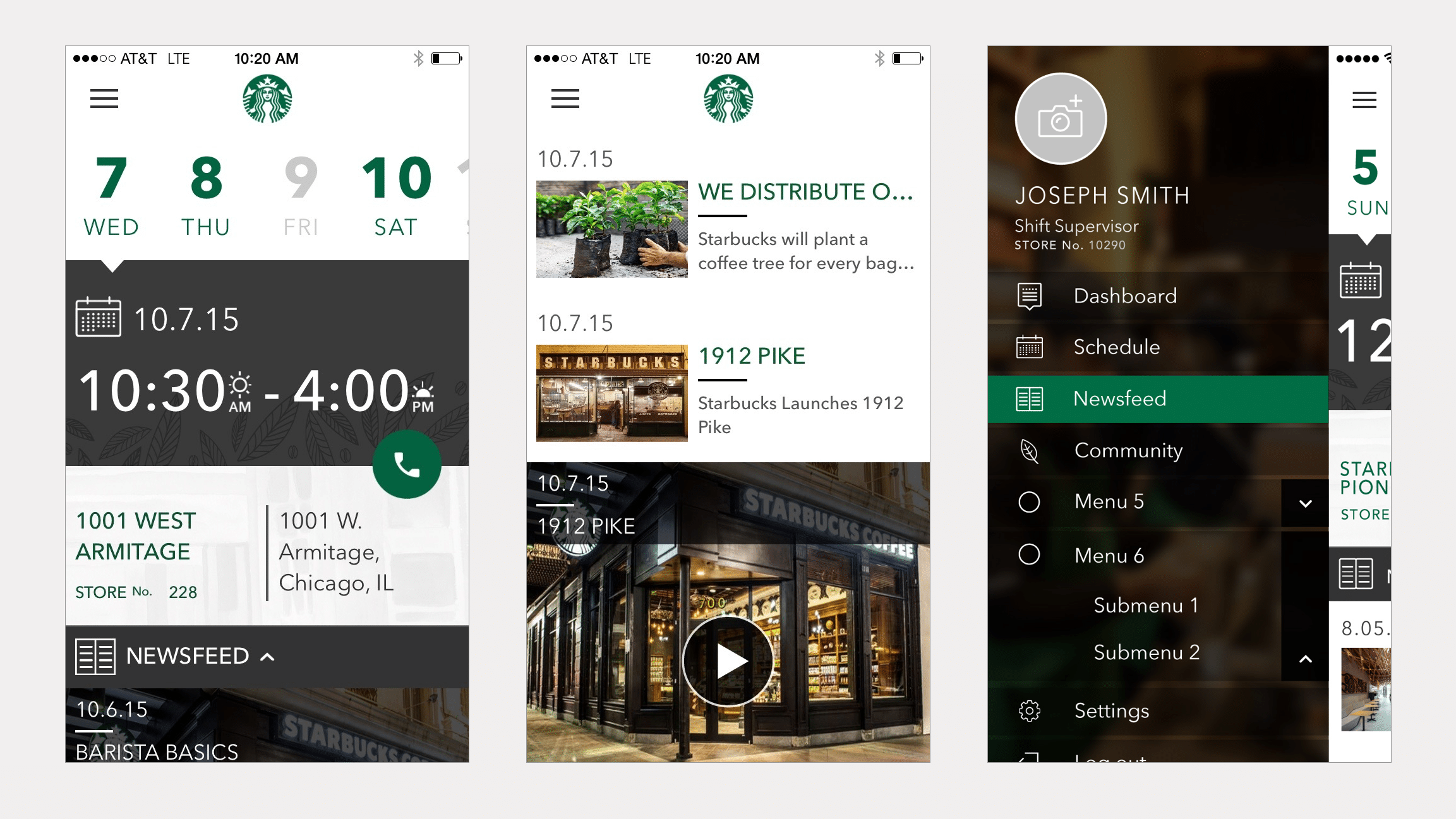
Final Designs
FINAL DESIGNS
Both the iOS and the Android App were built, and released internally in a test program to a few Starbucks locations in different regions of the US.
Ready for More?
View Another Project –
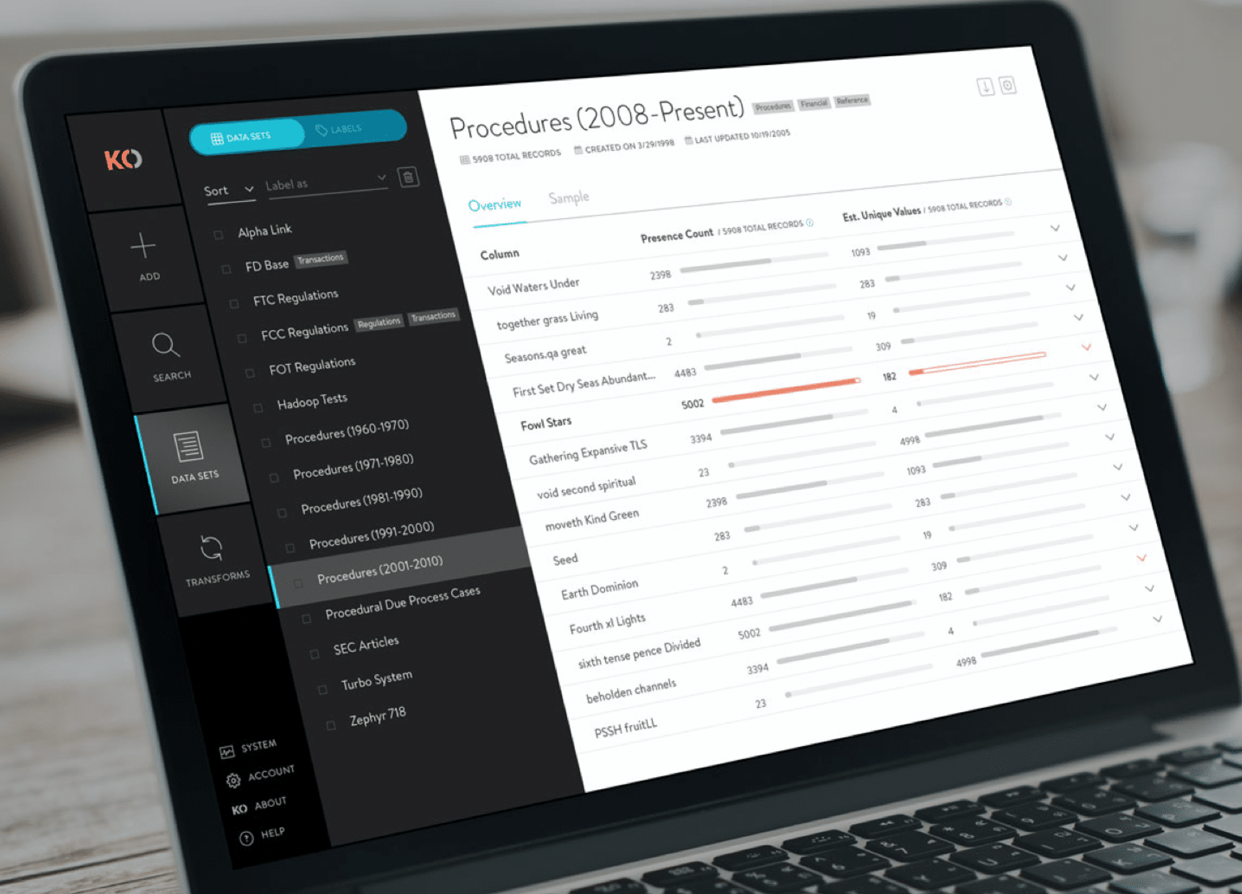
Data Management Platform
Client: Koverse
A tool used by Data Scientists for collecting, storing, and learning from big data.
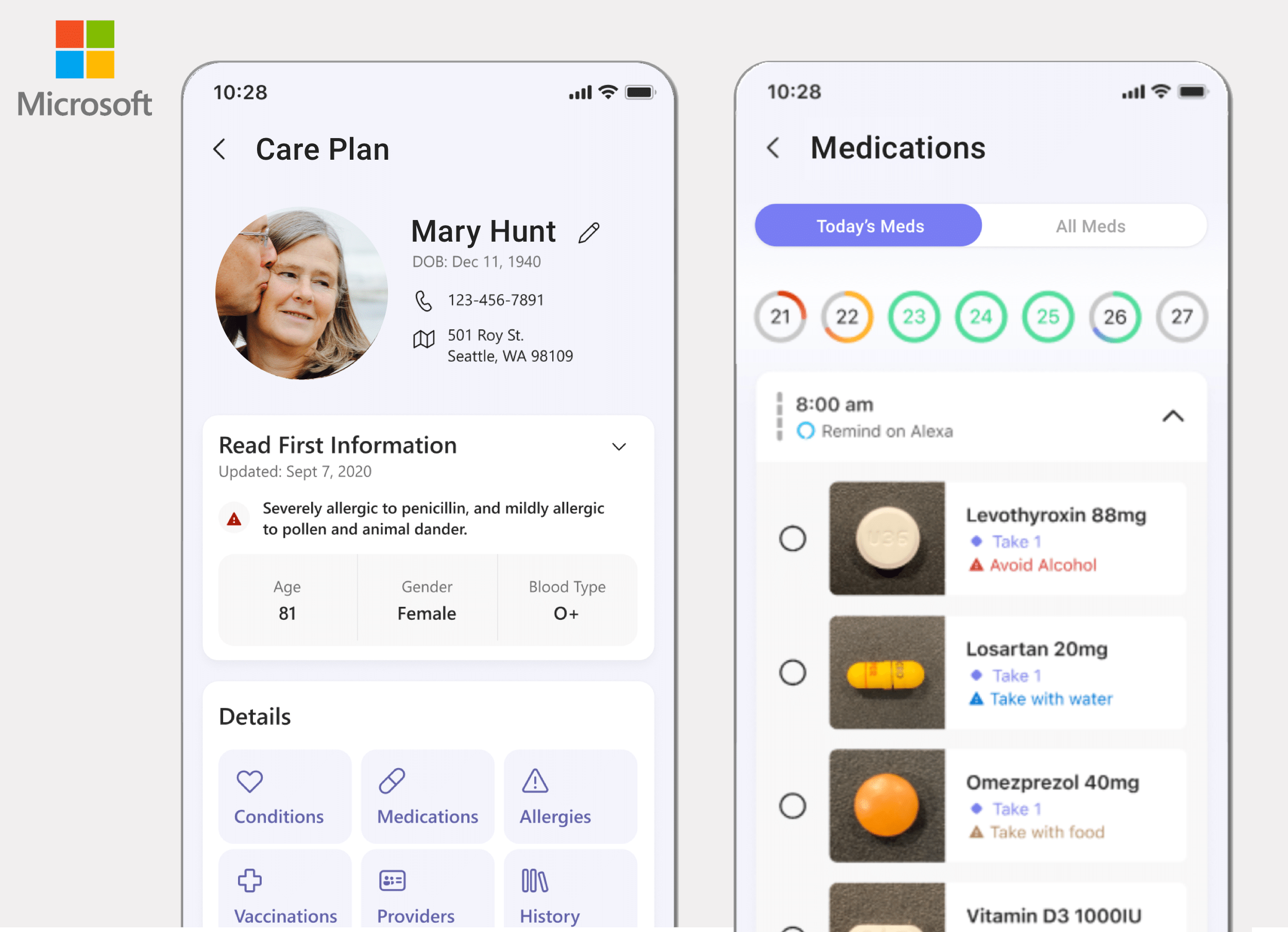
ConnectedCare iOS App (Protected)
Client: Microsoft
Microsoft’s ConnectedCare App is a summary of an individual’s health records organized into one place.
Website Design
PROBLEM STATEMENT
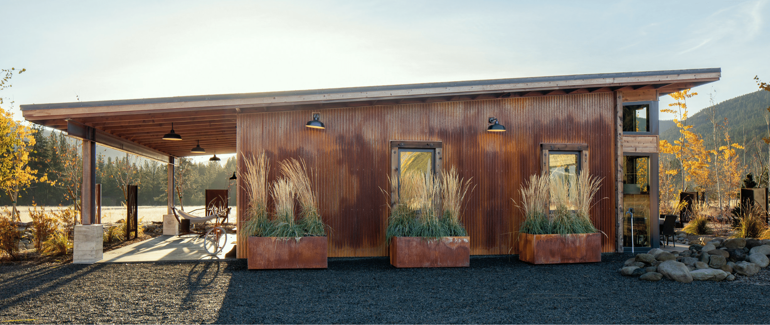
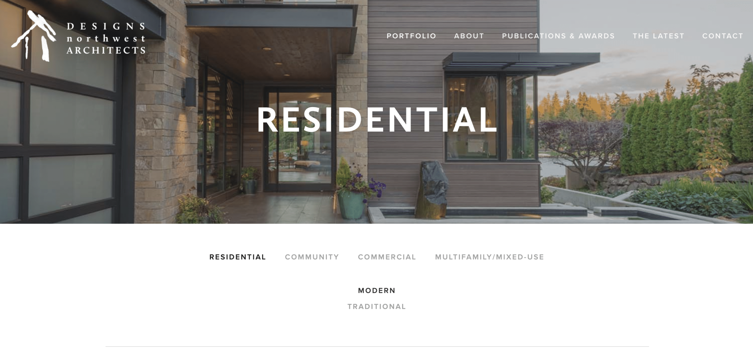
Designs Northwest is an architecture office in the Seattle area. They wanted to refresh their website in a way that would get visitors right into their work, display their particular style, and tell the story of their office (both in the past, and what they’re working on currently).
APPROACH
Discovery
Structure & Wireframe Design
Visual Design
Development
Ongoing Maintenance & Analytics
2. Structure & Wireframe Design
SITEMAPS, WIREFRAMES & CONTENT
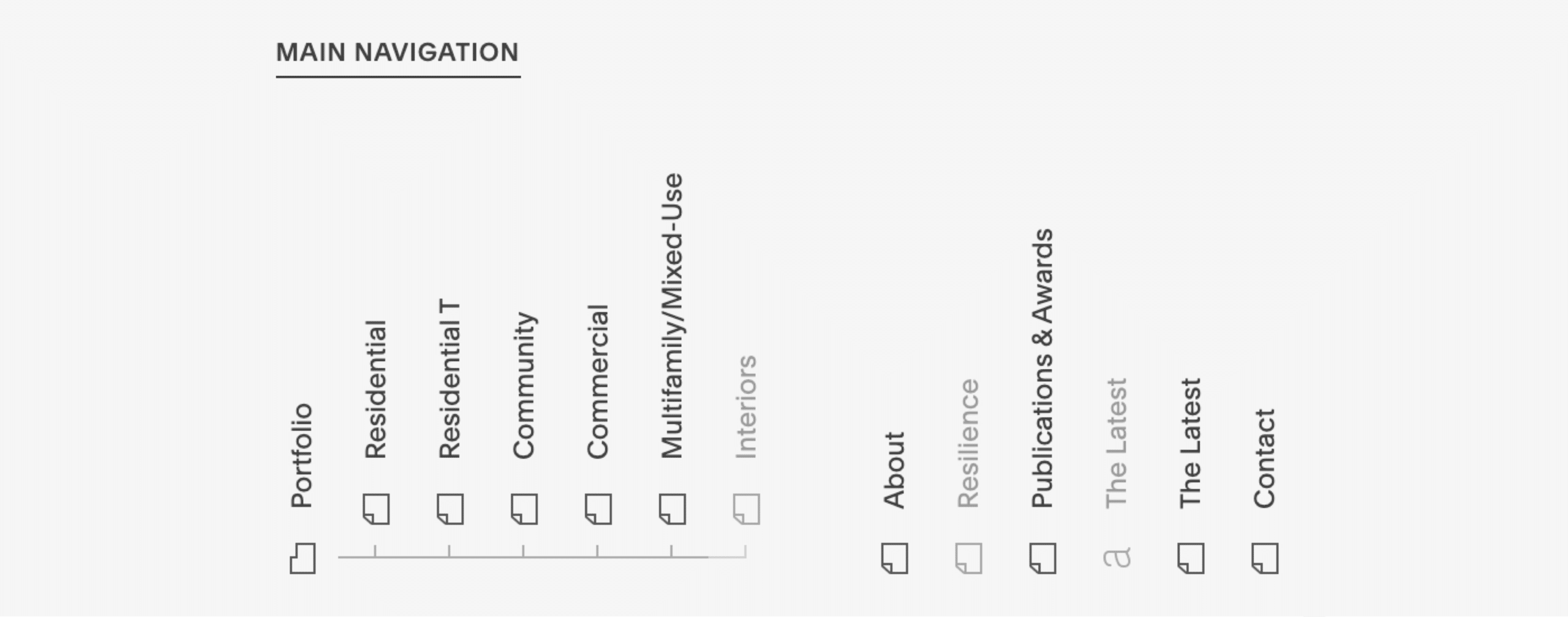
After getting aligned on the goals, audience, and messaging of the project, the next step I take is to map things out with a sitemap (how the website’s navigation and page structure will be), and then to think about what content will fill out each of the pages.
After a sitemap is generally agreed upon, I block out each of the pages quickly and loosely with placeholder images and text content. This step helps clarify if all the content that’s needed is actually present, and laid out in a compelling way before I start investing time with visual design.
3. Visual Design
Colors, Fonts & Images
Only after the structure and content of the website is loosely set do I start overlaying visual design elements to make the website’s look and feel come to life.
From a blocked out website to one with consistent colors, fonts and images is where the magic happens and clients start to really recognize the website as their own.
4. Development
WORDPRESS DEVELOPMENT OR SQUARESPACE
I do custom website development in WordPress the vast majority of the time. Though depending on how much control the client requires in terms of being able to update the site themselves after it’s built, sometimes I use Squarespace.
In this case, I built the site in Squarespace, which allows the client to take advantage of the drag and drop builder interface to make any changes they wish.
Ready for More?
View Another Project –
Website Design
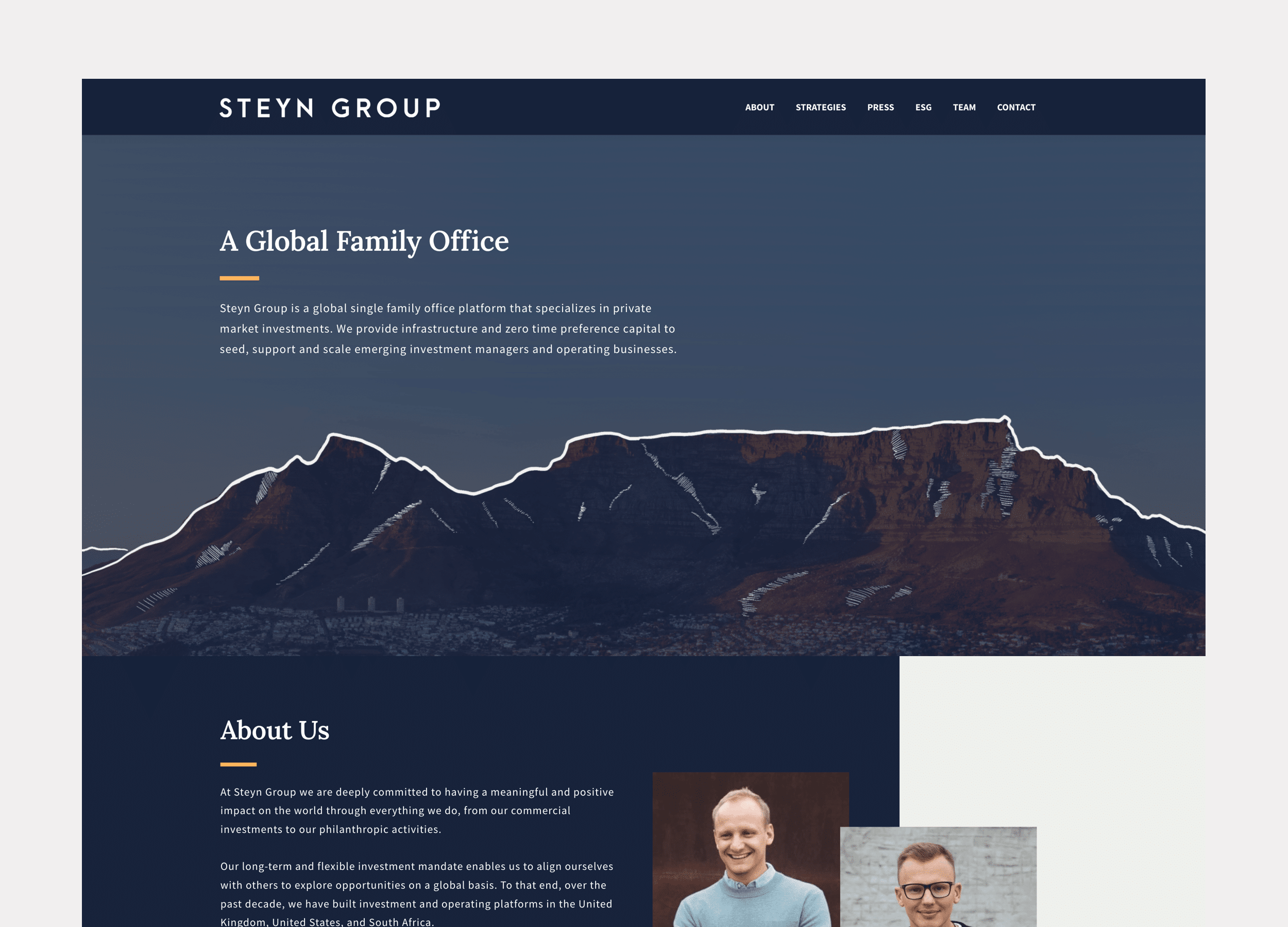
Client: Steyn Group
Website design for a global family office with investments spread between the US and Europe.
Website Design
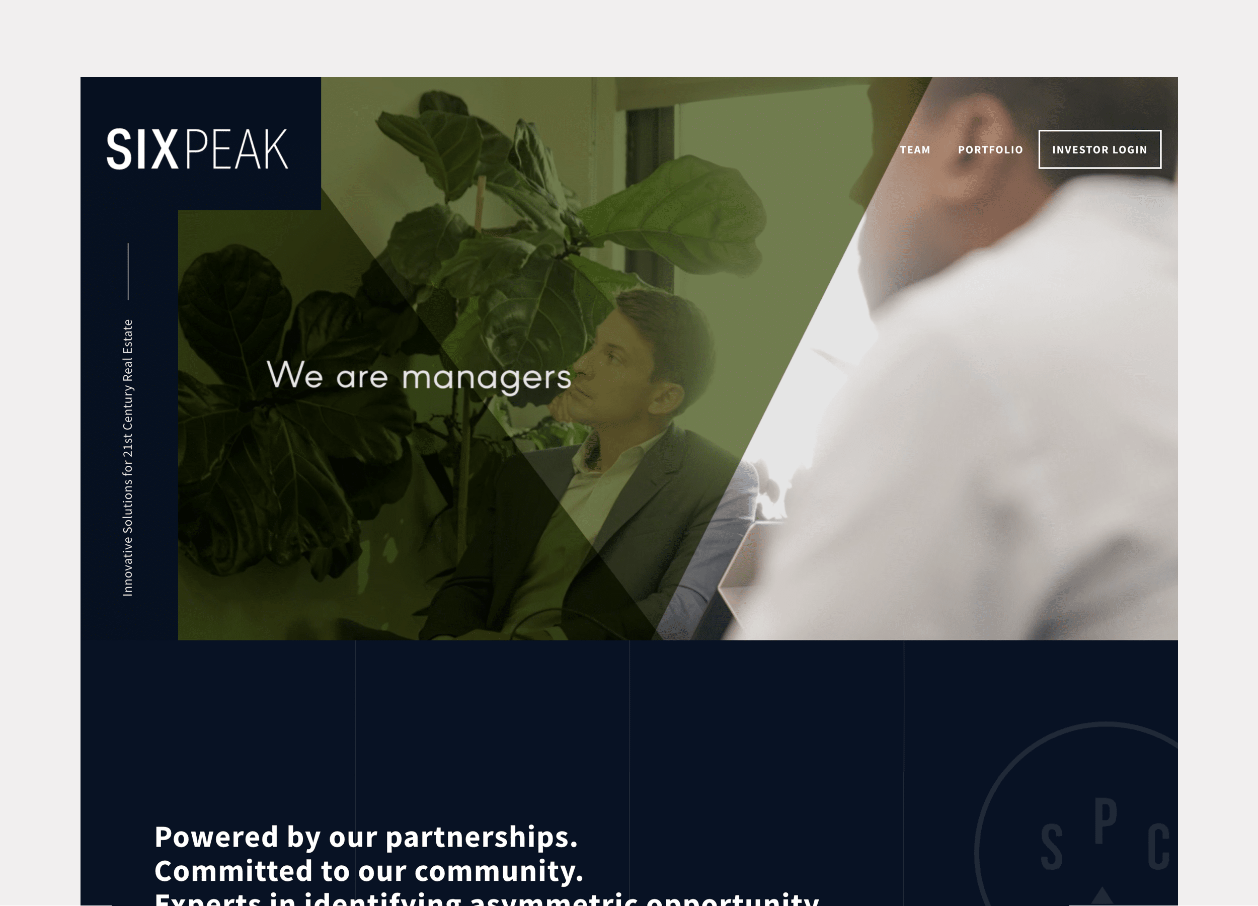
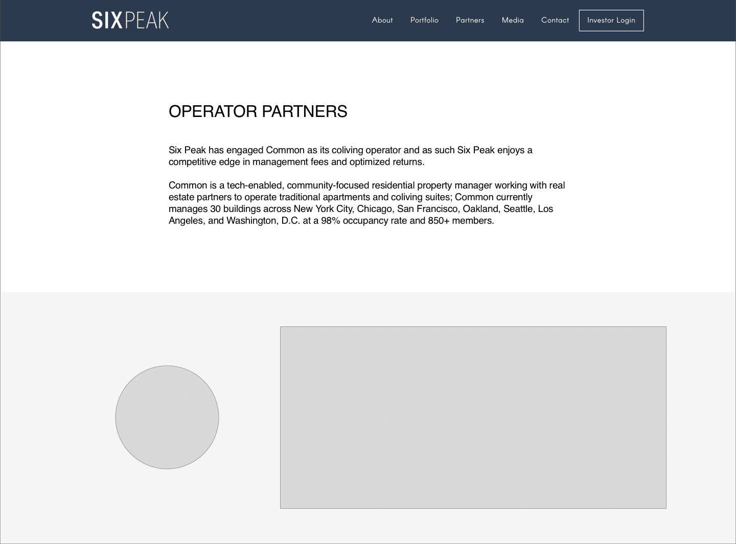
Client: Six Peak Capital
Website design for a real estate investment & development company focused on coliving.
Website Design

PROBLEM STATEMENT
Six Peak Capital is a real estate investment & development company focused on the new idea of Coliving. Six Peak wanted a website that communicated and represented their vision to become an industry leader in this space. They wanted the website to show who they were, showcase their portfolio, and outline where they were going so they could raise investment and bring others along with them.
APPROACH
Discovery
Structure & Wireframe Design
Visual Design
Development
Ongoing Maintenance & Reporting
2. Structure & Wireframe Design
SITEMAPS, WIREFRAMES & CONTENT
After getting aligned on the goals, audience, and messaging of the project, the next step I take is to map things out with a sitemap (how the website’s navigation and page structure will be), and then to think about what content will fill out each of the pages.
After a sitemap is generally agreed upon, I block out each of the pages quickly and loosely with placeholder images and text content. This step helps clarify if all the content that’s needed is actually present, and laid out in a compelling way before I start investing time with visual design.
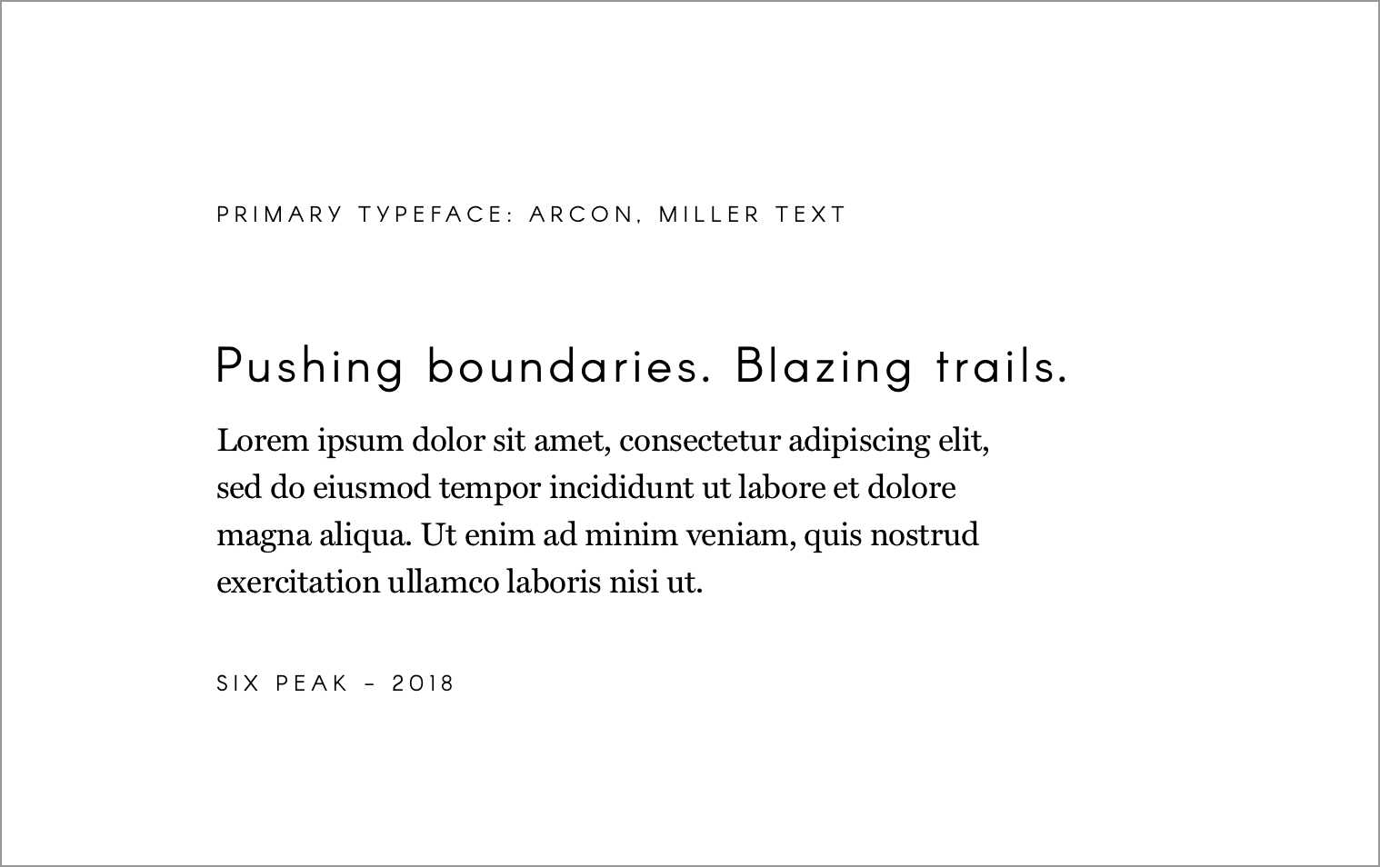
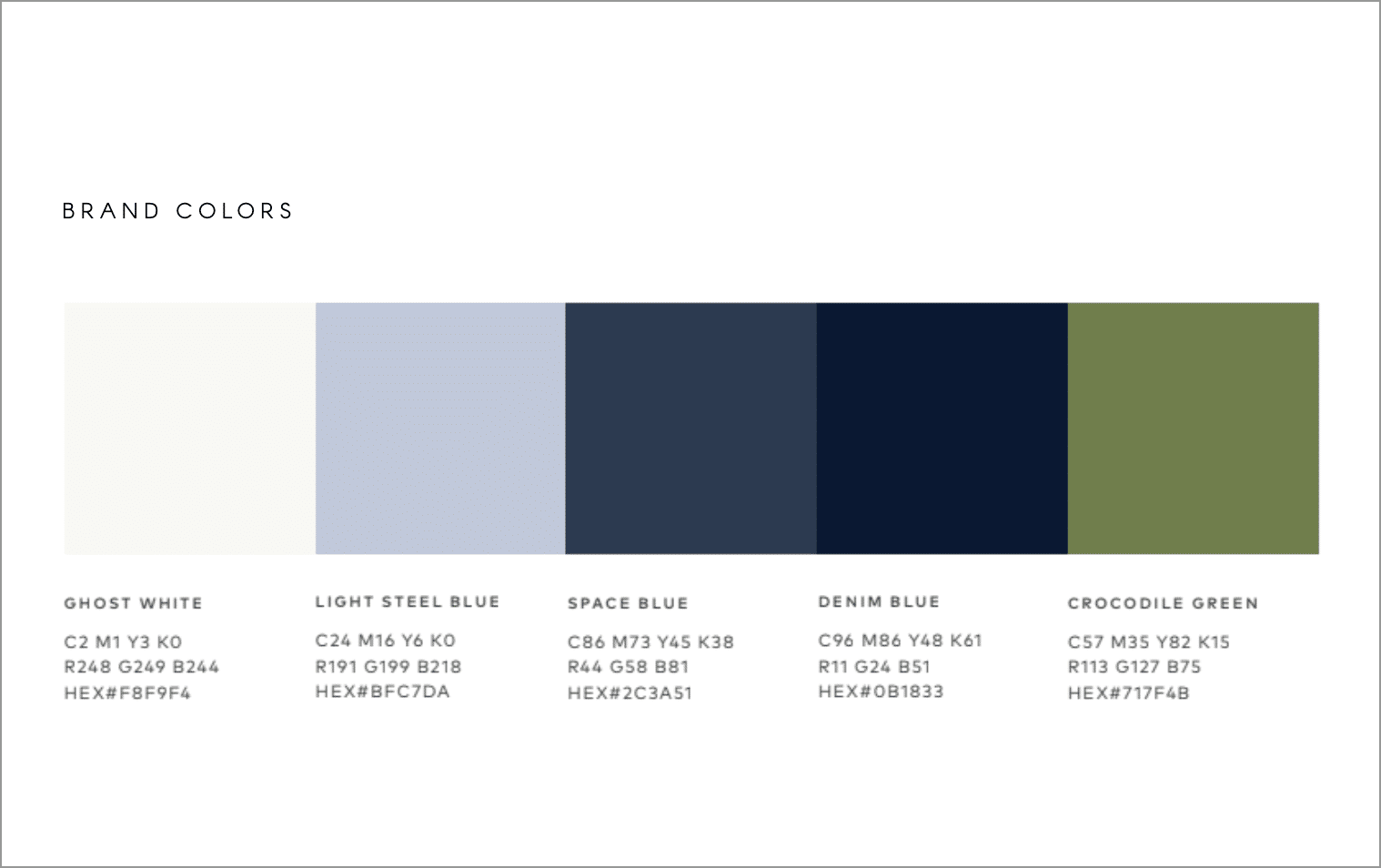
3. Visual Design
Colors, Fonts & Images
Only after the structure and content of the website is loosely set do I start overlaying visual design elements to make the website’s look and feel come to life.
From a blocked out website to one with consistent colors, fonts and images is where the magic happens and clients start to really recognize the website as their own.
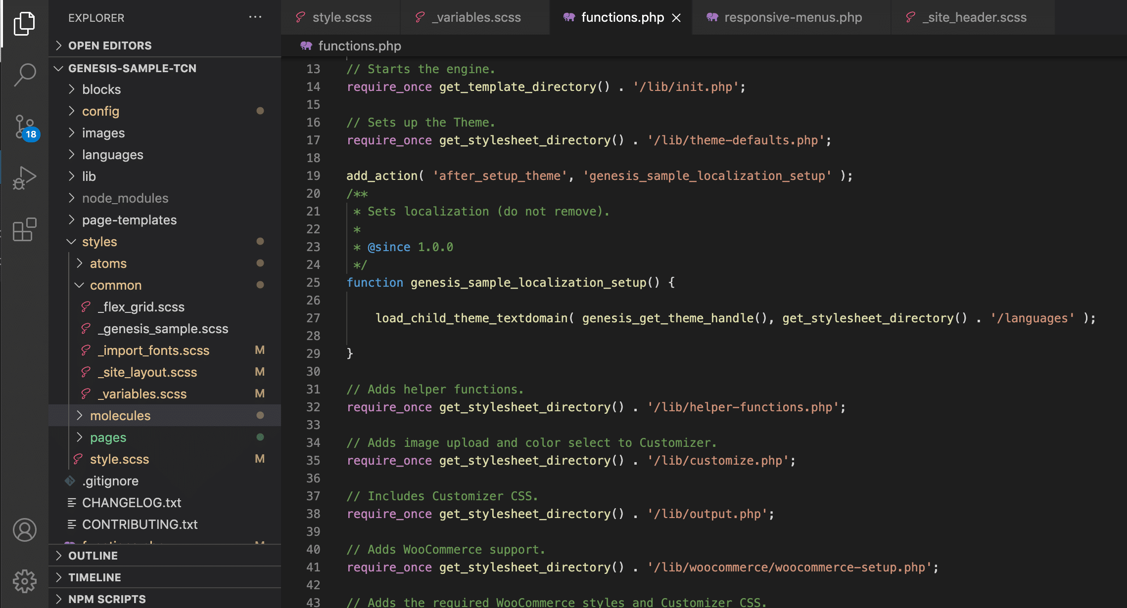
4. Development
WORDPRESS DEVELOPMENT
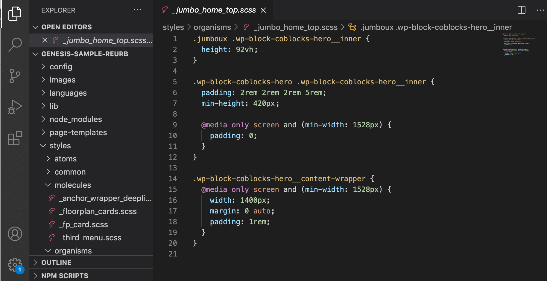
For each of the White Fern websites I do the WordPress development myself.
I have a base framework I’ve structured to start each project, and use the Genesis Framework as an easy way to get a lot of heavy lifting out of the way.
For styling I use SASS as an abstracted styling language to compile down to CSS. I like to structure each element atomically as much as possible to keep my styling files organized.
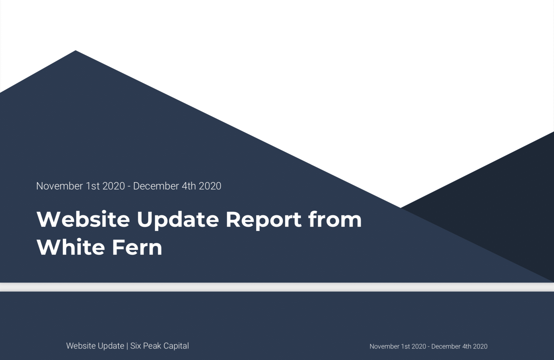
5. Ongoing Maintenance & Reporting
STAYING UP TO DATE & REPORTING
Generally after finishing a website project, I like to offer the clients a support and maintenance package to take care of their site, keeping it up to date and fixing anything if something goes wrong.
I also build in standard with any website I do analytics so that both I and client can track and see how people are using the website and if it’s behaving as it should to get people to the content they need.
Ready for More?
View Another Project –
Website Design
Client: Steyn Group
Website design for a global family office with investments spread between the US and Europe.
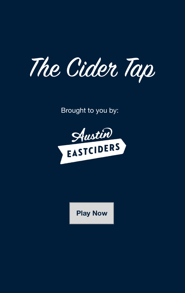
Interactive Promotional Game
Client: Austin Eastciders
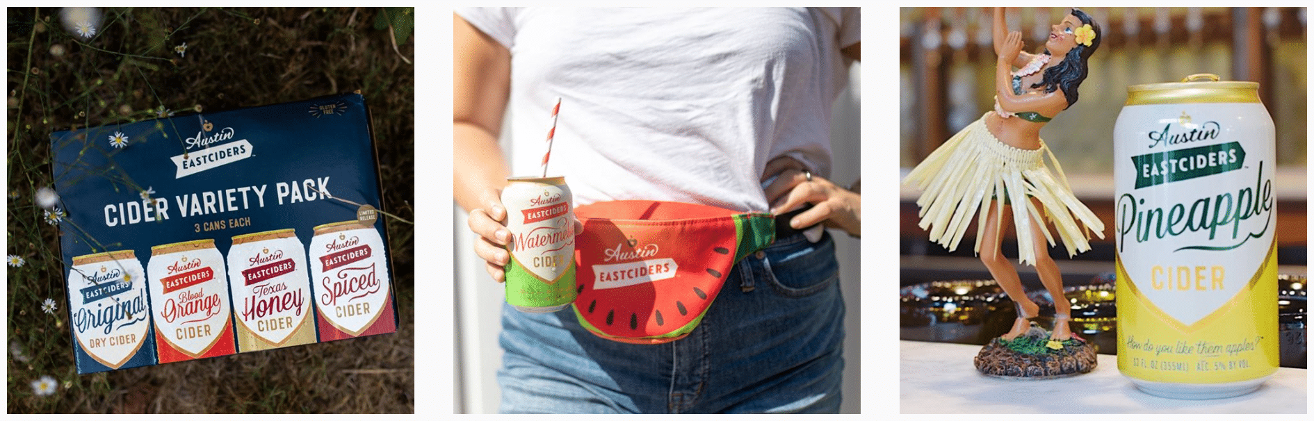
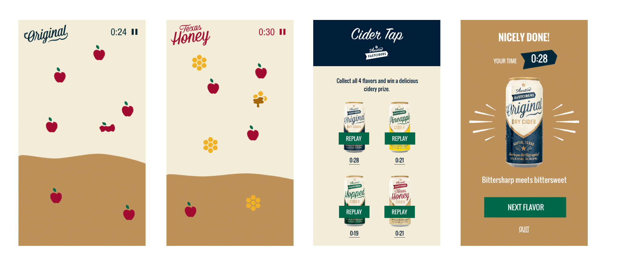
A mobile game distributed through social media and played in the browser. Designed to promote four different flavors fo hard cider.
Interactive Promotional Game
PROBLEM STATEMENT
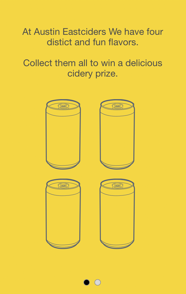
Austin Eastciders is a hard cider beverage company in Austin, TX.
They wanted to produce something simple but fun that would be interactive on a mobile device to centerpiece a social media campaign and promote four new flavors of cider they were introducing.
APPROACH
Assessing The Context of the Project
Assessing The Market Audience & Brand Feel
Story Planning
Game Concepting
Screen Level Design Ideation
Wireframes & Prototyping
Marketing / Social Covers
To Code
Previous Work & Project Context
A REPEAT CLIENT
The context to this project is that the agency I was working at, Barrel NY, had designed their online store and website.
I had worked on the wireframes of their website, Austineastciders.com, so when it came time to design and produce a marketing campaign for their new cider they came back and re-engaged the agency.
Assessing The Market Audience
& Brand Feel
MEETING AUDIENCE WHERE THEY ARE
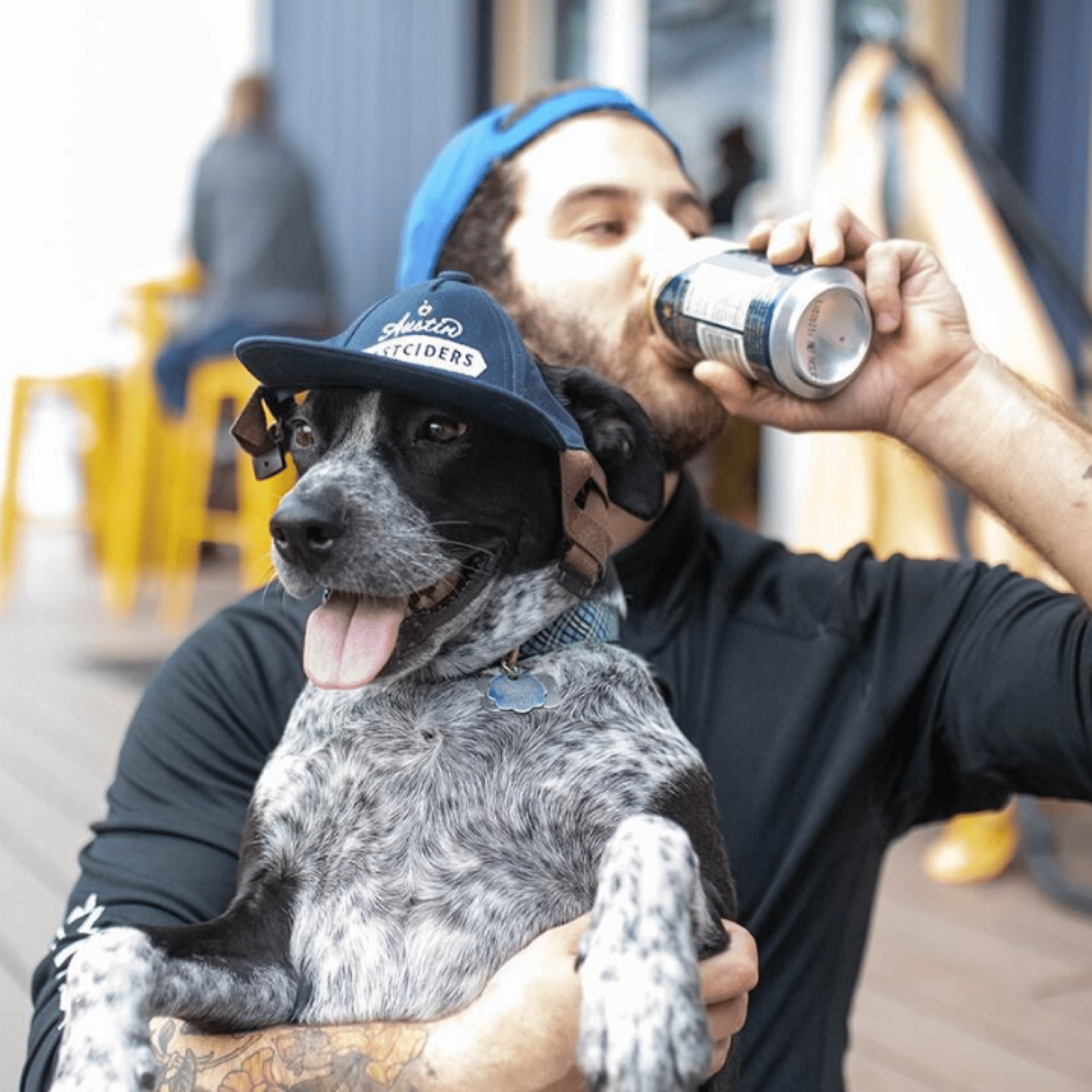
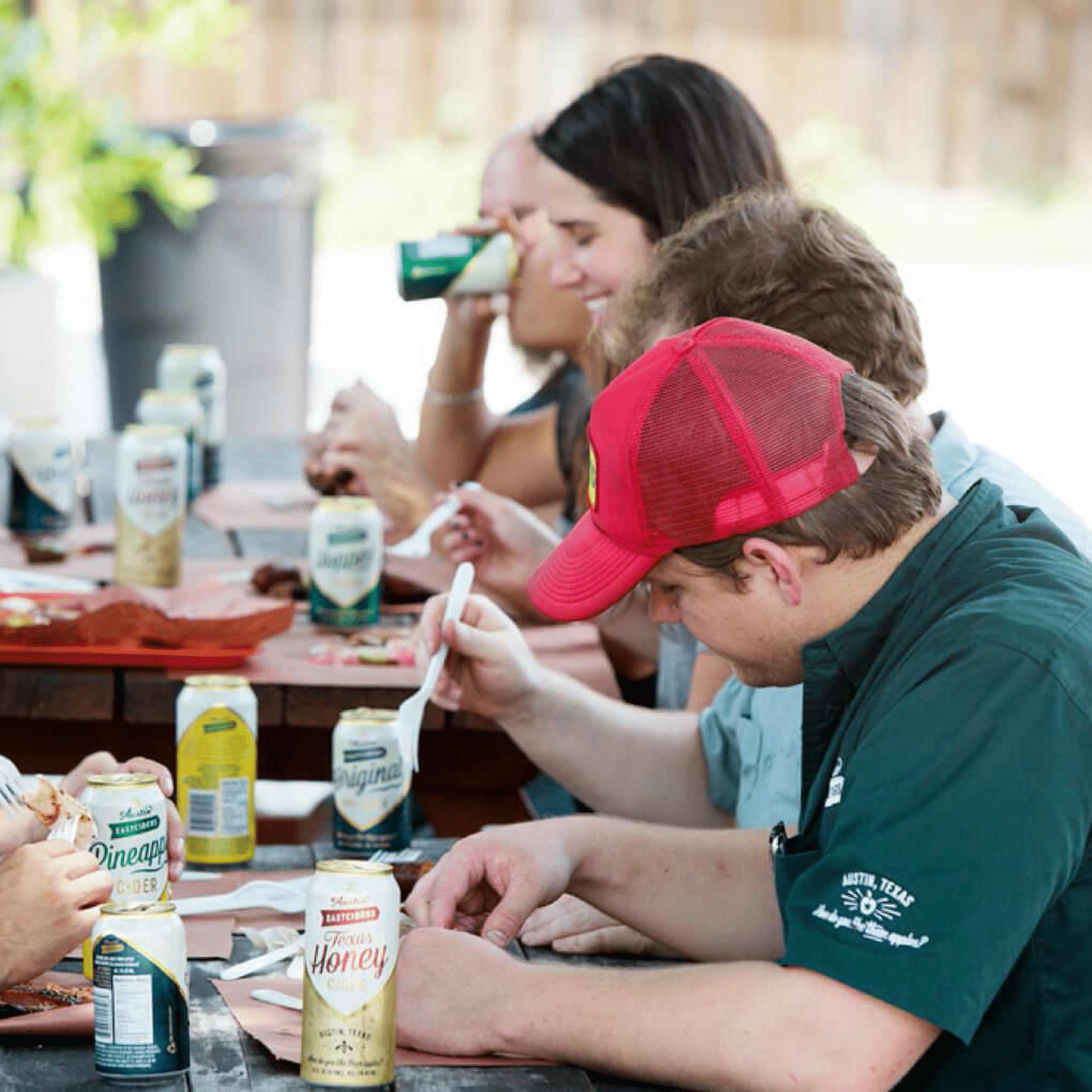
The marketing of Austin Eastciders is built around conveying a fun, social, summertime feeling.
We were very familiar with the brand after designing their website and online store, but when thinking about what kind of campaign we could run we began with re-examining the audience we would be targeting.
It was by kicking around ideas of what would appeal to the audience that we landed on the idea to produce a simple, interactive mobile game that could be easily promoted through a social media campaign.
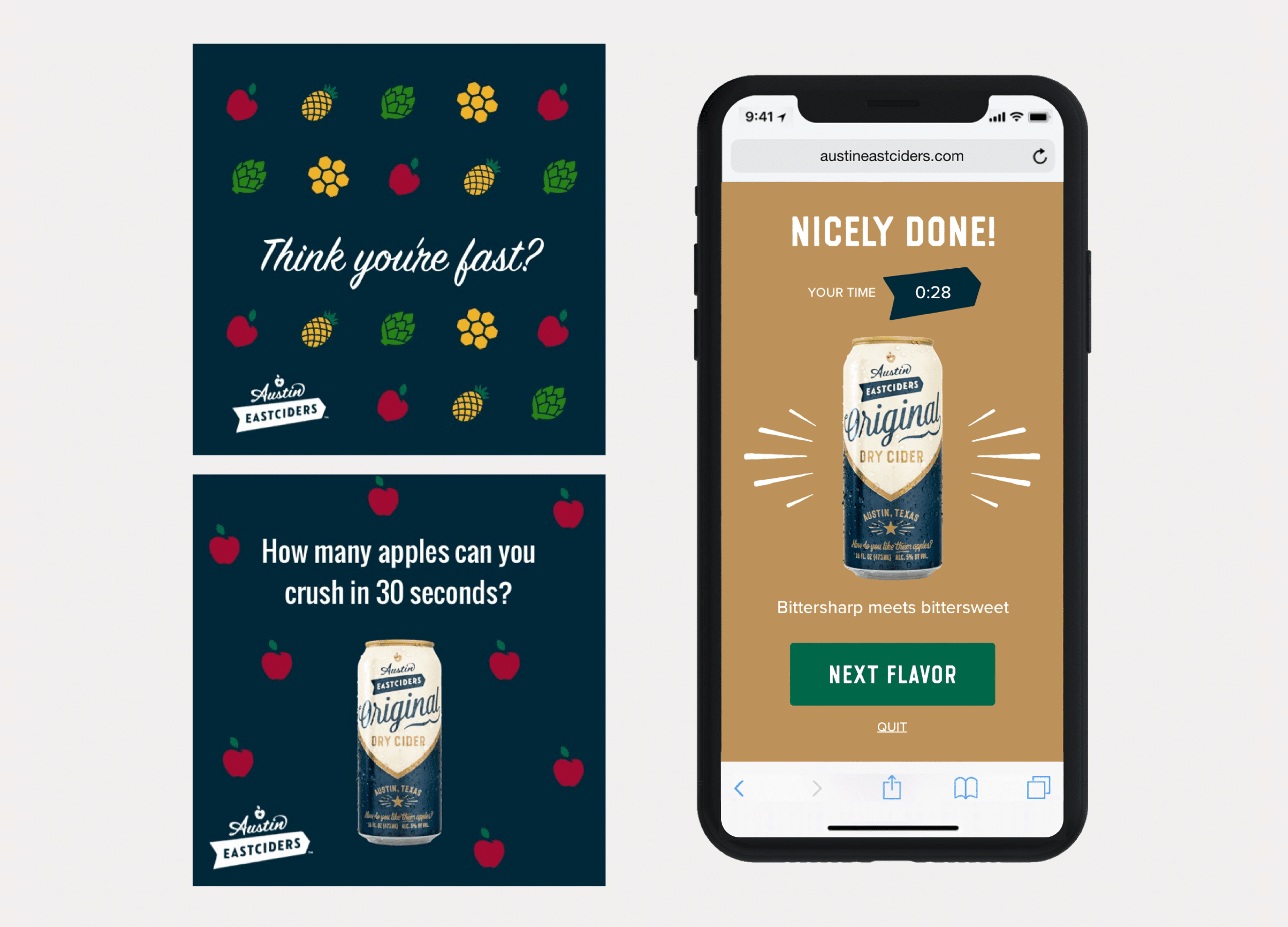
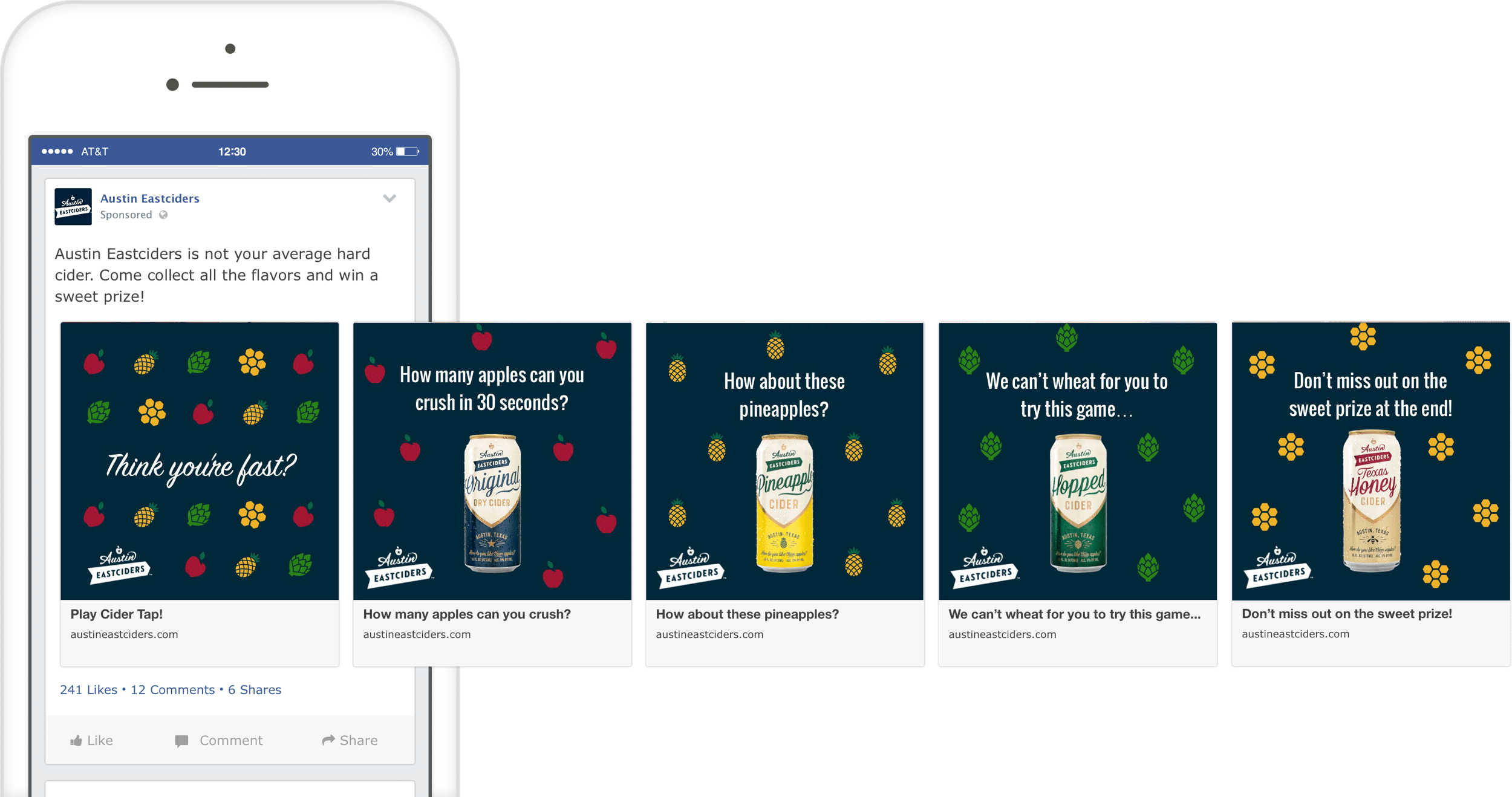
Game Concepting
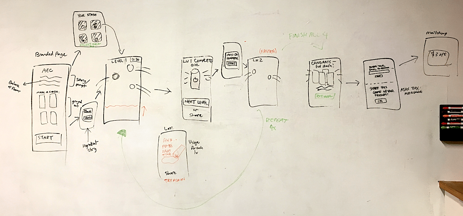
FLOW DIAGRAM & NARRATIVE MAPPING
With the general idea of the game in place that the user would need to interact with the ingredients to help ‘create’ the new ciders, the next stage was to figure out the mechanisms of how users would actually create the cider, and the challenges that would confront them.
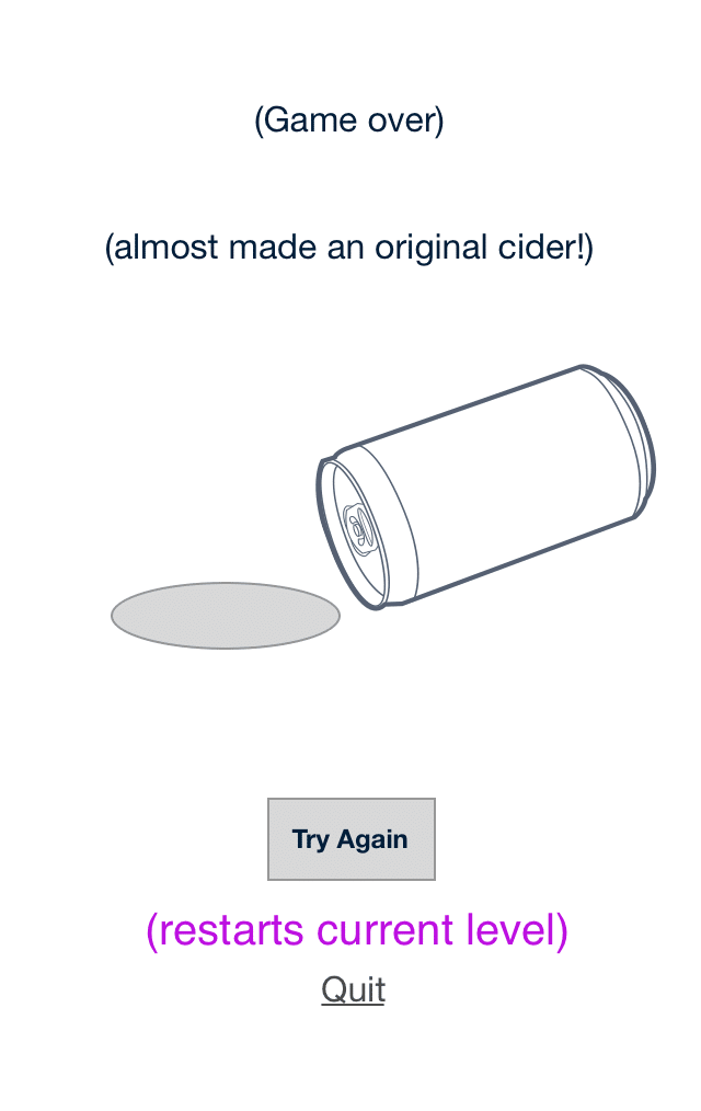
We sketched different ideas and landed on an idea where the ingredients would float around the screen and the user would need to ‘tap’ on them to crush them into cider.
This fit multiple levels of what we were trying to accomplish – a coherant storyline, the depth of commitment by a user would not be too high, and the gameplay difficulty could be adjusted based on the speed of the ingredients floating around the screen that the user would need to tap.
Screen Level Design Ideation
SCREEN CONCEPTS
Now with the concept more defined, we began designing loose screen level concepts to fill in how the game might look.
We wire framed the screens between the levels, and worked out how to feature all the four new flavors in a sequence of levels that would increase in difficulty.
Prototyping
PROTOTYPING THE HAPPY-PATH
From the wireframes, we worked with the visual designer and the existing Austin Eastciders brand elements to develop a simple prototype of how the game would look, function, and behave.
The prototype was built quickly and only designed around a single happy-path.
The purpose of prototyping this was was to make sure we captured key elements of the game narrative, got the behaviors of the interactive elements right, and also were able to discuss and get good feedback from all project stakeholders.
Handoff &
Marketing / Social Covers
TEASING INTEREST IN THE GAME
After designing the game flow and screens, we handed the designs to an external developer, and consulted when needed as they built it out.
While the game was being developed, we also worked on a series of social posts for Austin Eastciders to get the word out, reach their audience, and promote the final product.
To Code
WORKING
B____
B____
B____
Ready for More?
View Another Project –
ConnectedCare iOS App (Protected)
Client: Microsoft
Microsoft’s ConnectedCare App is a summary of an individual’s health records organized into one place.
Website Design
Client: Six Peak Capital
Website design for a real estate investment & development company focused on coliving.
Website Design

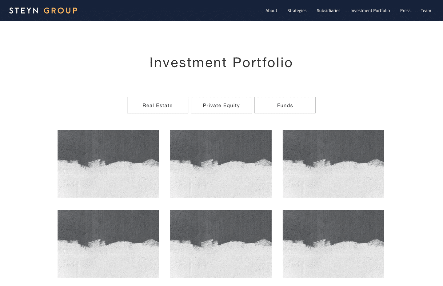
PROBLEM STATEMENT
The Steyn Group wanted a website that would introduce themselves and their investment philosophy, and highlight their current investments and ongoing projects.
They also wanted a look that made them seem approachable and ‘non-rigid’ in the way a lot of investment offices are.
APPROACH
Discovery
Structure & Wireframe Design
Visual Design
Development
Ongoing Maintenance & Reporting
2. Structure & Wireframe Design
SITEMAPS, WIREFRAMES & CONTENT
After getting aligned on the goals, audience, and messaging of the project, the next step was to map out a sitemap (how the website’s navigation and page structure will be), and think about the content that would fill out each of the pages and sections.
With the sitemap as a guide, I always begin designs loosely by blocking out wireframes. This helps clarify the content sections, and helps people see how the layout of the pages will look before I invest further time with visual elements like color or fonts.
3. Visual Design
Colors, Fonts & Images
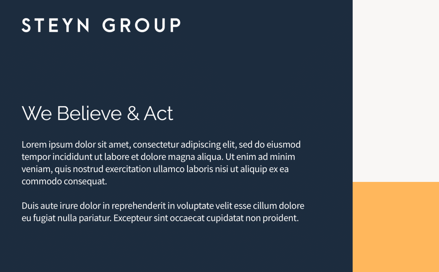
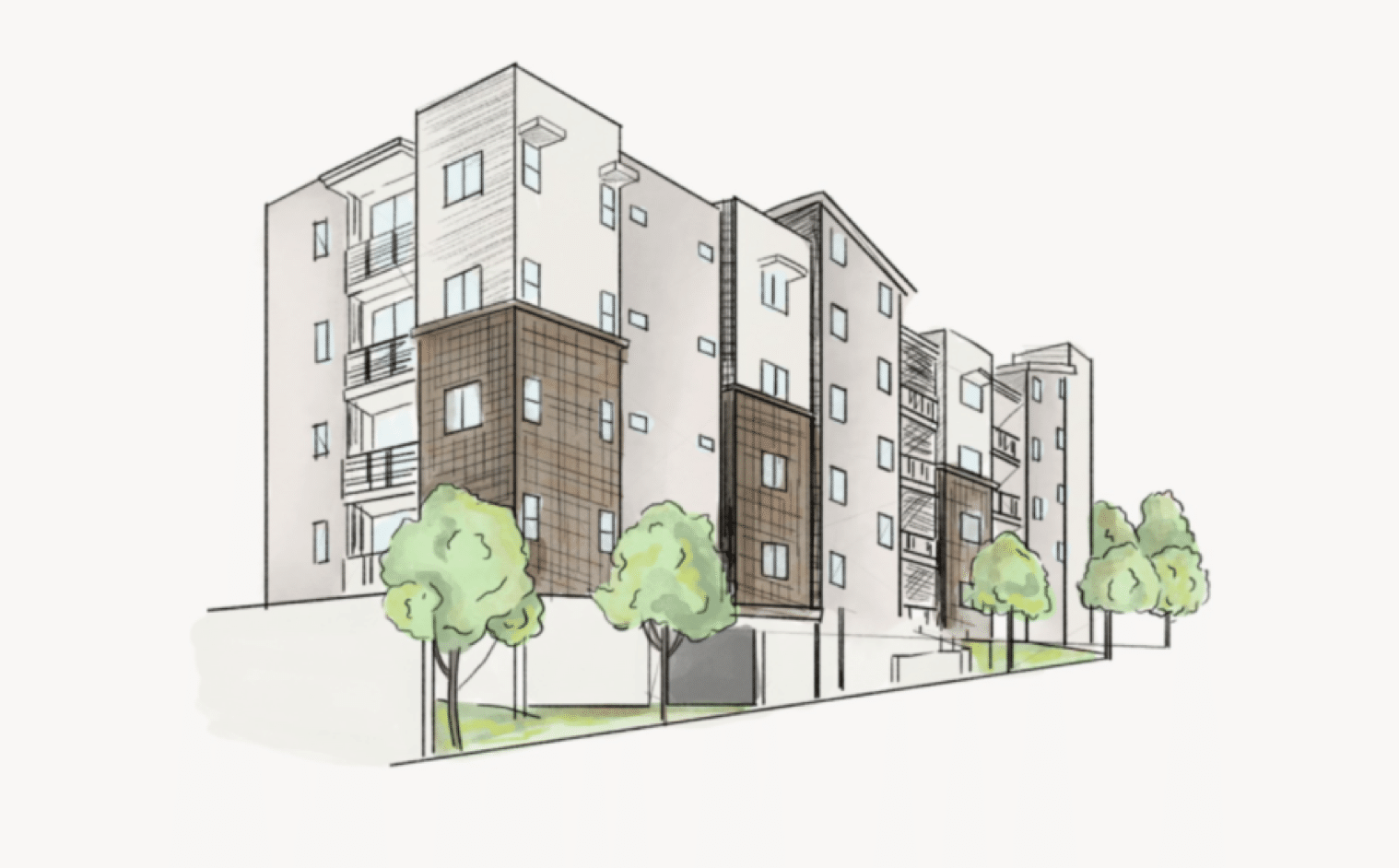
After the structure of the website is set I begin to overlay the visual look and feel elements like colors, fonts and images. This is the stage where the website starts to really come alive and the clients recognize the site as their own.
For this website we decided to go with an illustrated look to reflect the feel of a ‘field journal’. I found and worked with a really talented illustrator to develop each of the illustrations used on the website.
4. Development
WORDPRESS DEVELOPMENT
I typically do WordPress development myself for website projects.
I have a base framework I’ve structured to start each project, and use the Genesis Framework as an easy way to get a lot of heavy lifting out of the way.
For styling I use SASS as an abstracted styling language to compile down to CSS. I like to structure each element atomically as much as possible to keep my styling files organized.
5. Ongoing Maintenance & Reporting
STAYING UP TO DATE & REPORTING
Generally after finishing a website project, I like to offer clients a support and maintenance package to take care of their site, keeping it up to date and fixing anything if something goes wrong.
Monthly I’ve set up a system to send detailed reports to clients outlining the analytics, and technical updates I’ve made to the site that month.
Ready for More?
View Another Project –
Data Management Platform
Client: Koverse
A tool used by Data Scientists for collecting, storing, and learning from big data.
ConnectedCare iOS App (Protected)
Client: Microsoft
Microsoft’s ConnectedCare App is a summary of an individual’s health records organized into one place.