PROBLEM STATEMENT
Koverse is a Seattle based platform used to manage, normalize, and interpret large and complex data sets.
The original platform was built in 2012 with a focus on the extract, transform, load (ETL) process of combining and normalizing data.
Over the years as new features were added on to the platform, they had been added on in a siloed or piecemeal fashion. This made the tool work for one-off tasks but was not very effective for an end-to-end data processing workflow. Koverse was looking to remedy this.
APPROACH

Assessing the Tool to Redesign

User Research, Personas & Journeys

Competitive Analysis

Information Architecture

UI Concepts & Ideation

Wire-framing & Prototyping

Usability Testing

Development
Assessing the Tool To Redesign
LEARNING ABOUT THE DATA PROCESS
Because the application addressed such a specific function for data scientists, we first had to learn how the tool worked, what it could do, and how it was useful in data scientists’ workflow.
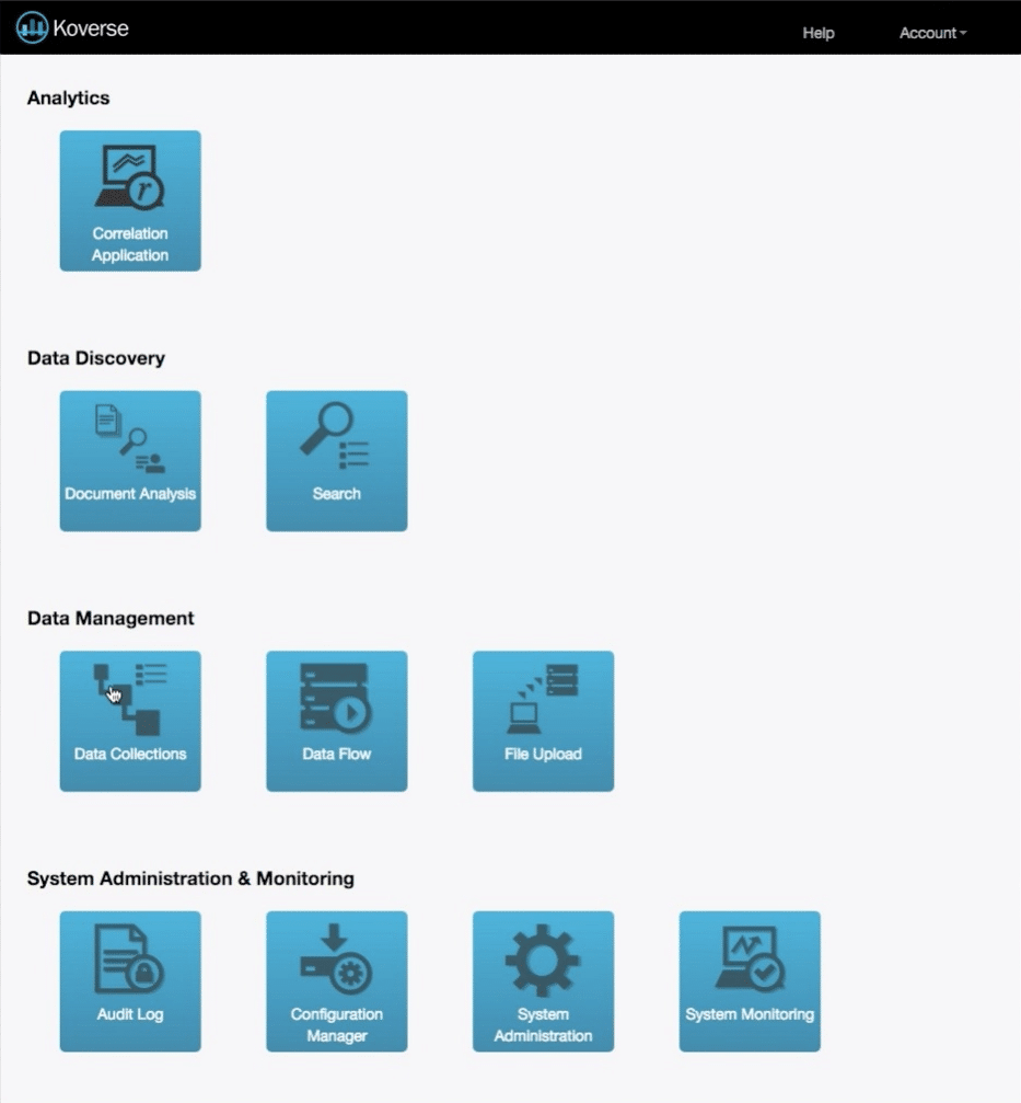
The Original Design
The dashboard when we began was broken out into individual tasks the application could do.
Each of these tasks is valuable to a Data Scientist’s workflow, but in the original design an end-to-end data processing workflow was difficult.
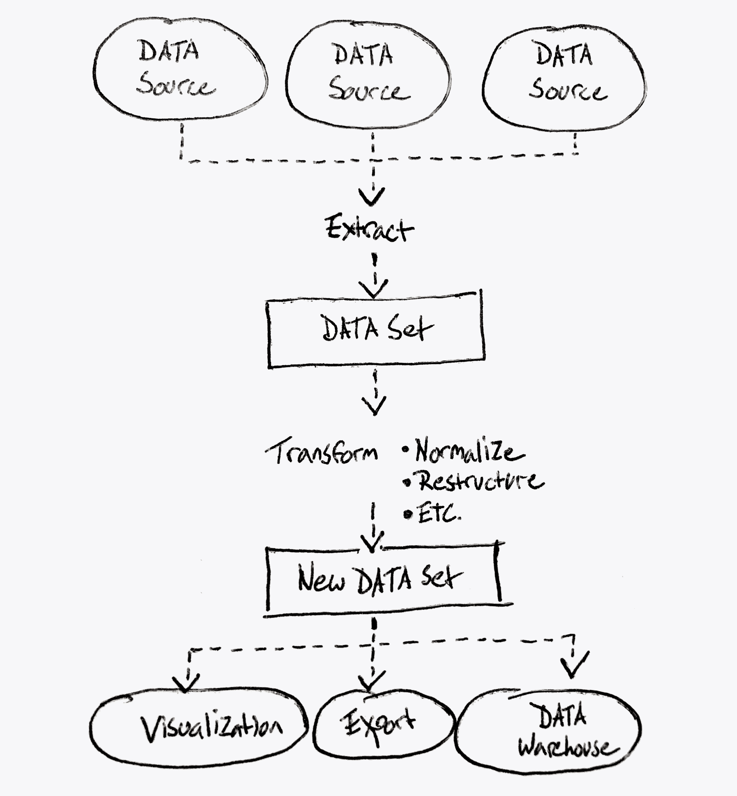
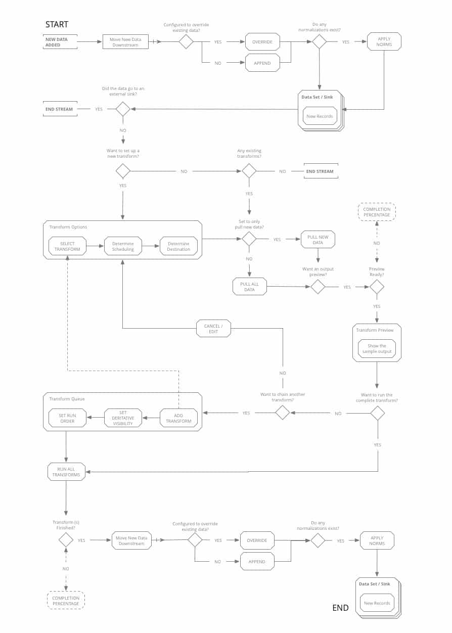
What Koverse Actually Does
This diagram represents more accurately what the platform could achieve.
Notice it’s a continuous data processing workflow from extracting data from the source down to transforming the data, and working with the data in a useful way.
User Research, Personas & Journeys
USER INTERVIEWS
Because none of us on the design team were data scientists ourselves, we needed to talk with data scientists to understand their mental models around processing data, and what workflows were more or less common to people in the processing stage.
We spoke with 18 people with job titles ranging from Data Analyst to Business Managers, and then sorted what they told us into common groupings using affinity diagram sorting.
View Our
Research Materials
The Interview Screener, the Script, and the Findings Spreadsheet
Research Materials
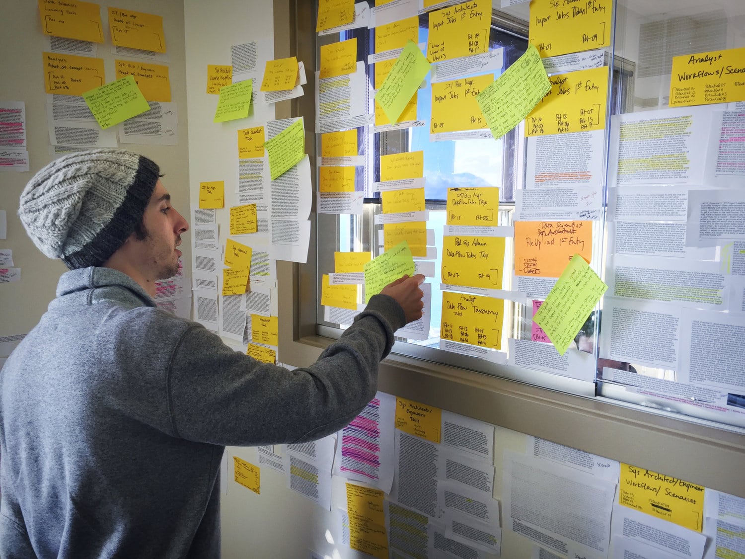
Affinity Diagram Sorting
PERSONAS & JOURNEYS
The affinity diagram sorting allowed us to group common responses into themes, and to see how the people with different job titles and roles all thought collectively about the data processing part of their jobs.
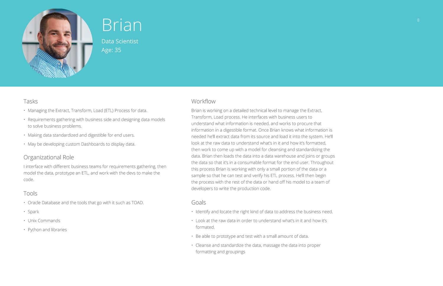
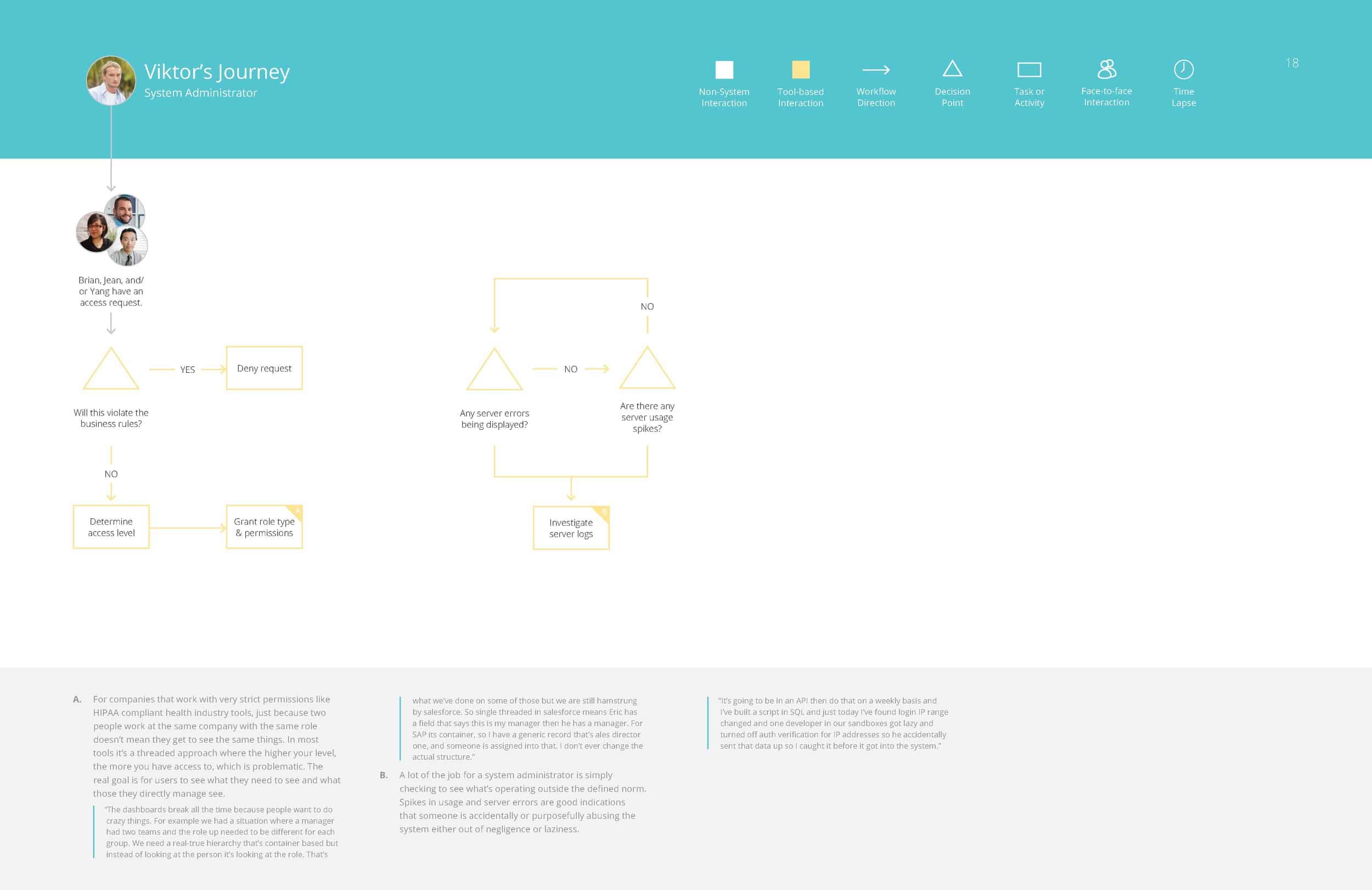
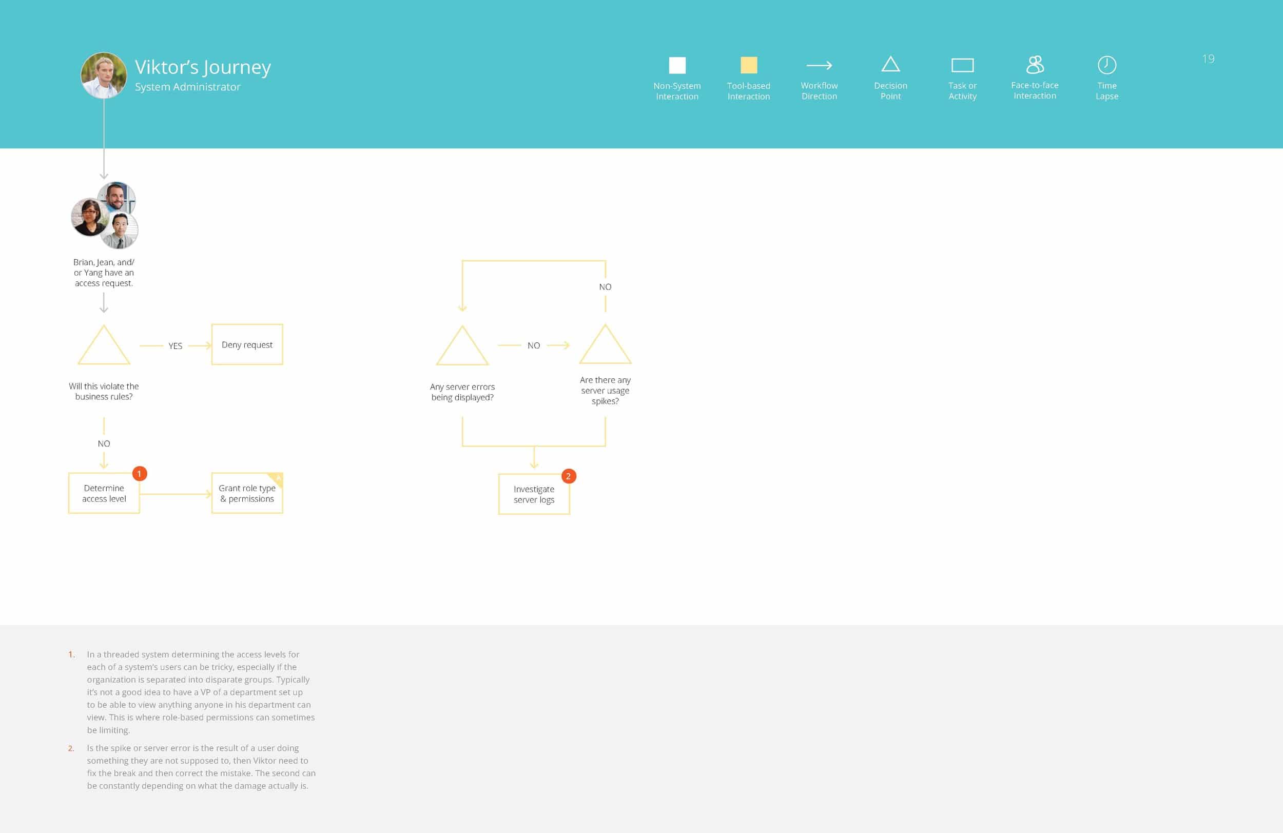
From these groupings of responses, and different workflows people had walked us through, we were able to assemble in depth personas for the different roles of people who would likely be interacting with this tool.
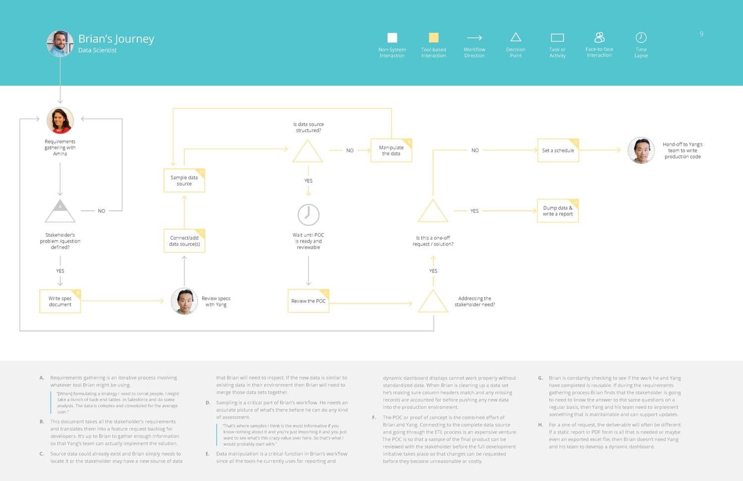
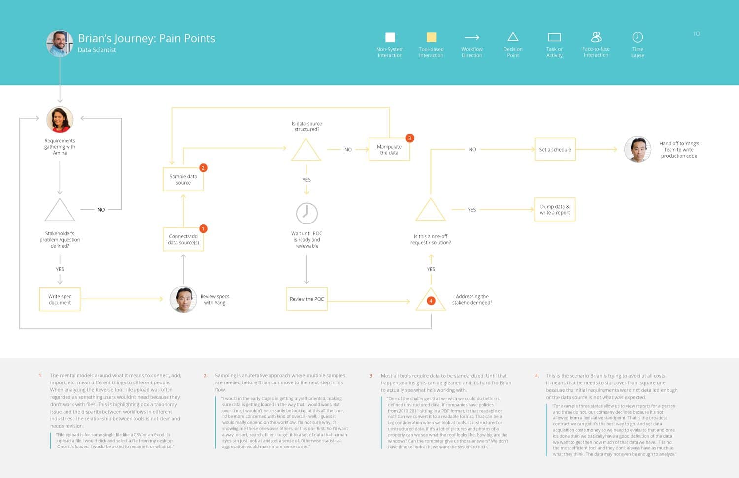
Brian – Data Scientist
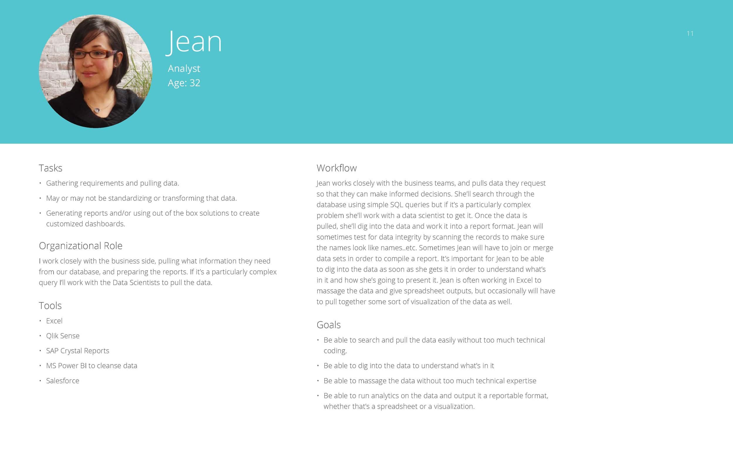
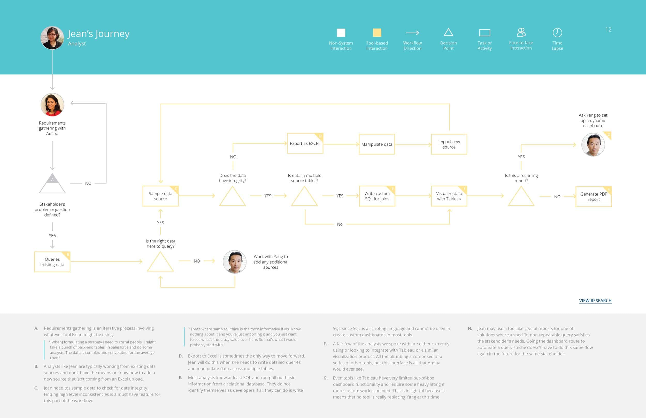
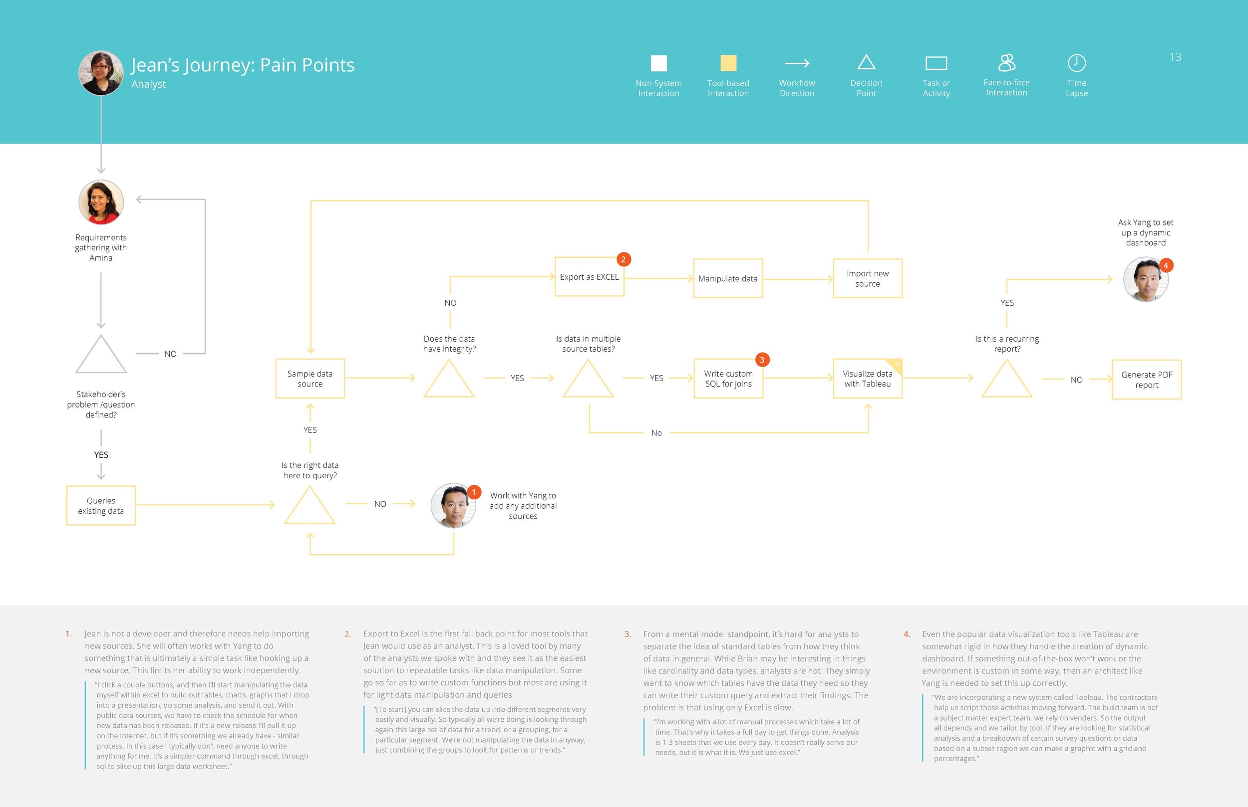
Jean – Analyst
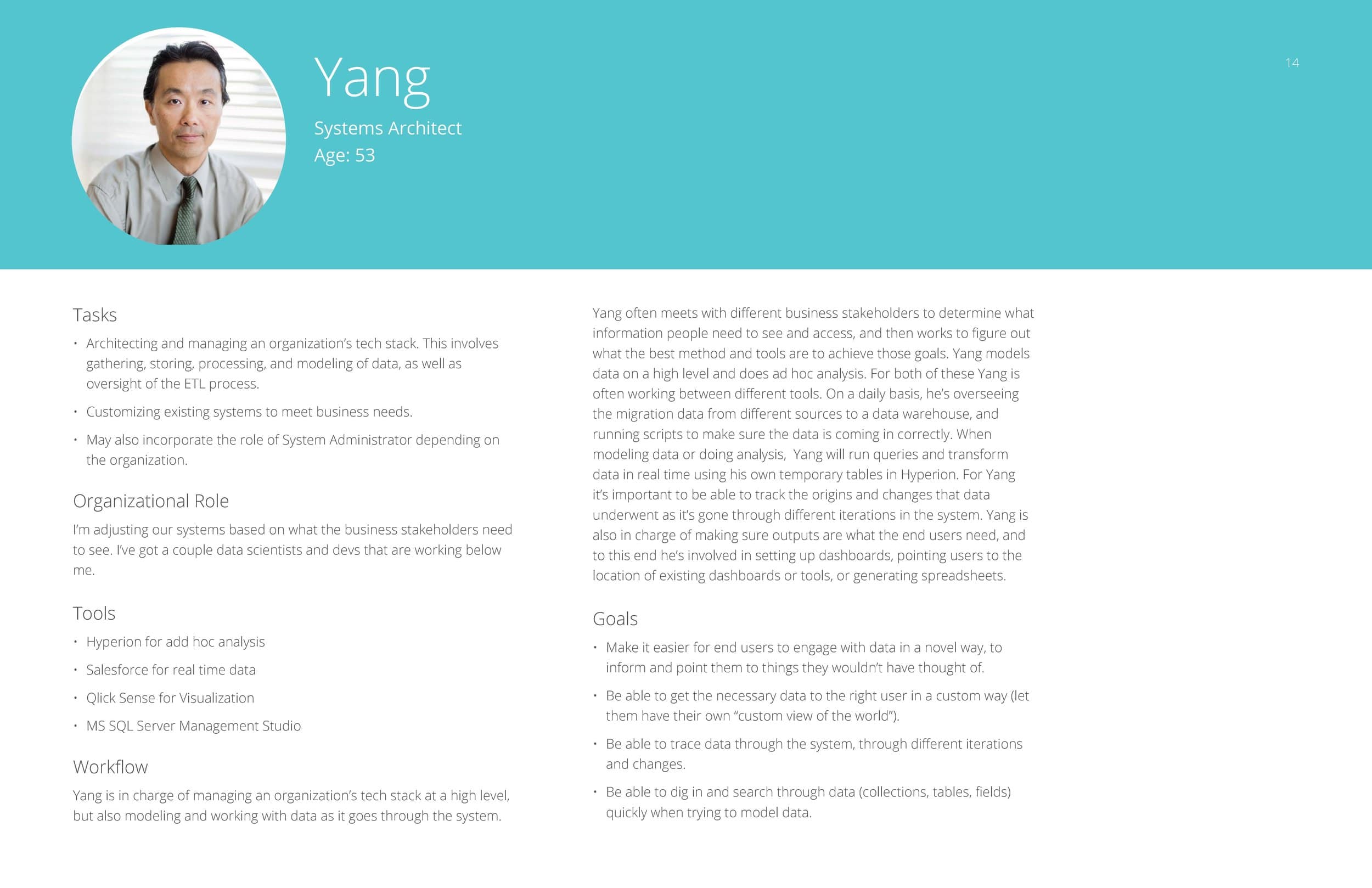
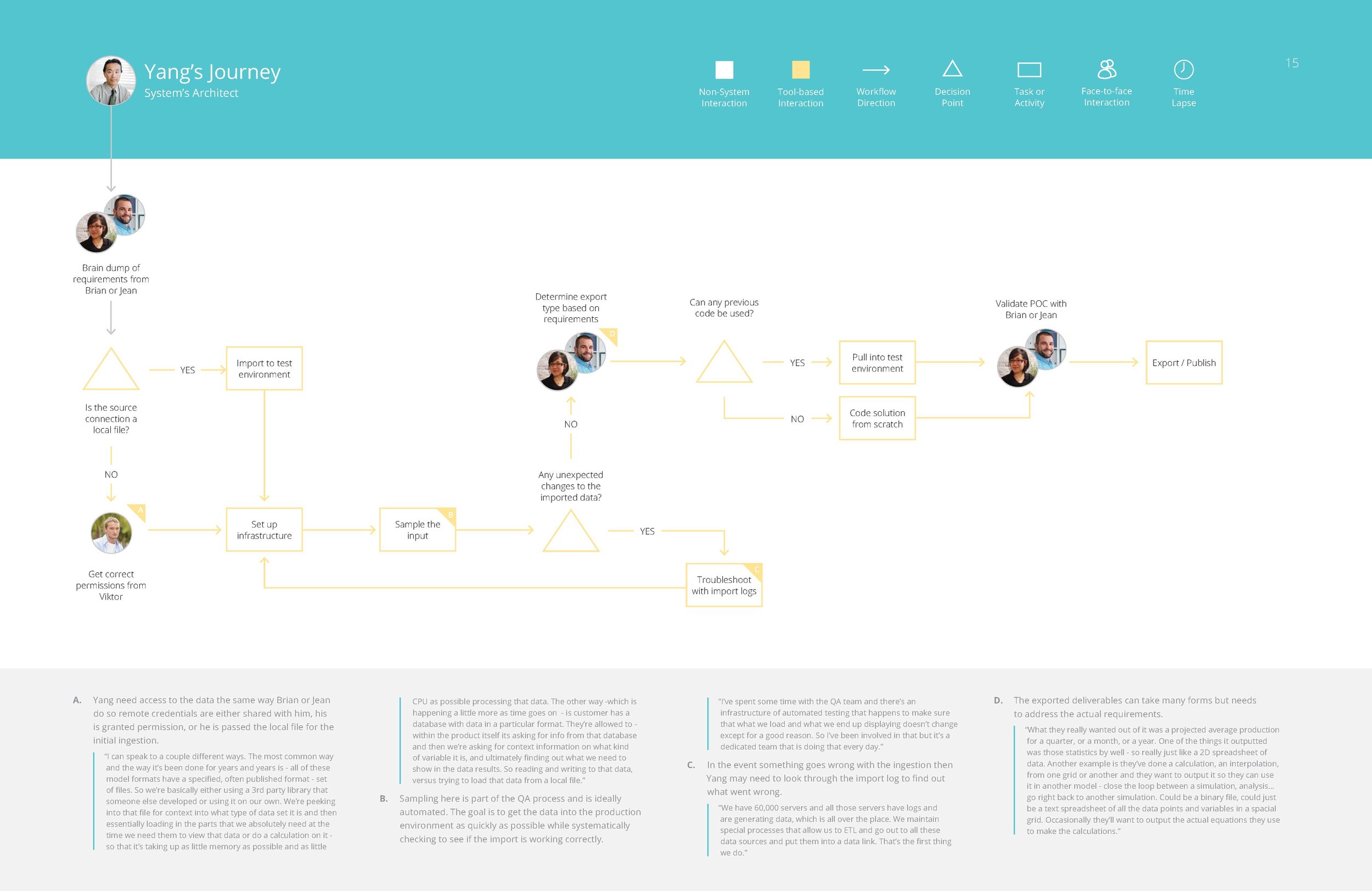
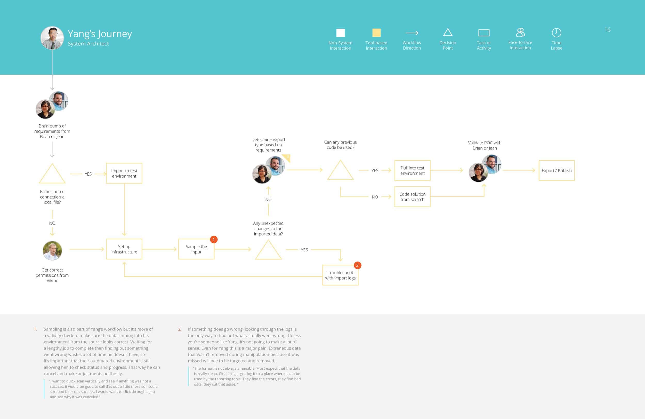
Yang – Systems Architect
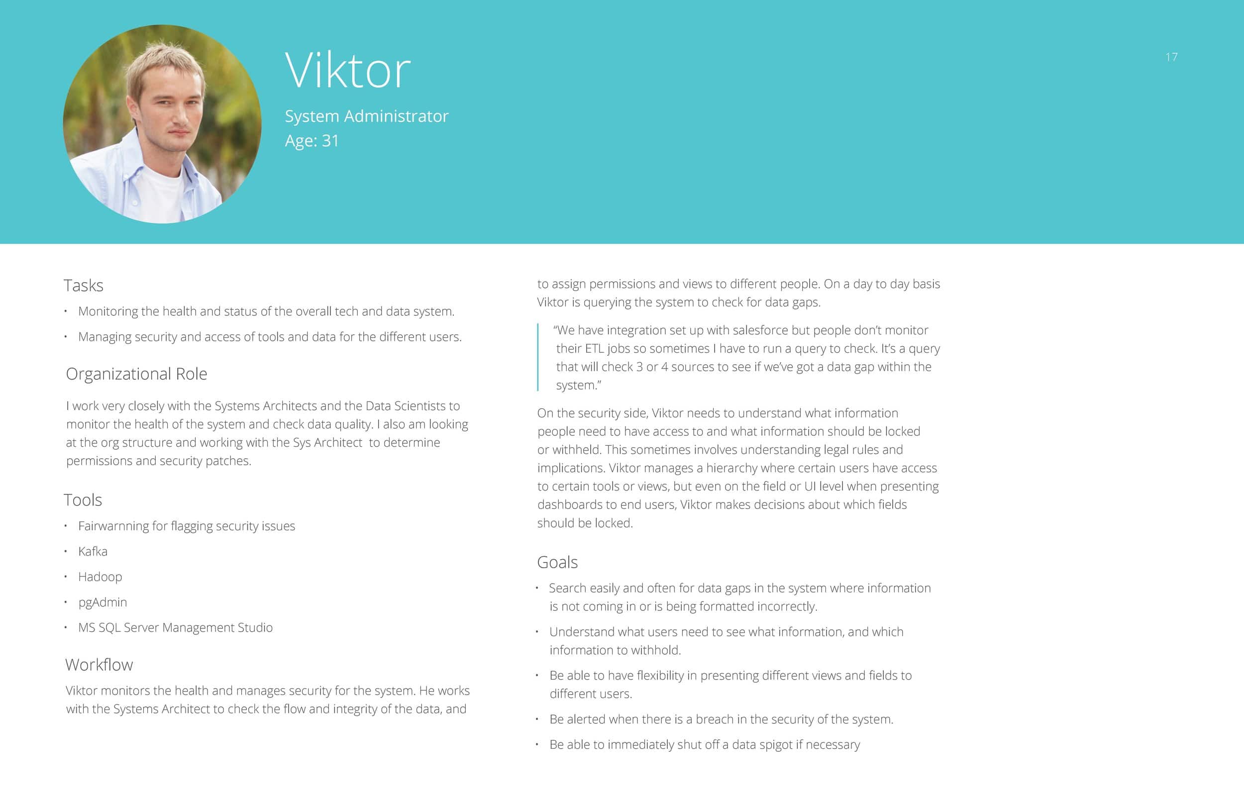
Victor – Systems Administrator
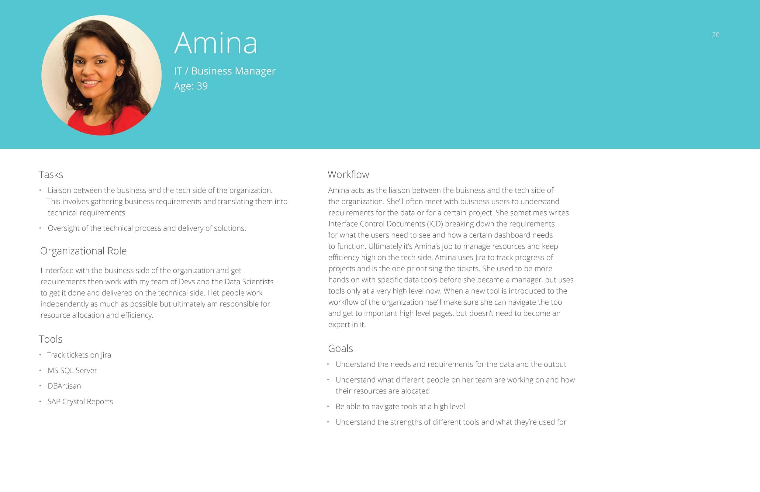
Amina – IT / Business Manager
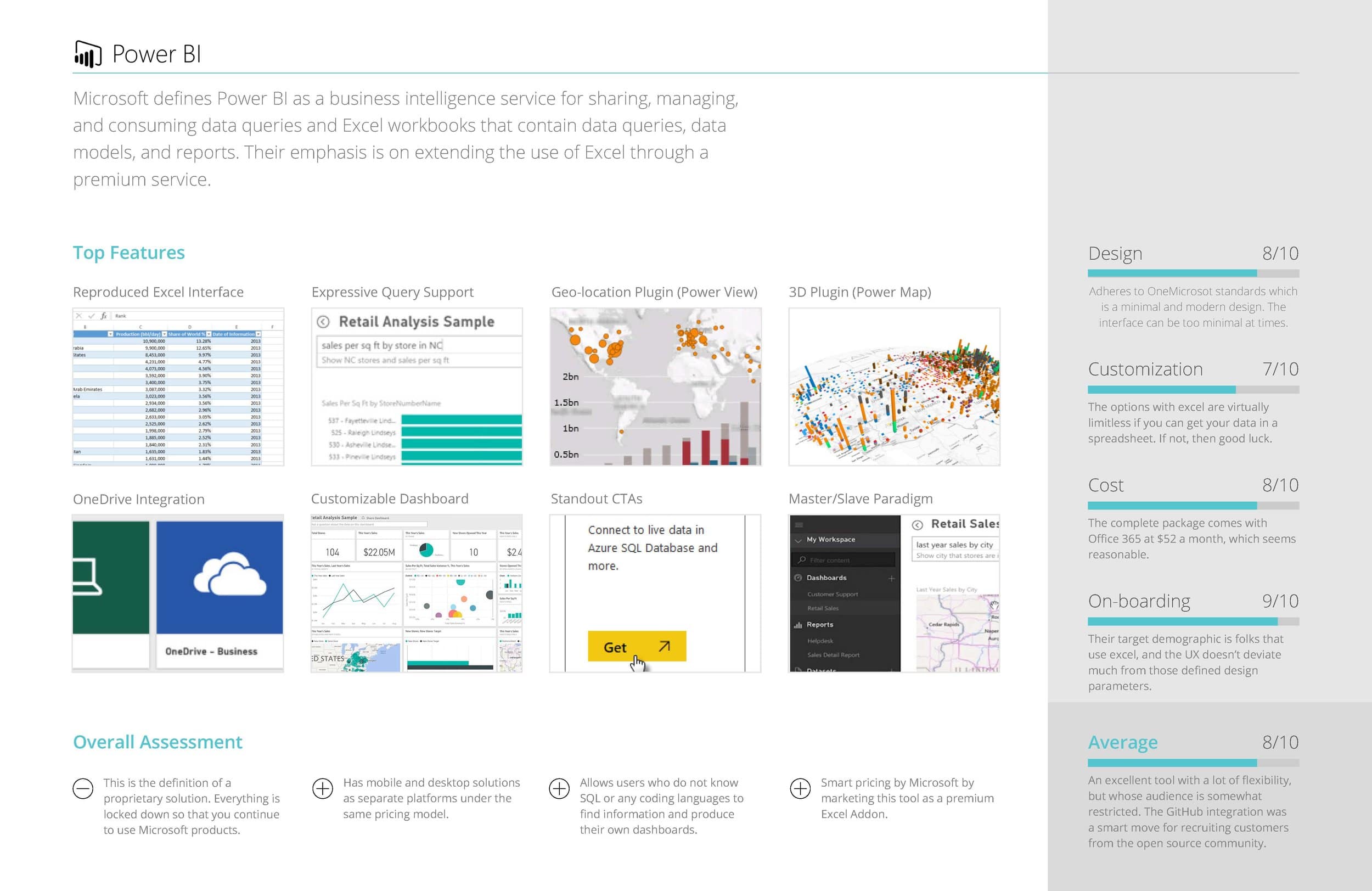
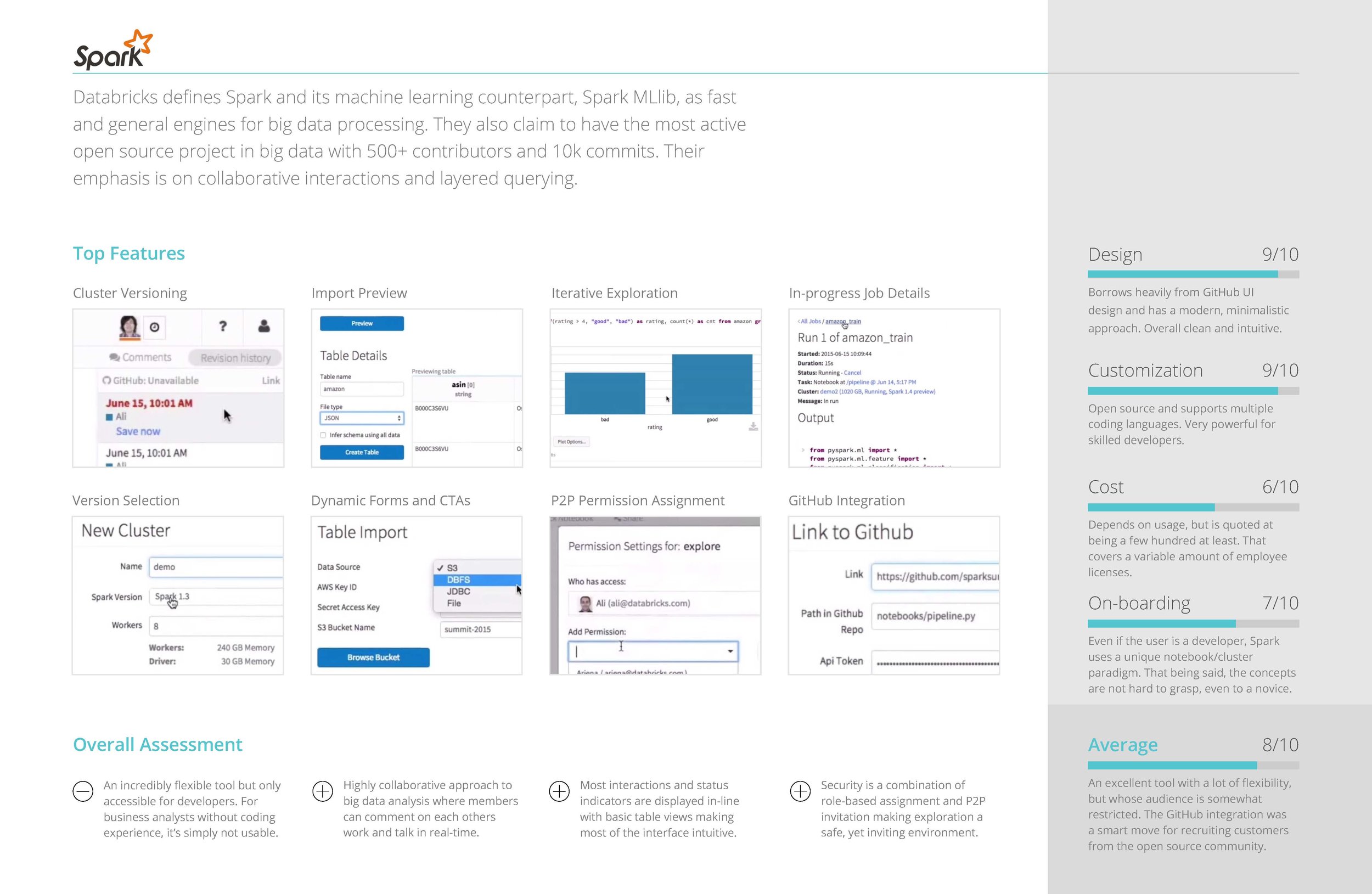
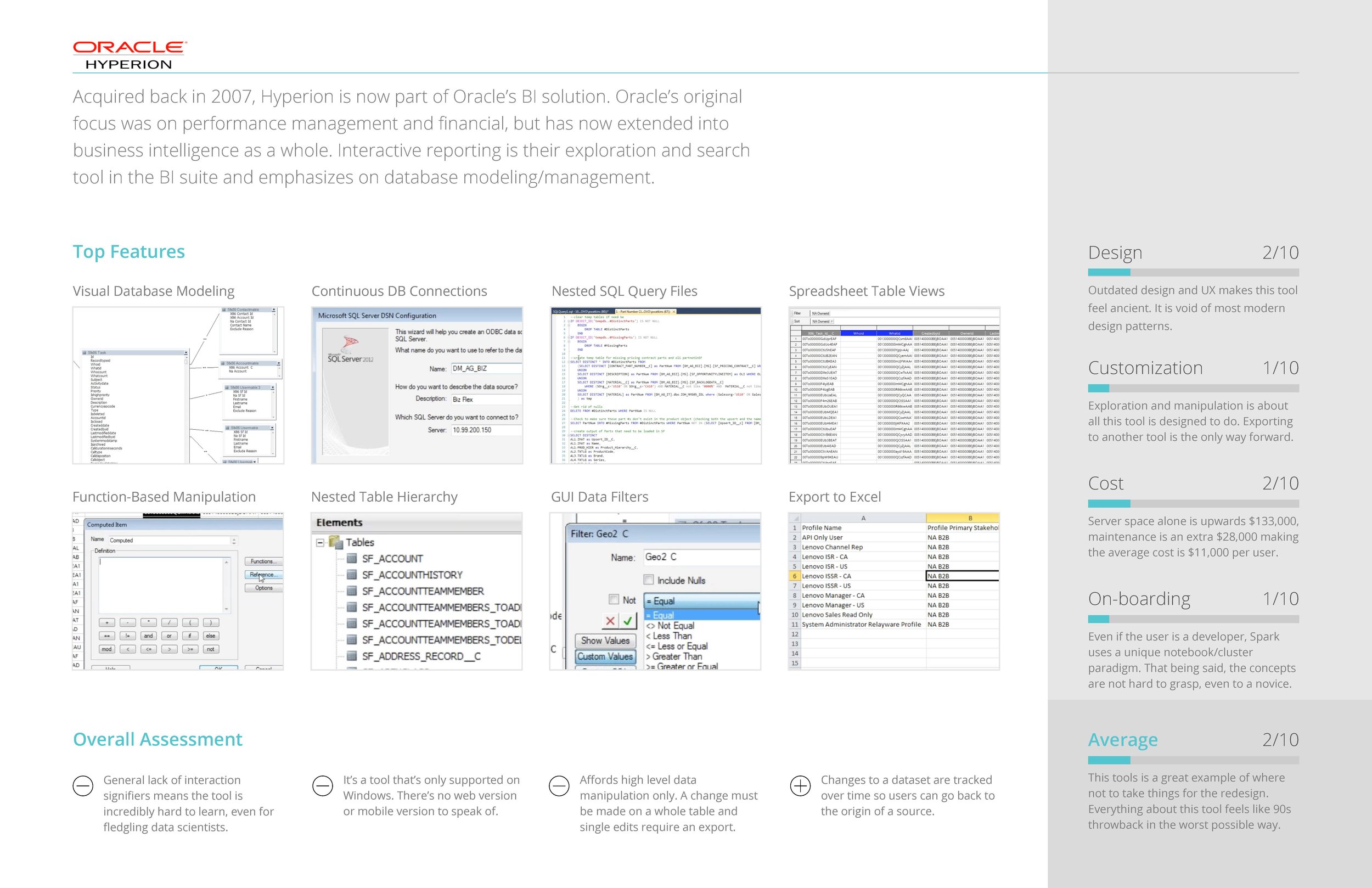
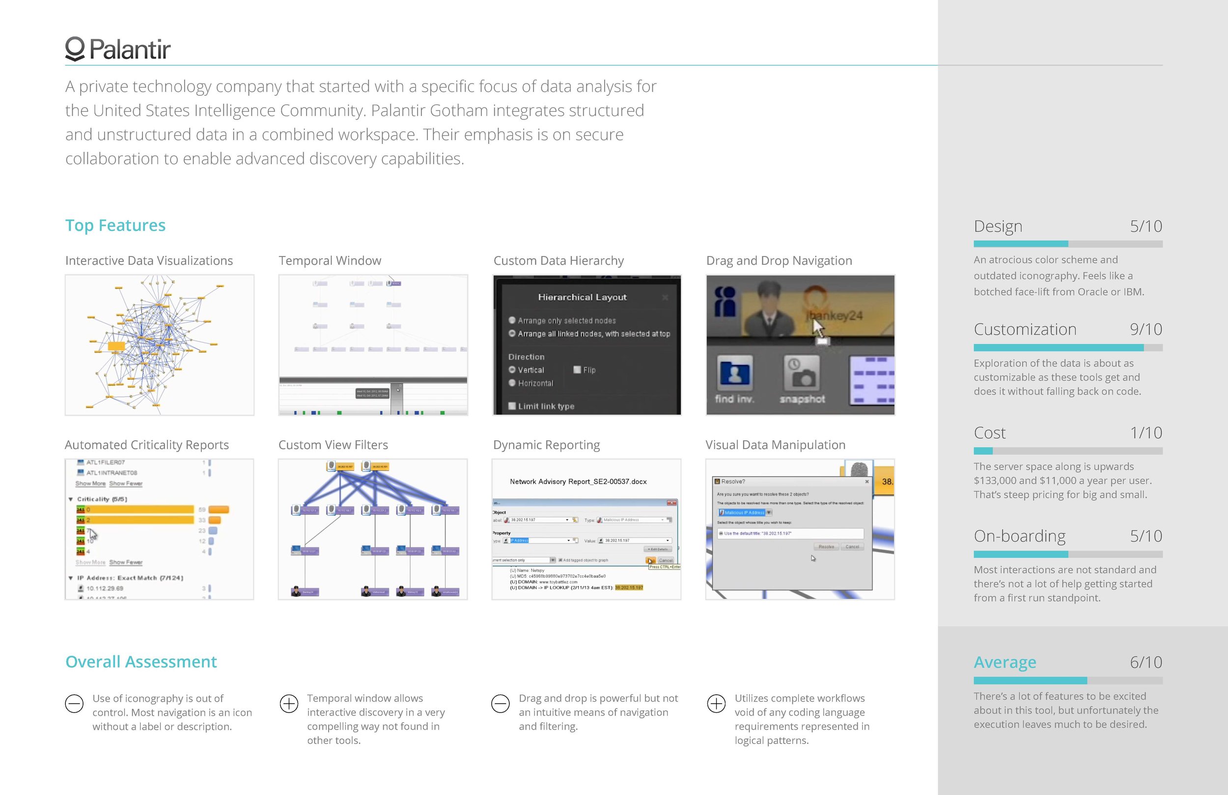
Competitive Analysis
COMPETITIVE ANALYSIS OF SIMILAR TOOLS
In addition to the information we gained from interviewing, we also found it enormously helpful to conduct a competitive analysis of similar big data tools that performed functions similar or complimentary to the tool we were redesigning.
Some of the questions we sought to answer were:
- What are the most common features across all apps?
- What UI paradigms are used the most?
- How do they onboard users?
- How customizable is the feature set?
Information Architecture / Flow Diagramming
FLOW DIAGRAMS
Using our persona journeys and competitive analysis as guides, we set to work mapping out the workflows that would become the main paths the new tool would be designed around.
With a tool this complex, and solving for such a complex set of workflows, it was imperative to diagram out the functionality and the main goals the users would be trying to achieve before jumping into screen level design.
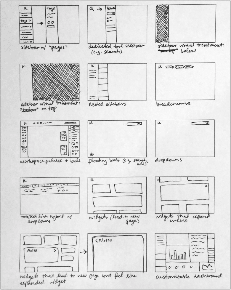
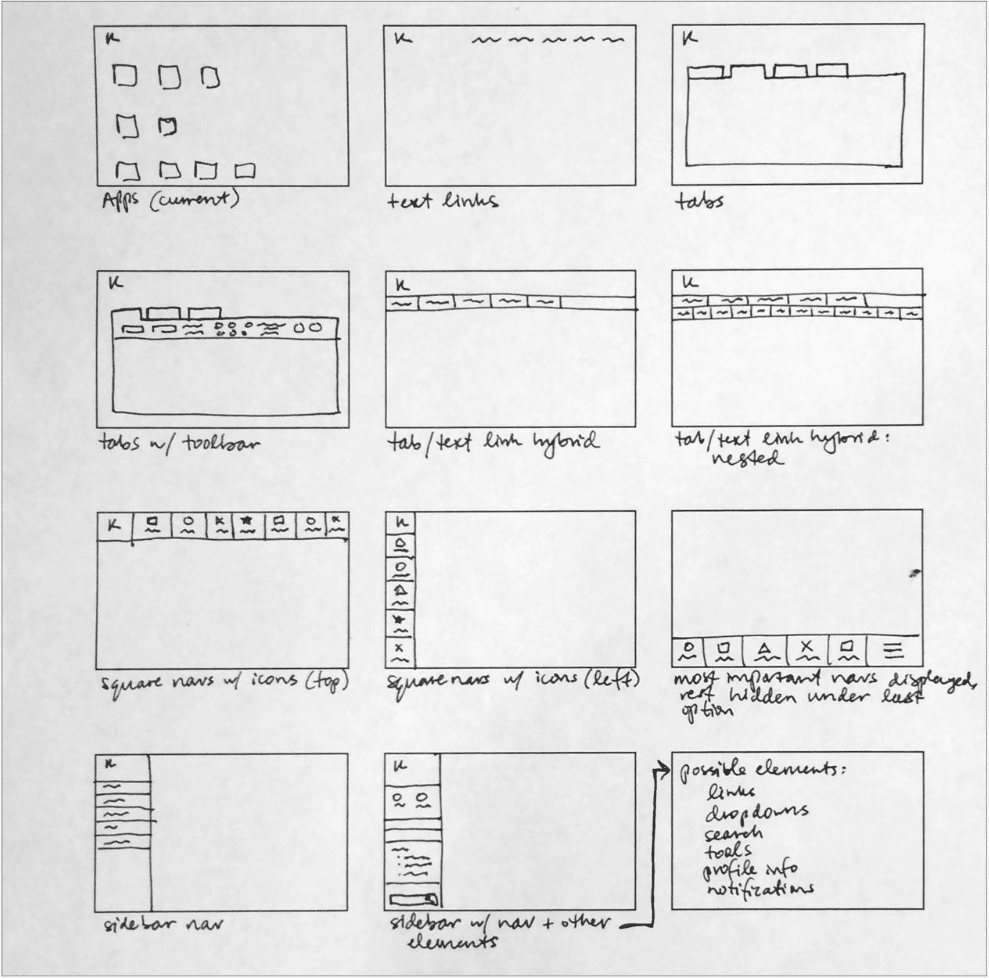
UI Concepts & Ideation
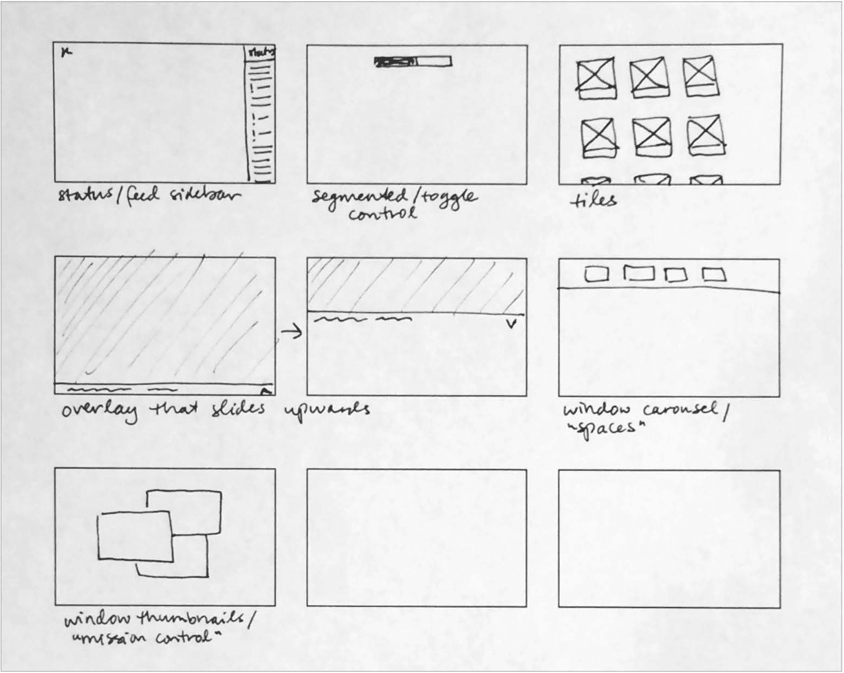
DASHBOARD ARRANGEMENT / FRAMEWORK
Armed with our diagrams of how the tool’s main workflows should function, we worked out screen level requirements for each stage of the data processing, and began ideating UI paradigms that would work to anchor the tool’s dashboard around an ever-present ‘menu’, while also facilitating a streamlined step-by-step data processing flow.
Wireframing & Prototyping
CONCEPTS & WIREFRAMING
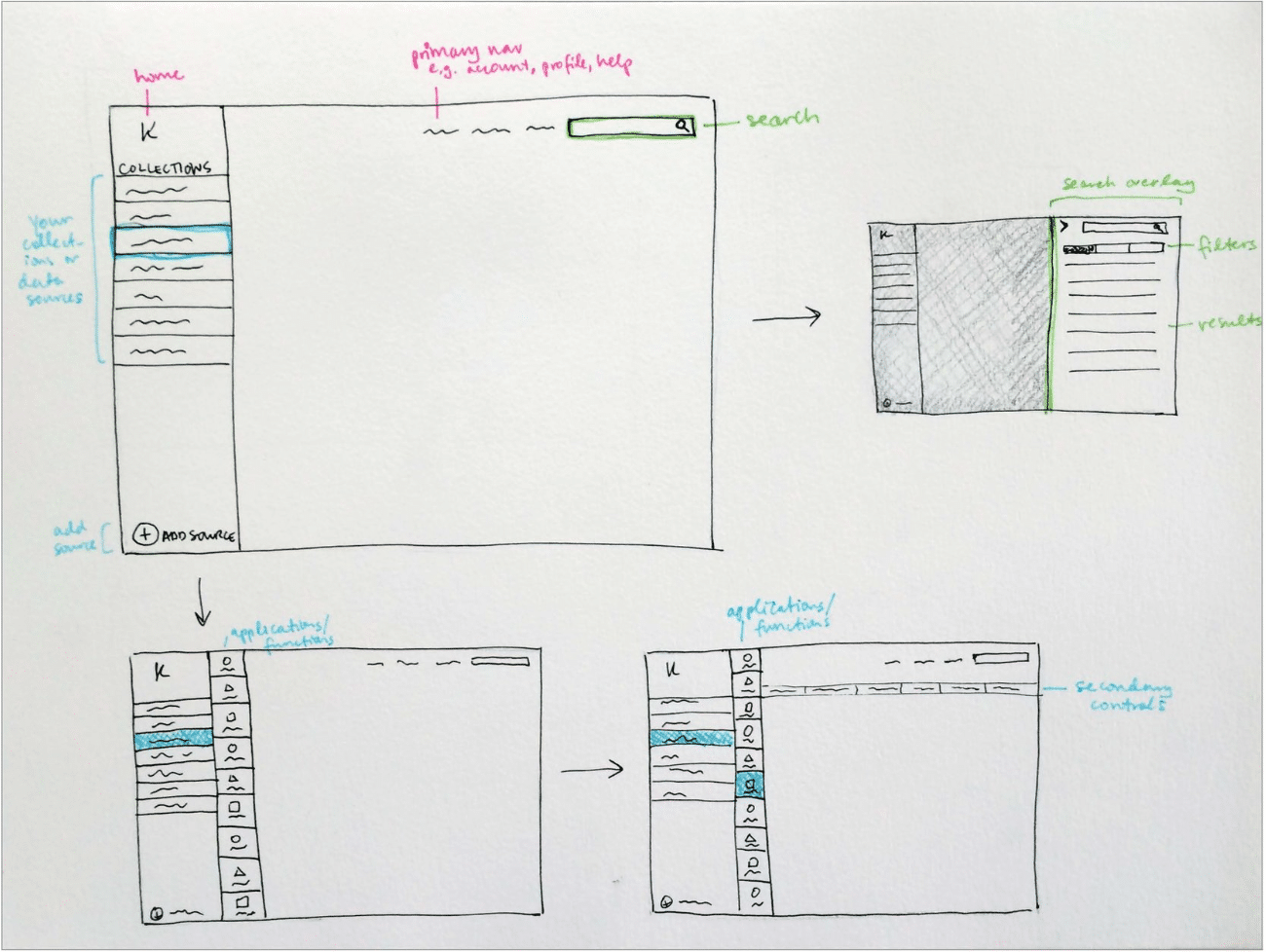
We settled on a left rail menu paradigm that would keep context continuity throughout the tool, and a main workspace where the user could go step by step through the data processing workflow.
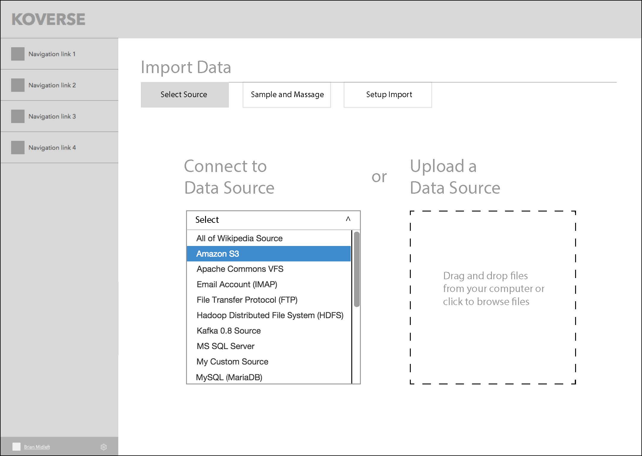
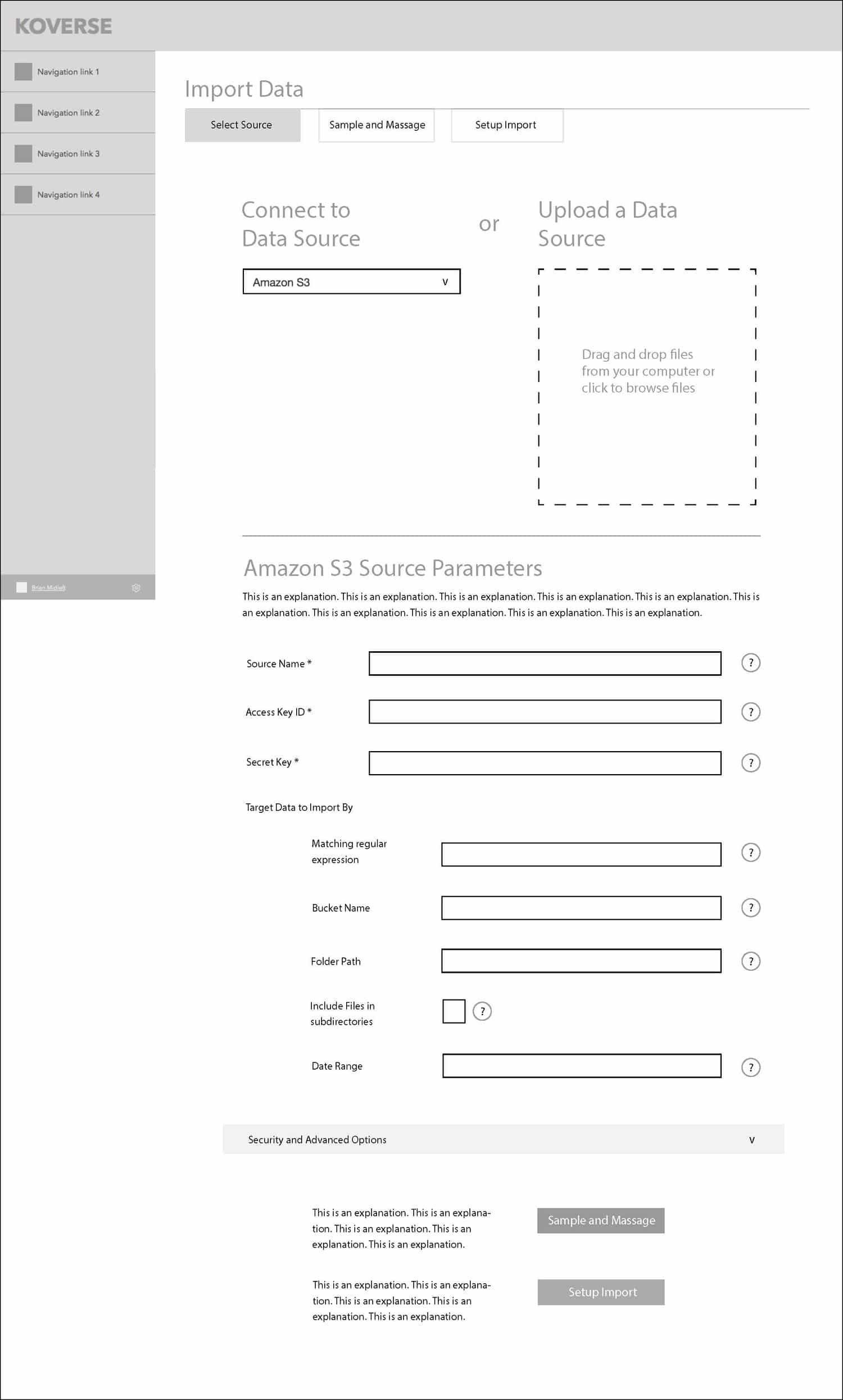
This series of screens shows the concept of a three-step wizard flow for importing data into the platform.
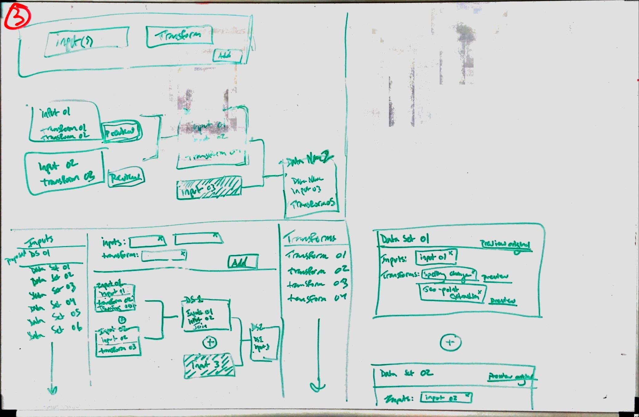
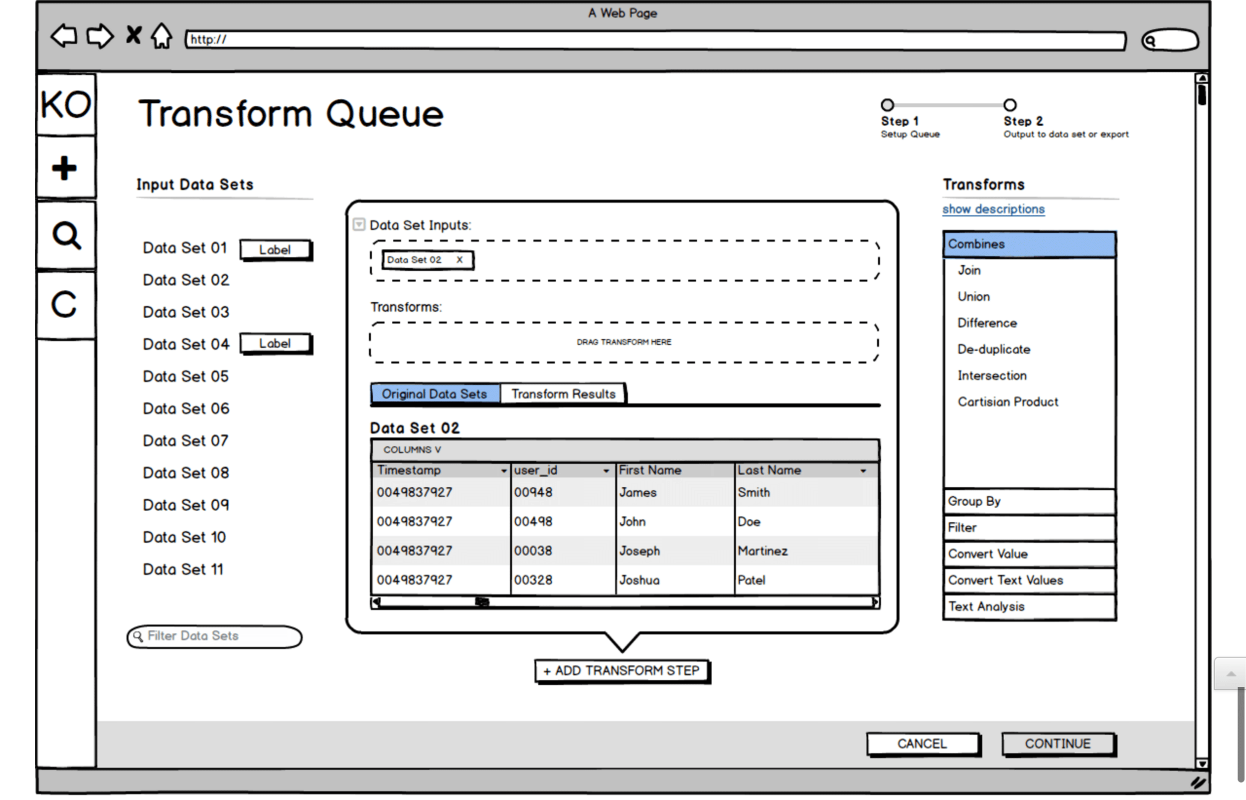
GOING DEEPER WITH COMPLEX TRANSFORMS
One of the big challenges with the Koverse interface is that the tool allows for transforms of the data (rules for how to systematically manipulate the data) to be chained together. These transforms could be selected from a list of common transforms, or written custom in Python.
With many data transforms in a row, the data flow becomes very complex to think about and control.
We did multiple rounds of sketching for the transform workflow, trying to make the experience intuitive and cut down on the vast cost of trial and error with large data sets. Here is one sketch and a Balsamiq wireframe exploring the interface we ultimately landed on for the design.
Usability Testing
USABILITY TESTING
When our design prototypes were ready, we set up usability tests with people in Data Scientist and Analyst roles who fit the target of who would be using the tool.
Because the Koverse stakeholders were interested in watching people use the tool as well, we took a page from Steve Krug’s Rocket Surgery Made Easy and created a ‘club house’ where observers could watch the tests remotely and make notes.
After the usability tests, issues where the participants didn’t understand something or were unsure of how to complete a task were marked down. From these issues, the design team then met and prioritized which issues to address first and how much time should go into redesigning certain elements or minor flows.
Testing Details
- Established a bi-weekly cadence with five participants per round.
- Scheduled participants using the Respondent.io online recruiting service.
- Used a scenario-based method.
- Created a “club house” for client observers.
View Our
Testing Resources
The Research Proposal, Study Kit, Findings, and Observation Worksheet
Usability Testing Resources
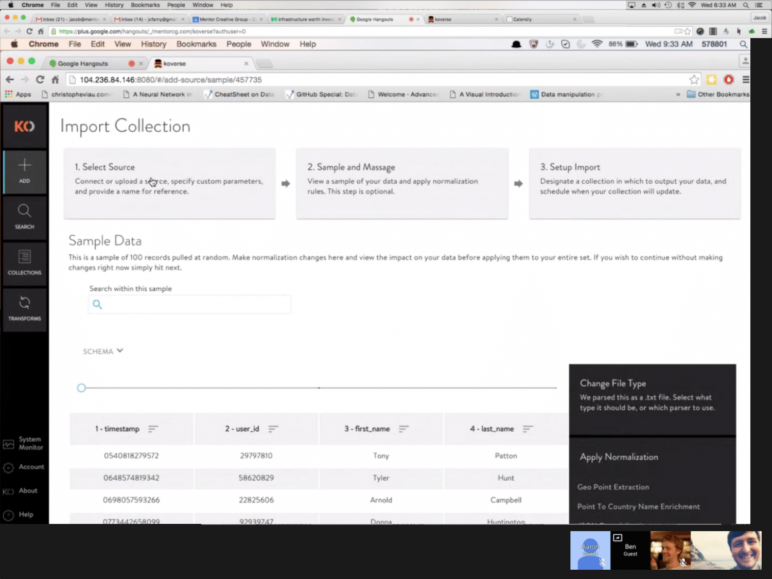
Usability Testing Screenshot
Development
TO CODE
Once the core elements of the design were wireframed, we went into a more ‘sketch to code’ phase where the prototype was being built in code and running with dummy data.
The prototype was built with Angular JS Material, and we tried not to stray too far from the default components for the sake of time and efficiency. Working this way allowed us to finish each sprint we were working on with fully functional code that Koverse could then use or test further.
As the design and prototype was being worked out and built, the visual designer on the team was working on a parallel path to style the interface from a component standpoint and provide a comprehensive style guide as trailing documentation.
Final Designs
****** This Section Needs to Be Reworded********
Final Designs
Koverse __________________________
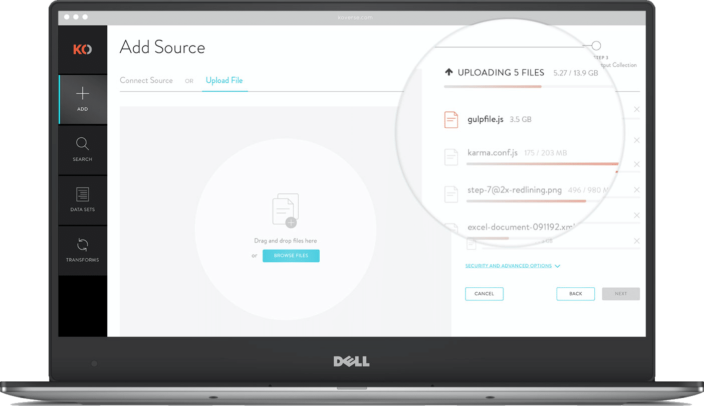
MULTI-FILE UPLOADER
For large data ingests it’s not uncommon for a user to upload hundreds of independent files from disparate sources. Instead of forcing users to go through the complete ETL process for each file independently, we allow batch uploads that can accommodate as many files as they want then apply light normalizations and store the data in a single data set.
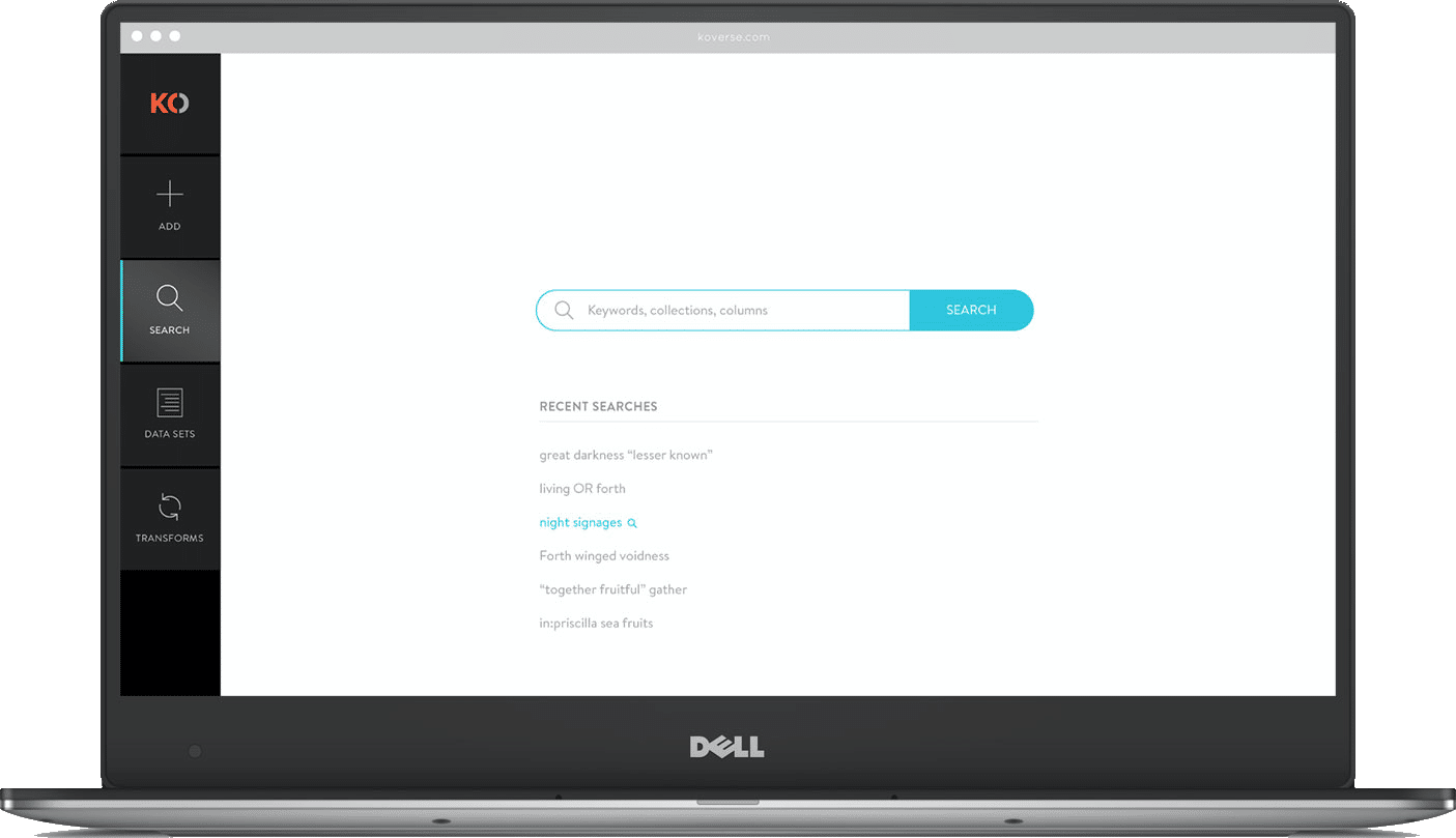
GLOBAL SEARCH
Other users of the system might be analysts who have little experience with the actual ETL process but want to perform keyword searches and run a query on the ingested data. Koverse’s search tool is build lucent syntax which is somewhere between common speech and SQL. For search results we show a sample schema making it easier to see if the data is applicable to the query they want to perform.
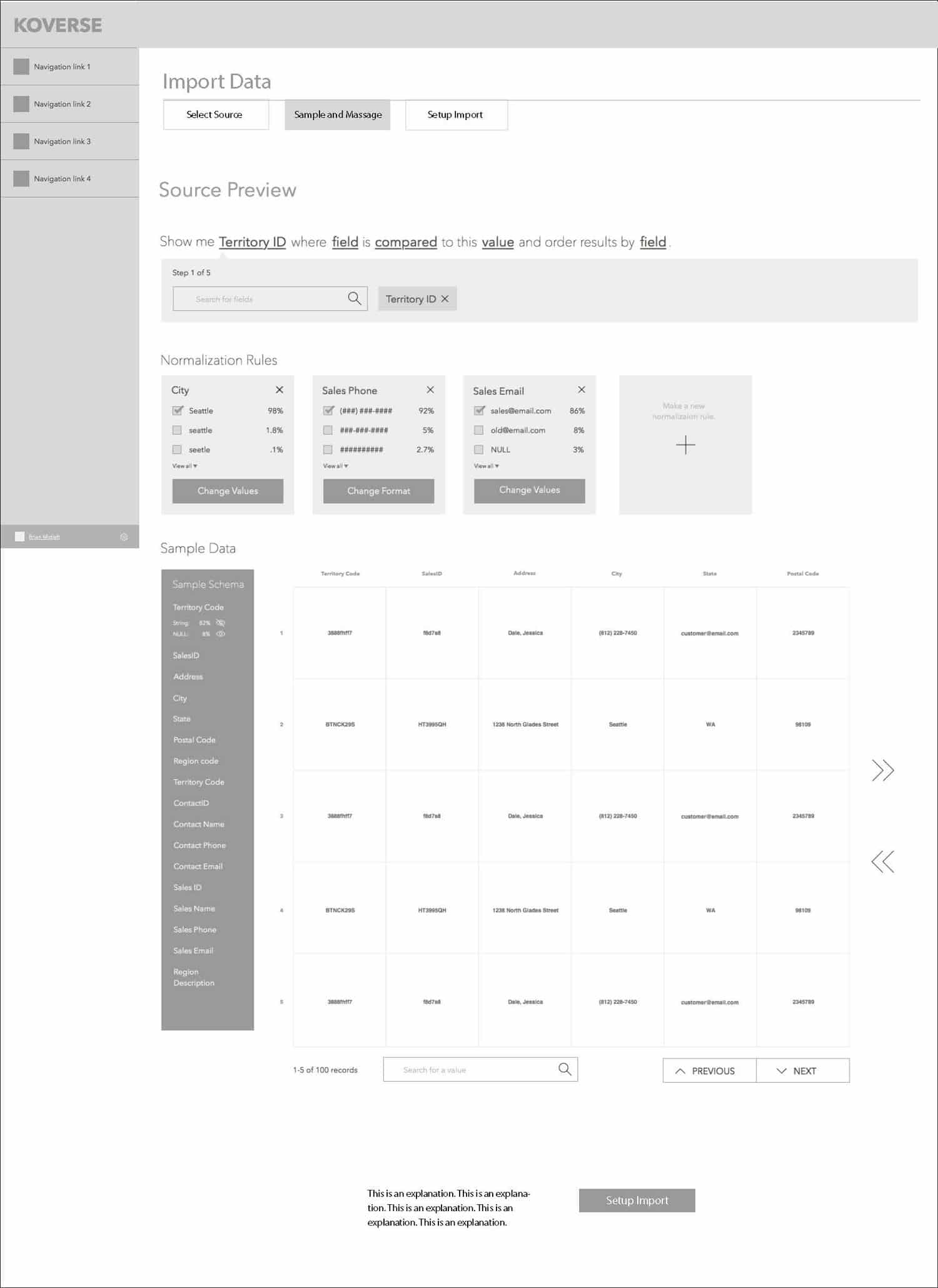
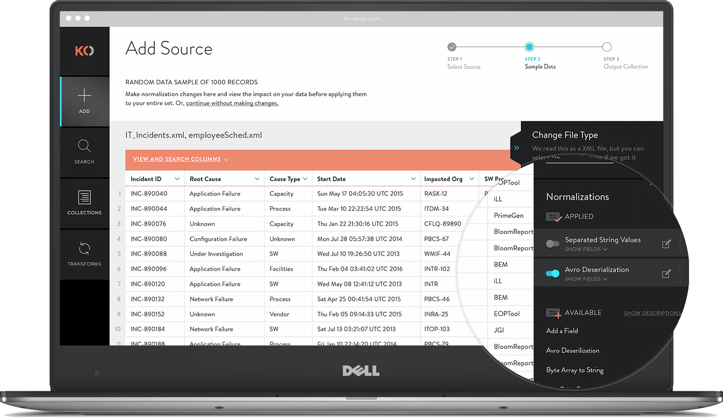
SAMPLE & NORMALIZE
After a source has been added, users can review a sample of the data. Large data sets can take hours to fully ingest then take even longer to normalize assuming the data is even workable. Including a sample during extraction allows users to see what’s coming in, apply a few normalizations to the sample, then start the full extraction with a better idea of the results.
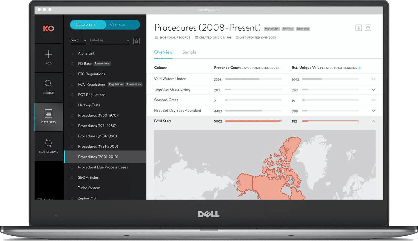
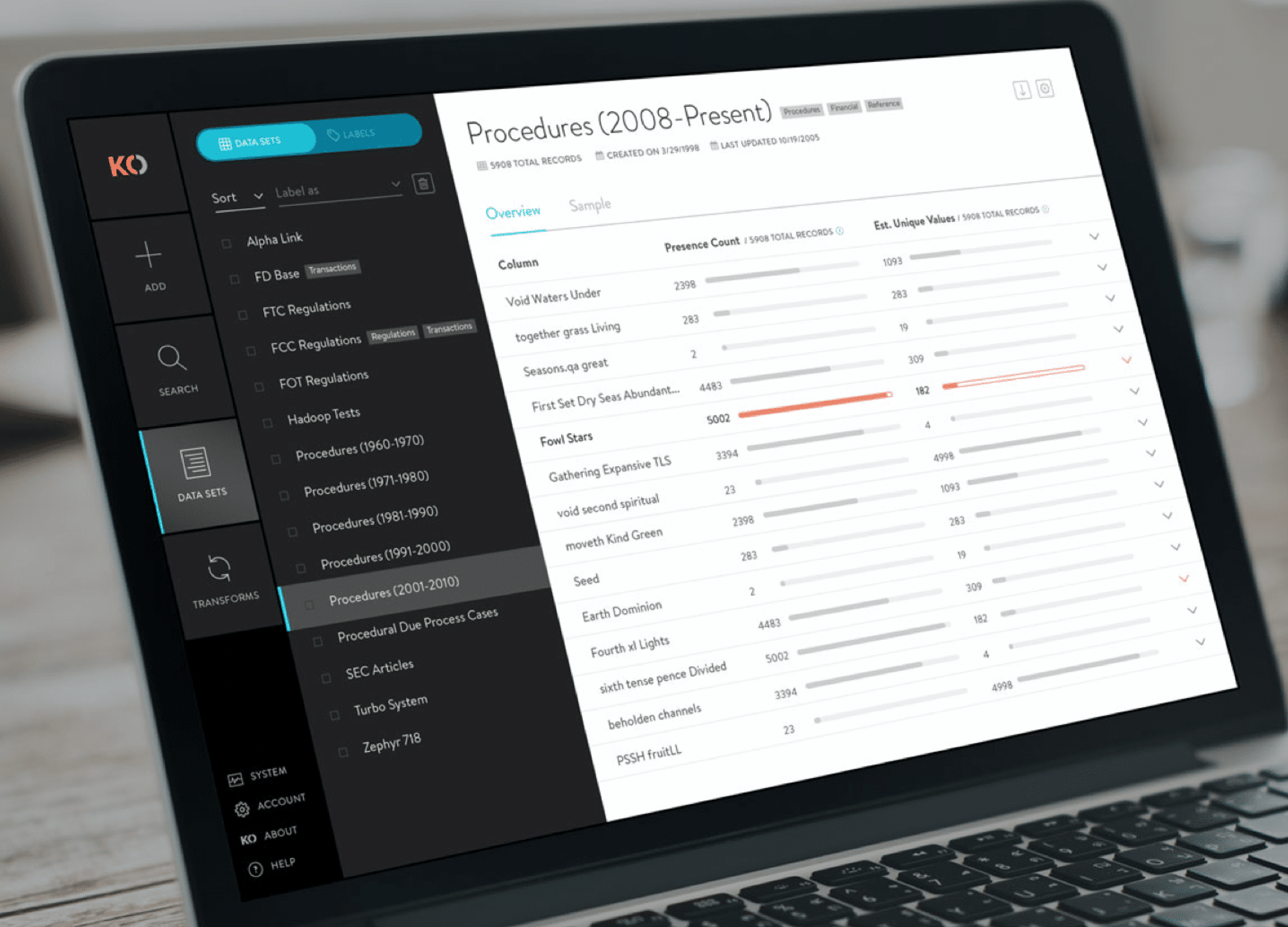
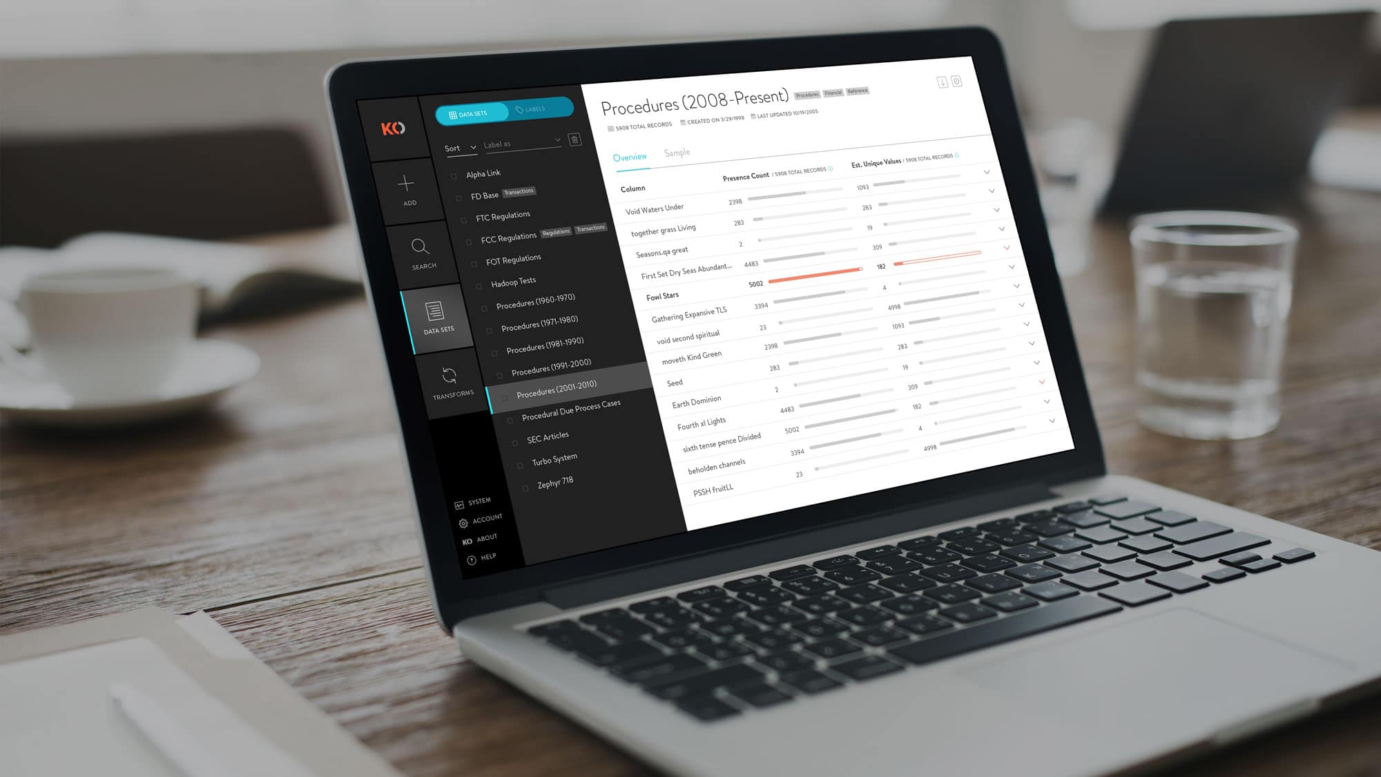
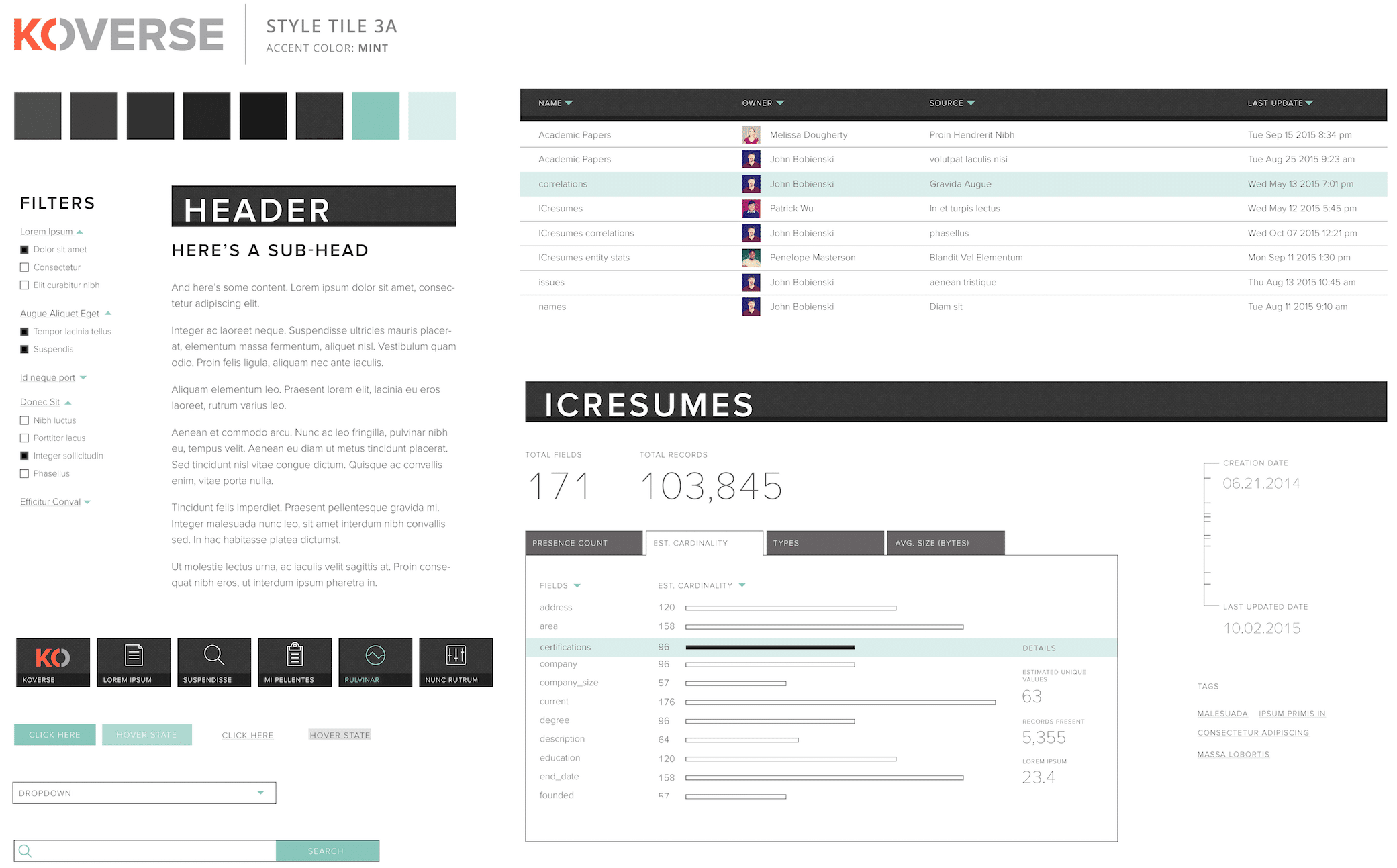
DATA SET OVERVIEW
This added feature gives a high level snapshot of the underlying data in a particular data set. It shows useful statistics like presence count and estimated unique values which allow a data scientist to quickly ascertain if a particular column is a good indexing candidate. On the flip side, it can quickly show if a data set is void in a particular column which might warrant further exploration.
Ready for More?
View Another Project –
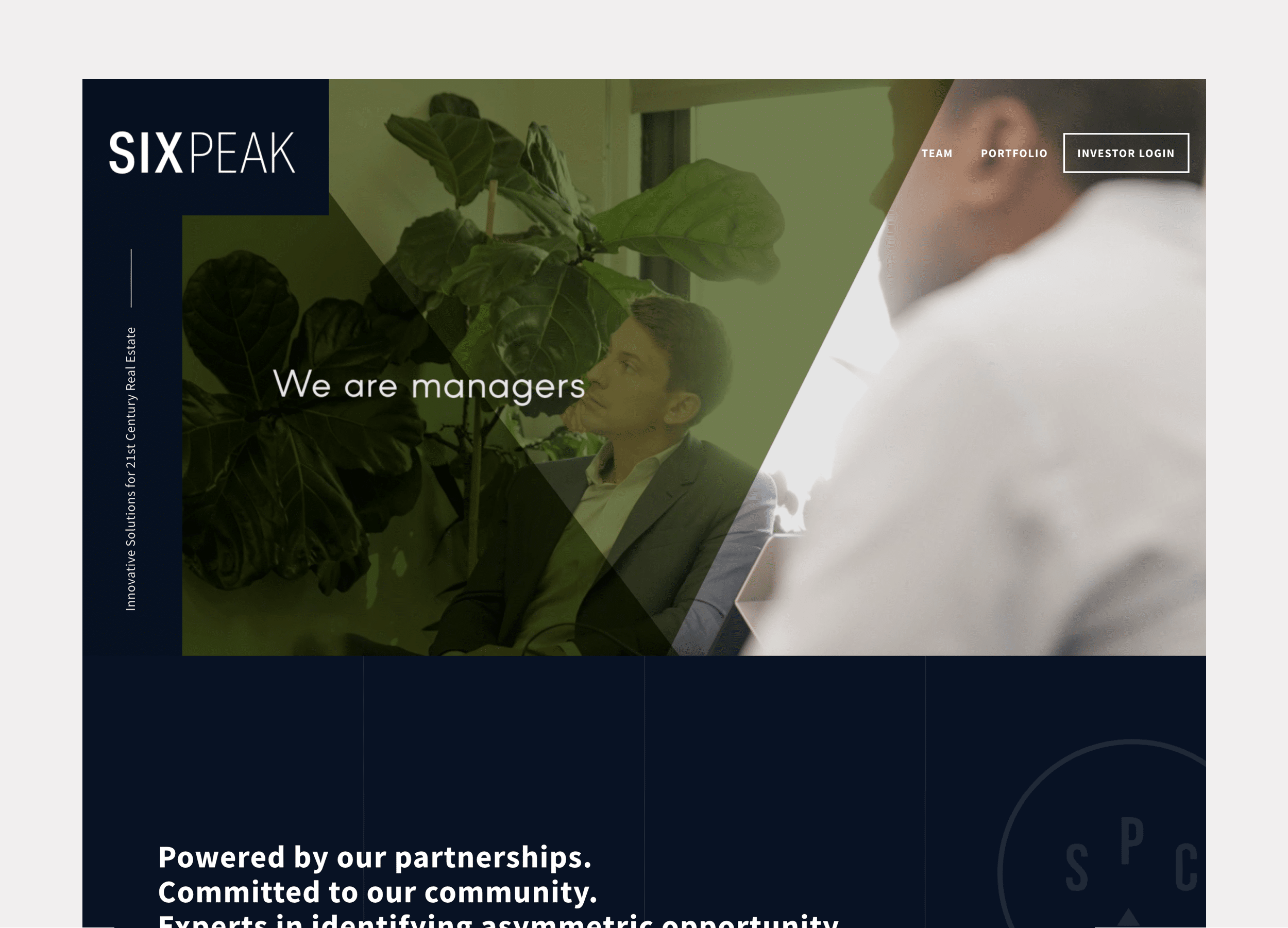
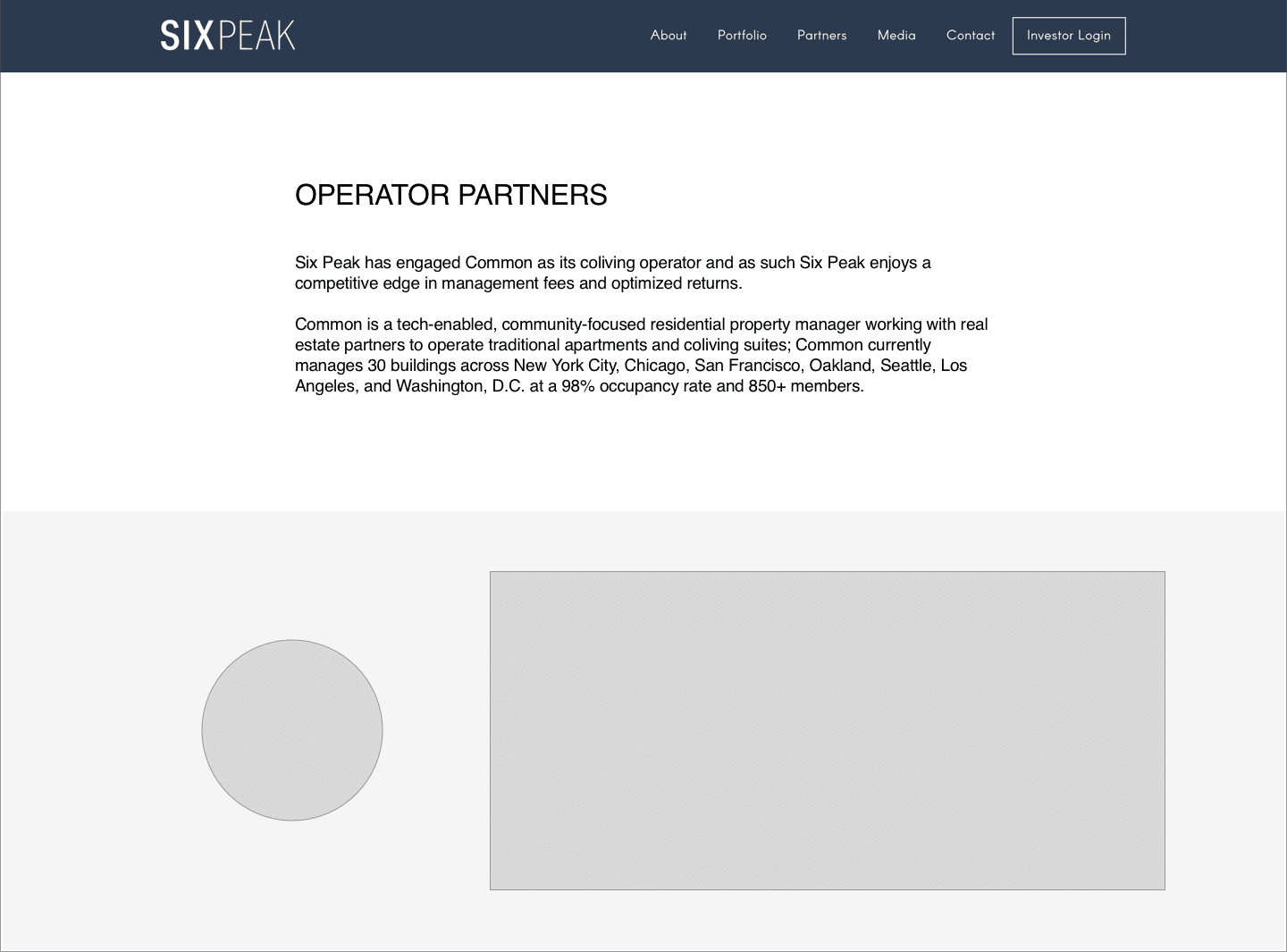
Website Design
Website design for a real estate investment & development company focused on coliving.
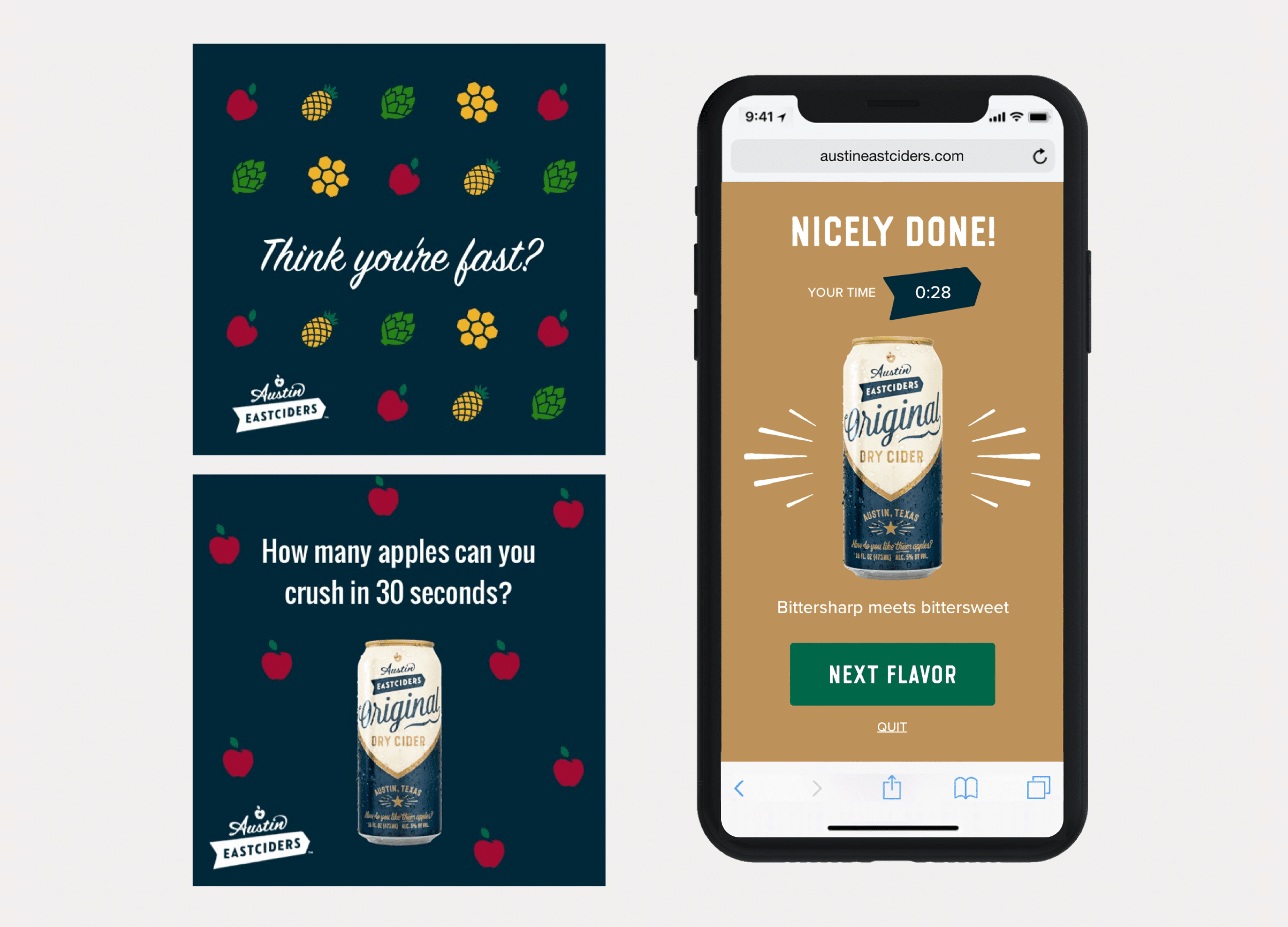
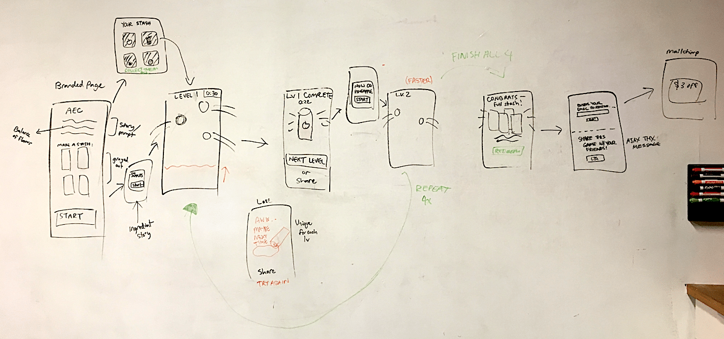
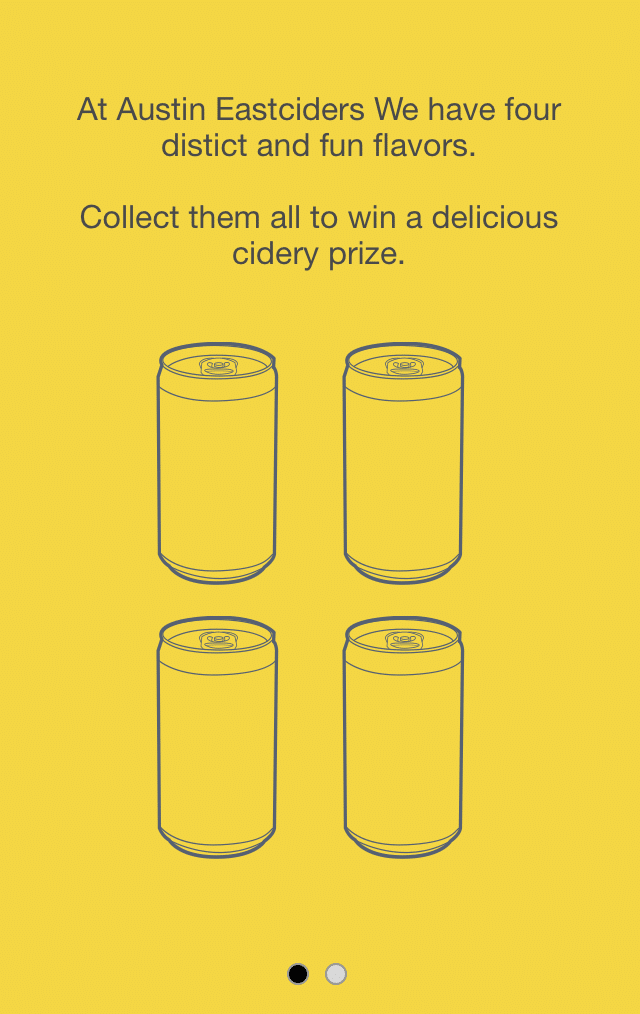
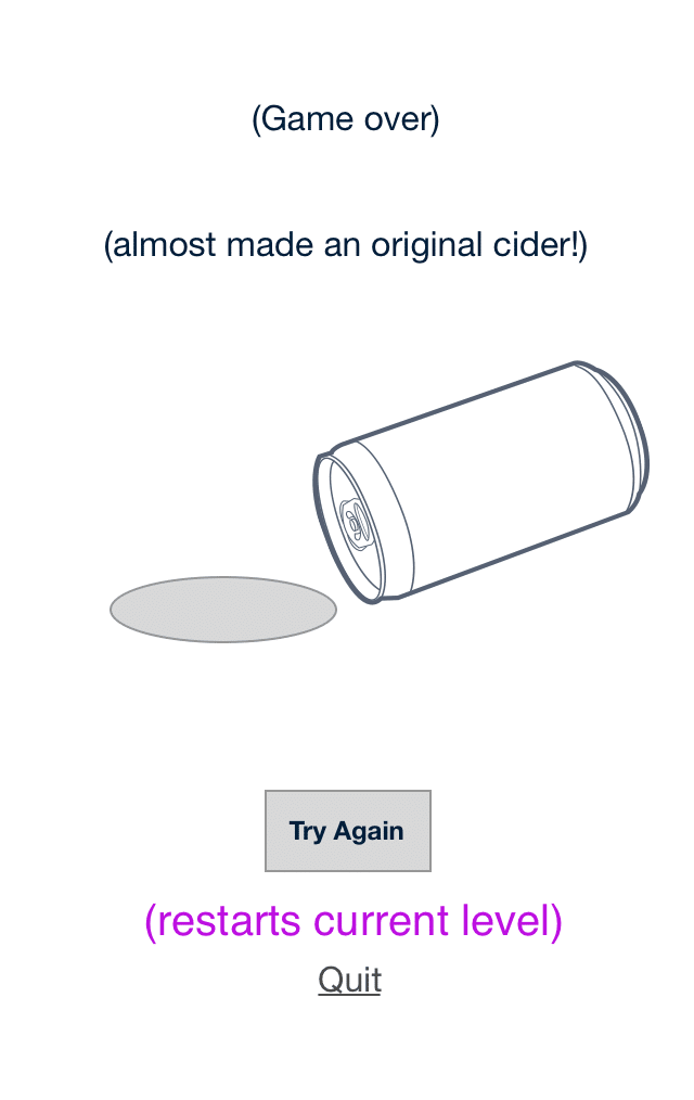
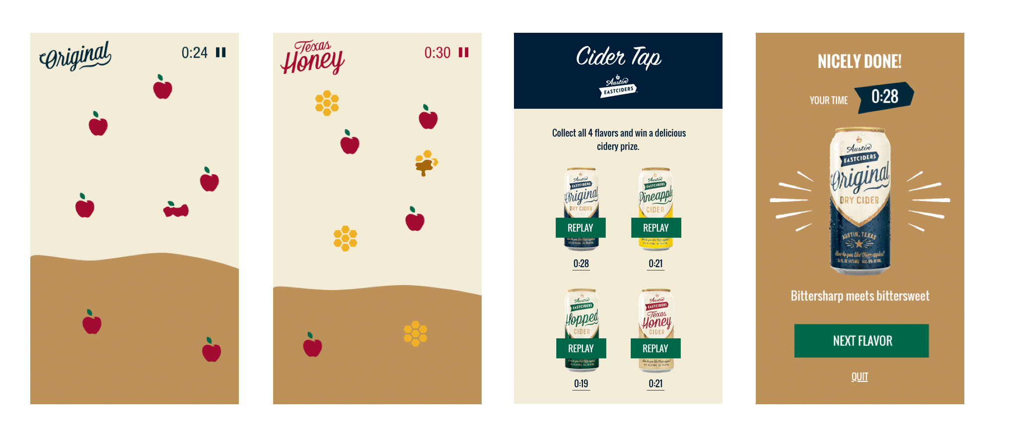
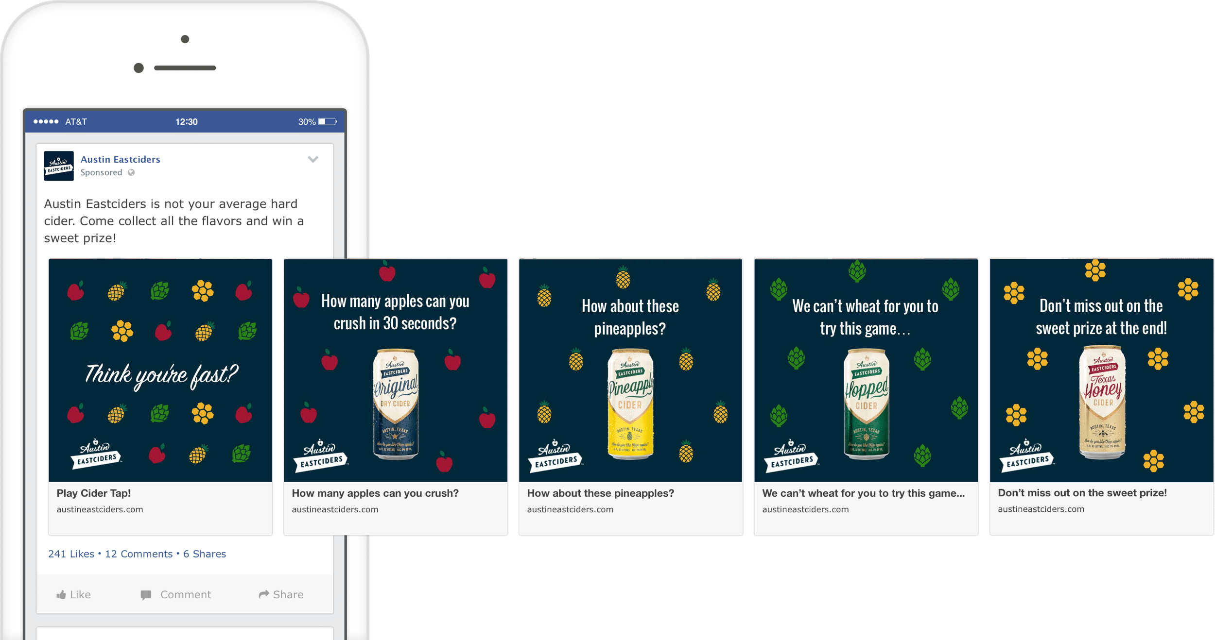
Interactive Promotional Game
A mobile game distributed through social media and played in the browser. Designed to promote four different flavors fo hard cider.