
Product Design
Insurance Claims

PROBLEM STATEMENT
One of Spot’s main offerings is Pass Protection, which allow purchasers of big-ticket items like ski passes to get a percentage of the purchase back if they find they can no longer use the pass.
The initial claims experience was temporarily based on a generic claim PDF a filer would download and fill out, but the generality and non-digital nature of this process meant a poor experience for both users that needed to file a pass claim, and internal users managing those claims.
The objectives of this project were to digitize the Pass Protection claim experience so that claimants could file a claim within their Spot account, and internal administrators could review the claims and make a verification ruling before sending the complete claim packet on to our claim adjudication partner.
APPROACH

Project Pitch and Planning

User Research and Requirements Review

Competitive Analysis and Defining Principles

Process Mapping, Information Architecture, and User Journeys

Wireframing and Prototyping

Copywriting and Review Process

Engineering Collaboration, and Supporting the Build and Launch

Usability Testing & Assessing Design Impact
Project Pitch & Planning
‘SHAPE UP’ PROJECT PITCH
At Spot we used a framework called ‘Shape Up’ to pitch new projects that needed working on. Between pitched projects and an already established roadmap, the leadership team at the company would select which projects to green light for the product and engineering teams.
A project pitch document would outline the problem to solve, list what data there was to illustrate the urgency of the problem, and loosely define the contours of what a solution might look like. It also would suggest a timeframe to allocate for the project.
Collecting data for a project started from the very beginning when putting together a project pitch. We were getting a lot of customer care tickets related to filing Pass Protection claims,
Qual: Time to file, customer care tickets (& hurdles anecdotes)
Quant: Abandoned rate, Expected increase in amount, number of purchasers who act.
===
Notes:
– MVP / Enough to Fit an appetite
For this project, we knew we needed to digitize the Pass Protection Claims experience, and included some data that exposed the limitations of the current generic claim PDF, forecasted the future volume of claims we would receive, and based on when that volume would increase, set a proposed timeline of a month and a half for UX discovery and planning, and three months for the design and build.


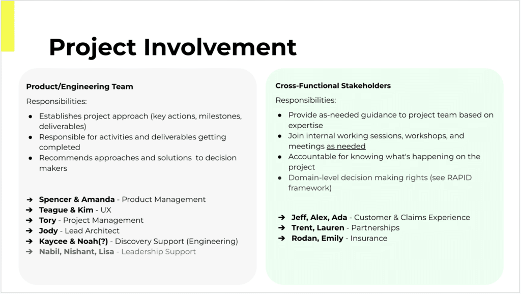
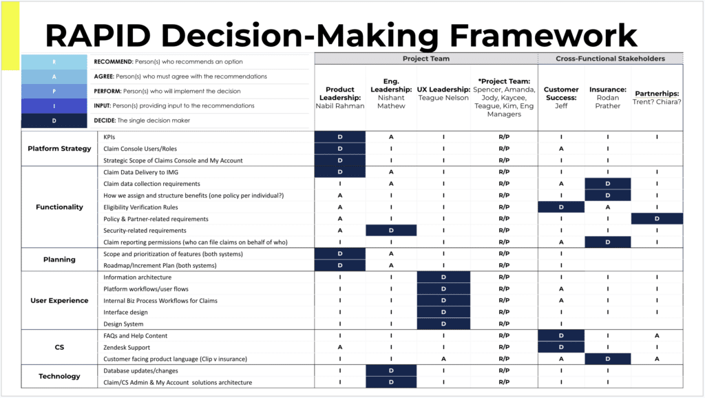
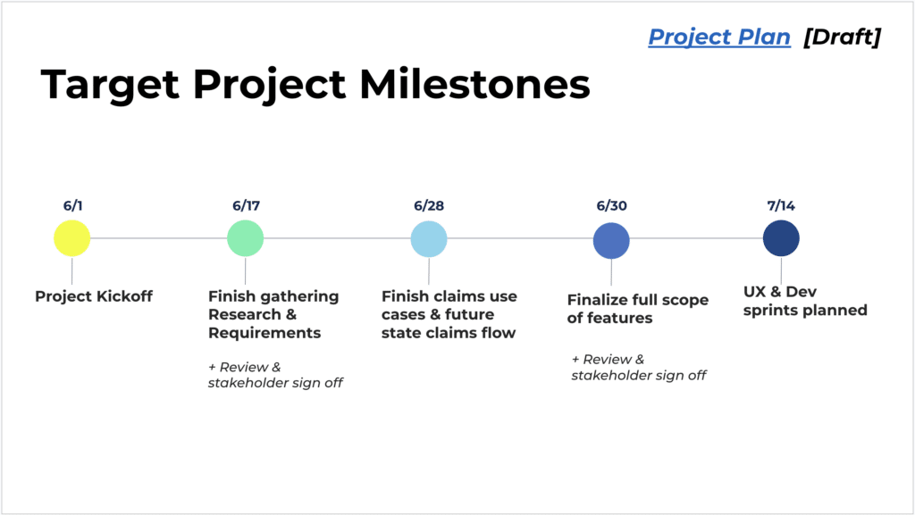
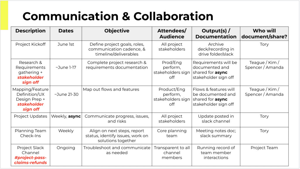
PROJECT PLANNING, STAKEHOLDER INVOLVEMENT & COMMUNICATIONS PLANNING
Once the project pitch was given a green light, a project plan was set up for the discovery phase of the project. This involved defining milestones for the project, identifying which stakeholders would be decision makers in the project, and outlining touchpoints to engage various teams and stakeholders.
The project planning was a collaboration between Project Management, Product Management, and UX, with details of the UX milestones and stakeholder involvement mostly left to the UX team to plan.
Discovery
USER RESEARCH AND
UNDERSTANDING CURRENT PROCESS
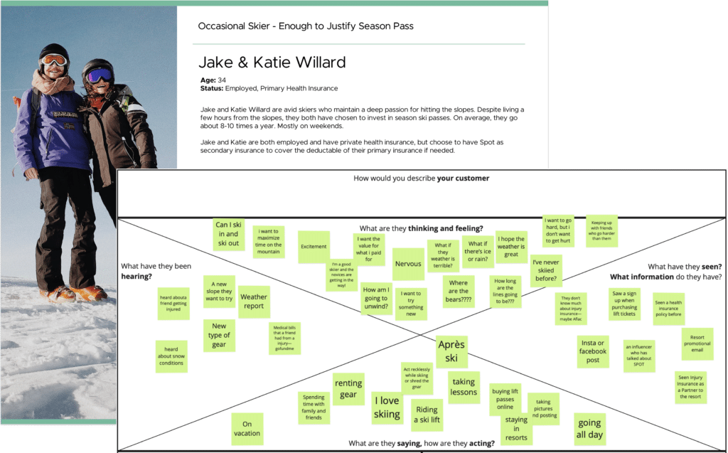
Discovery for the project started with a review of our personas at Spot, and filling in specific gaps in our understanding related to how our customers thought and felt about Pass Protection.
We uncovered when speaking with prior filers of Pass Protection that there were misunderstandings in how they thought Pass Protection would work when they purchased the product, and that there was a roller coaster of emotions most filers felt when they needed to actually use the Pass Protection product.
Most filers file because of a negative life reason, and then there are all these complicated insurance hoops to jump through which just adds to users’ frustrations.
In addition to gathering our customer’s context, we also talked to our internal Claim Advocates to understand more about their existing process of how they process Pass Protection claims. We did some shadowing/workshopping with them to really understand what it is they’re looking for when processing a claim.
- Do Perosnas
- Do Sentiment journey
- Do User Interviews
!! Include Collaborative Team Section
- Qual: ___
// Internal understaninfn differences with existing products
/ Actual hard reqs avout verification , How want to position Spot?
Discovery w/ Customer Advocates to understand how claims are currently being managed - =====
- !! Do Visuals Personas and Research
- Informs user journey mapping and current state process mapping
- Gather business and insurance requirements from IMG for Insurance & Refund Plan claims
- Informs documentation and review for alignment
- Collaborative exercise to show how the process should work, taking into account all claims use cases
- Will visually communicate all features, people, processes, and tech involved
- Determine required features for both the Claim Admin and My Account tools
- Review all required features / flows for stakeholder alignment
- Visual of features and user stories required to deliver the new Pass Claims experience
- Collaborative effort between Product, UX, and Engineering to write and prioritize stories

Main Findings from User Experiences

Discovery with Customer Advocates to Understand Current Process
REQUIREMENTS AND MATERIALS REVIEW
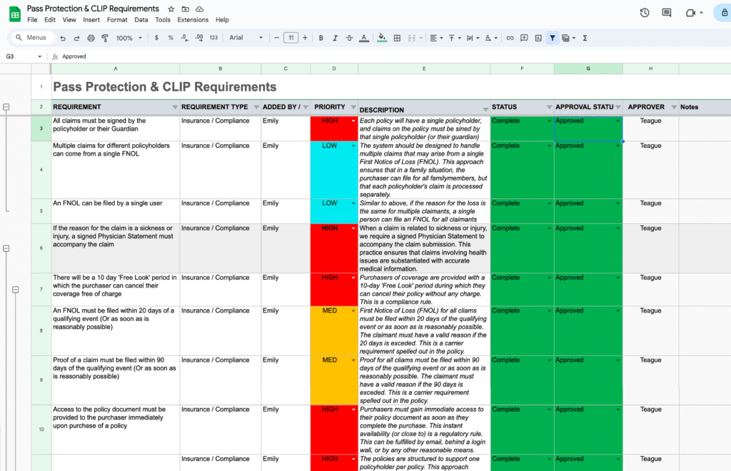
For a list of project requirements, the PMs had already started gathering an initial list of requirements with stakeholders into a centralized Project Requirements Document.
We then reviewed this list, formulated additional questions, sought to understand why specific requirements existed from our stakeholders, and had some further requirement discussions. The Project Requirements Document was a living and evolving document throughout the design process.
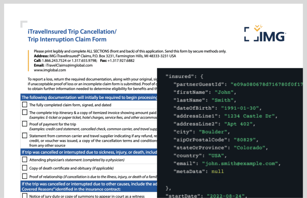
Along with project requirements, we also took a deep dive into the materials and data we had available to work with.
For this project, we had a set of data elements we knew we would receive from enrollment of new Pass Protection purchasers, and we knew from our insurance carrier partner what documents they typically requested during claim filing in order to adjudicate on a claim.
One big question we sought to answer by looking into the data was the breakdown of how many purchasers and claim filers filed claims as groups of people (as in a family filing a claim together), verses individuals filing a single claim.
- Informs user journey mapping and current state process mapping
- Gather business and insurance requirements from IMG for Insurance & Refund Plan claims
- Informs documentation and review for alignment
- Collaborative exercise to show how the process should work, taking into account all claims use cases
- Will visually communicate all features, people, processes, and tech involved
- Determine required features for both the Claim Admin and My Account tools
- Review all required features / flows for stakeholder alignment
- Visual of features and user stories required to deliver the new Pass Claims experience
- Collaborative effort between Product, UX, and Engineering to write and prioritize stories
Business Requirements
Materials Review
COMPETITIVE ANALYSIS
Concurrently with other discovery activities, we were looking around for other comparable experiences to how the Pass Protection claims process might work. We captured examples, flows, and made notes of how others had solved similar presentational challenges in dashboards and flows.
Because of the emotional ride most users are in when they come to file a claim, we took particular note of tone, language, and how others had sought to simplify and guide users through such a complex process.
Carrier’s Insurance Dashboard
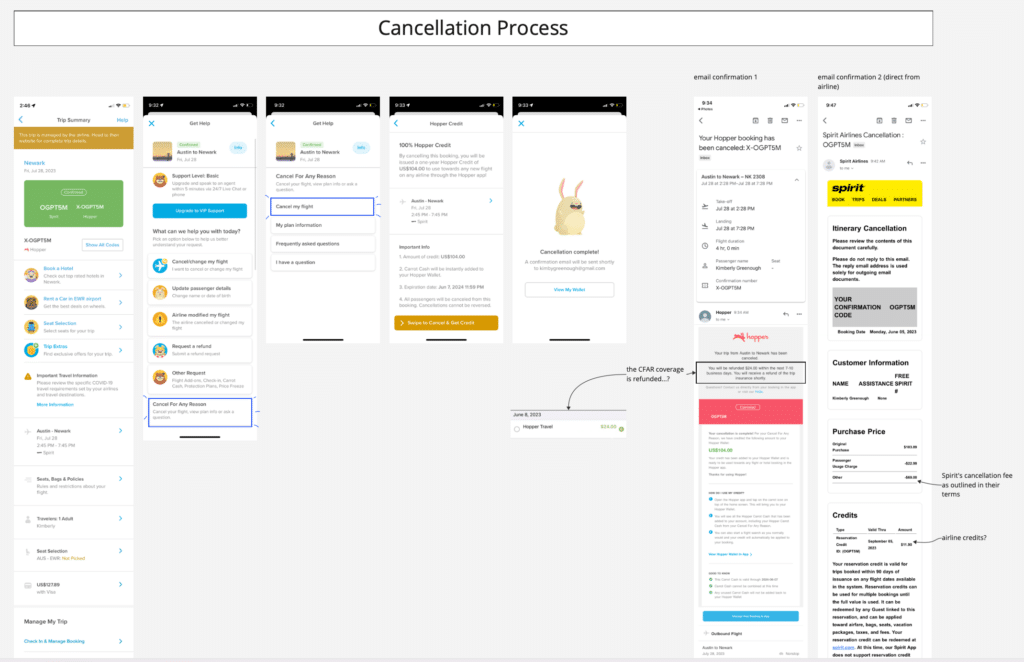
Hopper & Spirit Airlines Cancellation Process
DISCOVERY SYNTHESIS & PRINCIPLES
To internalize a lot of the insights we gained from discovery, and help turn these insights into guiding lights for our ideation and designs, we went about forming a few key design principles.
A lot of these principles were formed in response to the understanding gaps and emotional distress most filers felt when coming to file a claim. We wanted any design we came up with to be simple and clear, have help always available, and to position ourselves as advocates for the filers each step of the way.
Design principles like these are great for socialization with project stakeholders, and can serve to get teams aligned on what a good solution will look and feel like.

Process Mapping, Information Architecture (IA)
& User Journeys
SCENARIO & PROCESS MAPPING
Our first team-wide cross-functional collaborative activity was to gather the Product and Engineering teams, along with select stakeholders, and walk through different user scenarios for how this product would likely be interacted with at Spot, from purchase through to successful claim.
As we mapped these scenarios out we identified what customer interactions with Spot would need to occur. At each step along the way we also discussed what technical processes or business processes needed to be in place to support the high level user experience.
This was a great way to uncover open questions, requirements to clarify, prompt data questions to ask a data analyst to pull, and to spark discussion and ideas around the high level user experience.
This collaborative process mapping served to align the teams and stakeholders from the beginning on the contours of the project, and what we would be building. It’s also a great framing exercise to picture realistically what level of user experience we could support within the project timeline.
Include:
User Feelings

INFORMATION ARCHITECTURE
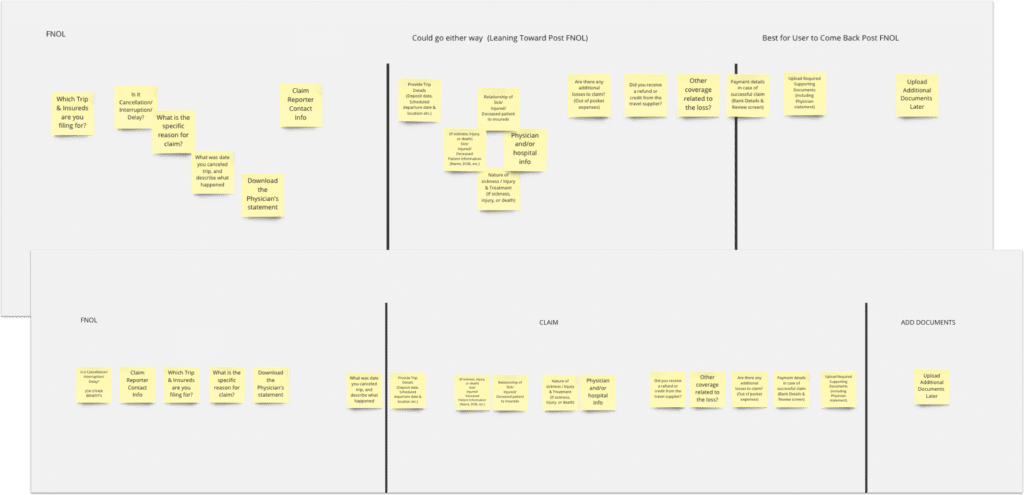
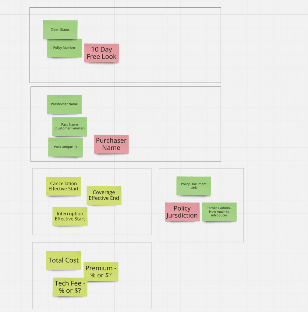
When getting into the design of how the claims flow itself would work I found sorting the steps of the flow, and the information we knew we needed to collect, onto ‘cards’ and laying out various arrangements let us see how best to logically prioritize the designs.
The claims flow was branched with conditional logic in various places, so rearranging the flow on ‘cards’ let us see that we could cleverly pose questions up front that would later inform the flow downstream.
We used similar card sorting exercises when planning out how to present details of the Pass Protection coverage to users, or give feedback about filed claims on the user’s account dashboard.
Qual:
Set of Needed questions to include = Constriant.
How to arrange in a way to reassure, educate up front hard concepts, backload uploading of docs
Arrange needed info first for details pages
WEn t Widee!
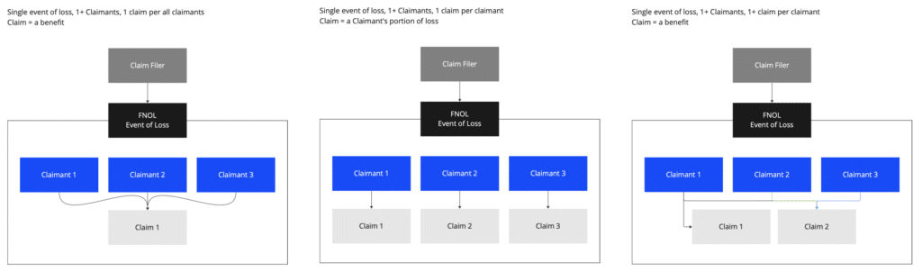
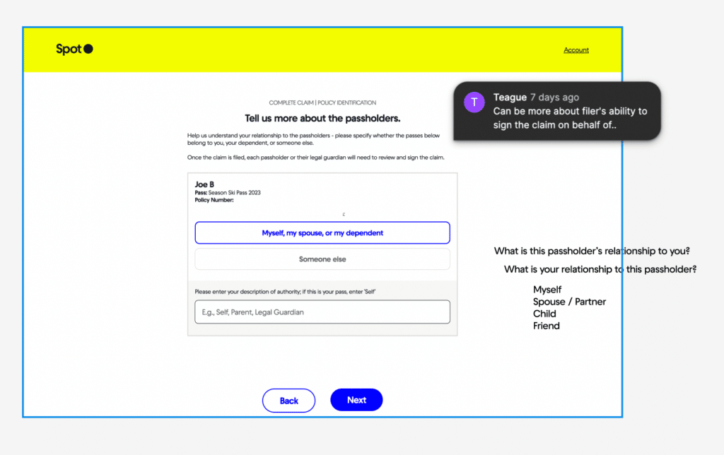
STRUCTURING THE FNOL, CASES, AND CLAIMS RELATIONSHIP
One element of the information architecture that’s worth highlighting was the need to clarify the relationship between the First Notice of Loss (FNOL), an insurance case, and what specifically counted as a claim.
The design needed to handle multiple claims that may arise from a single person filing on behalf of a group of people (for example in a family), but the way our insurance carrier partner needed to intake the claims once we passed them off was structured as only a single claim per filer.
We needed to balance how we presented claims to the filer (end user), how our own Claims Administrators thought about grouping claims, and how our insurance carrier partner though about the relationship of claim filers to claims.
To probe these different mental models we mapped out the different groupings and prioritized a discussion amongst the relevant stakeholders to reconcile how our system would present claim groupings.
Qual: Went back to Users to understand their mental model
Talked to internal team, and partners
USER JOURNEY MAPPING
Proceeding from the card sorting exercises, we then went into user journey mapping, and were able to more concretely look at what screens needed to be created, and how decision points would function.
The user journey mapping incorporated the results of decisions that had been made up until this point, for instance the resolution of claim groupings mentioned in the previous step.
Qual: Becsaue o. fhow purchasesers work and knowing group dinamics, we made a decision on familiarity of gropus

Wireframing & Prototyping
WIREFRAMING & SCREEN DESIGN
Having done a lot of the planning up front, when we got into wireframing we already knew what information would need to be presented throughout the flow.
Wireframing the customer facing screens was mostly about deciding visually how best to present this information, and leading the claim filer through the flow in a comfortable, well communicated way.
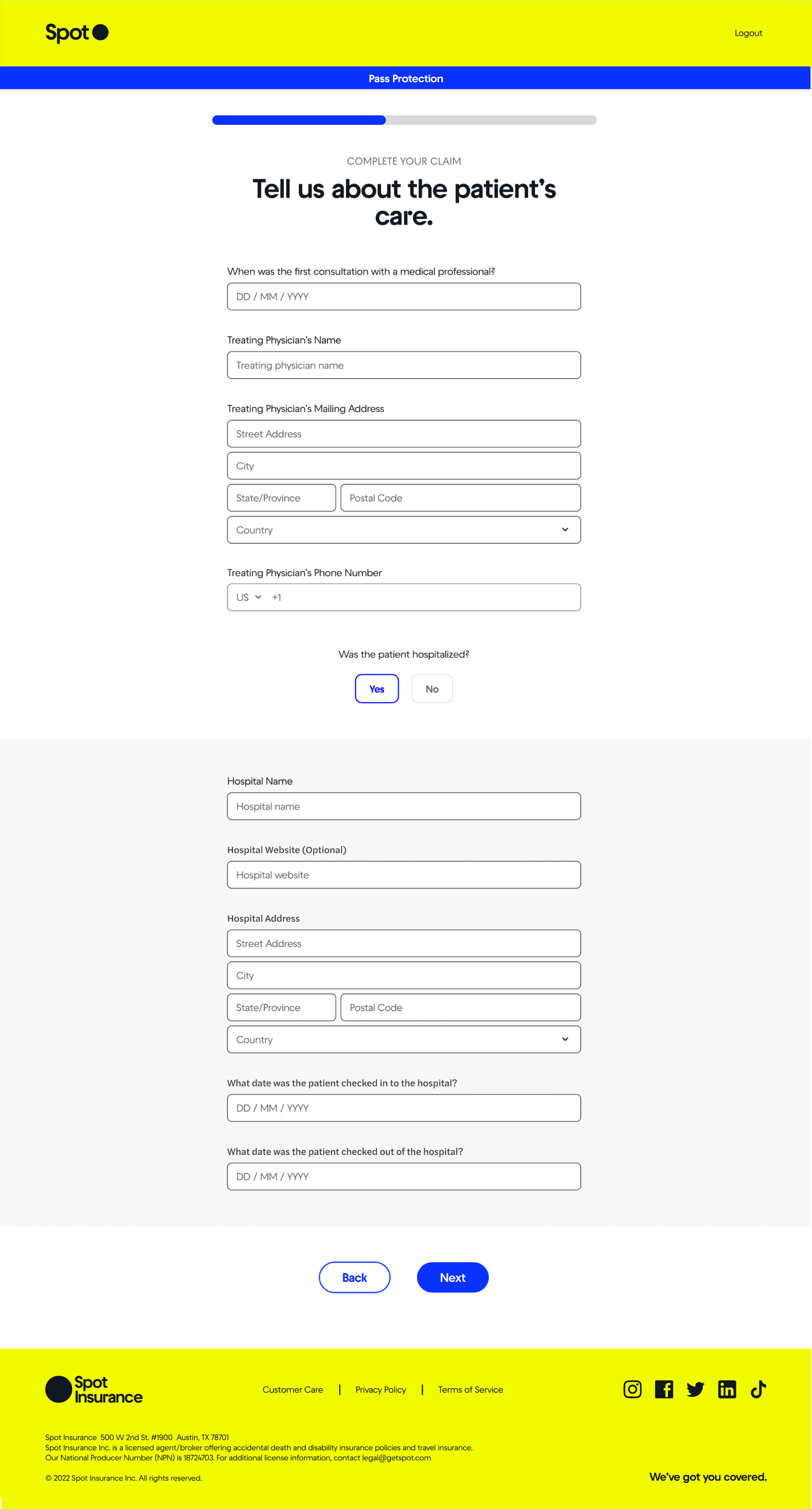
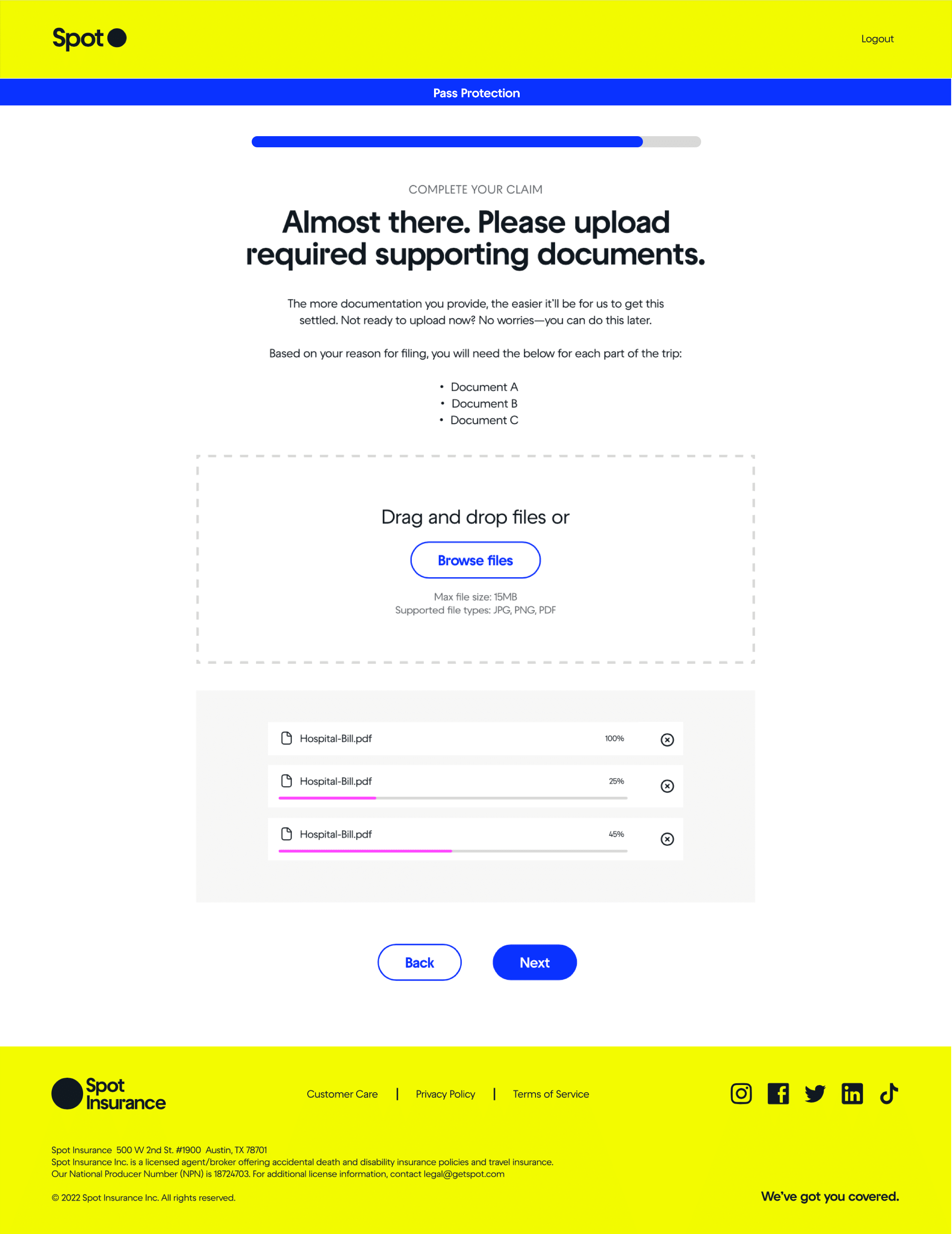
A lot of consideration went into how to help users understand what information they needed to provide, while keeping the screens as minimal and digestible as possible. We used contextual nudges where we could, conditionals question sets within screens, and a lot of iteration and emphasis was placed on the screen copy and microcopy to communicate clearly.
For the project we needed to consider both the customer facing, and management aspects of the claim flow. As we were working through the customer facing flow and dashboard, we were also wireframing how to best display their claim info on our claim administration dashboard for internal verification of claims.
Collabarive /
Standardizing Insurance Coverage Cards
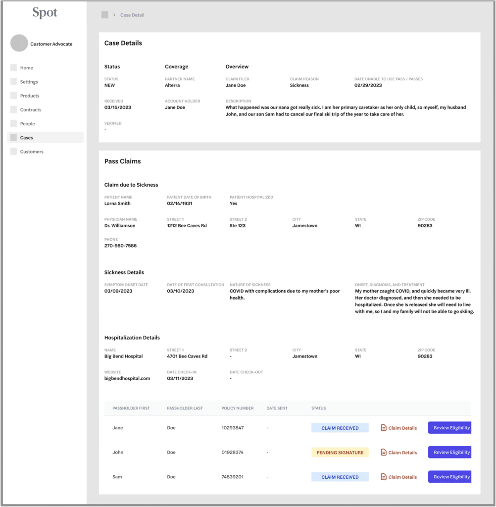
Displaying Case and Claim Info for Internal Claim Admins
Wireframing the Customer Facing Claim Flow
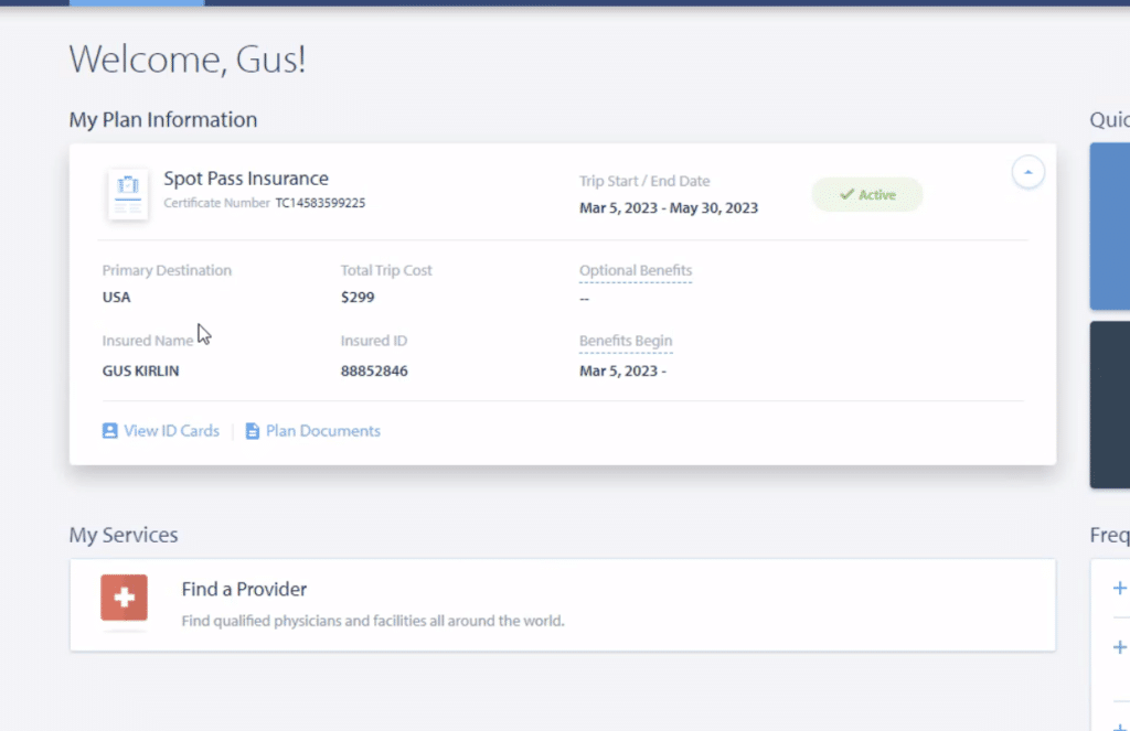
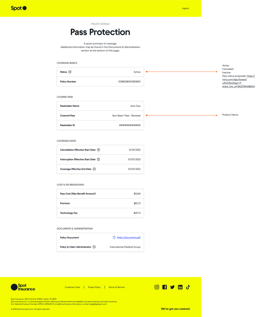
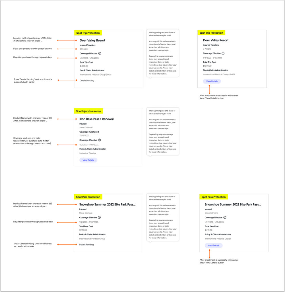
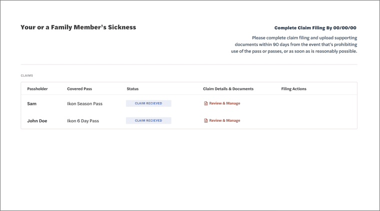
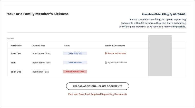
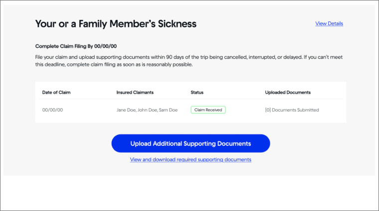
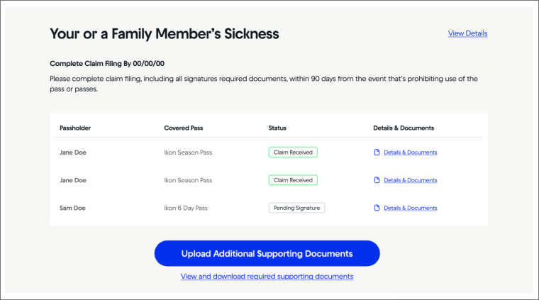
UI DESIGN & THE CUSTOMER’S CLAIM DASHBOARD
UI design and the detailed work of how to covey important information and affordances is often a very iterative process with improvements being designed and added over time. It’s about using visual hierarchy and the right UI elements to convey specific information in an ordered way to the user.
In this example, the customer’s claim dashboard, we designed this with a lot of the customer’s insights and uncertainties we heard from the discovery process in mind.
Filers were unsure about timelines and deadlines, so we added a ‘complete claim filing by’ date. Filers were unsure about what documents they needed to provide, so we added a specific link call out for this.
You can also see in these designs we were considering different ways to present if a group of people all filed together how might that look.
Iteration 1
Iteration 2
Iteration 3
Iteration 4
USING THE SPOT DESIGN SYSTEM
At Spot we maintained a Figma design system which made wireframeing and screen design constant, quick, and relatively easy to change around and work with.
I’ve written more about our work developing and maintaining the Spot Design System in my writeup on the UX Overview and My Role at Spot.


UX COPYWRITING & REVIEW PROCESS
Tone to calm, educate, keep simple, Direct
_____
Facutally Correct
Highly Precise
Compliant
Descriptive to take actions
Approachable and in brand voice.
Short is best.
Using – List of tone words
Copywriting Iteration and Notes
Copy needed to be precise and convey a lot of info
Copy needed to get the user to take complex actions
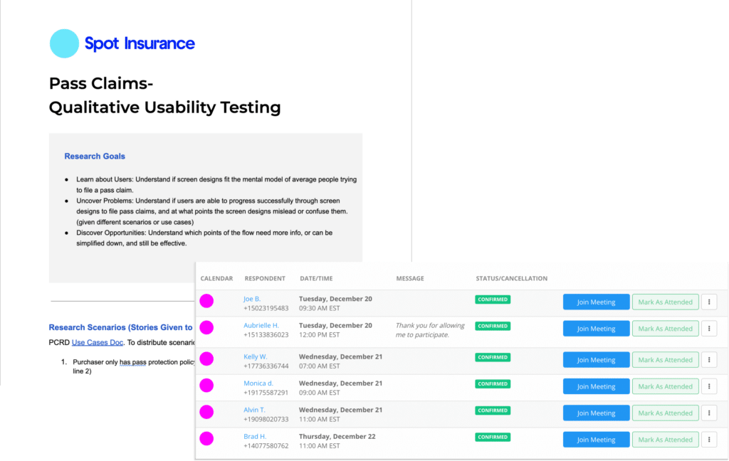
Usability Testing & Assessing Design Impact
USABILITY TESTING & DEFINING METRICS TO TRACK OVER TIME
Mind
_____
BUSINESS IMPACT & ASSESSING ORIGINAL GOALS
_____

Final Designs
FINAL DESIGNS
_____
====
HOW WORK WITH:
PM / Data / Content Writers / Engineering
My Role and Contribution
Return to answer Shapeup Qs
Fix Patient’s Care Placeholder Text Below.. (Sketch)
INTERNAL TOOLING – SEP CASE STUDY???


Ready for More?
View Another Project –
Data Management Platform
Client: Koverse
A tool used by Data Scientists for collecting, storing, and learning from big data.
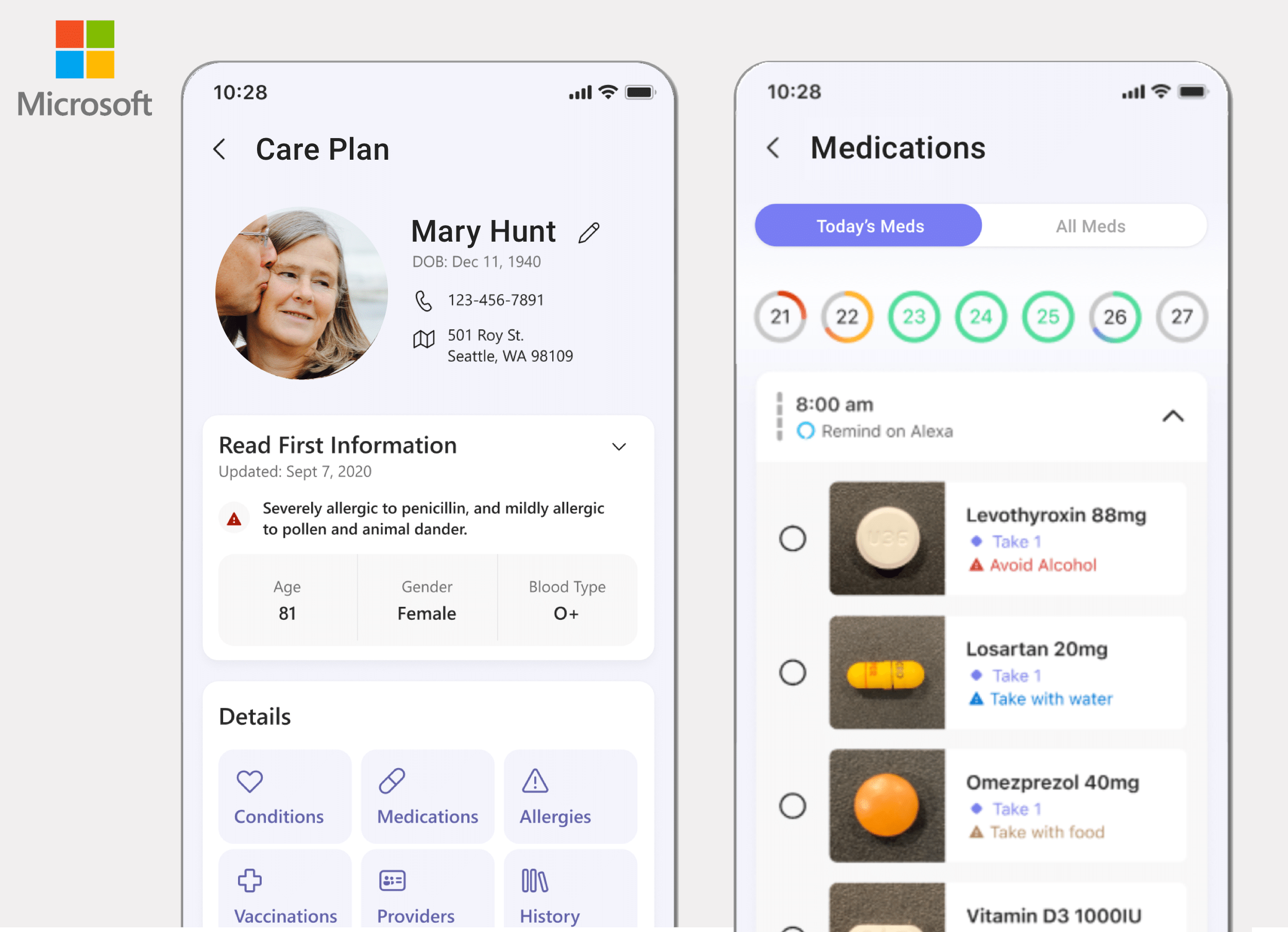
ConnectedCare iOS App (Protected)
Client: Microsoft
Microsoft’s ConnectedCare App is a summary of an individual’s health records organized into one place.
Data Management Platform
PROBLEM STATEMENT
Koverse is a Seattle based platform used to manage, normalize, and interpret large and complex data sets.
The original platform was built in 2012 with a focus on the extract, transform, load (ETL) process of combining and normalizing data.
Over the years as new features were added on to the platform, they had been added on in a siloed or piecemeal fashion. This made the tool work for one-off tasks but was not very effective for an end-to-end data processing workflow. Koverse was looking to remedy this.
APPROACH
Assessing the Tool to Redesign
User Research, Personas & Journeys
Competitive Analysis
Information Architecture
UI Concepts & Ideation
Wire-framing & Prototyping
Usability Testing
Development
Assessing the Tool To Redesign
LEARNING ABOUT THE DATA PROCESS
Because the application addressed such a specific function for data scientists, we first had to learn how the tool worked, what it could do, and how it was useful in data scientists’ workflow.
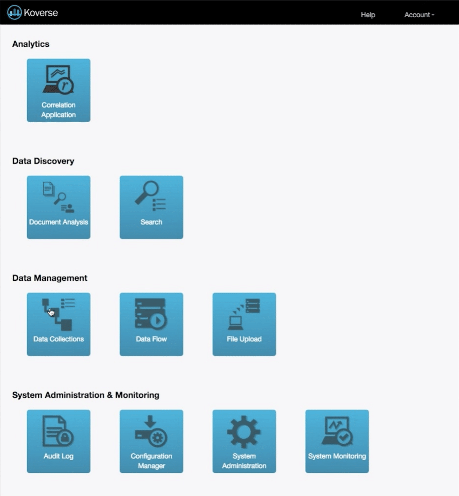
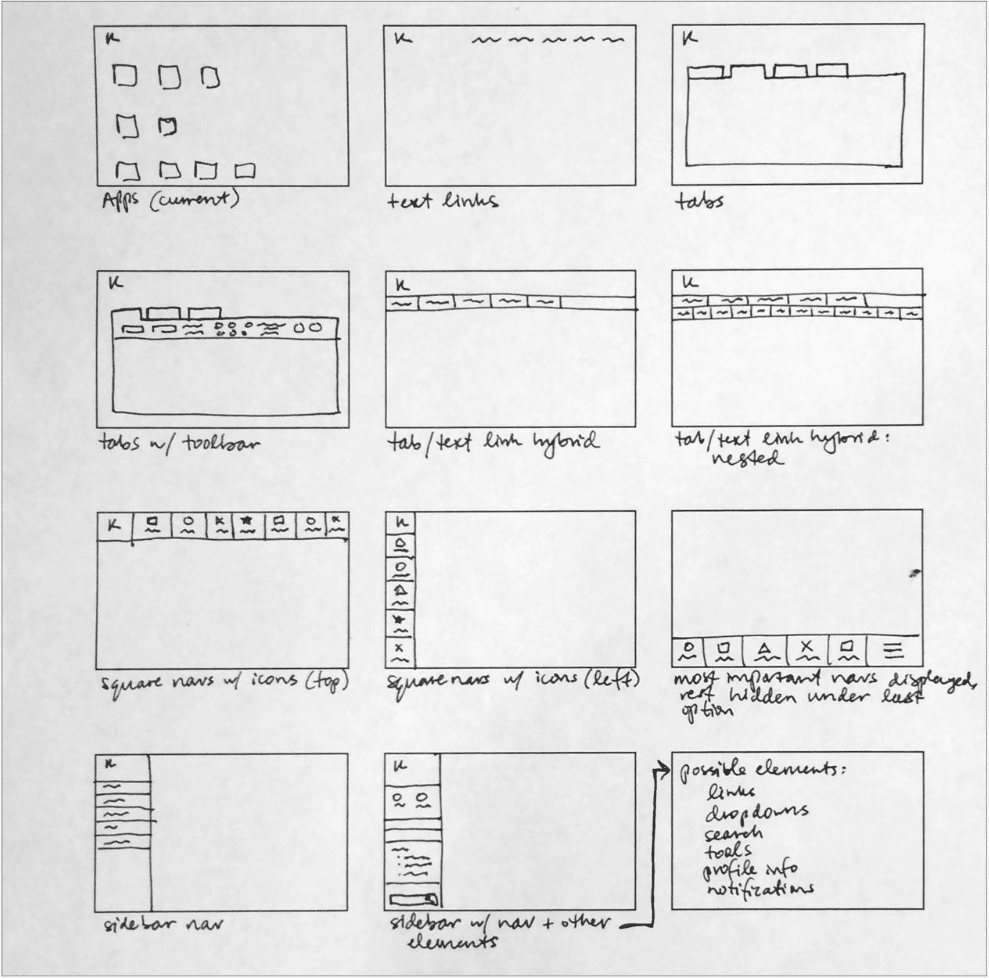
The Original Design
The dashboard when we began was broken out into individual tasks the application could do.
Each of these tasks is valuable to a Data Scientist’s workflow, but in the original design an end-to-end data processing workflow was difficult.
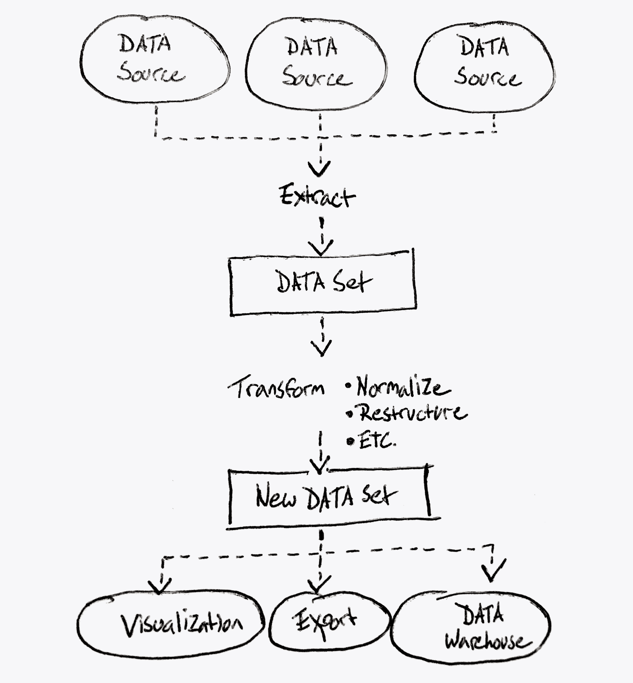
What Koverse Actually Does
This diagram represents more accurately what the platform could achieve.
Notice it’s a continuous data processing workflow from extracting data from the source down to transforming the data, and working with the data in a useful way.
User Research, Personas & Journeys
USER INTERVIEWS
Because none of us on the design team were data scientists ourselves, we needed to talk with data scientists to understand their mental models around processing data, and what workflows were more or less common to people in the processing stage.
We spoke with 18 people with job titles ranging from Data Analyst to Business Managers, and then sorted what they told us into common groupings using affinity diagram sorting.
View Our
Research Materials
The Interview Screener, the Script, and the Findings Spreadsheet
Research Materials
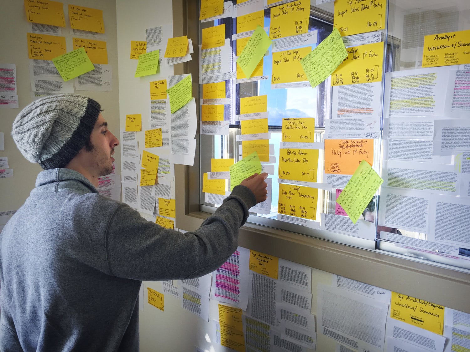
Affinity Diagram Sorting
PERSONAS & JOURNEYS
The affinity diagram sorting allowed us to group common responses into themes, and to see how the people with different job titles and roles all thought collectively about the data processing part of their jobs.
From these groupings of responses, and different workflows people had walked us through, we were able to assemble in depth personas for the different roles of people who would likely be interacting with this tool.
Brian – Data Scientist
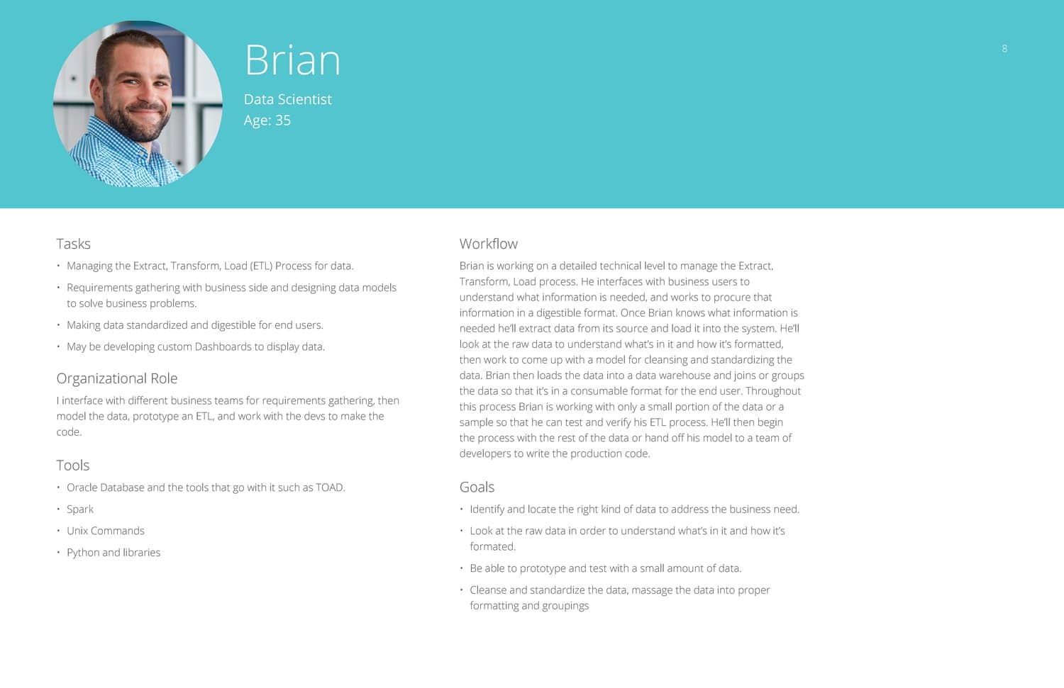
Jean – Analyst
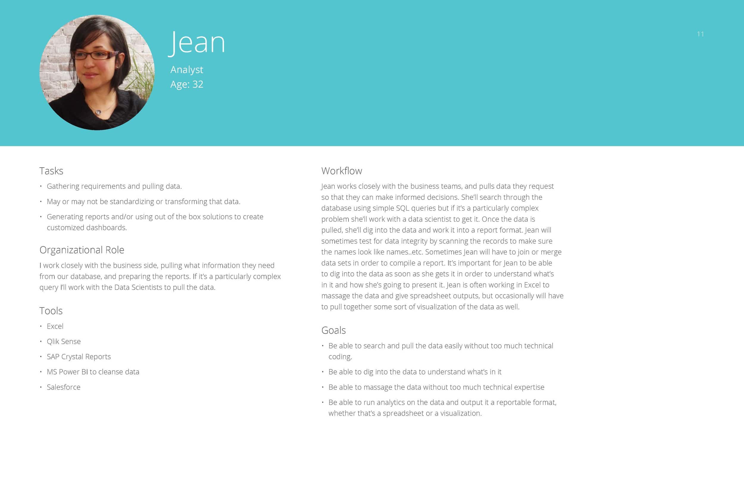
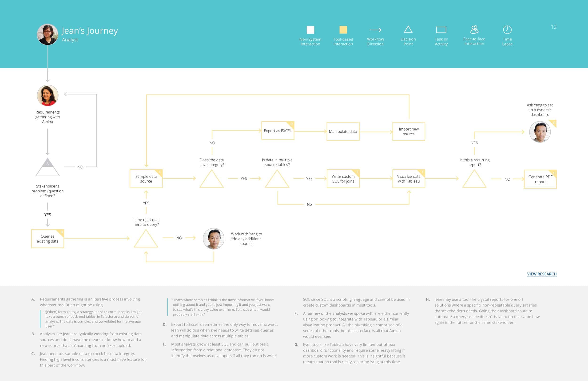
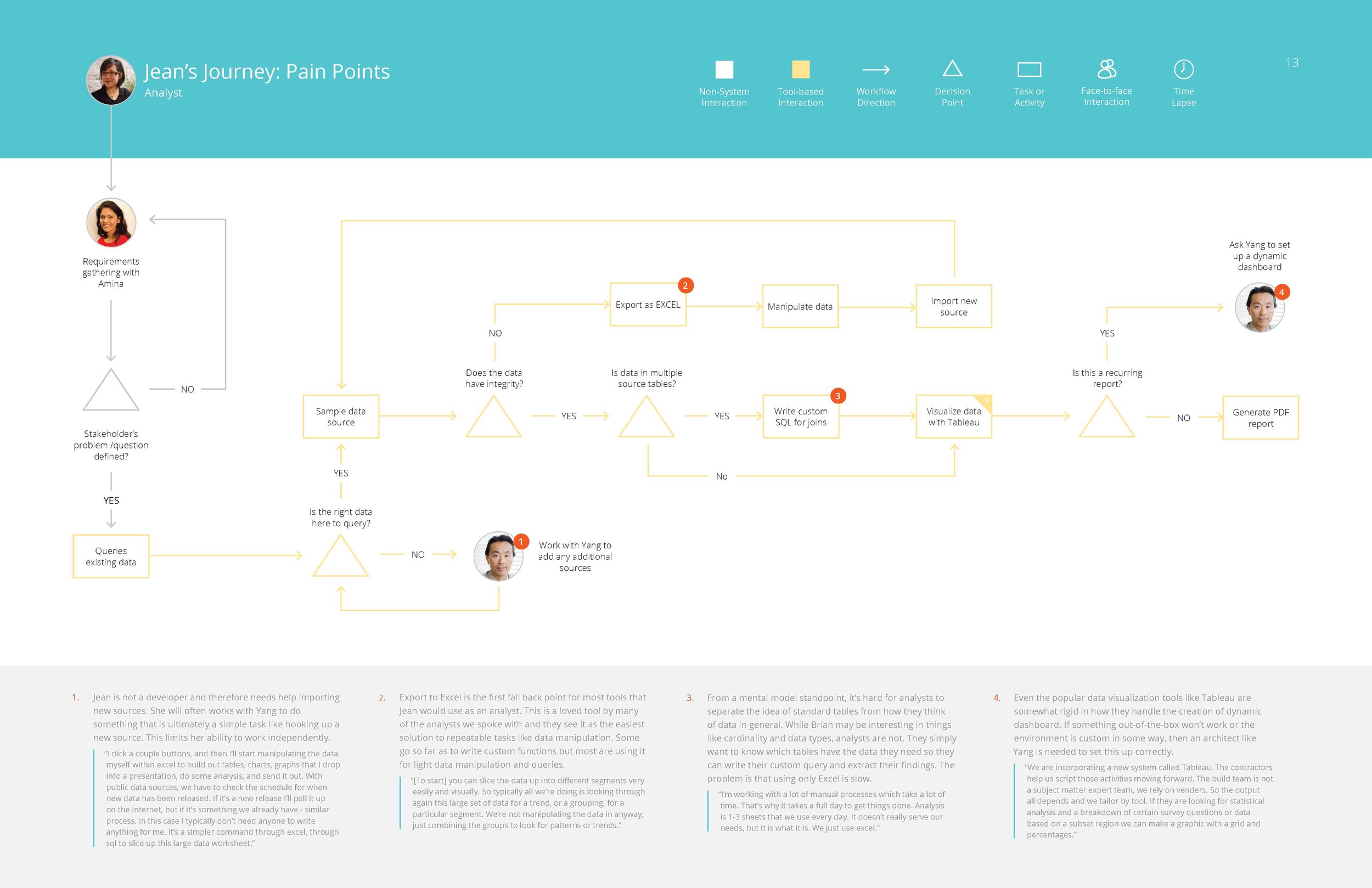
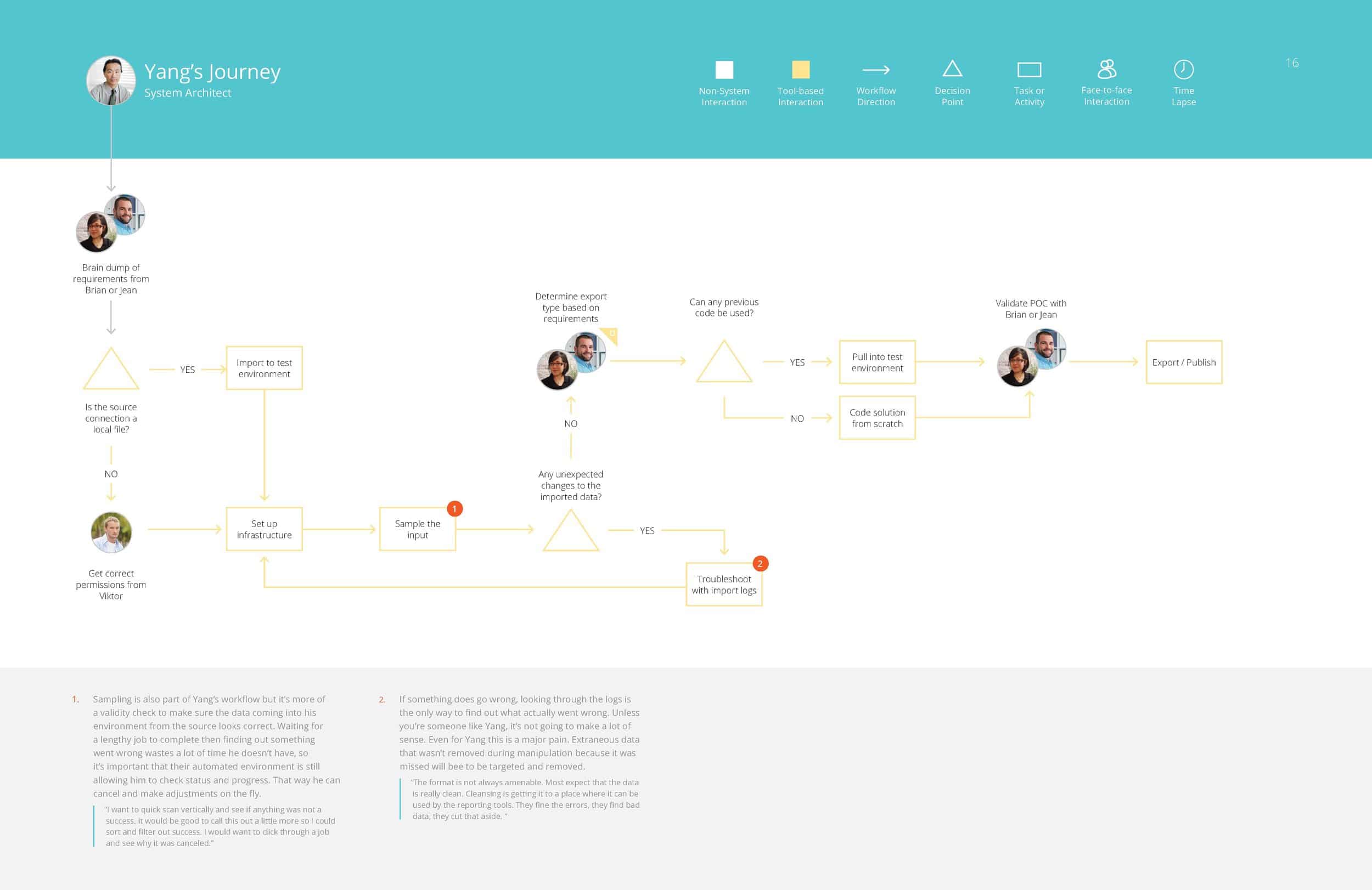
Yang – Systems Architect
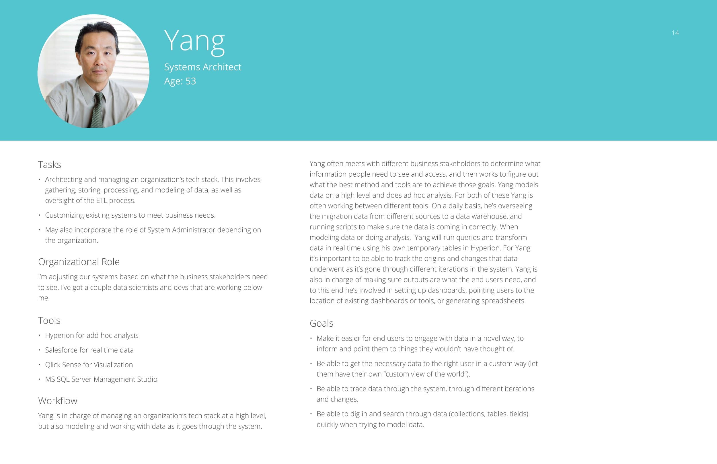
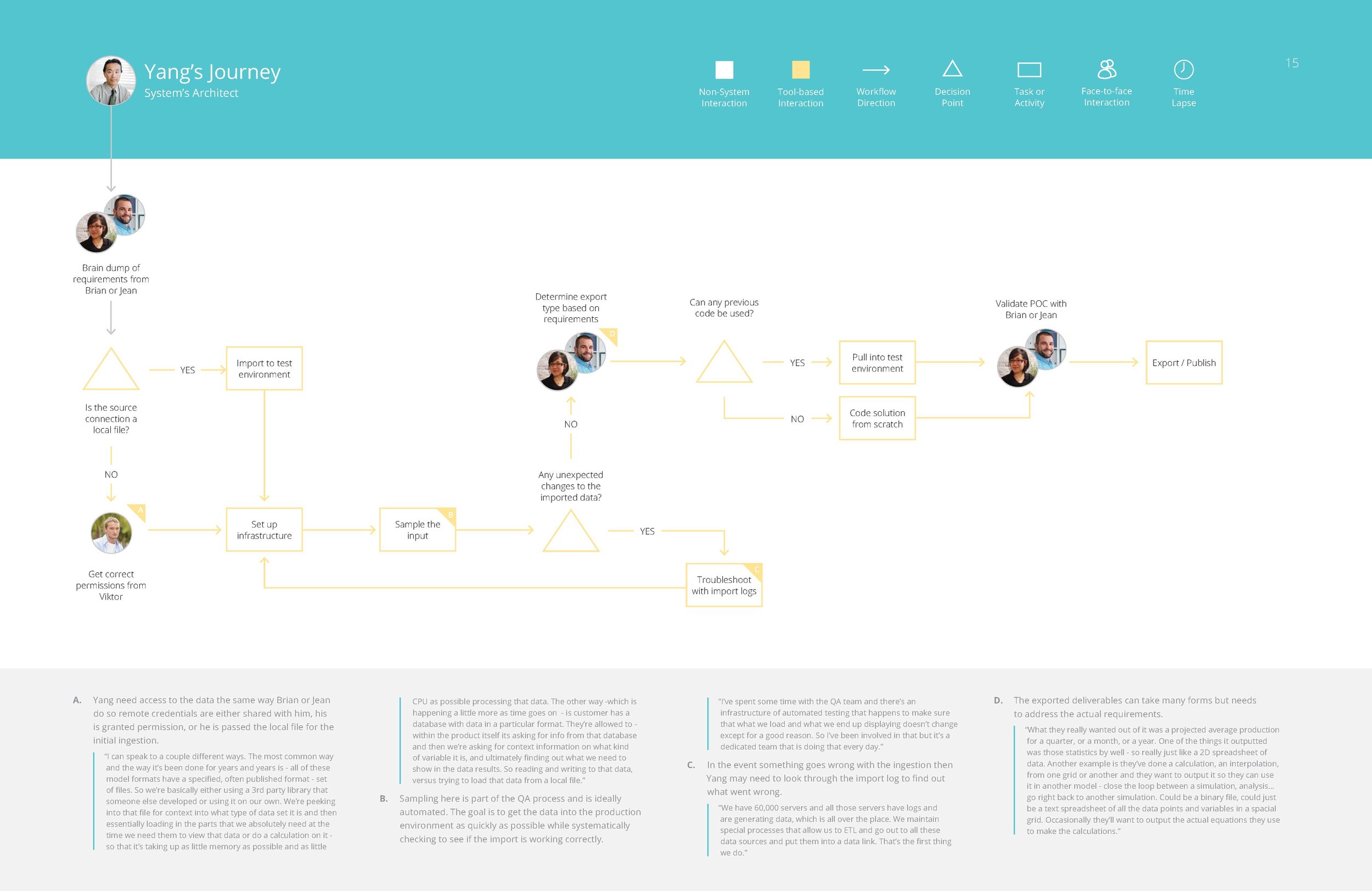
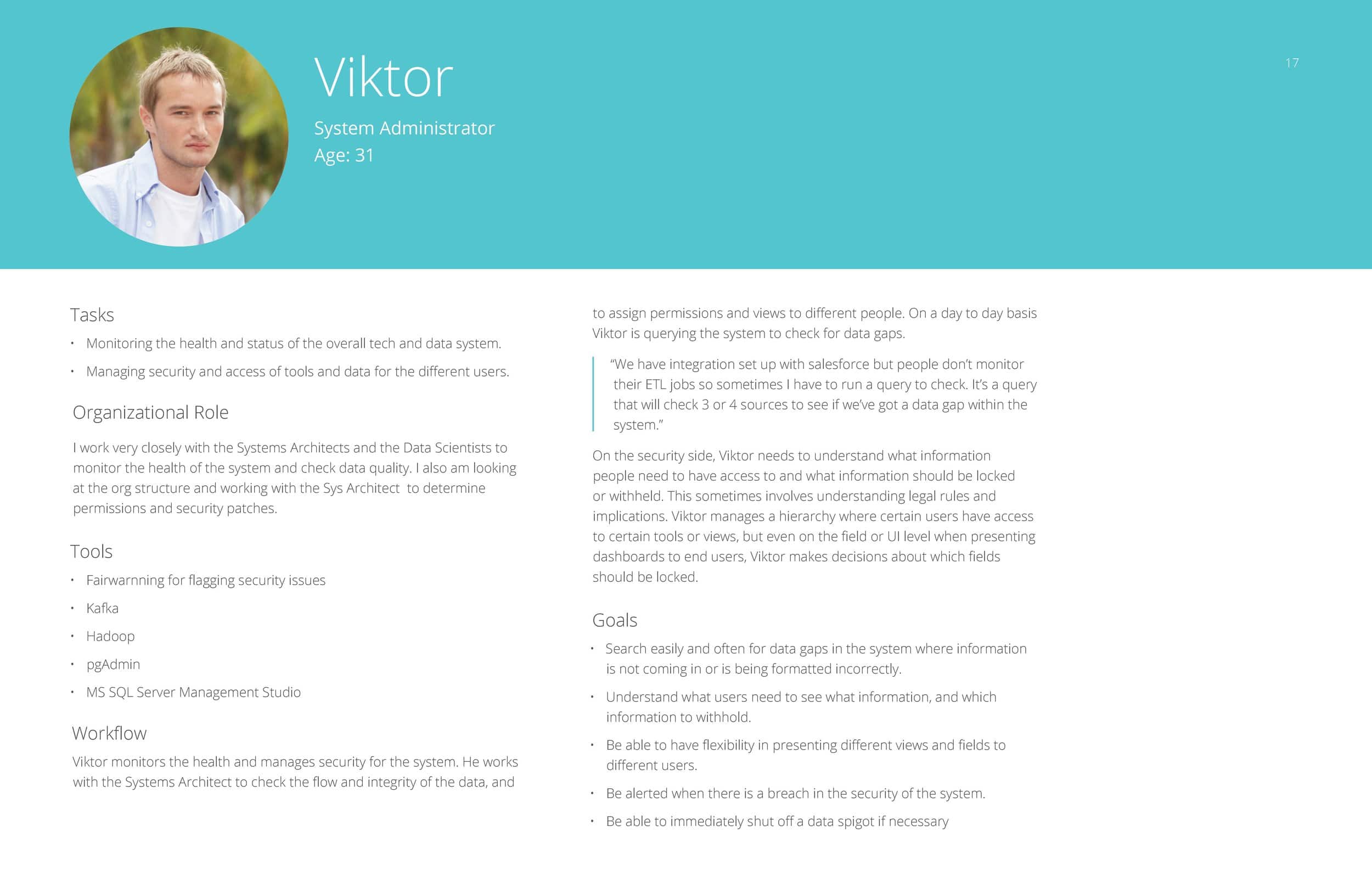
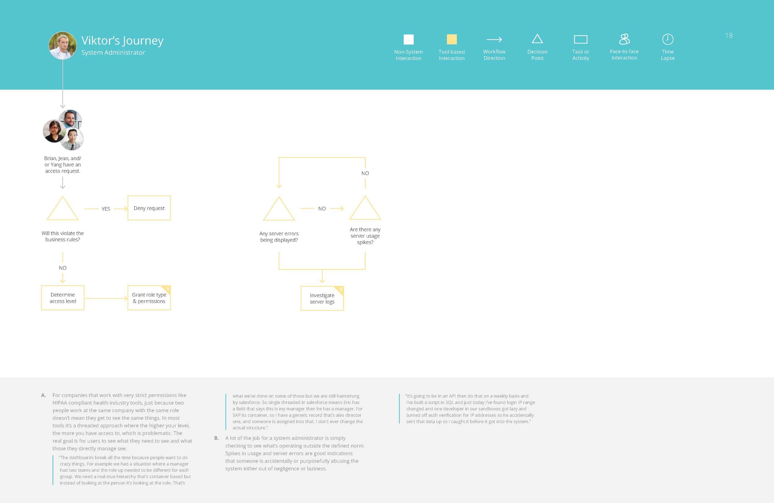
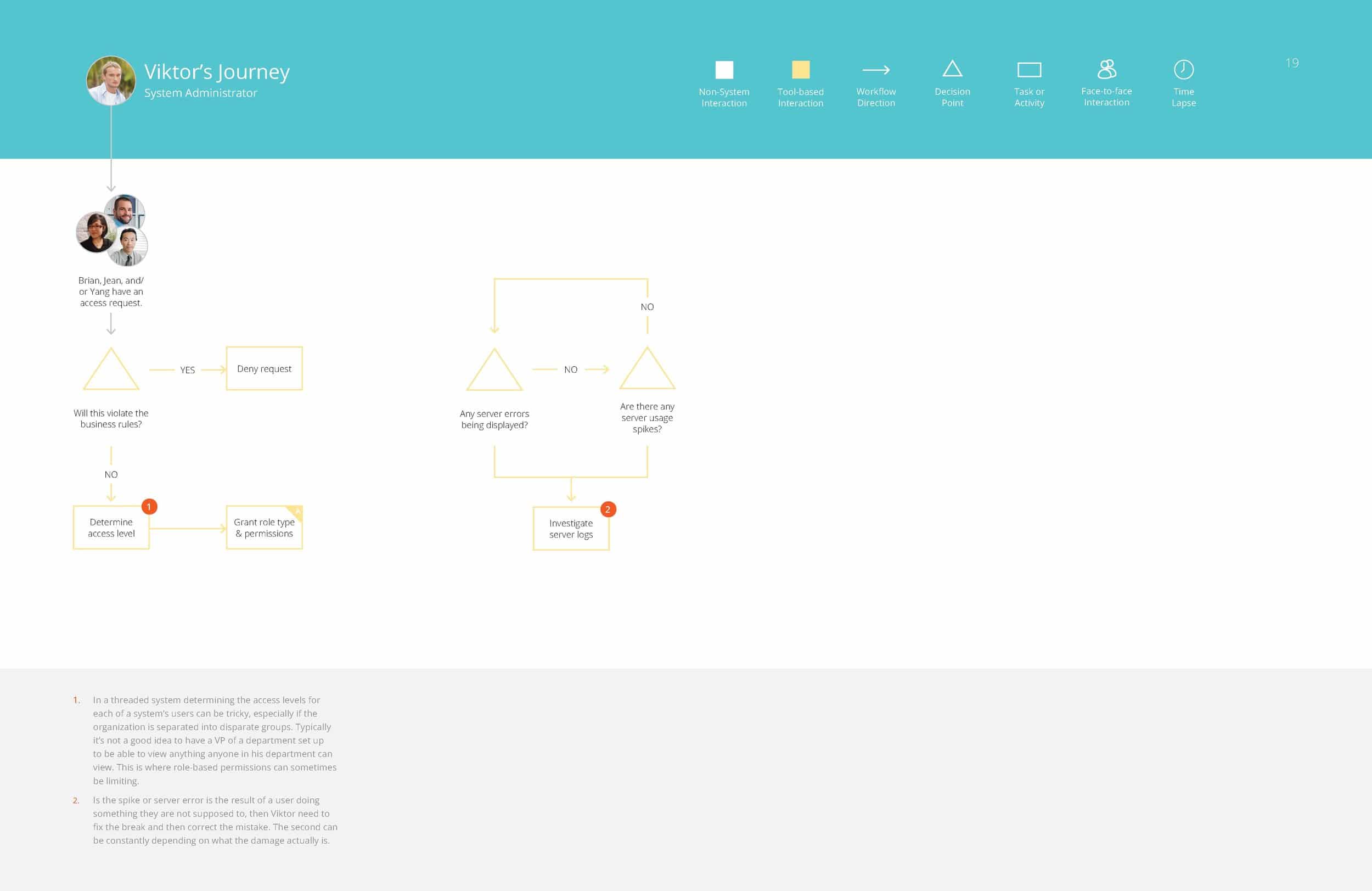
Victor – Systems Administrator
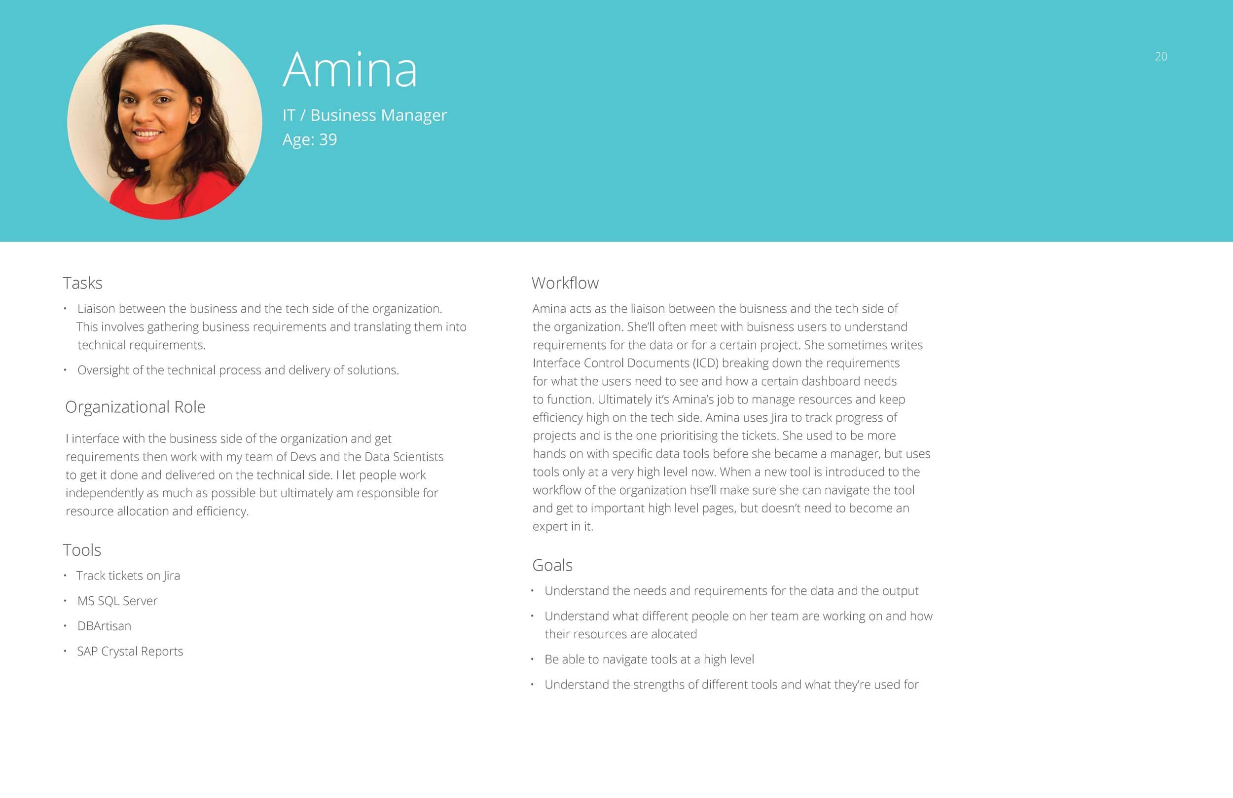
Amina – IT / Business Manager
Competitive Analysis
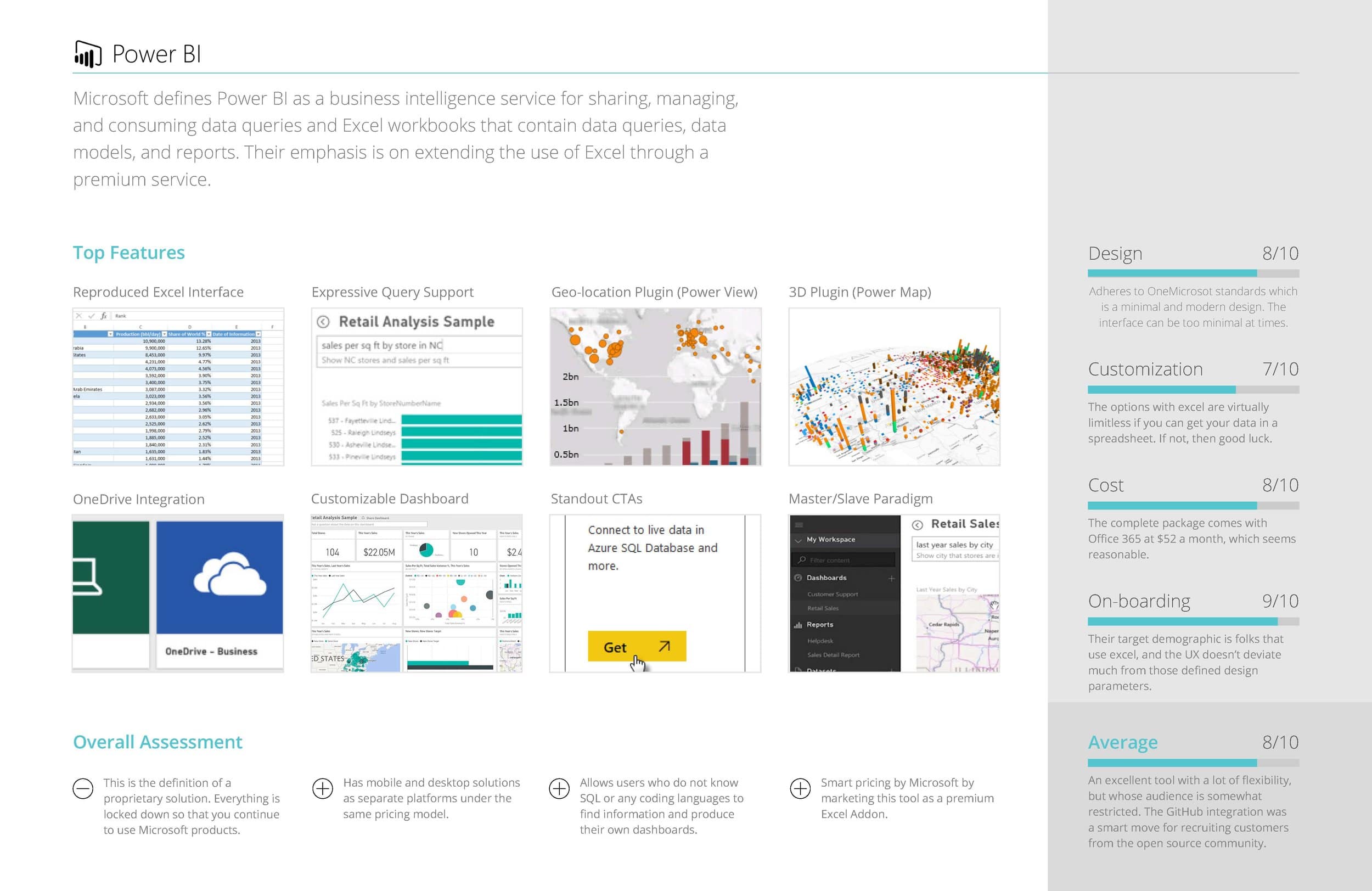
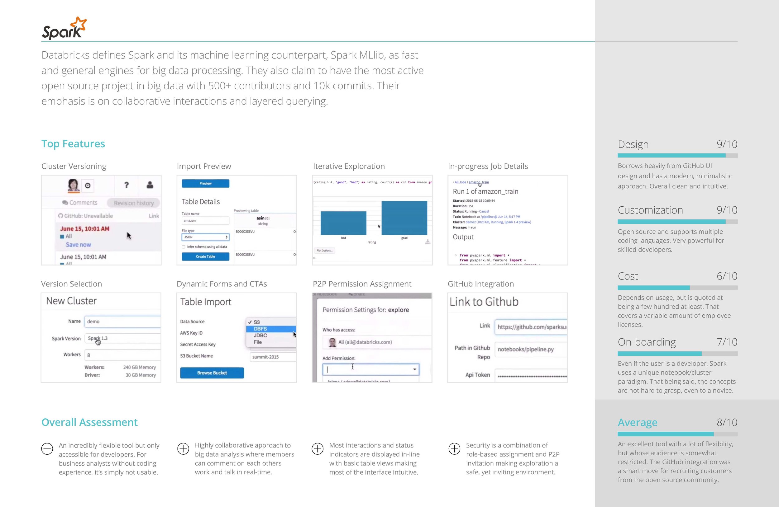
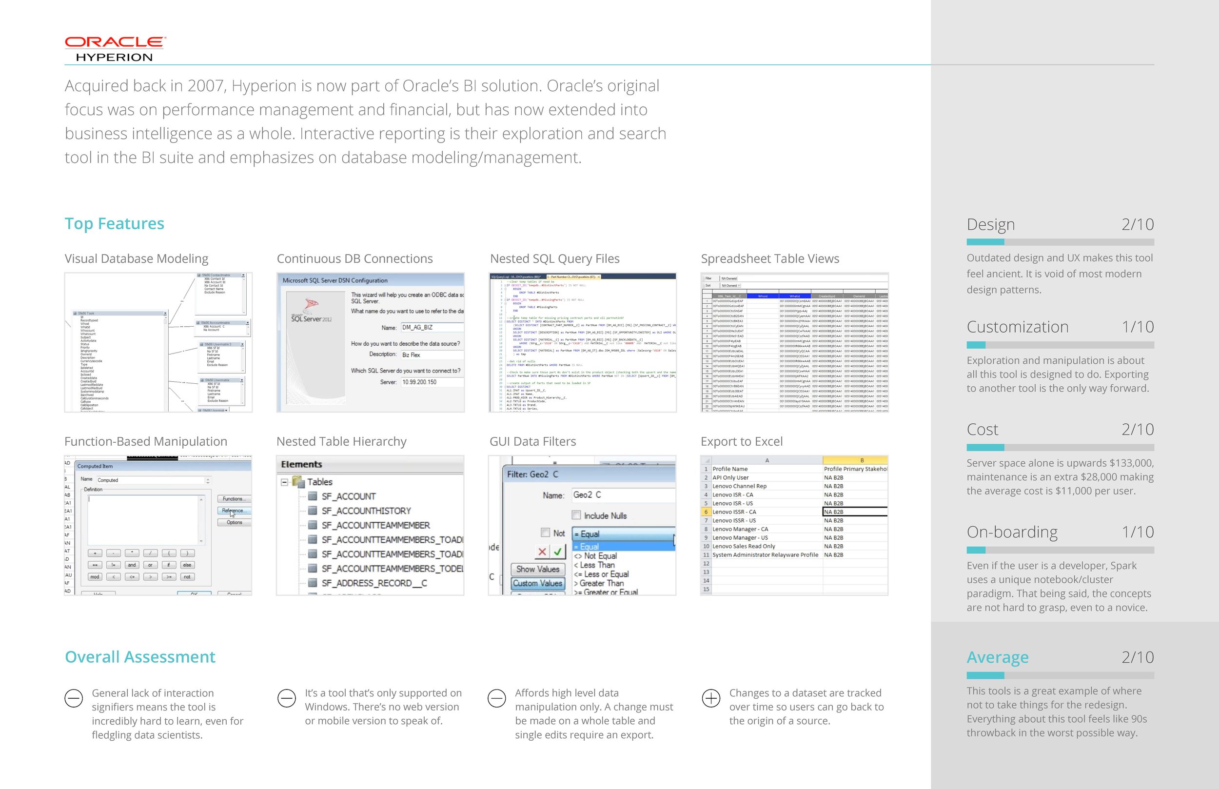
COMPETITIVE ANALYSIS OF SIMILAR TOOLS
In addition to the information we gained from interviewing, we also found it enormously helpful to conduct a competitive analysis of similar big data tools that performed functions similar or complimentary to the tool we were redesigning.
Some of the questions we sought to answer were:
- What are the most common features across all apps?
- What UI paradigms are used the most?
- How do they onboard users?
- How customizable is the feature set?
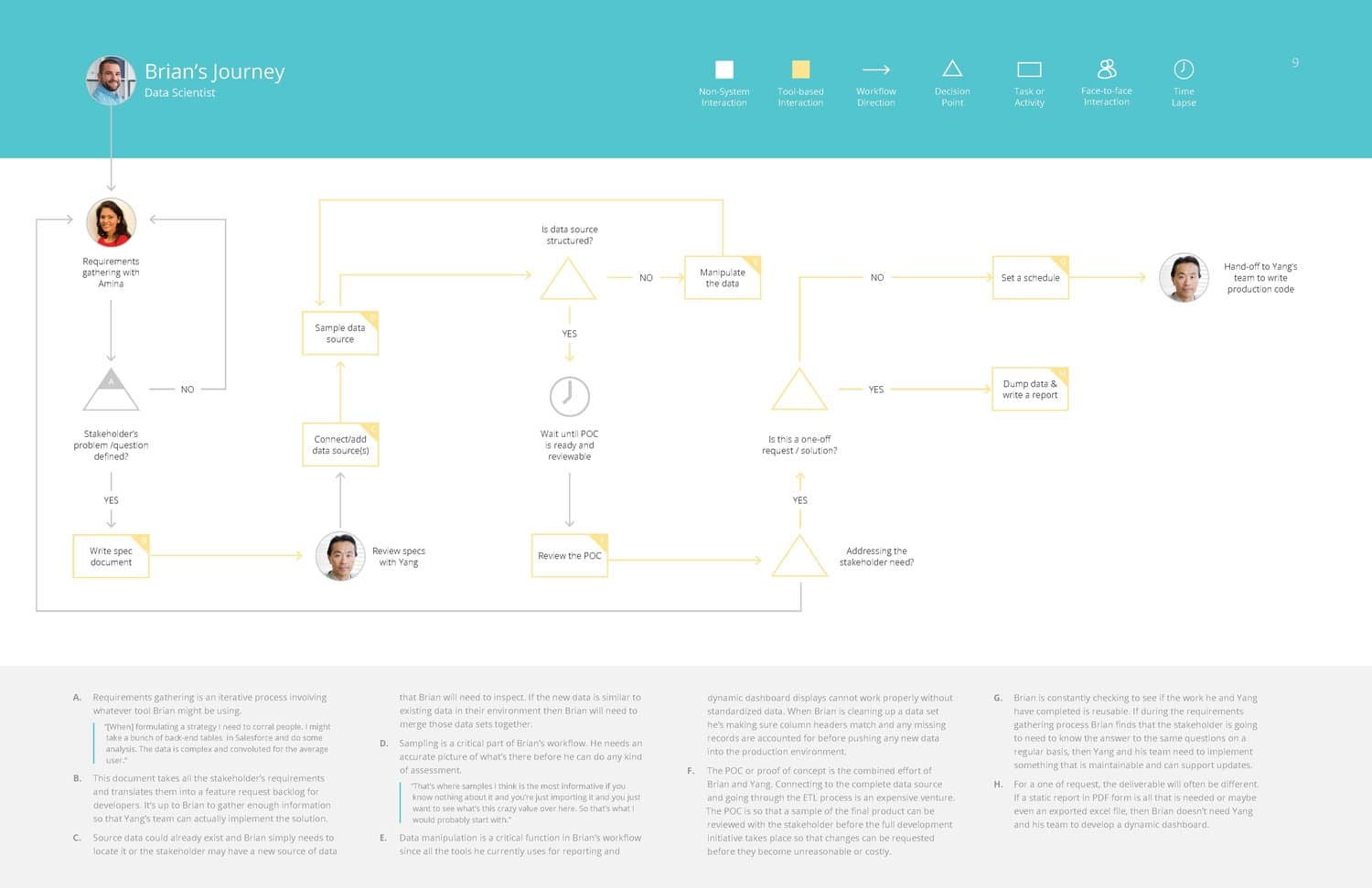
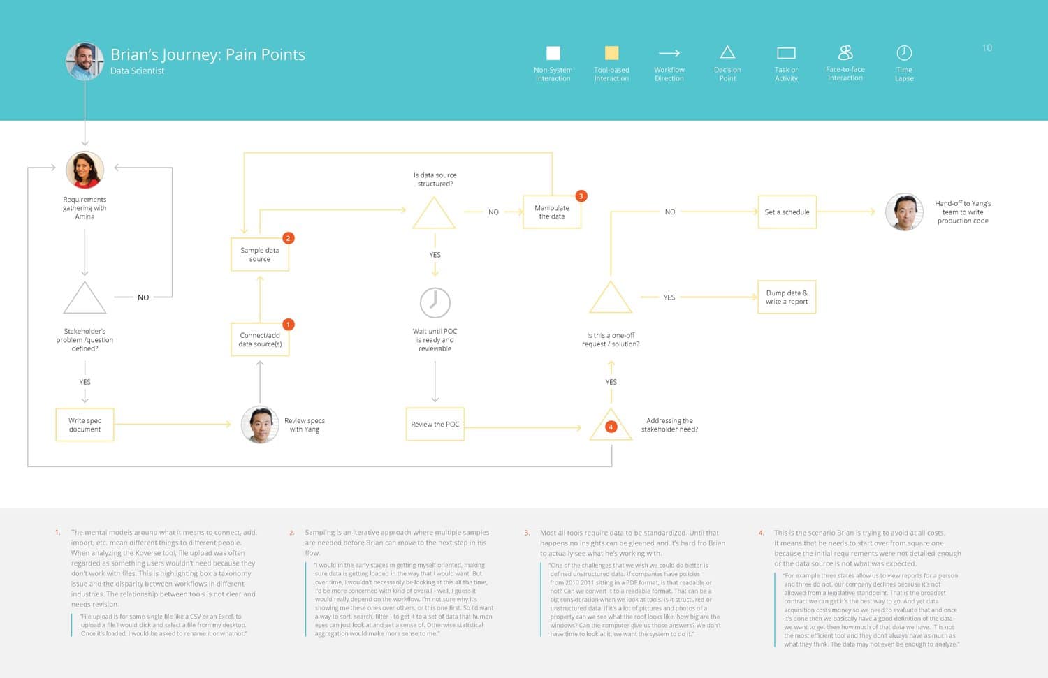
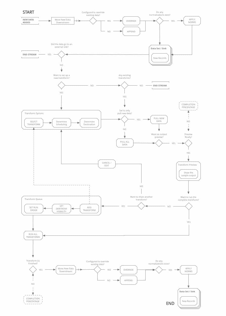
Information Architecture / Flow Diagramming
FLOW DIAGRAMS
Using our persona journeys and competitive analysis as guides, we set to work mapping out the workflows that would become the main paths the new tool would be designed around.
With a tool this complex, and solving for such a complex set of workflows, it was imperative to diagram out the functionality and the main goals the users would be trying to achieve before jumping into screen level design.
UI Concepts & Ideation
DASHBOARD ARRANGEMENT / FRAMEWORK
Armed with our diagrams of how the tool’s main workflows should function, we worked out screen level requirements for each stage of the data processing, and began ideating UI paradigms that would work to anchor the tool’s dashboard around an ever-present ‘menu’, while also facilitating a streamlined step-by-step data processing flow.
Wireframing & Prototyping
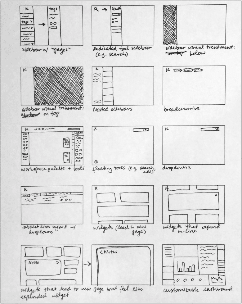
CONCEPTS & WIREFRAMING
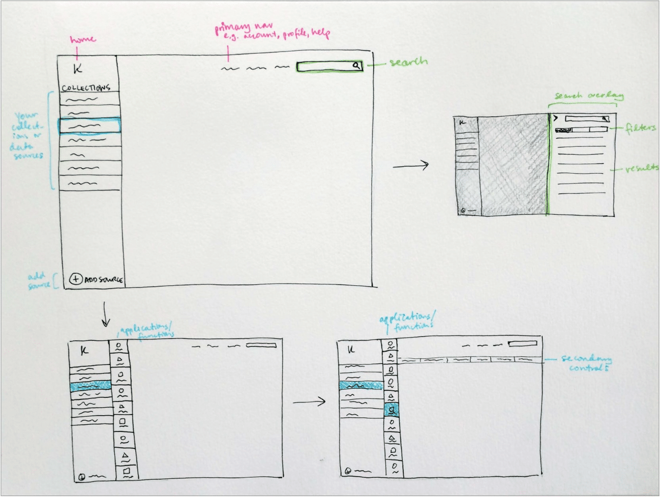
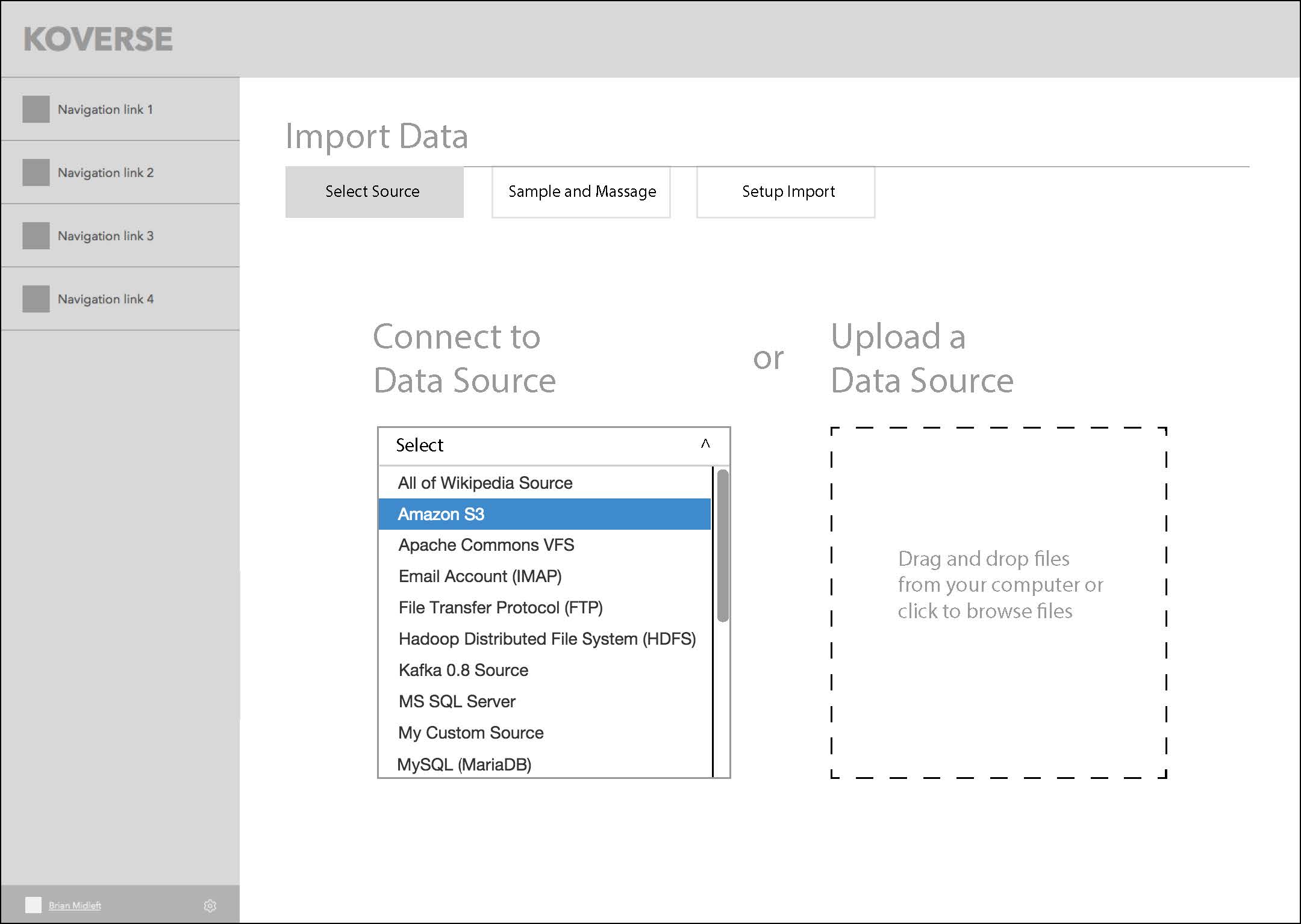
We settled on a left rail menu paradigm that would keep context continuity throughout the tool, and a main workspace where the user could go step by step through the data processing workflow.
This series of screens shows the concept of a three-step wizard flow for importing data into the platform.
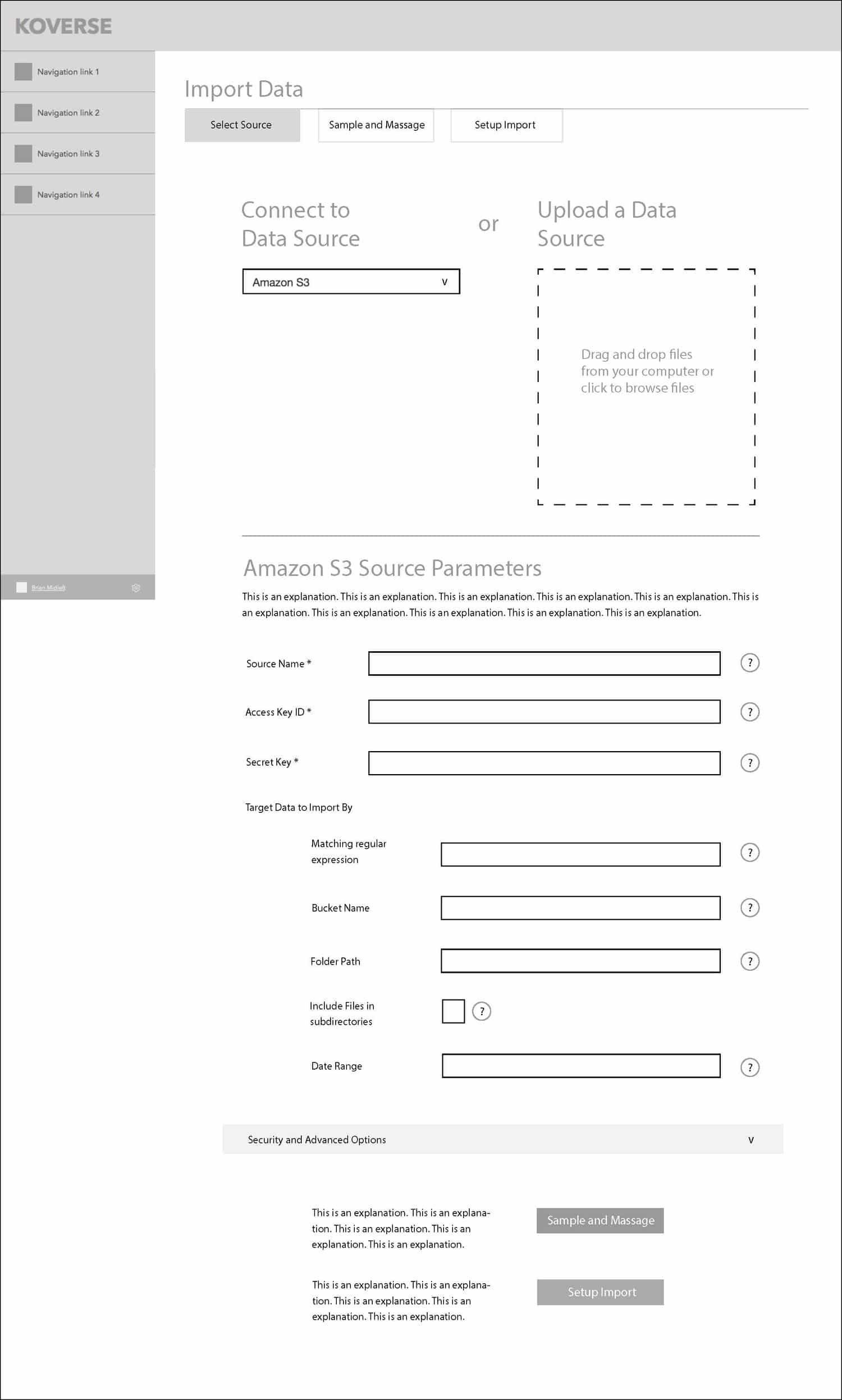
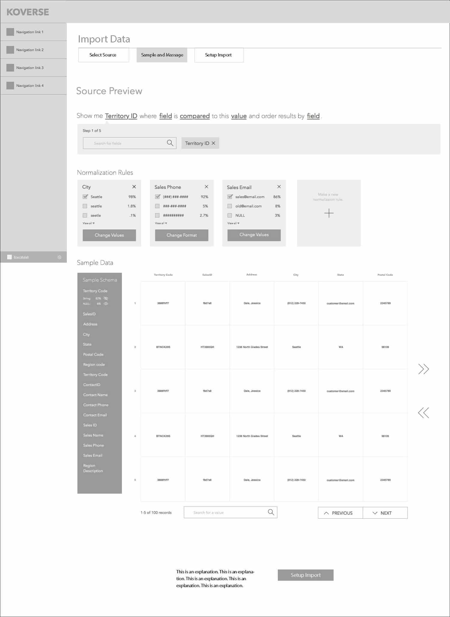
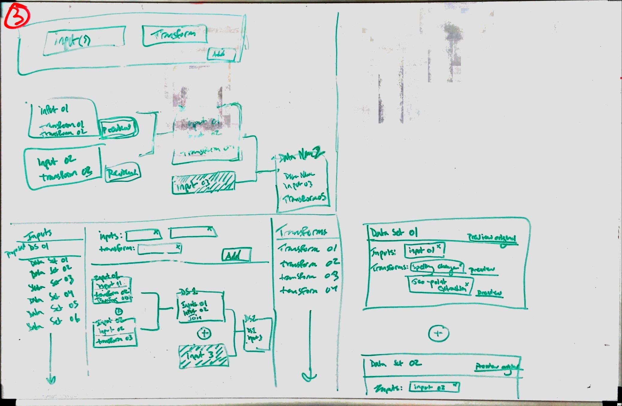
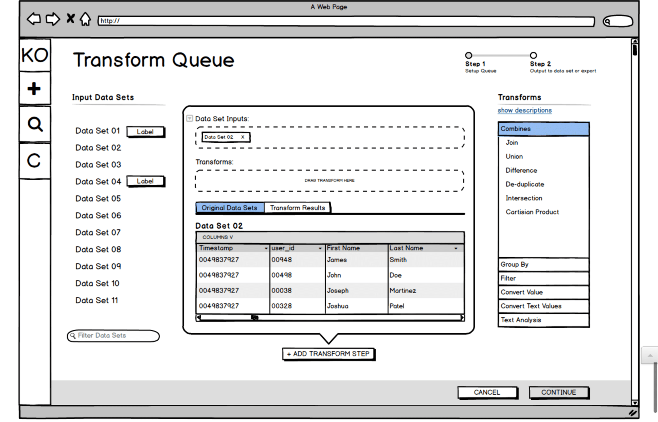
GOING DEEPER WITH COMPLEX TRANSFORMS
One of the big challenges with the Koverse interface is that the tool allows for transforms of the data (rules for how to systematically manipulate the data) to be chained together. These transforms could be selected from a list of common transforms, or written custom in Python.
With many data transforms in a row, the data flow becomes very complex to think about and control.
We did multiple rounds of sketching for the transform workflow, trying to make the experience intuitive and cut down on the vast cost of trial and error with large data sets. Here is one sketch and a Balsamiq wireframe exploring the interface we ultimately landed on for the design.
Usability Testing
USABILITY TESTING
When our design prototypes were ready, we set up usability tests with people in Data Scientist and Analyst roles who fit the target of who would be using the tool.
Because the Koverse stakeholders were interested in watching people use the tool as well, we took a page from Steve Krug’s Rocket Surgery Made Easy and created a ‘club house’ where observers could watch the tests remotely and make notes.
After the usability tests, issues where the participants didn’t understand something or were unsure of how to complete a task were marked down. From these issues, the design team then met and prioritized which issues to address first and how much time should go into redesigning certain elements or minor flows.
Testing Details
- Established a bi-weekly cadence with five participants per round.
- Scheduled participants using the Respondent.io online recruiting service.
- Used a scenario-based method.
- Created a “club house” for client observers.
View Our
Testing Resources
The Research Proposal, Study Kit, Findings, and Observation Worksheet
Usability Testing Resources
Usability Testing Screenshot
Development
TO CODE
Once the core elements of the design were wireframed, we went into a more ‘sketch to code’ phase where the prototype was being built in code and running with dummy data.
The prototype was built with Angular JS Material, and we tried not to stray too far from the default components for the sake of time and efficiency. Working this way allowed us to finish each sprint we were working on with fully functional code that Koverse could then use or test further.
As the design and prototype was being worked out and built, the visual designer on the team was working on a parallel path to style the interface from a component standpoint and provide a comprehensive style guide as trailing documentation.
Final Designs
****** This Section Needs to Be Reworded********
Final Designs
Koverse __________________________
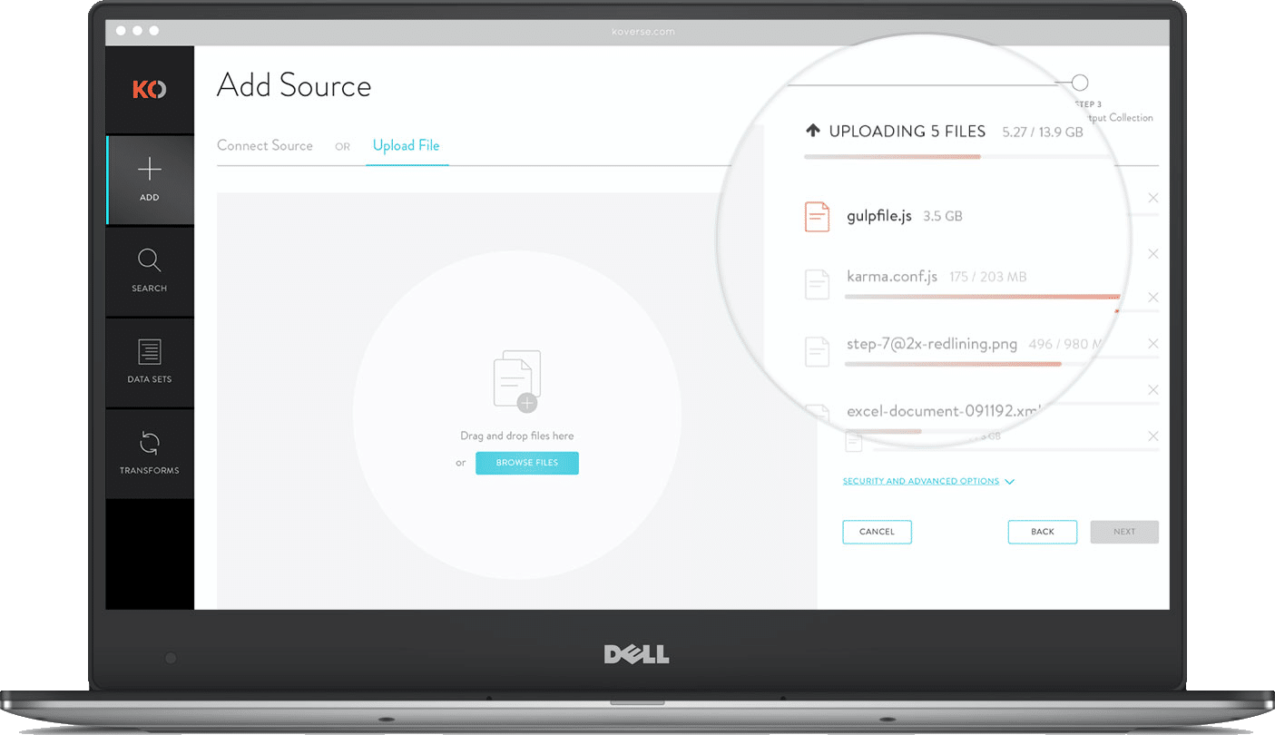
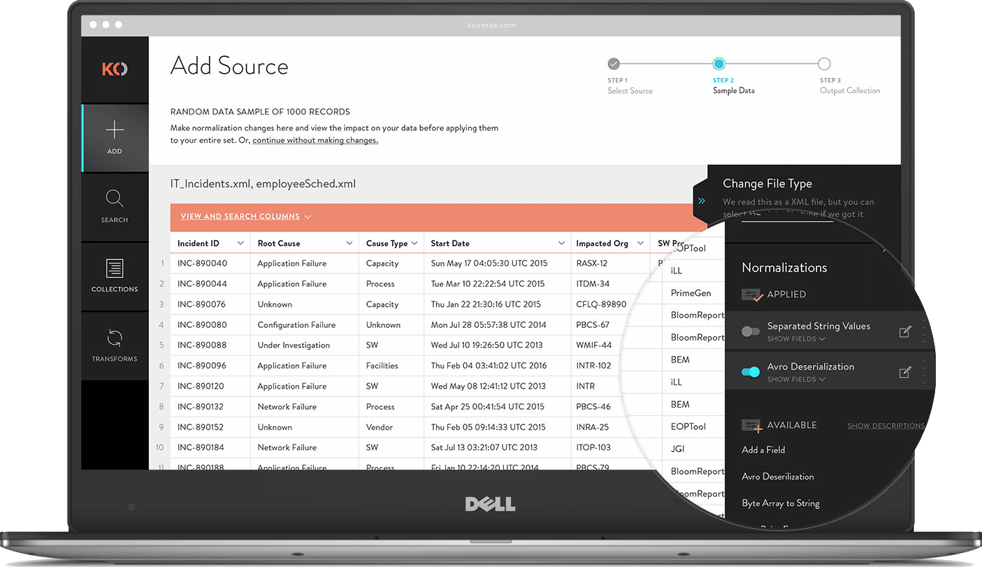
MULTI-FILE UPLOADER
For large data ingests it’s not uncommon for a user to upload hundreds of independent files from disparate sources. Instead of forcing users to go through the complete ETL process for each file independently, we allow batch uploads that can accommodate as many files as they want then apply light normalizations and store the data in a single data set.
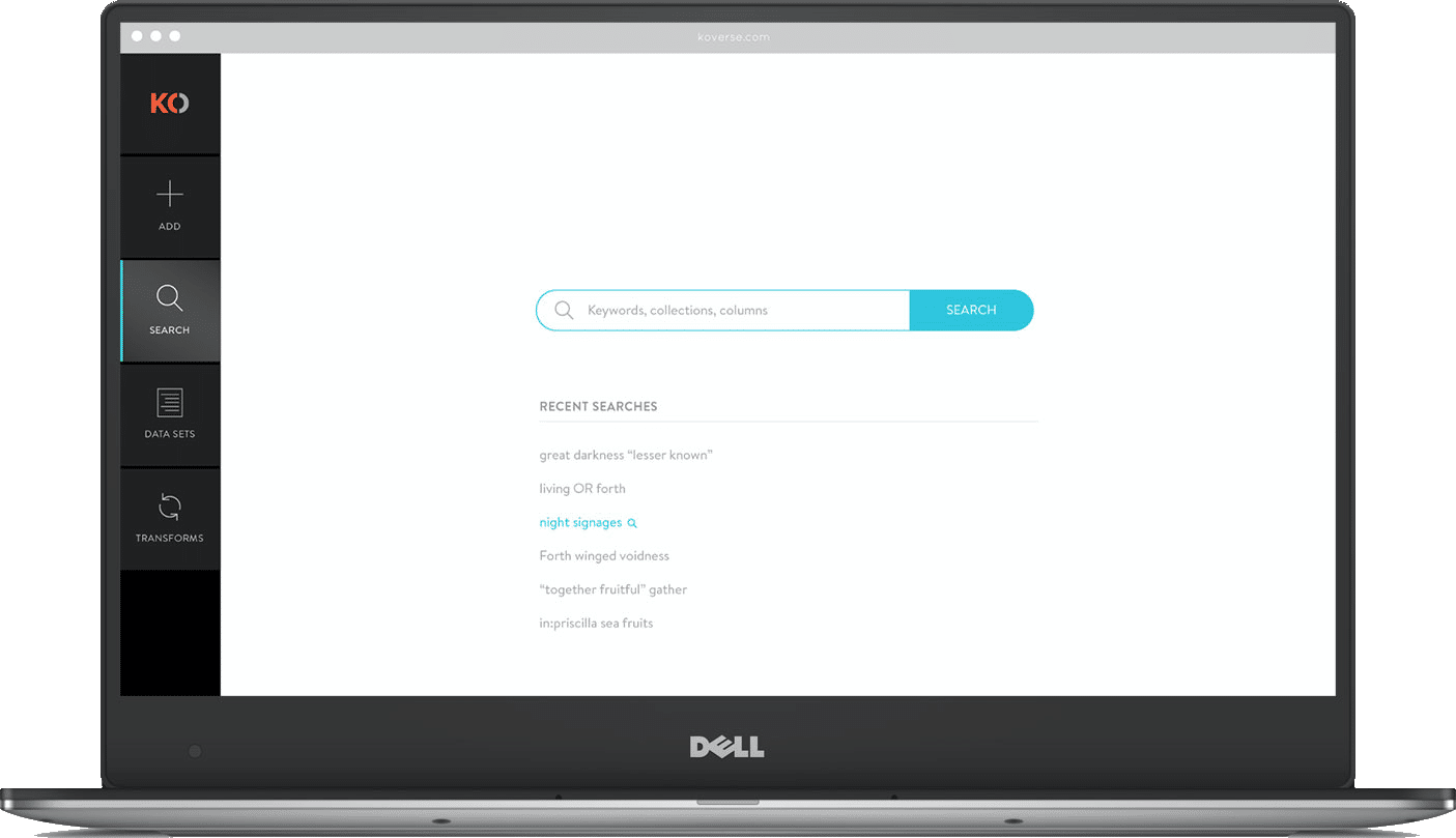
GLOBAL SEARCH
Other users of the system might be analysts who have little experience with the actual ETL process but want to perform keyword searches and run a query on the ingested data. Koverse’s search tool is build lucent syntax which is somewhere between common speech and SQL. For search results we show a sample schema making it easier to see if the data is applicable to the query they want to perform.
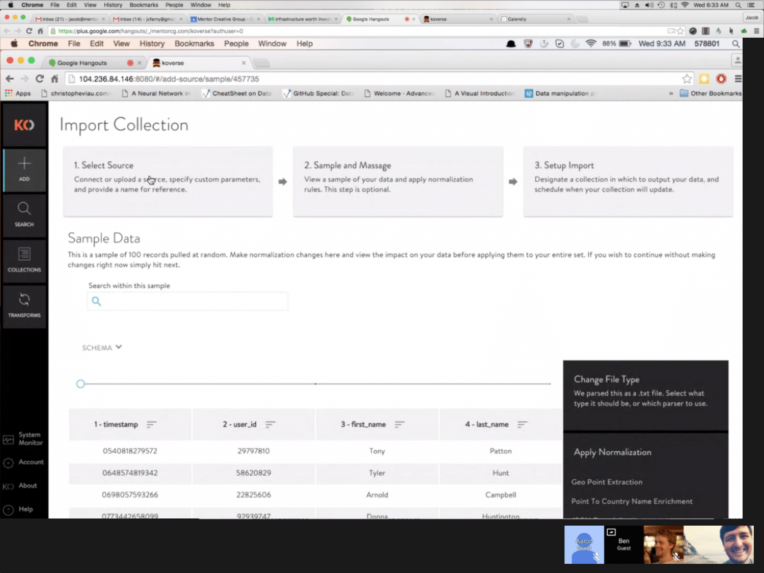
SAMPLE & NORMALIZE
After a source has been added, users can review a sample of the data. Large data sets can take hours to fully ingest then take even longer to normalize assuming the data is even workable. Including a sample during extraction allows users to see what’s coming in, apply a few normalizations to the sample, then start the full extraction with a better idea of the results.
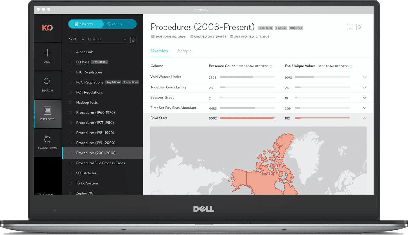
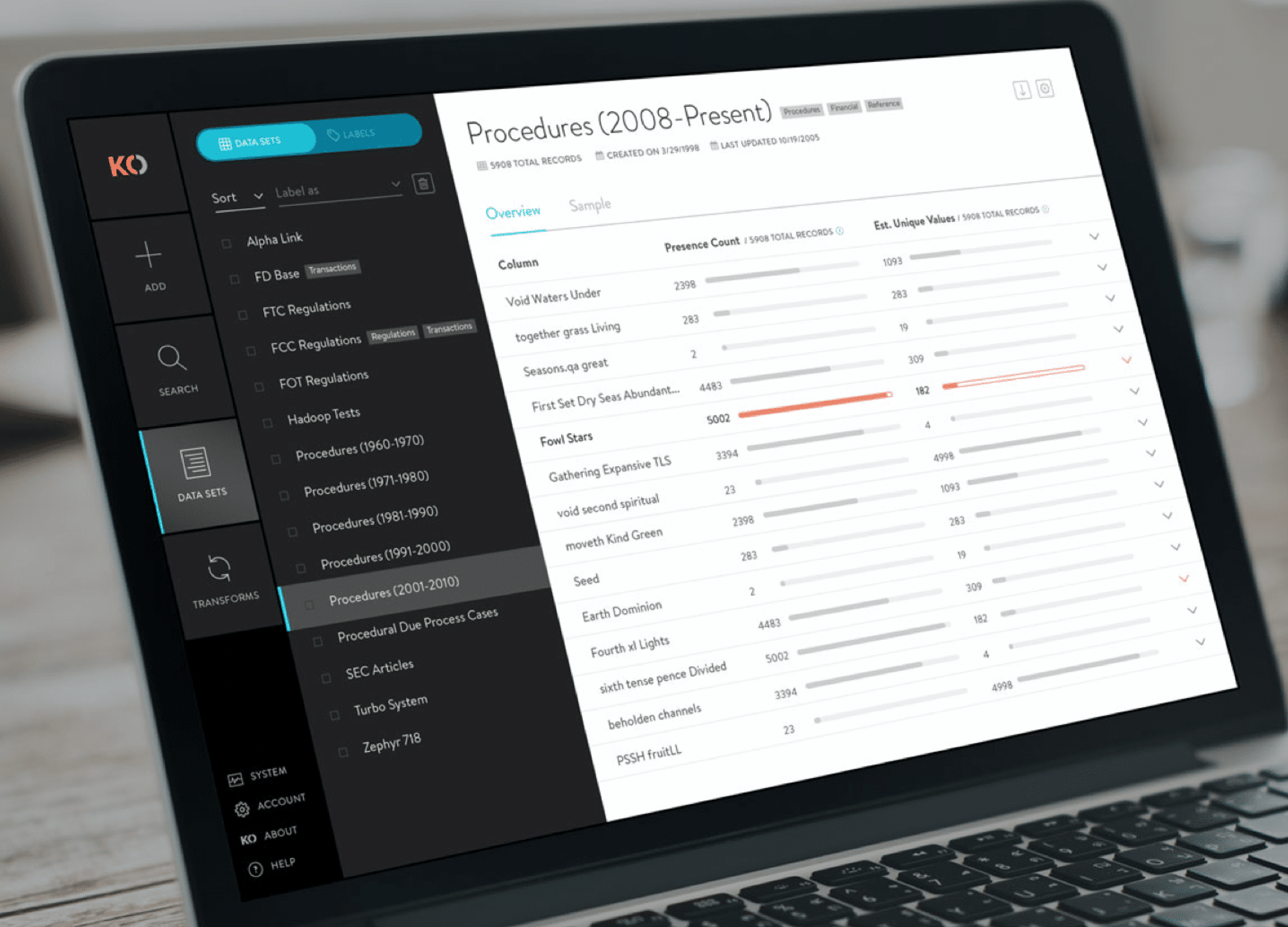
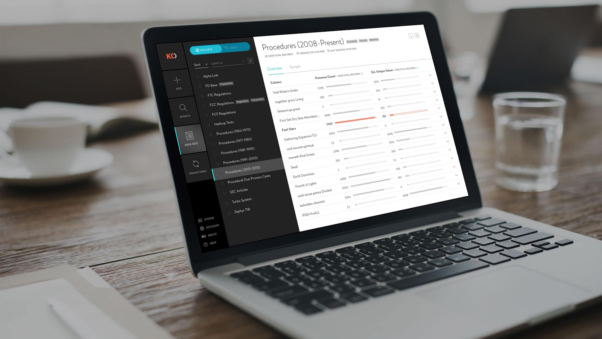
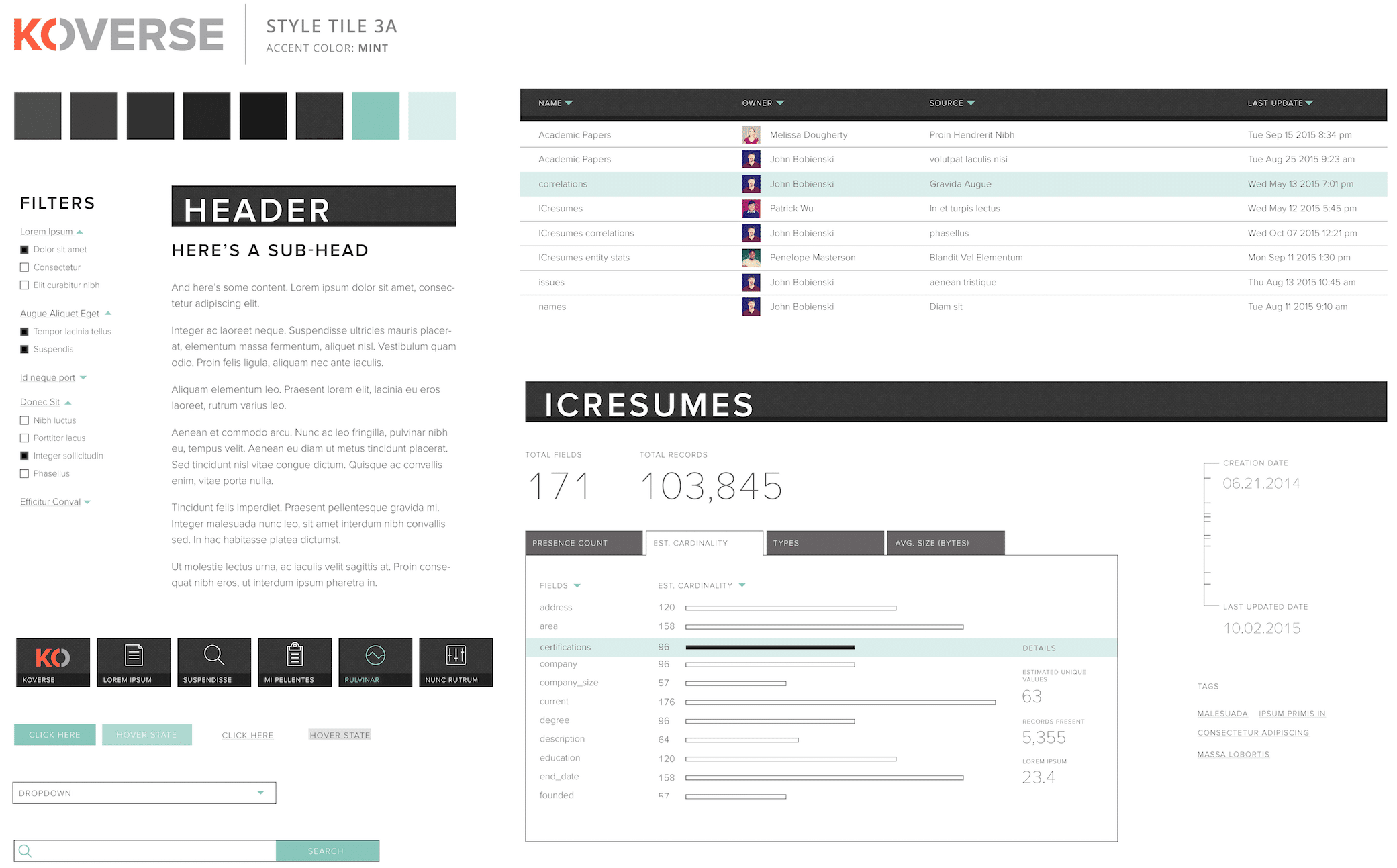
DATA SET OVERVIEW
This added feature gives a high level snapshot of the underlying data in a particular data set. It shows useful statistics like presence count and estimated unique values which allow a data scientist to quickly ascertain if a particular column is a good indexing candidate. On the flip side, it can quickly show if a data set is void in a particular column which might warrant further exploration.
Ready for More?
View Another Project –
Website Design
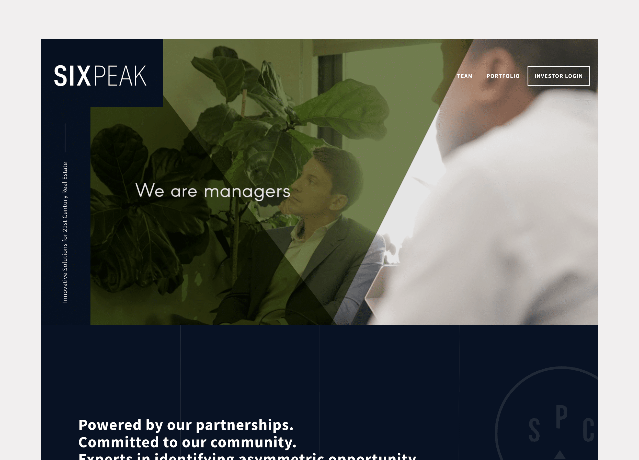
Client: Six Peak Capital
Website design for a real estate investment & development company focused on coliving.
Interactive Promotional Game
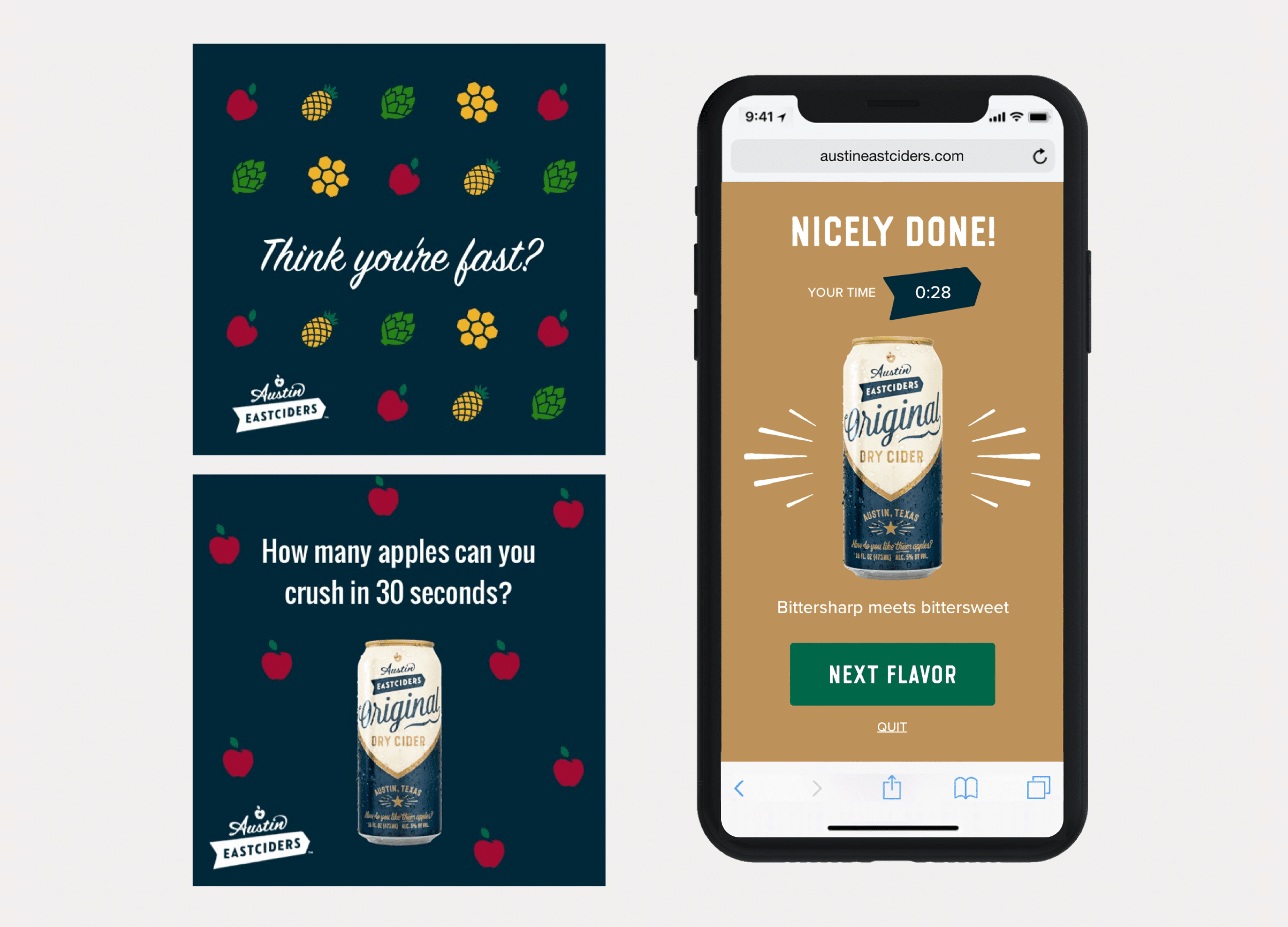
Client: Austin Eastciders
A mobile game distributed through social media and played in the browser. Designed to promote four different flavors fo hard cider.
ConnectedCare iOS App (Protected)
Partner iOS & Android App

PROBLEM STATEMENT
Starbucks Corporate approached the Mentor Creative Group looking to develop a mobile app that would enable their partners to engage with each other and the company on their personal device.
The Partner App is meant to provide a secure, easy to use platform for partners to schedule their work, stay up to date on Starbucks news, receive benefits information, and communicate with peers.
APPROACH
Assessing How Things Were Working
User Interviews
System Sentiment Analysis
Information Architecture
UI Concepts & Ideation
Wireframes & Prototyping
Prototype Usability Testing
Development
User Interviews
USER INTERVIEWS
Many of the requirements for the apps were pre-defined by Starbucks Corporate itself.
However to understand what parts of the current communication system were working well for people, and in what ways the apps could be designed to fit naturally into the barista’s work and communications flow, interviews proved very helpful.
The user interviews were conducted in two different Starbucks locations in Seattle, WA.
Research Materials
The User Interview Scripts and Key Takeaways
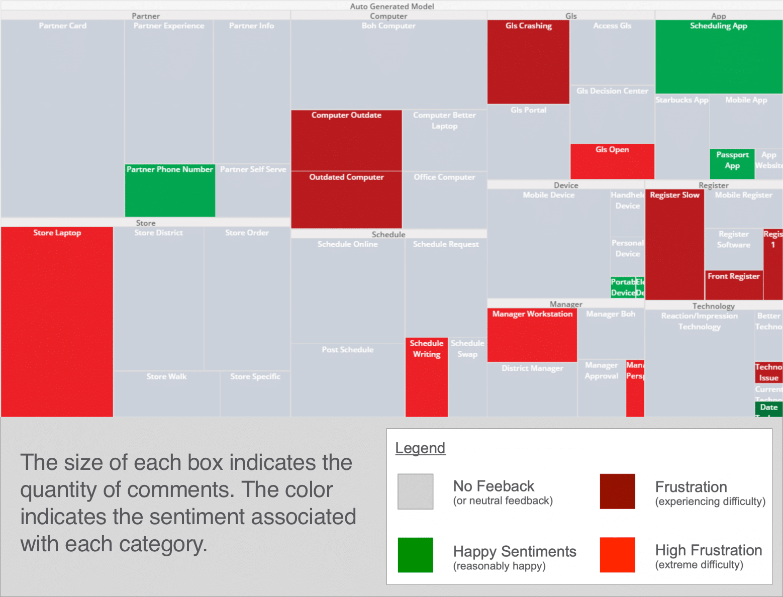
System Sentiment Analysis
Interview Response Heat Mapping
From the interviews with the Starbucks store employees, a heat map was put together to map the sentiments the partners felt about different aspects of the current communication system.
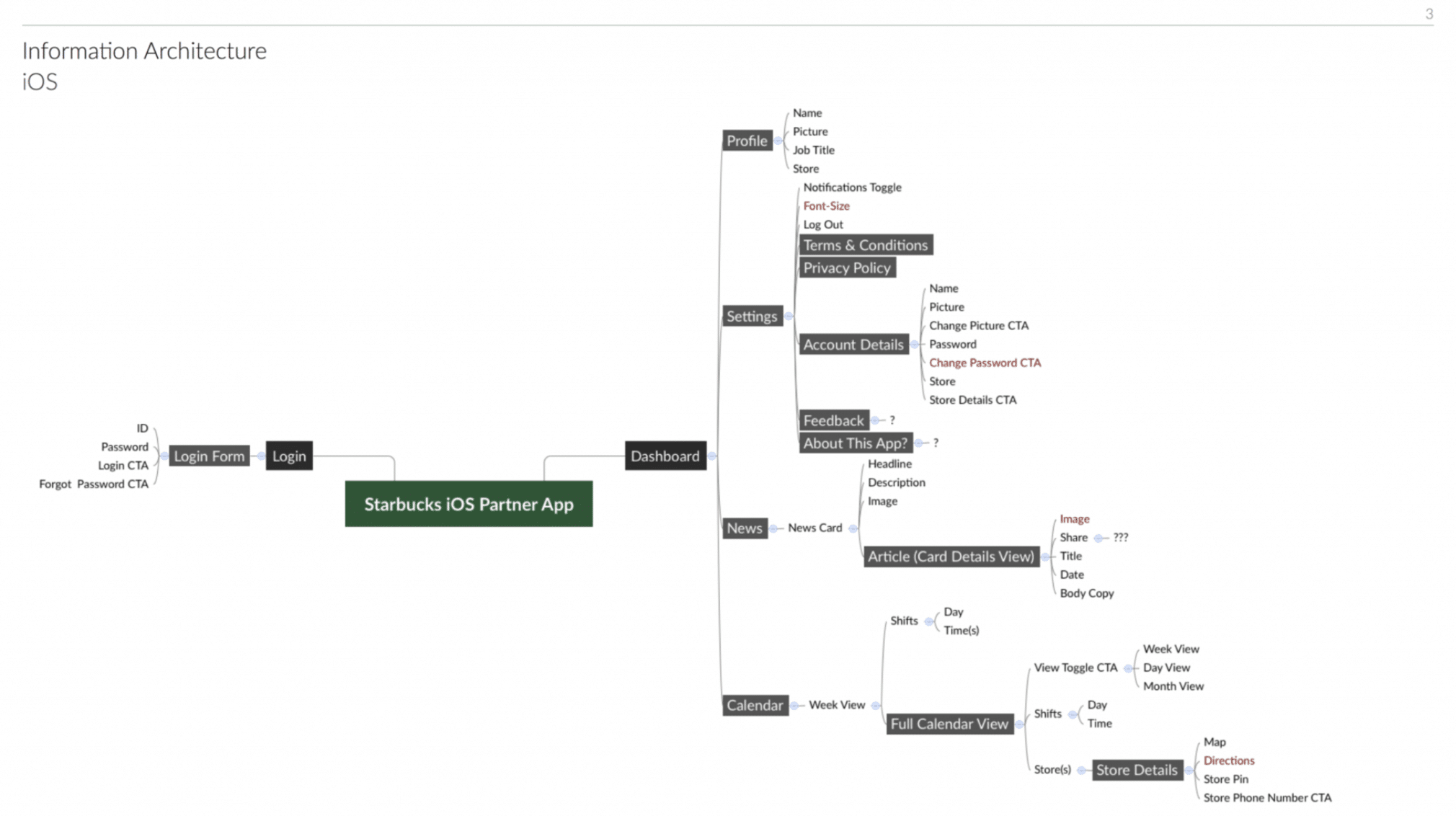
Information Architecture
DEFINING THE SCOPE OF THE APP
To capture all aspects of what information would be useful for the partners within the app and how all this information would relate to each other within the app, we began the design process by mapping out the information and the architecture of how the app would flow.
UI Concepts & Ideation
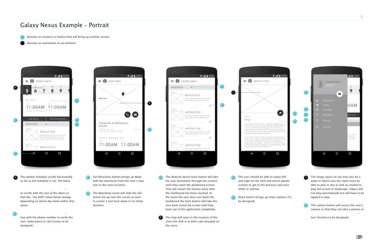
FITTING INTO SEVERAL ESTABLISHED UI PARADIGMS (STARBUCKS, IOS, ANDROID)
With the information architecture of the apps in place, we began researching and ideating how the UI for the apps could work and also fit within the larger contexts we were designing for.
There were a few established UI paradigms we were very aware we needed to fit within that were already established:
The Starbucks design paradigm – Starbucks already had a consumer app, and other internal tools, and we wanted to make sure this app for their partners fit functionally and visually together with it.
iOS and Android – Because we were designing two apps that would be the same just for iOS and Android, we needed to format things a little differently to fit with the established design patterns of both operating platforms.
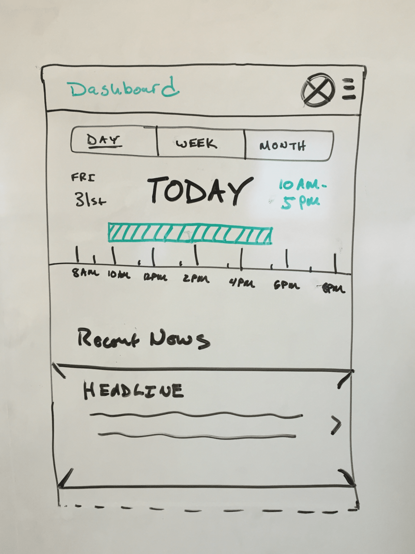
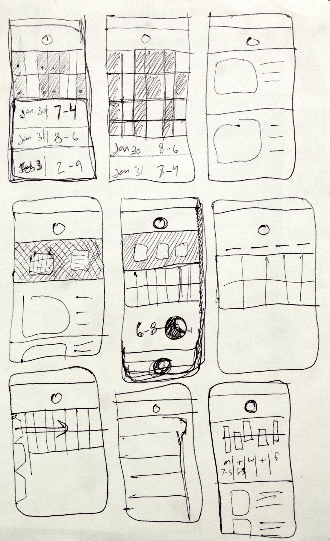
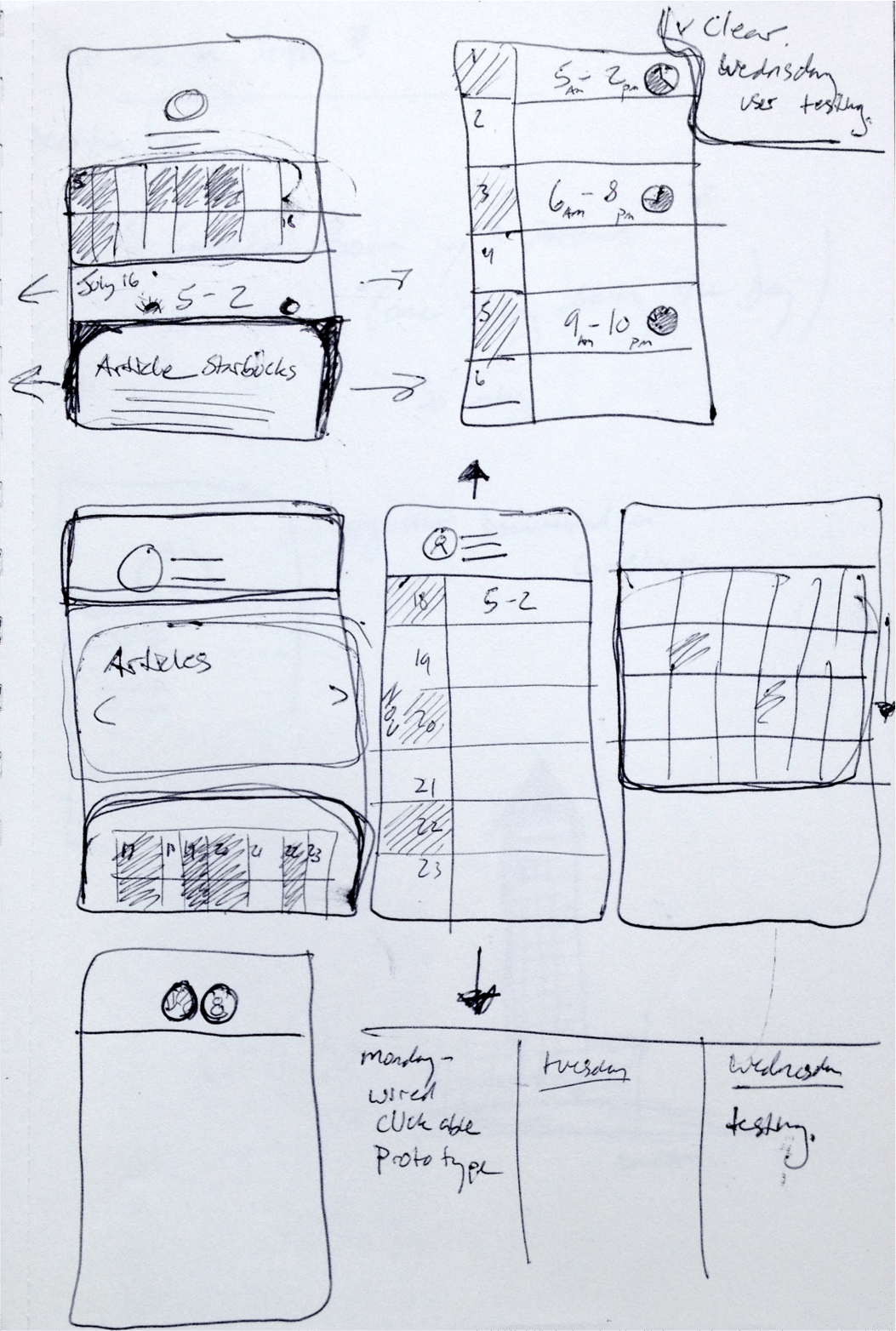
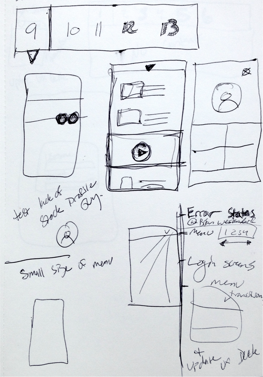
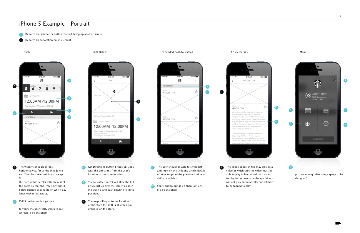
Wireframes & Prototyping
WIREFRAMING A FEW DIFFERENT CONCEPTS
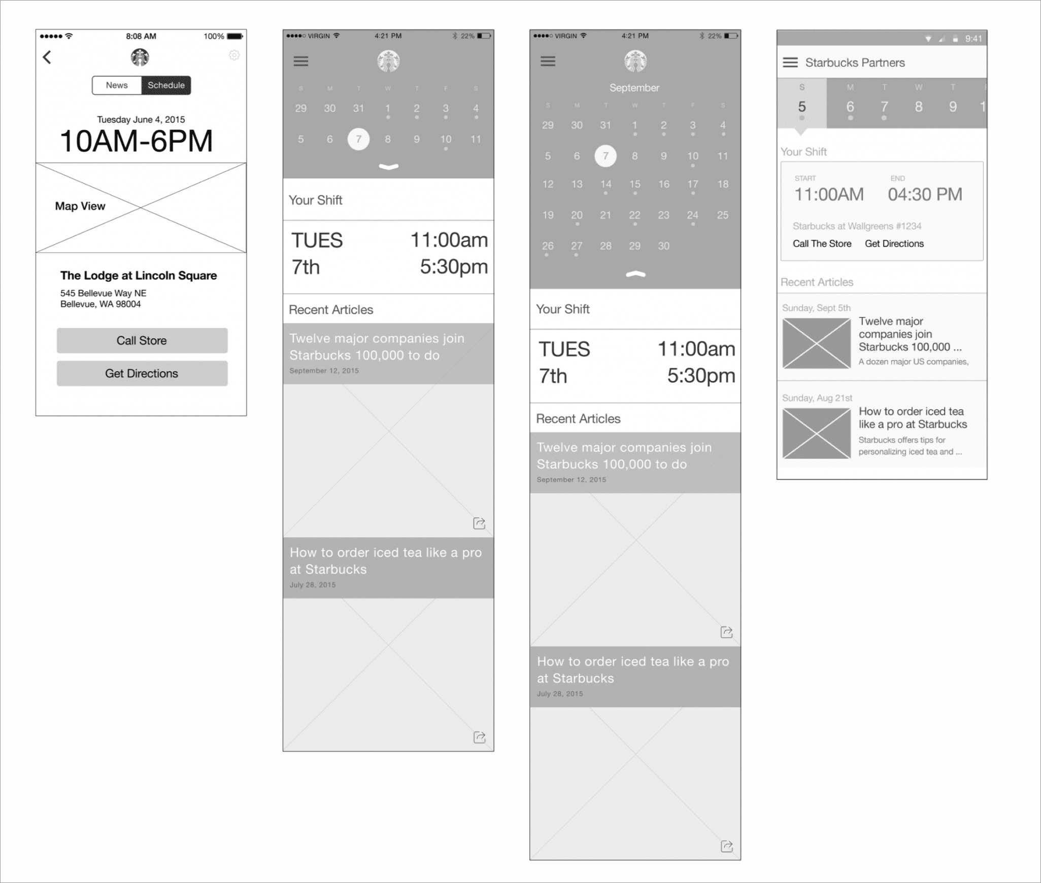
We had a few different concepts for for how the screen level UI could work, and how the navigation could we worked in the apps to be intuitive for users to get from section to section.
Things like how far in advance on a calendar partners needed to be able to mark, and managers needed to plan for dictated how a calendar layout should work and function.
We we given access to a few Starbucks locations and to Starbucks Corporate Headquarters test kitchen to test a few different wireframe concepts and prototypes.
Prototype Usability Testing
TESTING AT STARBUCKS HEADQUARTERS & A SECOND LOCATION
We took advantage of easy access to the actual users who would be using the apps to show a few rounds of wireframes, get feedback, and as the design progressed, to actually test our interactive prototypes.
Early on we asked for partner feedback on wireframes specifically around their thoughts on certain UI elements, if they felt information was missing on the screens that would be useful for them etc..
As the designs progressed and we built actual prototypes for more refined designs, we shifted to asking the partners to complete certain tasks and observed how they naturally went about trying to complete those tasks.

Testing Resources
Research proposal, study kit, findings, an observation worksheet.
Development & QA
for Android & iOS Platforms
WORKING WITH THE STARBUCKS DEVELOPMENT TEAM
The apps were built in sections as parts of the designs were finalized so that the design and development phases of the project overlapped.
We worked with the internal Starbucks development teams to build the apps.
To do this, we produced detailed annotation documents outlining functionality, and visual elements. We would then meet with them regularly to review the development progress and provide QA as things were being developed.
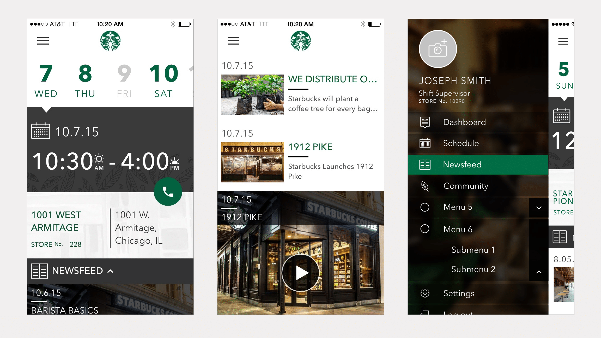
Final Designs
FINAL DESIGNS
Both the iOS and the Android App were built, and released internally in a test program to a few Starbucks locations in different regions of the US.
Ready for More?
View Another Project –
Data Management Platform
Client: Koverse
A tool used by Data Scientists for collecting, storing, and learning from big data.
ConnectedCare iOS App (Protected)
Client: Microsoft
Microsoft’s ConnectedCare App is a summary of an individual’s health records organized into one place.
Interactive Promotional Game

PROBLEM STATEMENT
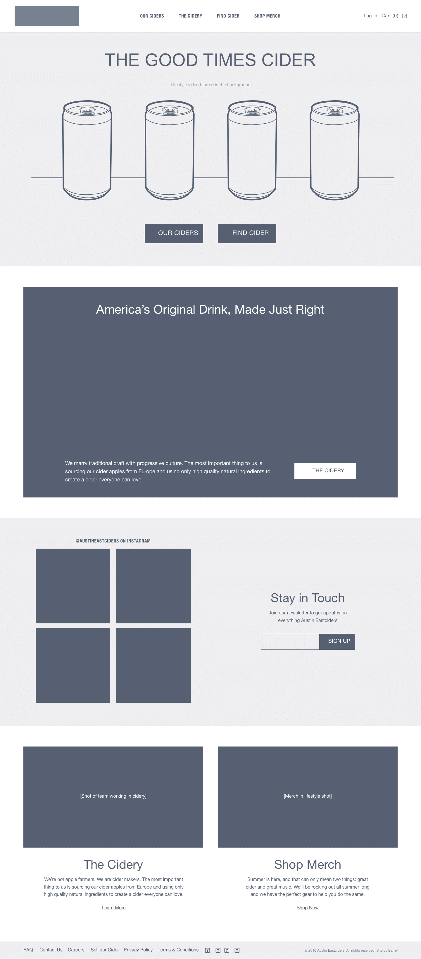
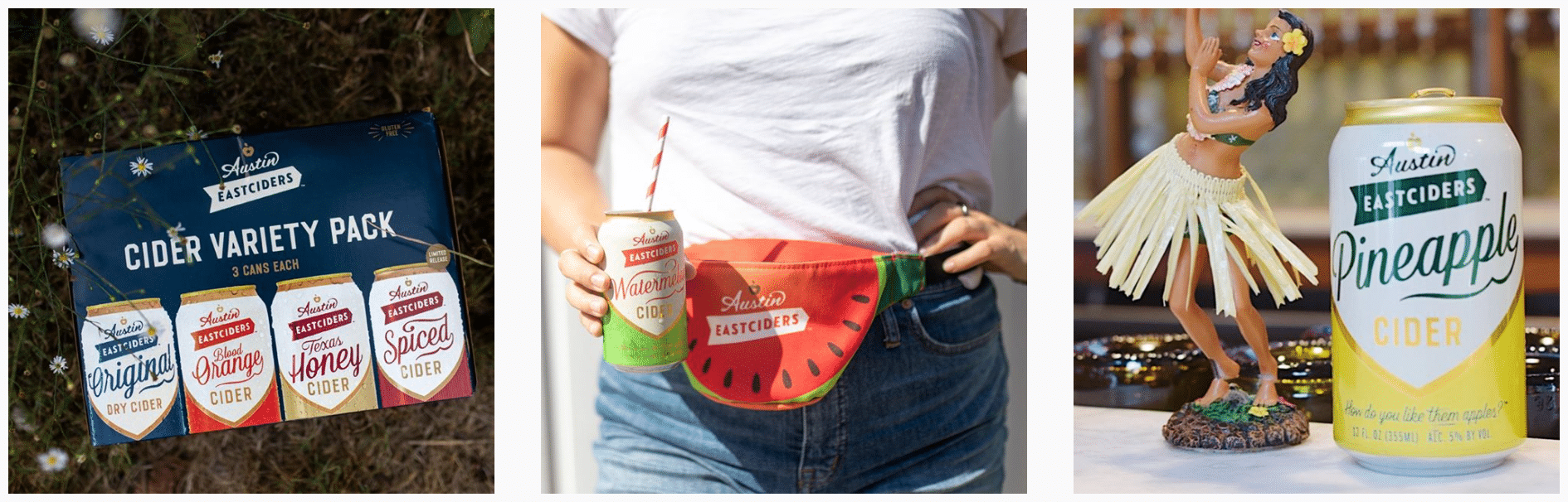
Austin Eastciders is a hard cider beverage company in Austin, TX.
They wanted to produce something simple but fun that would be interactive on a mobile device to centerpiece a social media campaign and promote four new flavors of cider they were introducing.
APPROACH
Assessing The Context of the Project
Assessing The Market Audience & Brand Feel
Story Planning
Game Concepting
Screen Level Design Ideation
Wireframes & Prototyping
Marketing / Social Covers
To Code
Previous Work & Project Context
A REPEAT CLIENT
The context to this project is that the agency I was working at, Barrel NY, had designed their online store and website.
I had worked on the wireframes of their website, Austineastciders.com, so when it came time to design and produce a marketing campaign for their new cider they came back and re-engaged the agency.
Assessing The Market Audience
& Brand Feel
MEETING AUDIENCE WHERE THEY ARE
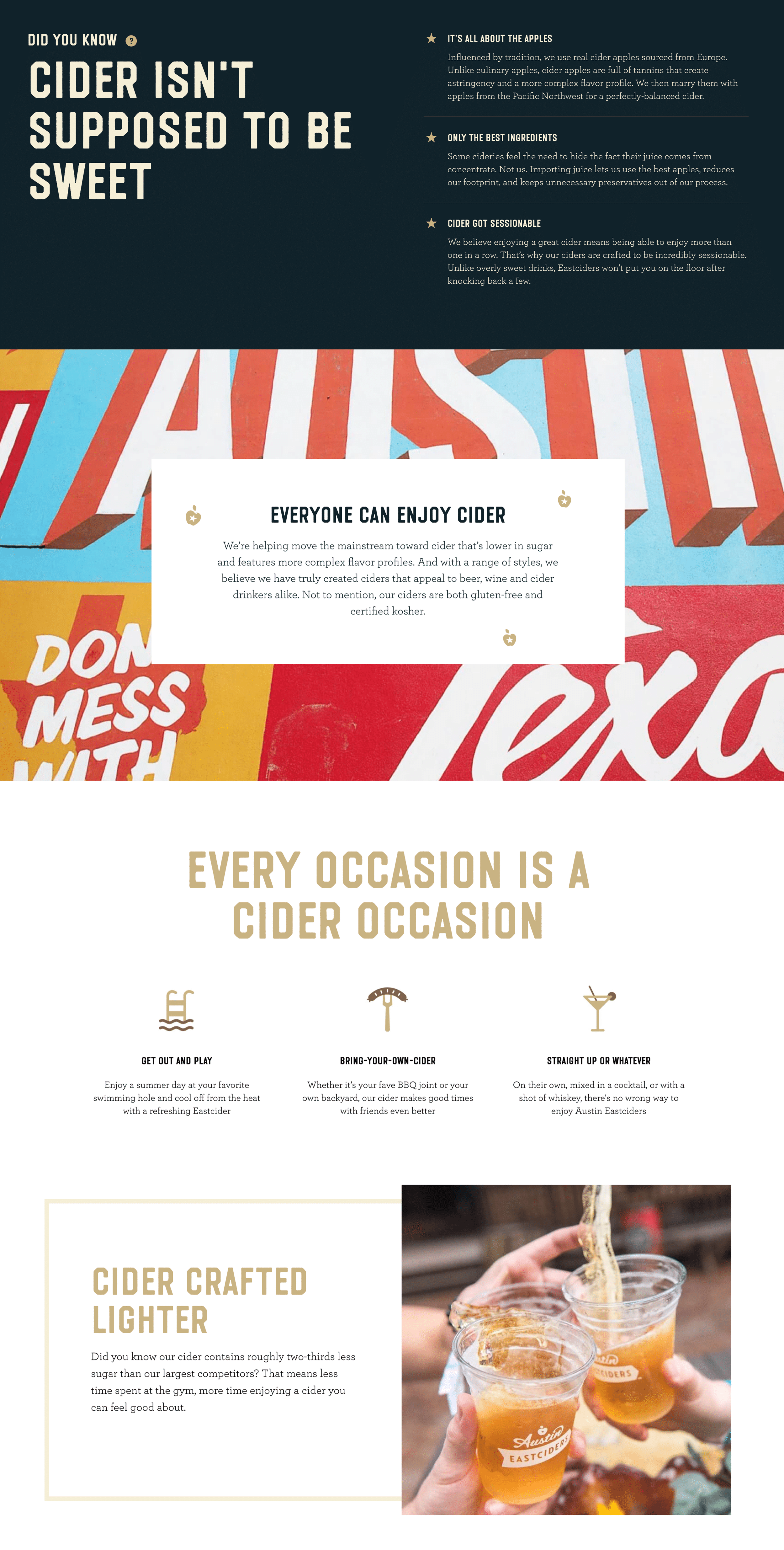
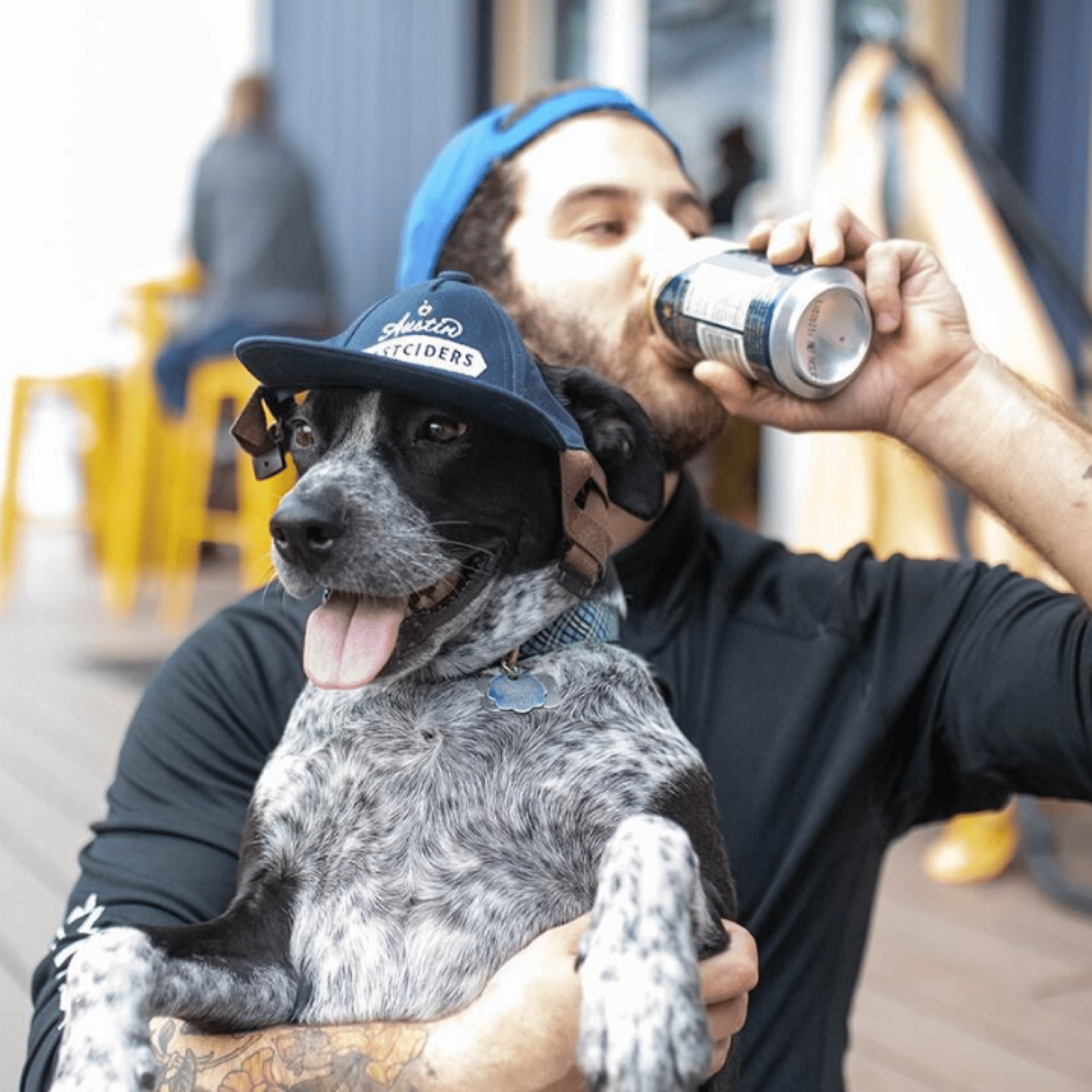
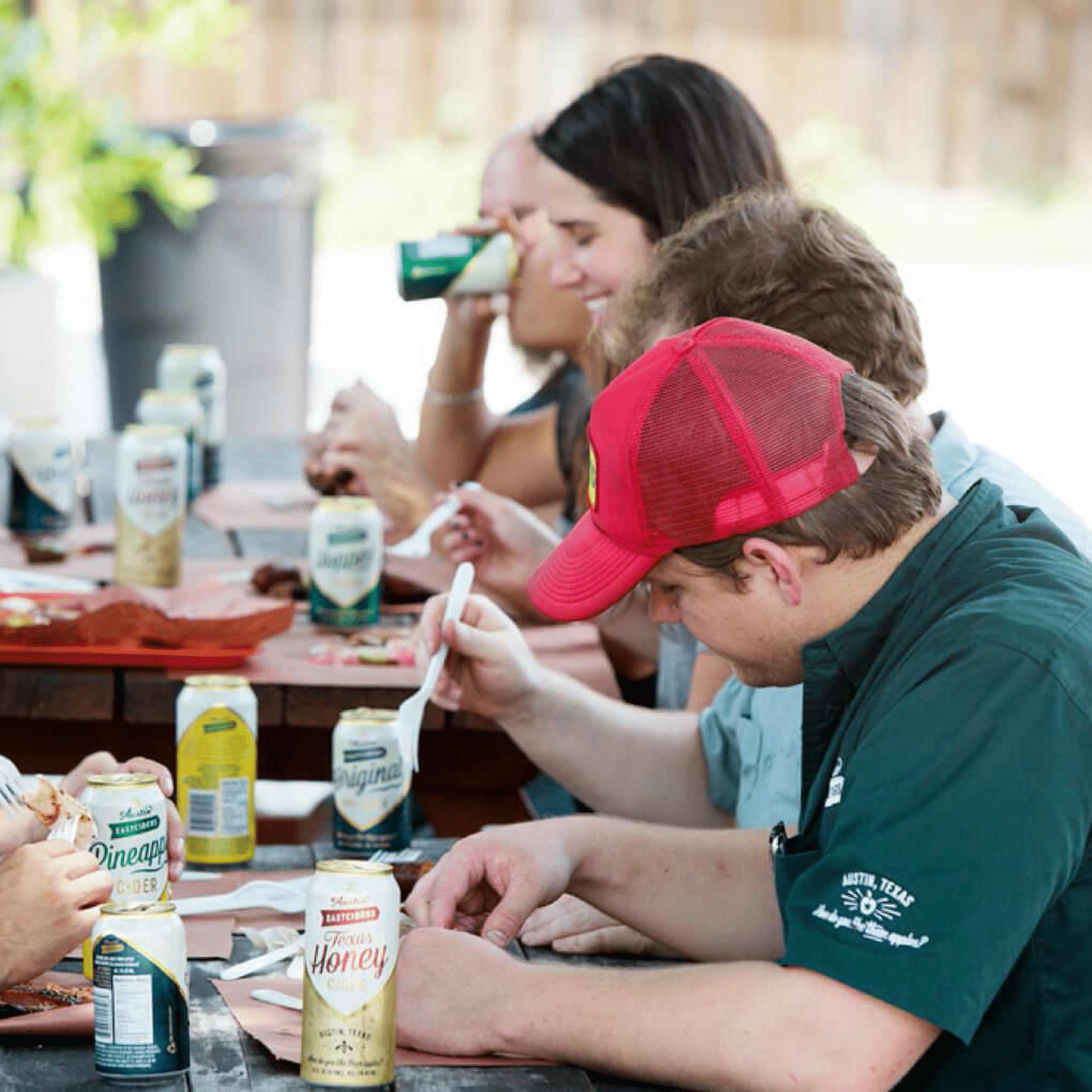
The marketing of Austin Eastciders is built around conveying a fun, social, summertime feeling.
We were very familiar with the brand after designing their website and online store, but when thinking about what kind of campaign we could run we began with re-examining the audience we would be targeting.
It was by kicking around ideas of what would appeal to the audience that we landed on the idea to produce a simple, interactive mobile game that could be easily promoted through a social media campaign.
Game Concepting
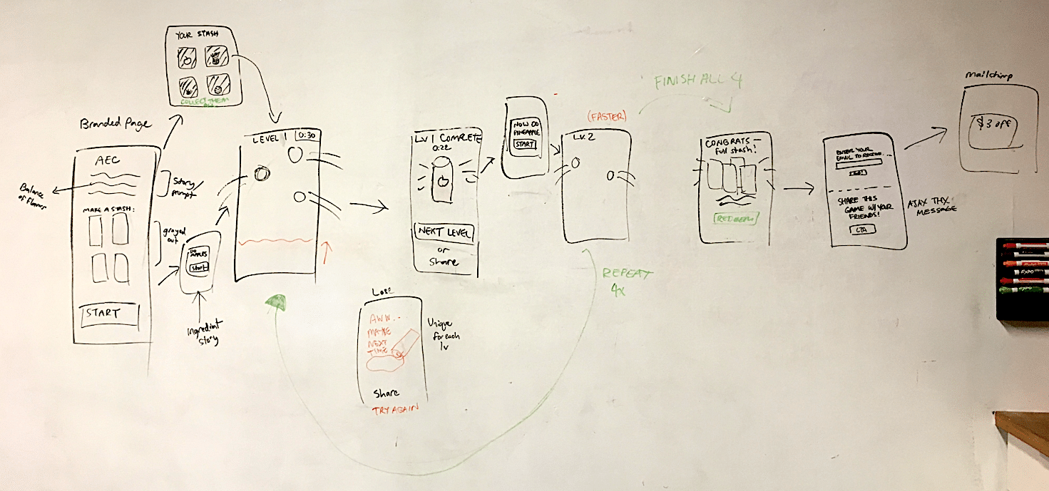
FLOW DIAGRAM & NARRATIVE MAPPING
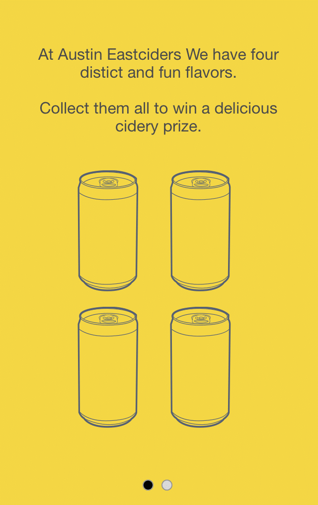
With the general idea of the game in place that the user would need to interact with the ingredients to help ‘create’ the new ciders, the next stage was to figure out the mechanisms of how users would actually create the cider, and the challenges that would confront them.
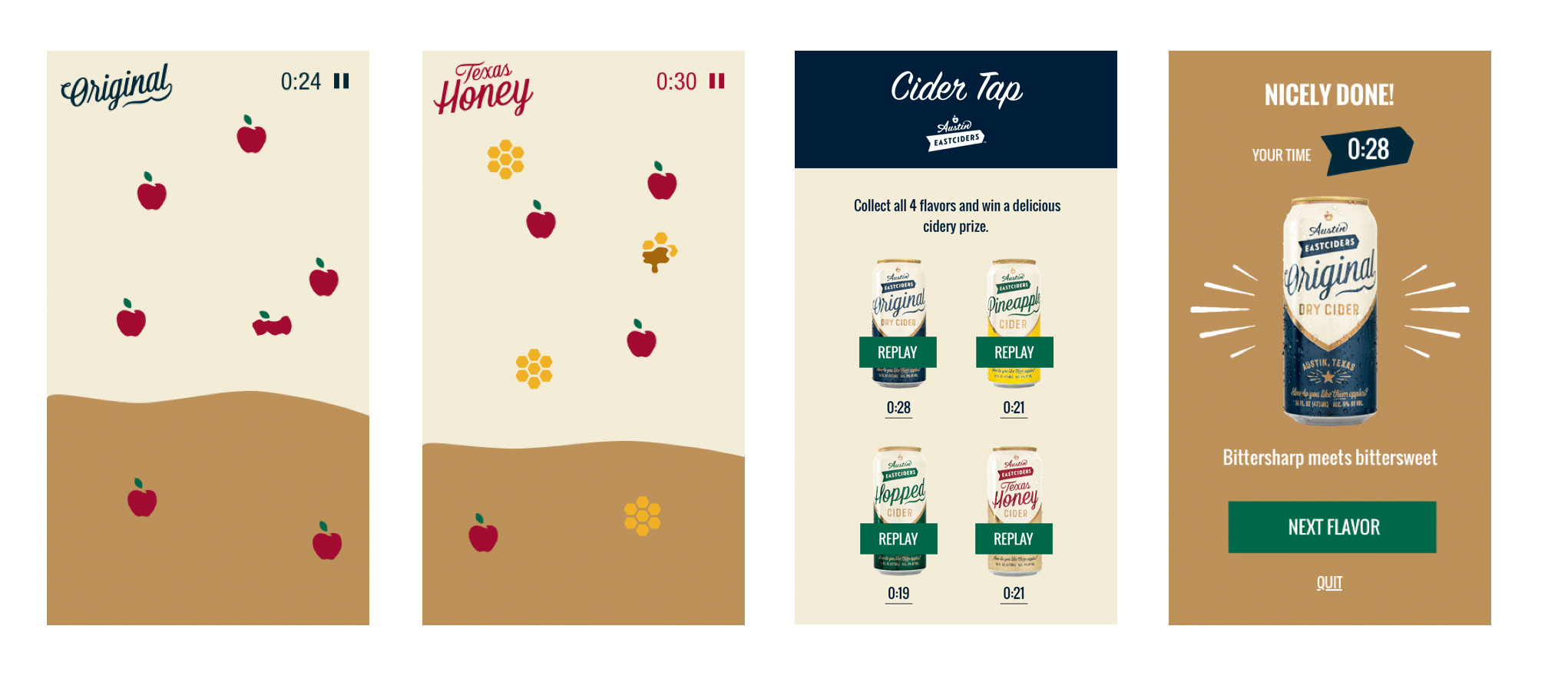
We sketched different ideas and landed on an idea where the ingredients would float around the screen and the user would need to ‘tap’ on them to crush them into cider.
This fit multiple levels of what we were trying to accomplish – a coherant storyline, the depth of commitment by a user would not be too high, and the gameplay difficulty could be adjusted based on the speed of the ingredients floating around the screen that the user would need to tap.
Screen Level Design Ideation
SCREEN CONCEPTS
Now with the concept more defined, we began designing loose screen level concepts to fill in how the game might look.
We wire framed the screens between the levels, and worked out how to feature all the four new flavors in a sequence of levels that would increase in difficulty.
Prototyping
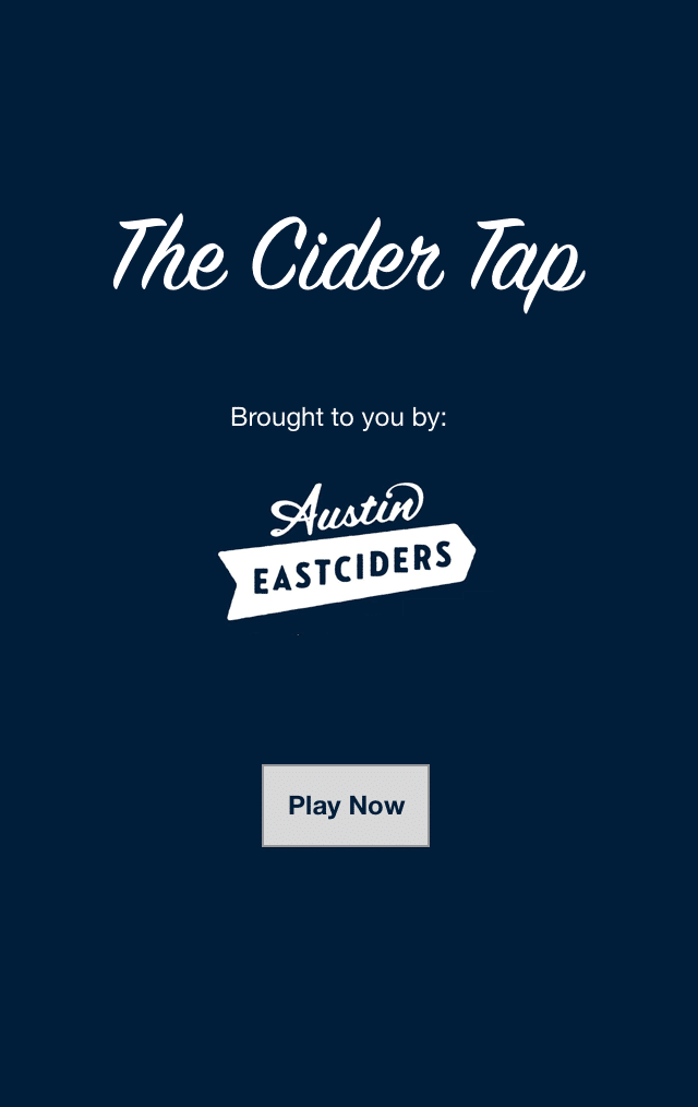
PROTOTYPING THE HAPPY-PATH
From the wireframes, we worked with the visual designer and the existing Austin Eastciders brand elements to develop a simple prototype of how the game would look, function, and behave.
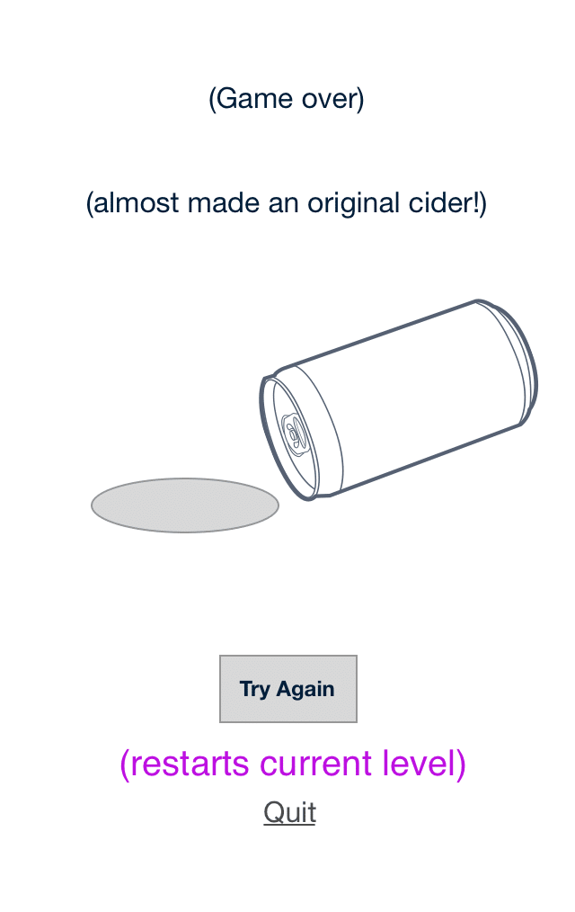
The prototype was built quickly and only designed around a single happy-path.
The purpose of prototyping this was was to make sure we captured key elements of the game narrative, got the behaviors of the interactive elements right, and also were able to discuss and get good feedback from all project stakeholders.
Handoff &
Marketing / Social Covers
TEASING INTEREST IN THE GAME
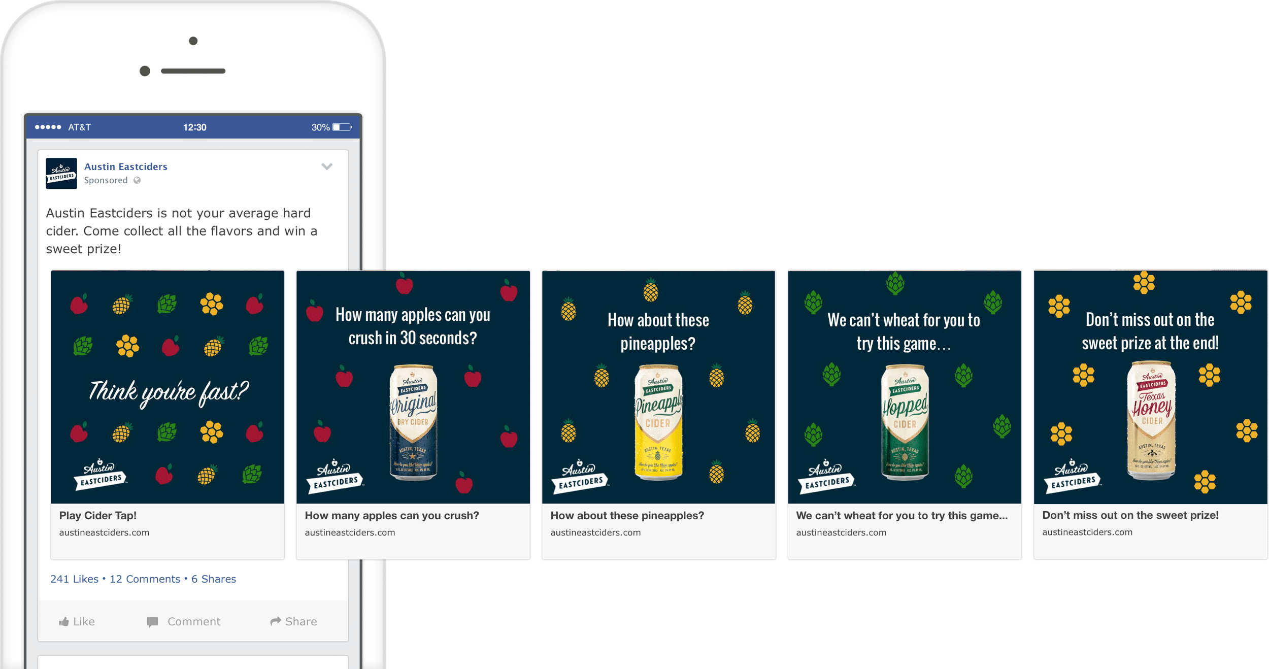
After designing the game flow and screens, we handed the designs to an external developer, and consulted when needed as they built it out.
While the game was being developed, we also worked on a series of social posts for Austin Eastciders to get the word out, reach their audience, and promote the final product.
To Code
WORKING
B____
B____
B____
Ready for More?
View Another Project –
ConnectedCare iOS App (Protected)
Client: Microsoft
Microsoft’s ConnectedCare App is a summary of an individual’s health records organized into one place.
Website Design
Client: Six Peak Capital
Website design for a real estate investment & development company focused on coliving.