

PROBLEM STATEMENT
One of Spot’s main offerings is Pass Protection, which allow purchasers of big-ticket items like ski passes to get a percentage of the purchase back if they find they can no longer use the pass.
The initial claims experience was temporarily based on a generic claim PDF a filer would download and fill out, but the generality and non-digital nature of this process meant a poor experience for both users that needed to file a pass claim, and internal users managing those claims.
The objectives of this project were to digitize the Pass Protection claim experience so that claimants could file a claim within their Spot account, and internal administrators could review the claims and make a verification ruling before sending the complete claim packet on to our claim adjudication partner.
APPROACH

Project Pitch and Planning

User Research and Requirements Review

Competitive Analysis and Defining Principles

Process Mapping, Information Architecture, and User Journeys
Wireframing and Prototyping
Copywriting and Review Process

Engineering Collaboration, and Supporting the Build and Launch

Usability Testing & Assessing Design Impact
Project Pitch & Planning
‘SHAPE UP’ PROJECT PITCH
At Spot we used a framework called ‘Shape Up’ to pitch new projects that needed working on. Between pitched projects and an already established roadmap, the leadership team at the company would select which projects to green light for the product and engineering teams.
A project pitch document would outline the problem to solve, list what data there was to illustrate the urgency of the problem, and loosely define the contours of what a solution might look like. It also would suggest a timeframe to allocate for the project.
Collecting data for a project started from the very beginning when putting together a project pitch. We were getting a lot of customer care tickets related to filing Pass Protection claims,
Qual: Time to file, customer care tickets (& hurdles anecdotes)
Quant: Abandoned rate, Expected increase in amount, number of purchasers who act.
===
Notes:
– MVP / Enough to Fit an appetite
For this project, we knew we needed to digitize the Pass Protection Claims experience, and included some data that exposed the limitations of the current generic claim PDF, forecasted the future volume of claims we would receive, and based on when that volume would increase, set a proposed timeline of a month and a half for UX discovery and planning, and three months for the design and build.


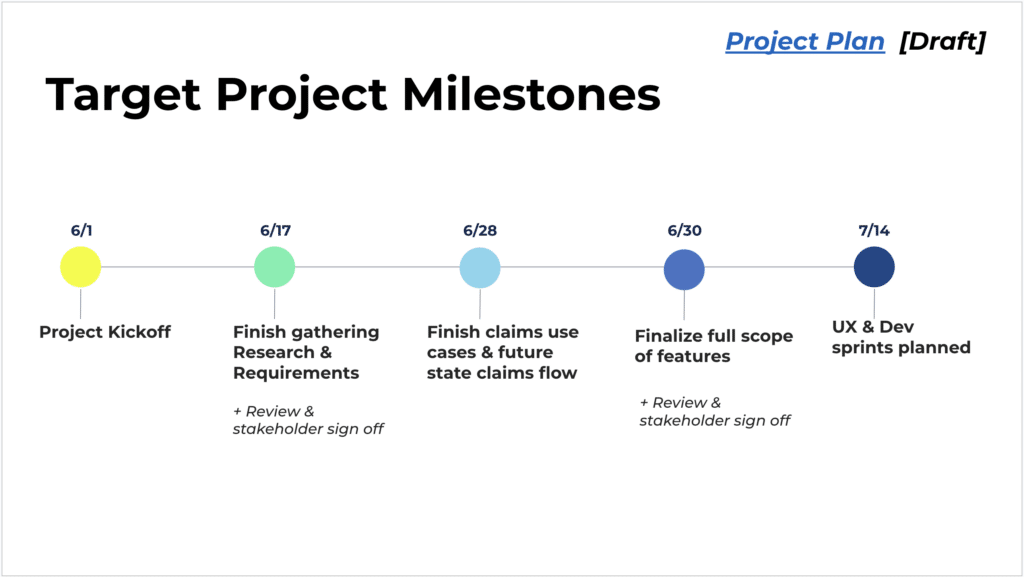
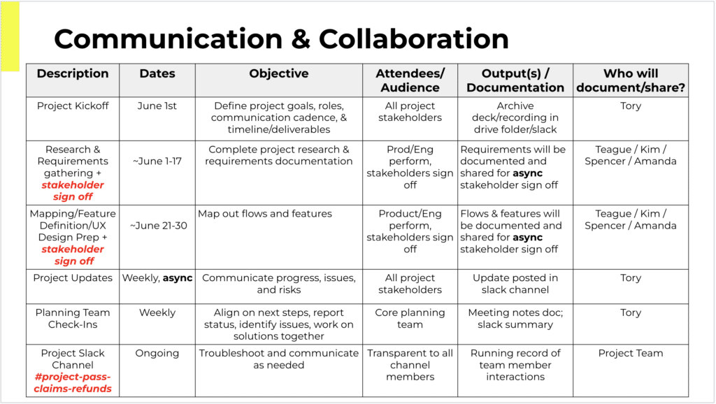
PROJECT PLANNING, STAKEHOLDER INVOLVEMENT & COMMUNICATIONS PLANNING
Once the project pitch was given a green light, a project plan was set up for the discovery phase of the project. This involved defining milestones for the project, identifying which stakeholders would be decision makers in the project, and outlining touchpoints to engage various teams and stakeholders.
The project planning was a collaboration between Project Management, Product Management, and UX, with details of the UX milestones and stakeholder involvement mostly left to the UX team to plan.
Discovery
USER RESEARCH AND
UNDERSTANDING CURRENT PROCESS
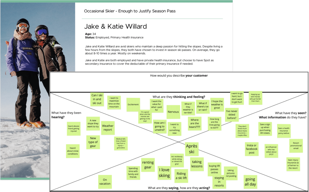
Discovery for the project started with a review of our personas at Spot, and filling in specific gaps in our understanding related to how our customers thought and felt about Pass Protection.
We uncovered when speaking with prior filers of Pass Protection that there were misunderstandings in how they thought Pass Protection would work when they purchased the product, and that there was a roller coaster of emotions most filers felt when they needed to actually use the Pass Protection product.
Most filers file because of a negative life reason, and then there are all these complicated insurance hoops to jump through which just adds to users’ frustrations.
In addition to gathering our customer’s context, we also talked to our internal Claim Advocates to understand more about their existing process of how they process Pass Protection claims. We did some shadowing/workshopping with them to really understand what it is they’re looking for when processing a claim.
- Do Perosnas
- Do Sentiment journey
- Do User Interviews
!! Include Collaborative Team Section
- Qual: ___
// Internal understaninfn differences with existing products
/ Actual hard reqs avout verification , How want to position Spot?
Discovery w/ Customer Advocates to understand how claims are currently being managed - =====
- !! Do Visuals Personas and Research
- Informs user journey mapping and current state process mapping
- Gather business and insurance requirements from IMG for Insurance & Refund Plan claims
- Informs documentation and review for alignment
- Collaborative exercise to show how the process should work, taking into account all claims use cases
- Will visually communicate all features, people, processes, and tech involved
- Determine required features for both the Claim Admin and My Account tools
- Review all required features / flows for stakeholder alignment
- Visual of features and user stories required to deliver the new Pass Claims experience
- Collaborative effort between Product, UX, and Engineering to write and prioritize stories

Main Findings from User Experiences

Discovery with Customer Advocates to Understand Current Process
REQUIREMENTS AND MATERIALS REVIEW
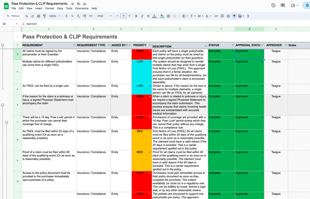
For a list of project requirements, the PMs had already started gathering an initial list of requirements with stakeholders into a centralized Project Requirements Document.
We then reviewed this list, formulated additional questions, sought to understand why specific requirements existed from our stakeholders, and had some further requirement discussions. The Project Requirements Document was a living and evolving document throughout the design process.
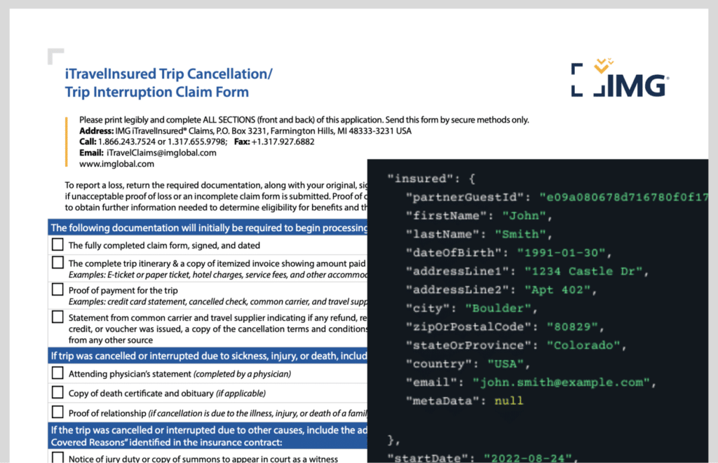
Along with project requirements, we also took a deep dive into the materials and data we had available to work with.
For this project, we had a set of data elements we knew we would receive from enrollment of new Pass Protection purchasers, and we knew from our insurance carrier partner what documents they typically requested during claim filing in order to adjudicate on a claim.
One big question we sought to answer by looking into the data was the breakdown of how many purchasers and claim filers filed claims as groups of people (as in a family filing a claim together), verses individuals filing a single claim.
- Informs user journey mapping and current state process mapping
- Gather business and insurance requirements from IMG for Insurance & Refund Plan claims
- Informs documentation and review for alignment
- Collaborative exercise to show how the process should work, taking into account all claims use cases
- Will visually communicate all features, people, processes, and tech involved
- Determine required features for both the Claim Admin and My Account tools
- Review all required features / flows for stakeholder alignment
- Visual of features and user stories required to deliver the new Pass Claims experience
- Collaborative effort between Product, UX, and Engineering to write and prioritize stories
Business Requirements
Materials Review
COMPETITIVE ANALYSIS
Concurrently with other discovery activities, we were looking around for other comparable experiences to how the Pass Protection claims process might work. We captured examples, flows, and made notes of how others had solved similar presentational challenges in dashboards and flows.
Because of the emotional ride most users are in when they come to file a claim, we took particular note of tone, language, and how others had sought to simplify and guide users through such a complex process.
Carrier’s Insurance Dashboard
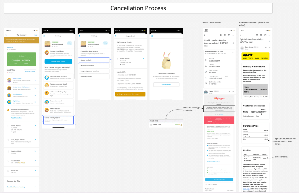
Hopper & Spirit Airlines Cancellation Process
DISCOVERY SYNTHESIS & PRINCIPLES
To internalize a lot of the insights we gained from discovery, and help turn these insights into guiding lights for our ideation and designs, we went about forming a few key design principles.
A lot of these principles were formed in response to the understanding gaps and emotional distress most filers felt when coming to file a claim. We wanted any design we came up with to be simple and clear, have help always available, and to position ourselves as advocates for the filers each step of the way.
Design principles like these are great for socialization with project stakeholders, and can serve to get teams aligned on what a good solution will look and feel like.

Process Mapping, Information Architecture (IA)
& User Journeys
SCENARIO & PROCESS MAPPING
Our first team-wide cross-functional collaborative activity was to gather the Product and Engineering teams, along with select stakeholders, and walk through different user scenarios for how this product would likely be interacted with at Spot, from purchase through to successful claim.
As we mapped these scenarios out we identified what customer interactions with Spot would need to occur. At each step along the way we also discussed what technical processes or business processes needed to be in place to support the high level user experience.
This was a great way to uncover open questions, requirements to clarify, prompt data questions to ask a data analyst to pull, and to spark discussion and ideas around the high level user experience.
This collaborative process mapping served to align the teams and stakeholders from the beginning on the contours of the project, and what we would be building. It’s also a great framing exercise to picture realistically what level of user experience we could support within the project timeline.
Include:
User Feelings

INFORMATION ARCHITECTURE
When getting into the design of how the claims flow itself would work I found sorting the steps of the flow, and the information we knew we needed to collect, onto ‘cards’ and laying out various arrangements let us see how best to logically prioritize the designs.
The claims flow was branched with conditional logic in various places, so rearranging the flow on ‘cards’ let us see that we could cleverly pose questions up front that would later inform the flow downstream.
We used similar card sorting exercises when planning out how to present details of the Pass Protection coverage to users, or give feedback about filed claims on the user’s account dashboard.
Qual:
Set of Needed questions to include = Constriant.
How to arrange in a way to reassure, educate up front hard concepts, backload uploading of docs
Arrange needed info first for details pages
WEn t Widee!
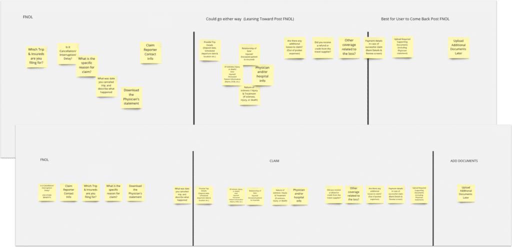
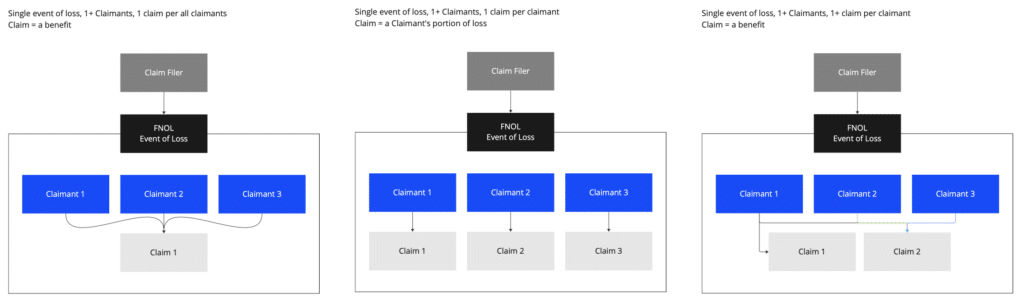
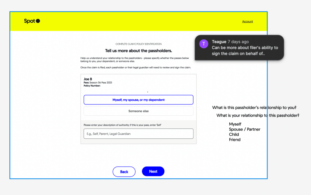
STRUCTURING THE FNOL, CASES, AND CLAIMS RELATIONSHIP
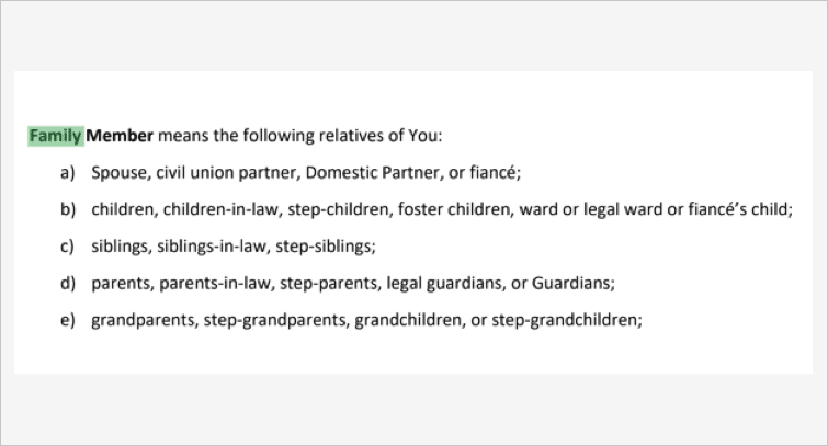
One element of the information architecture that’s worth highlighting was the need to clarify the relationship between the First Notice of Loss (FNOL), an insurance case, and what specifically counted as a claim.
The design needed to handle multiple claims that may arise from a single person filing on behalf of a group of people (for example in a family), but the way our insurance carrier partner needed to intake the claims once we passed them off was structured as only a single claim per filer.
We needed to balance how we presented claims to the filer (end user), how our own Claims Administrators thought about grouping claims, and how our insurance carrier partner though about the relationship of claim filers to claims.
To probe these different mental models we mapped out the different groupings and prioritized a discussion amongst the relevant stakeholders to reconcile how our system would present claim groupings.
Qual: Went back to Users to understand their mental model
Talked to internal team, and partners
USER JOURNEY MAPPING
Proceeding from the card sorting exercises, we then went into user journey mapping, and were able to more concretely look at what screens needed to be created, and how decision points would function.
The user journey mapping incorporated the results of decisions that had been made up until this point, for instance the resolution of claim groupings mentioned in the previous step.
Qual: Becsaue o. fhow purchasesers work and knowing group dinamics, we made a decision on familiarity of gropus

Wireframing & Prototyping
WIREFRAMING & SCREEN DESIGN
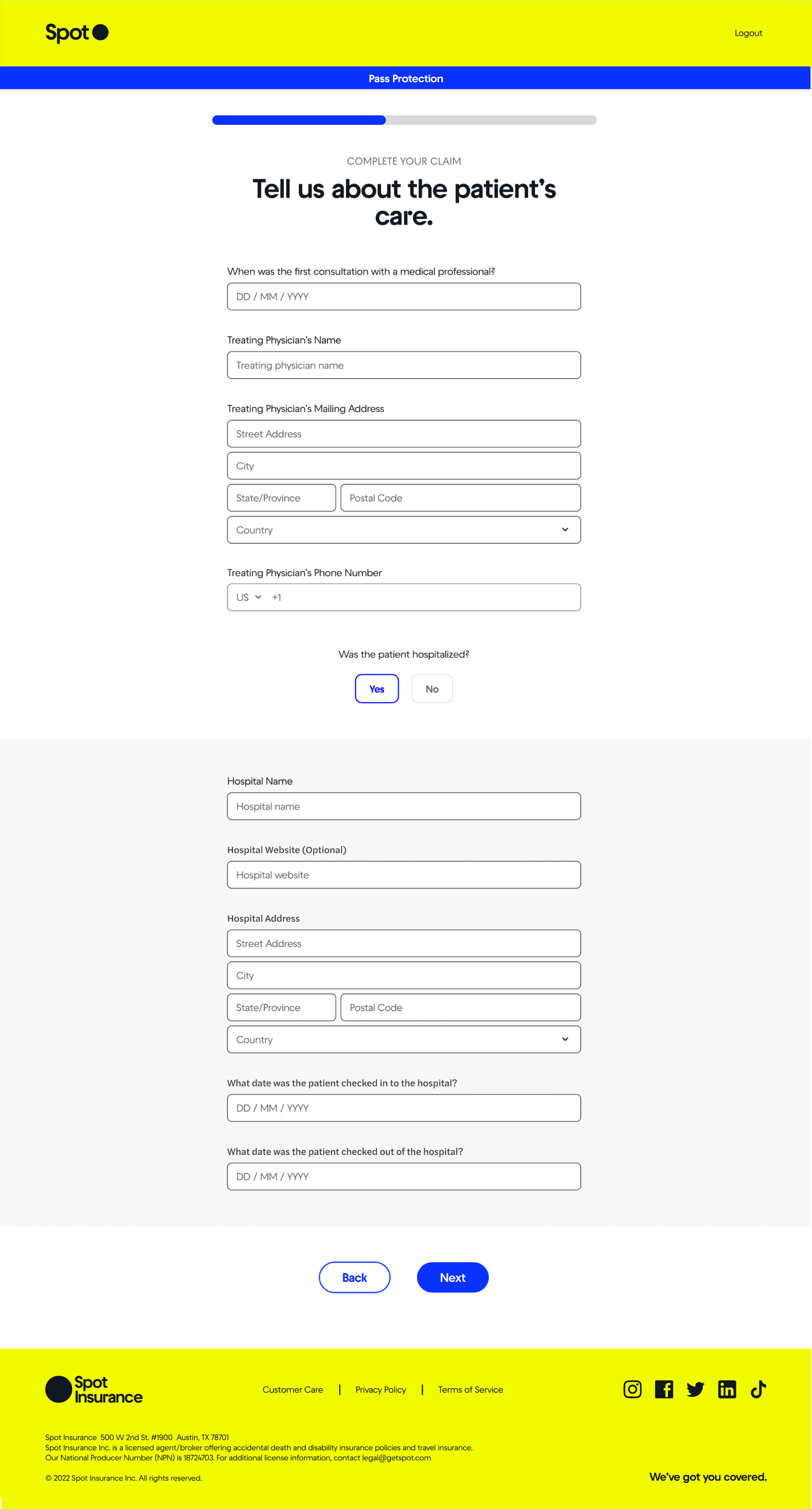
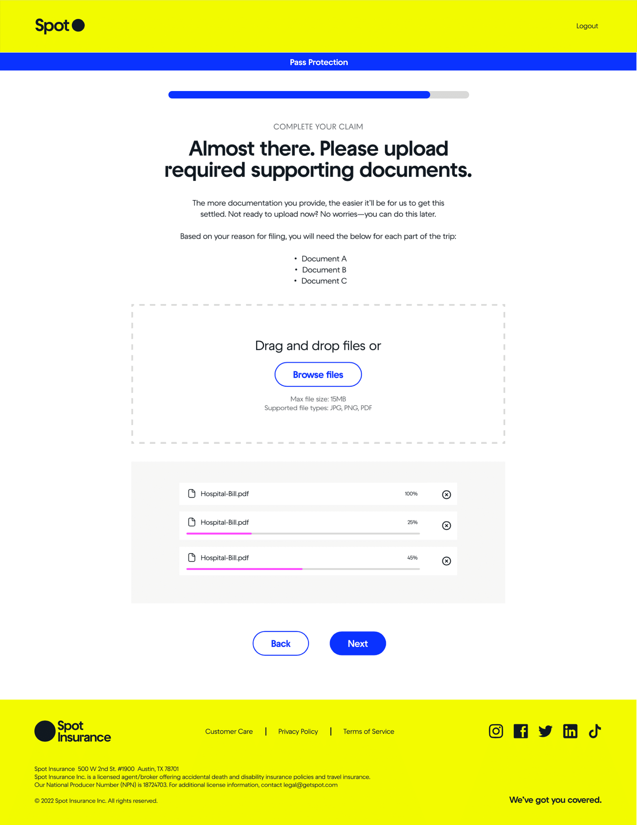
Having done a lot of the planning up front, when we got into wireframing we already knew what information would need to be presented throughout the flow.
Wireframing the customer facing screens was mostly about deciding visually how best to present this information, and leading the claim filer through the flow in a comfortable, well communicated way.
A lot of consideration went into how to help users understand what information they needed to provide, while keeping the screens as minimal and digestible as possible. We used contextual nudges where we could, conditionals question sets within screens, and a lot of iteration and emphasis was placed on the screen copy and microcopy to communicate clearly.
For the project we needed to consider both the customer facing, and management aspects of the claim flow. As we were working through the customer facing flow and dashboard, we were also wireframing how to best display their claim info on our claim administration dashboard for internal verification of claims.
Collabarive /
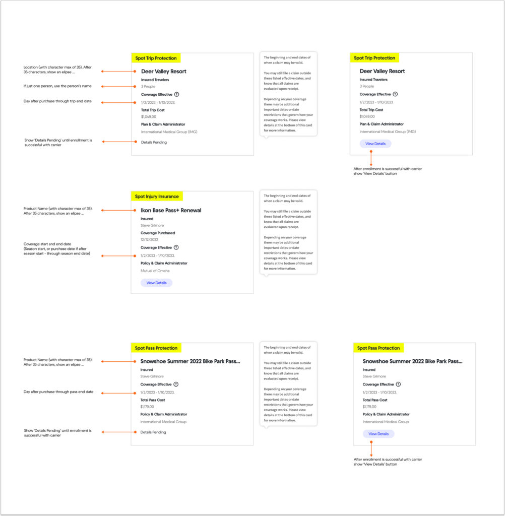
Standardizing Insurance Coverage Cards
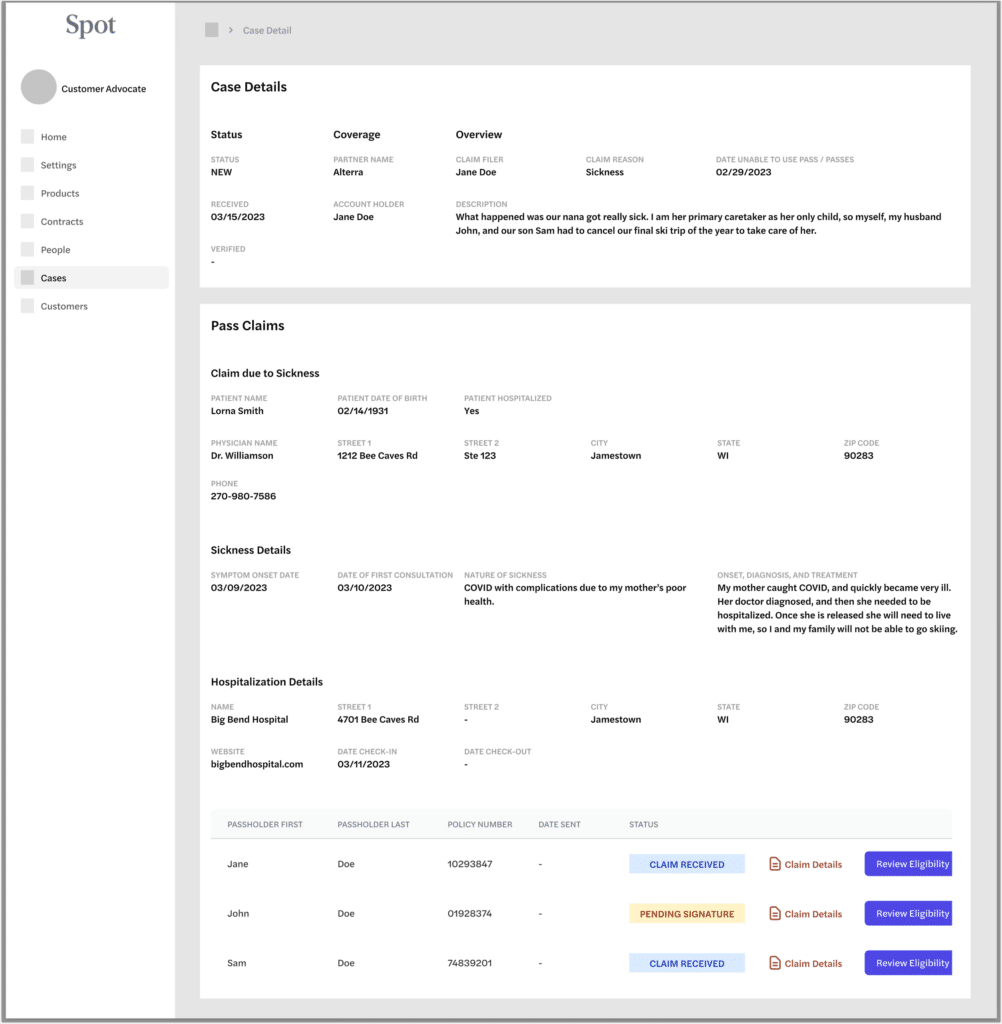
Displaying Case and Claim Info for Internal Claim Admins
Wireframing the Customer Facing Claim Flow
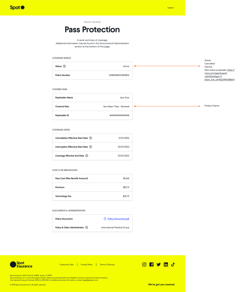
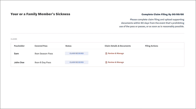
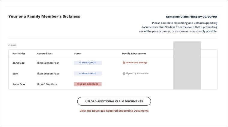
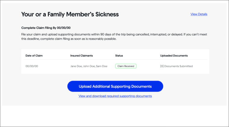
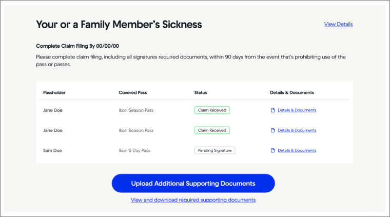
UI DESIGN & THE CUSTOMER’S CLAIM DASHBOARD
UI design and the detailed work of how to covey important information and affordances is often a very iterative process with improvements being designed and added over time. It’s about using visual hierarchy and the right UI elements to convey specific information in an ordered way to the user.
In this example, the customer’s claim dashboard, we designed this with a lot of the customer’s insights and uncertainties we heard from the discovery process in mind.
Filers were unsure about timelines and deadlines, so we added a ‘complete claim filing by’ date. Filers were unsure about what documents they needed to provide, so we added a specific link call out for this.
You can also see in these designs we were considering different ways to present if a group of people all filed together how might that look.
Iteration 1
Iteration 2
Iteration 3
Iteration 4
USING THE SPOT DESIGN SYSTEM
At Spot we maintained a Figma design system which made wireframeing and screen design constant, quick, and relatively easy to change around and work with.
I’ve written more about our work developing and maintaining the Spot Design System in my writeup on the UX Overview and My Role at Spot.


UX COPYWRITING & REVIEW PROCESS
Tone to calm, educate, keep simple, Direct
_____
Facutally Correct
Highly Precise
Compliant
Descriptive to take actions
Approachable and in brand voice.
Short is best.
Using – List of tone words
Copywriting Iteration and Notes
Copy needed to be precise and convey a lot of info
Copy needed to get the user to take complex actions
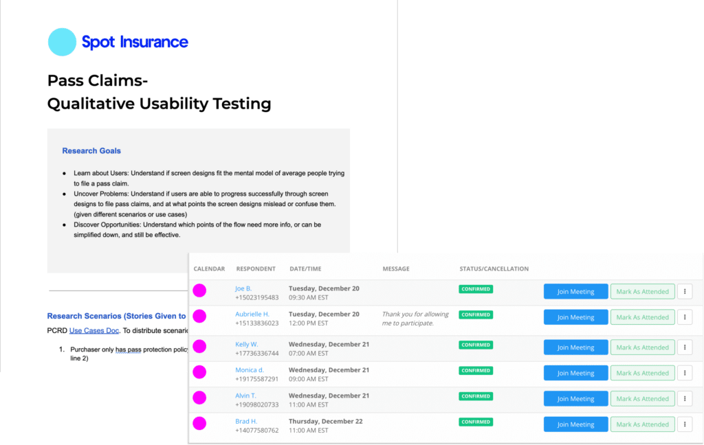
Usability Testing & Assessing Design Impact
USABILITY TESTING & DEFINING METRICS TO TRACK OVER TIME
Mind
_____
BUSINESS IMPACT & ASSESSING ORIGINAL GOALS
_____

Final Designs
FINAL DESIGNS
_____
====
HOW WORK WITH:
PM / Data / Content Writers / Engineering
My Role and Contribution
Return to answer Shapeup Qs
Fix Patient’s Care Placeholder Text Below.. (Sketch)
INTERNAL TOOLING – SEP CASE STUDY???


Ready for More?
View Another Project –
Data Management Platform
A tool used by Data Scientists for collecting, storing, and learning from big data.
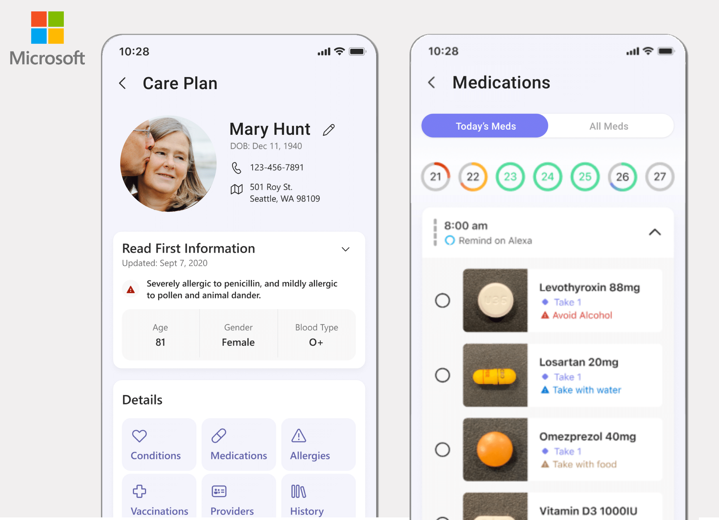
ConnectedCare iOS App (Protected)
Microsoft’s ConnectedCare App is a summary of an individual’s health records organized into one place.