

PROBLEM STATEMENT
Starbucks Corporate approached the Mentor Creative Group looking to develop a mobile app that would enable their partners to engage with each other and the company on their personal device.
The Partner App is meant to provide a secure, easy to use platform for partners to schedule their work, stay up to date on Starbucks news, receive benefits information, and communicate with peers.
APPROACH

Assessing How Things Were Working

User Interviews
System Sentiment Analysis

Information Architecture

UI Concepts & Ideation
Wireframes & Prototyping
Prototype Usability Testing

Development
User Interviews
USER INTERVIEWS
Many of the requirements for the apps were pre-defined by Starbucks Corporate itself.
However to understand what parts of the current communication system were working well for people, and in what ways the apps could be designed to fit naturally into the barista’s work and communications flow, interviews proved very helpful.
The user interviews were conducted in two different Starbucks locations in Seattle, WA.
Research Materials
The User Interview Scripts and Key Takeaways
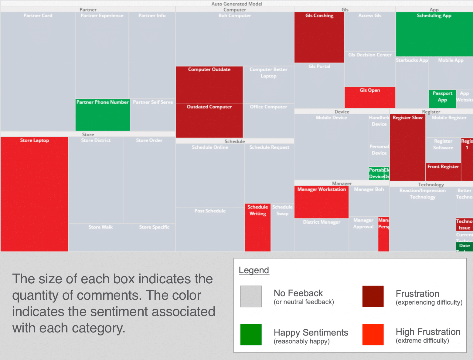
System Sentiment Analysis
Interview Response Heat Mapping
From the interviews with the Starbucks store employees, a heat map was put together to map the sentiments the partners felt about different aspects of the current communication system.
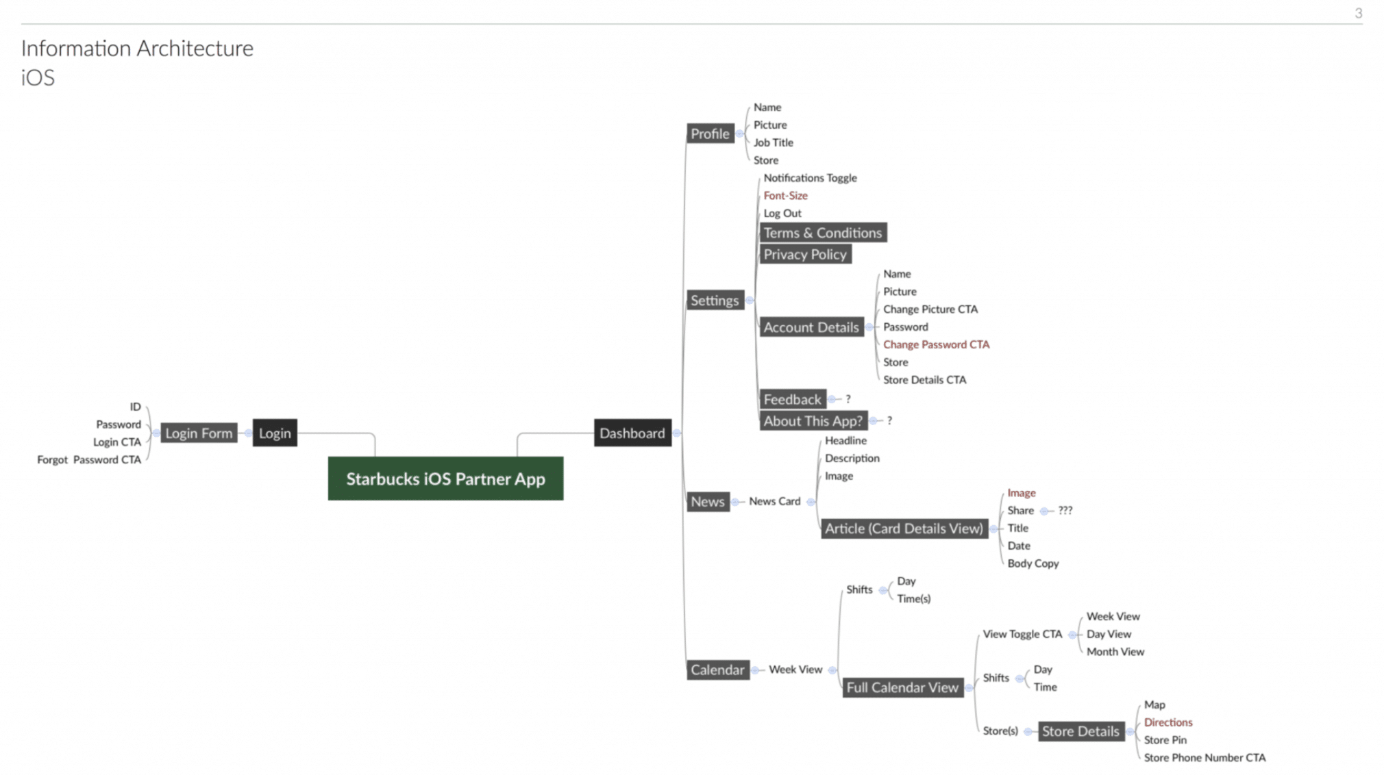
Information Architecture
DEFINING THE SCOPE OF THE APP
To capture all aspects of what information would be useful for the partners within the app and how all this information would relate to each other within the app, we began the design process by mapping out the information and the architecture of how the app would flow.
UI Concepts & Ideation
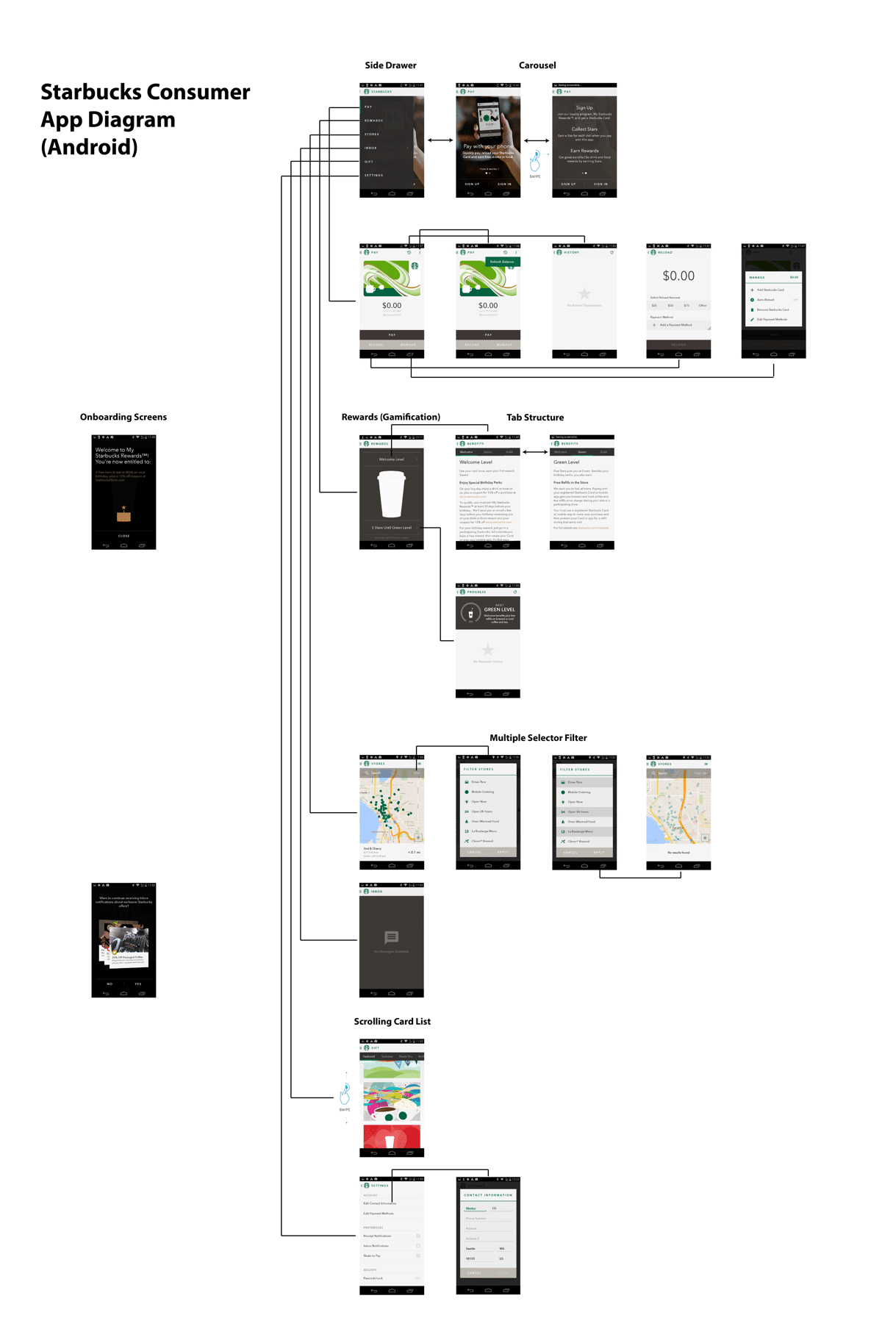
FITTING INTO SEVERAL ESTABLISHED UI PARADIGMS (STARBUCKS, IOS, ANDROID)
With the information architecture of the apps in place, we began researching and ideating how the UI for the apps could work and also fit within the larger contexts we were designing for.
There were a few established UI paradigms we were very aware we needed to fit within that were already established:
The Starbucks design paradigm – Starbucks already had a consumer app, and other internal tools, and we wanted to make sure this app for their partners fit functionally and visually together with it.
iOS and Android – Because we were designing two apps that would be the same just for iOS and Android, we needed to format things a little differently to fit with the established design patterns of both operating platforms.
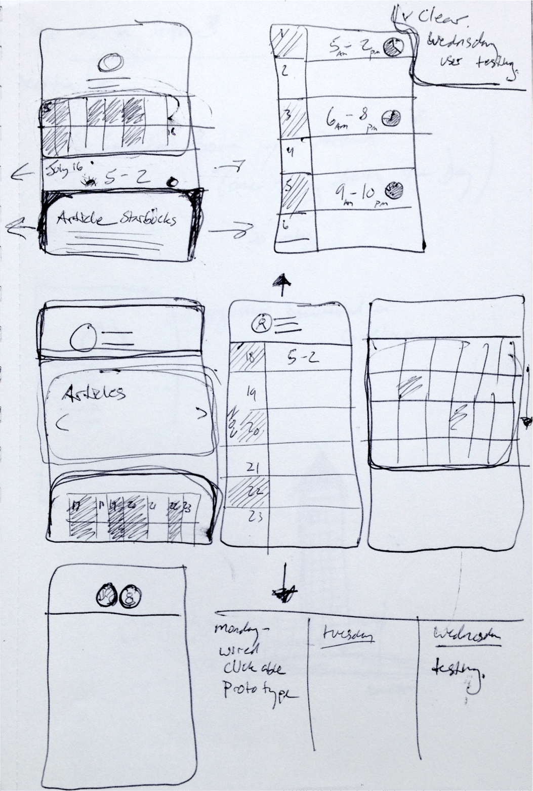
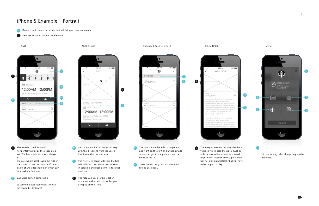
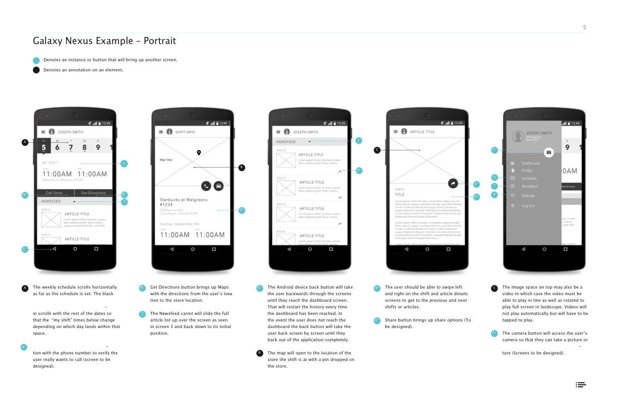
Wireframes & Prototyping
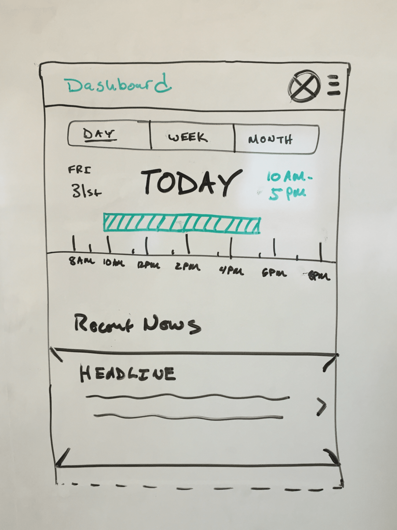
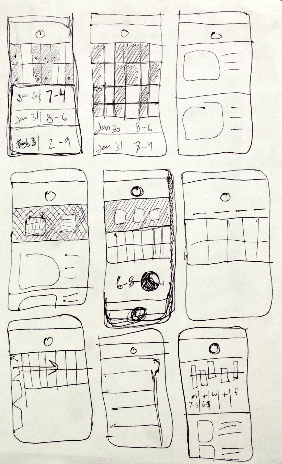
WIREFRAMING A FEW DIFFERENT CONCEPTS
We had a few different concepts for for how the screen level UI could work, and how the navigation could we worked in the apps to be intuitive for users to get from section to section.
Things like how far in advance on a calendar partners needed to be able to mark, and managers needed to plan for dictated how a calendar layout should work and function.
We we given access to a few Starbucks locations and to Starbucks Corporate Headquarters test kitchen to test a few different wireframe concepts and prototypes.
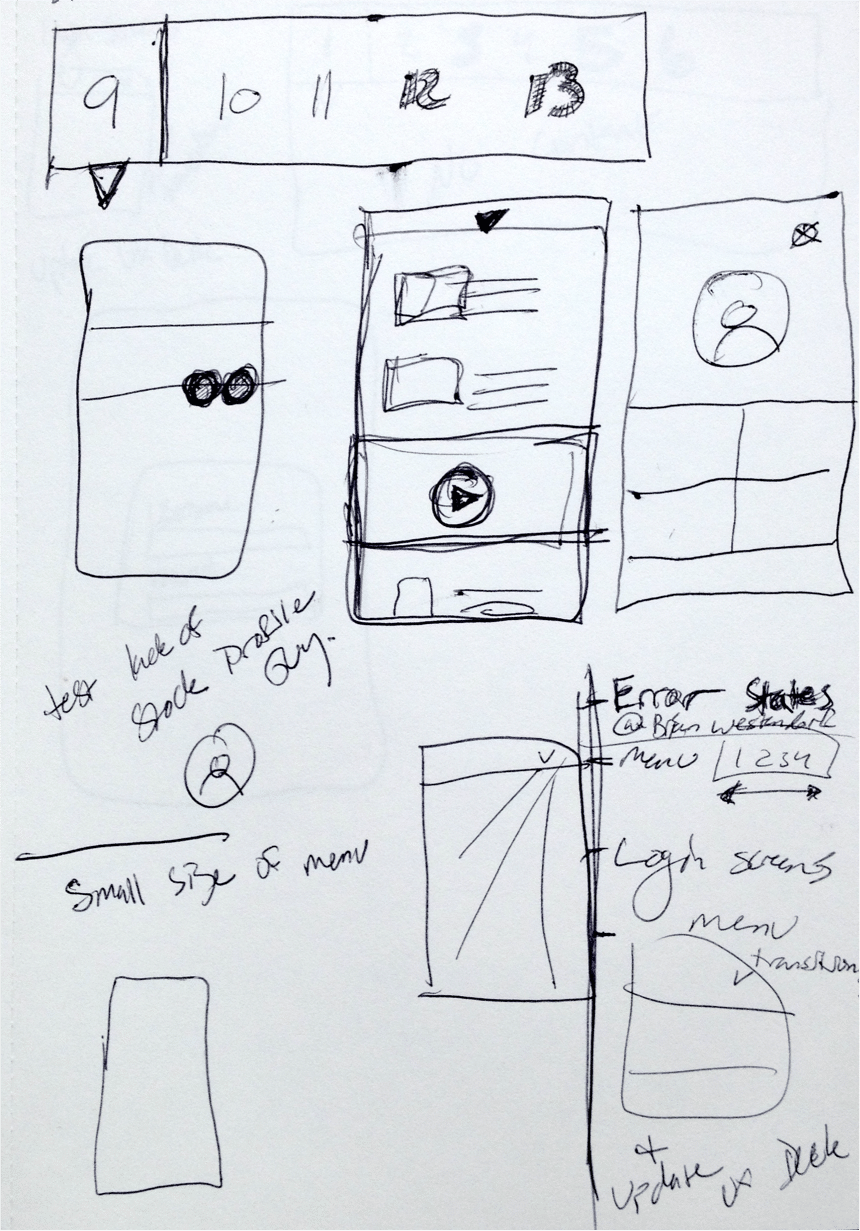
Prototype Usability Testing
TESTING AT STARBUCKS HEADQUARTERS & A SECOND LOCATION
We took advantage of easy access to the actual users who would be using the apps to show a few rounds of wireframes, get feedback, and as the design progressed, to actually test our interactive prototypes.
Early on we asked for partner feedback on wireframes specifically around their thoughts on certain UI elements, if they felt information was missing on the screens that would be useful for them etc..
As the designs progressed and we built actual prototypes for more refined designs, we shifted to asking the partners to complete certain tasks and observed how they naturally went about trying to complete those tasks.
Testing Resources
Research proposal, study kit, findings, an observation worksheet.
Development & QA
for Android & iOS Platforms
WORKING WITH THE STARBUCKS DEVELOPMENT TEAM
The apps were built in sections as parts of the designs were finalized so that the design and development phases of the project overlapped.
We worked with the internal Starbucks development teams to build the apps.
To do this, we produced detailed annotation documents outlining functionality, and visual elements. We would then meet with them regularly to review the development progress and provide QA as things were being developed.
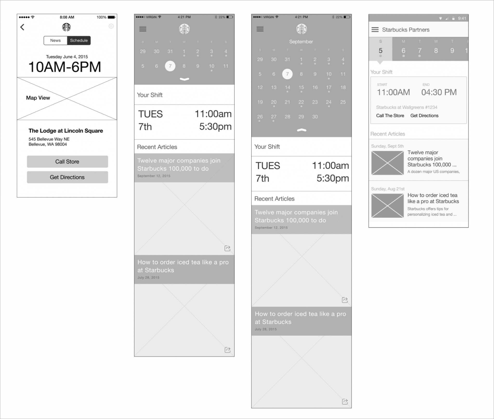
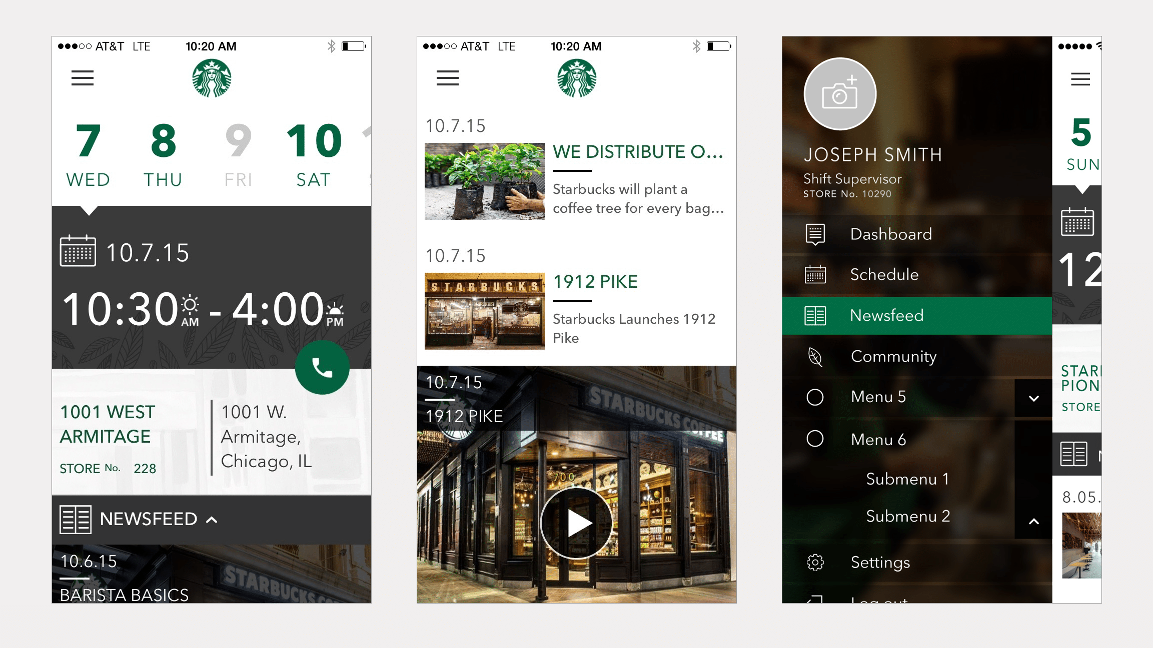
Final Designs
FINAL DESIGNS
Both the iOS and the Android App were built, and released internally in a test program to a few Starbucks locations in different regions of the US.
Ready for More?
View Another Project –
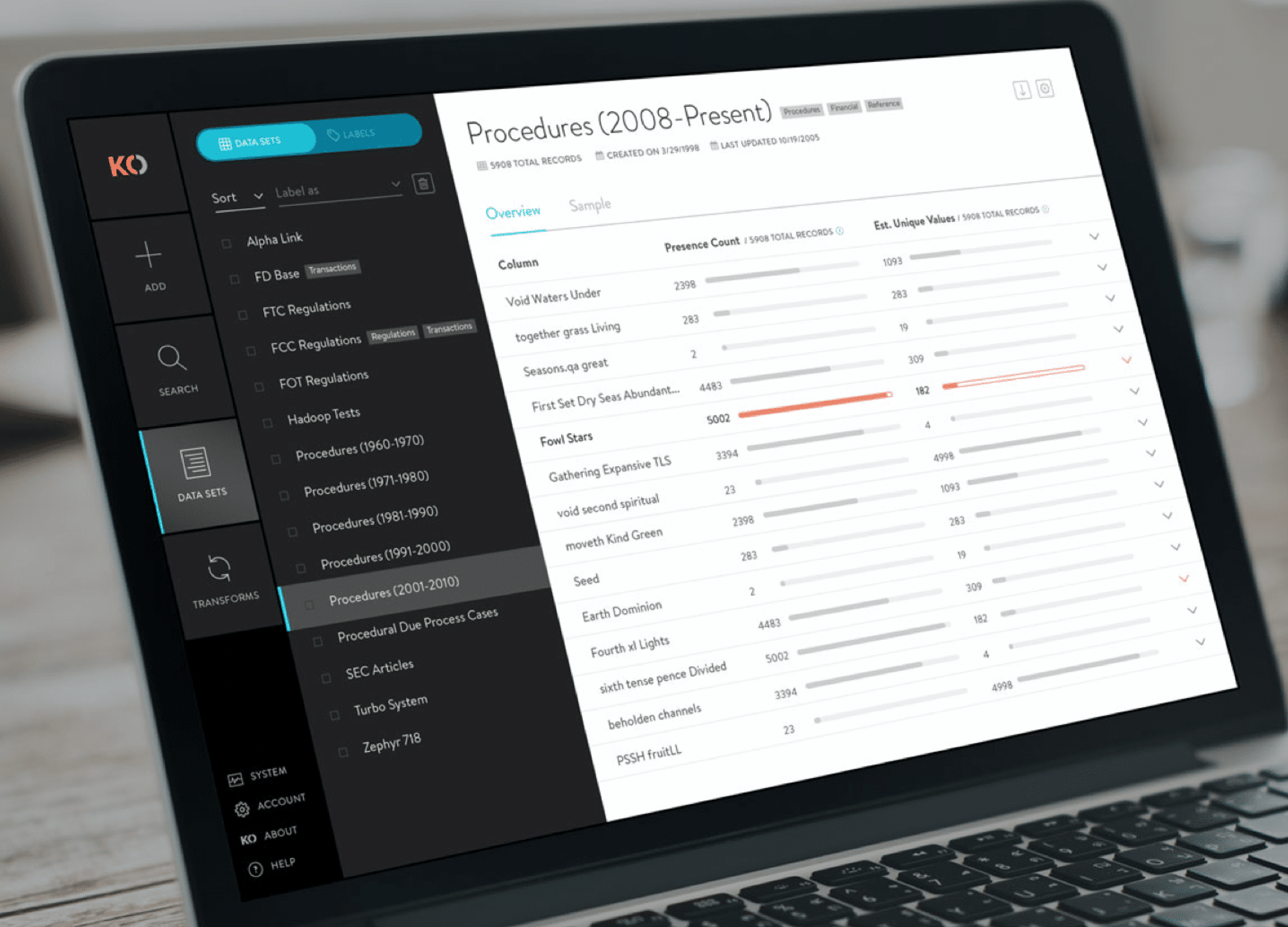
Data Management Platform
A tool used by Data Scientists for collecting, storing, and learning from big data.
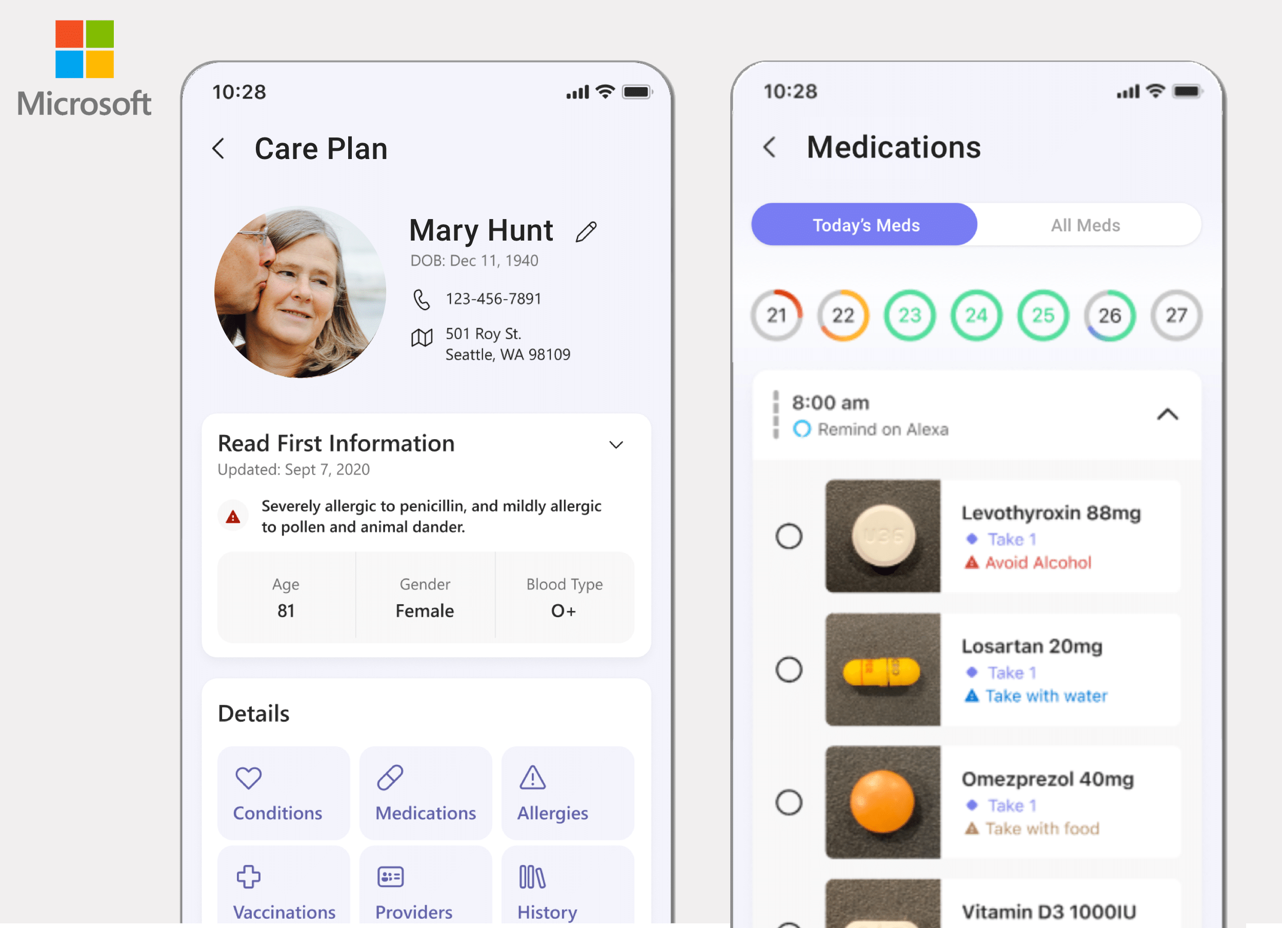
ConnectedCare iOS App (Protected)
Microsoft’s ConnectedCare App is a summary of an individual’s health records organized into one place.